MIS is infused into all the other business disciplines. Marketing is no exception. The relationship is even more pronounced when the item being marketed is itself an MIS product—such as an iPhone app.
In this chapter you will design an iPhone app and create a photo realistic mockup of the app. To do this you need to apply both MIS and marketing skills. Marketing skills help to establish the need for the app—is it something that will sell? MIS skills help to craft the product in order to meet those needs.
At some point in their lives many students dream of starting their own business. The iPhone has given hope to millions of entrepreneurs to do just that by creating and selling an app. You will have the opportunity to envision your own appAn application or app is a computer program that runs on the iPhone. The term is also used for programs running on other platforms such as the iPad, Android phone, or indeed any computer. The iTunes store categorizes apps as follows: Books • Business • Education • Entertainment • Finance • Games • Healthcare & Fitness • Lifestyle • Medical • Music • Navigation • News • Photography • Productivity • Reference • Social Networking • Sports • Travel • Utilities • Weather and make a mockup of that app in PowerPoint or KeyNote.
Every MIS product, including an iPhone app, should be designed with a specific group of people in mind. These groups, called market segments, are normally described demographically using characteristics such as age, income, location, gender, and so forth. When a company identifies a market segment upon which it will focus its efforts, that becomes the target market.
For this class, your target market is your classmates. To make it even more real we ask that you develop a fictional persona in the target market. You design the app for that persona. You need to develop a brand position that will distinguish your app from the competition.
An app should improve a process through higher efficiency or effectiveness. Taking a detailed look at a current process diagram will help you identify where and how a process can be improved and enable you to design an enhanced future process. Through understanding the app’s market segmentation and analyzing the process, a popular app can be put on the market.
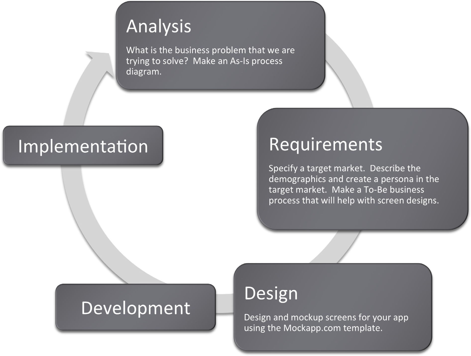
Many information systems projects are conceived of in a life cycle that progresses in stages from analysis to implementation. The diagram below shows the stages that we touch in the current chapter:
Marketers identify groups of potential customers for a company’s product. This process is called market segmentation. Markets can be segmented based on a variety of demographicsA way to categorize groups of people using age, income level, gender, education level, home ownership, and so forth., or characteristics of the population. Examples include age, income level, gender, hobbies, or interests. Each group is called a market segmentA group of potential customers for a product or service. Segments are typically identified by demographics..
Marketing dollars are best spent targeting the segments most likely to buy the product. It would be unwise to waste money on promotional campaignsThe marketing communication that is aimed at the target market. This includes ads, news releases, and so forth. Marketers must try to accurately predict what type of campaign will appeal to the target market while staying consistent with the brand. aimed at audiences not interested in a particular product. For example, a good marketer would not tailor an ad campaign for low-rise jeans to 50-year-old men. Part of the marketer’s job is to persuade the members of the target marketThe segment that is chosen or targeted by the company. Promotional campaigns are aimed at the target market. that they need the product.
Abercrombie & Fitch has little difficulty convincing 14 to 24-year-olds that they need A&F branded merchandise. However, it would be much harder to sell this merchandise to an older age segment. A good marketer knows not to target everyone for a certain product. Instead, they target only those segments most likely to be interested. The challenge for marketers is to find a way to appeal to each target segment. For A&F, a large part of their appeal is sex — a theme of great interest to its target market. However, universities recruiting students in the same age group would most likely not use sex as an appeal in their advertising. Universities do not use sex appeal because although students are their customers, it is likely that their parents will have veto power over the final decision in college selection. Therefore, a marketer’s job becomes more difficult when there are multiple decision makers, each with different needs and wants.
One common marketing mistake, known as the majority fallacyThe targeting of only the largest segment or group of segments, when a smaller loyal segment could be more profitable., is to exclusively pursue those segments that make up the majority of the market. Marketers most likely do this because the competition is also pursuing those segments. It may be wiser to go after a smaller segment, or a niche, that is under served by the competition. Concentrating on a small, highly defined segment is called niche marketingA narrow and highly defined target market. For example, a niche market might be 21 year old females who drive red economy cars and drink diet Coke.. This type of marketing can be very profitable.
The power of a brandNarrowly defining a product or service so that it provokes a single positive image in the mind of the consumer—such as “cool” for Apple Computer. is proportional to its focus. A brand should not try to target everyone. Instead, a brand should narrowly define a product and all of its benefits. Mention of a brand should conjure a single word in the consumer’s imagination, such as “sporty” (Mini Cooper), “safety” (Volvo), or “luxury” (Lexus).
Table 4.1 Apps
| App Name | Price |
|---|---|
| Wheels on the Bus | $0.99 |
| Becker’s 2010 CPA Mobile Flash Cards | $299.99 |
| Dress Up and Makeup | $1.99 |
| Star Chart | $2.99 |
| Kids Song Machine | $1.99 |
| iHomework | $1.99 |
| SkyVoyager | $14.99 |
| Baby Pregnancy Tracker | $2.99 |
These are all apps listed in the education category at the iTunes store. The apps target different market segments. What market segment does each app target? Would it be a good or a bad idea to go after multiple segments?
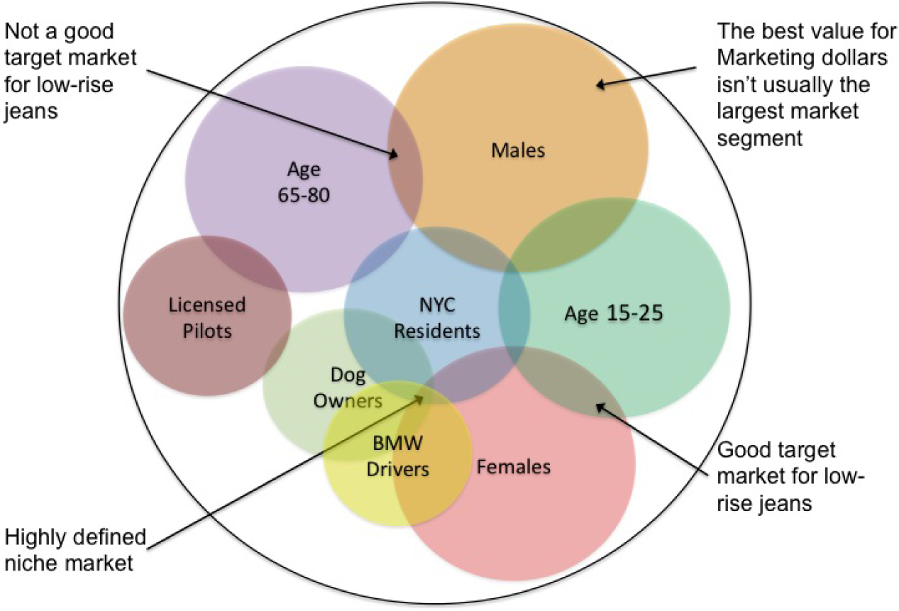
Demographic variables tend to overlap. The market segments are defined at the points of overlap. A niche market is defined where multiple variables overlap.
The MIS methodology best suited to designing for a target market is user centered designChanging the design to fit the user rather than asking the user to accommodate the design.. According to Wikipedia, “The chief difference from other product design philosophies is that user-centered design tries to optimize the product around how users can, want, or need to use the product, rather than forcing the users to change their behavior to accommodate the product.”
In a later chapter we will look at some heuristic rules of usabilityHow easy a product is to use.—how easy something is to navigate and use—especially as applied to websites. However, in this chapter we are envisioning the overall user experience (UX)“A person’s perceptions and responses that result from the use or anticipated use of a product, system or service” ISO 9241-210. What would a person in our target market actually want the app to do? How would they want it to behave? Can we make using the app a natural and pleasant experience?
Designers have found that it is a lot easier to answer these questions if you first envision a user in the target market. This fictional user is called a personaA fictional person from the target market created by the designer to help influence design choices.. Once a persona, say Fred, is created then designers can debate what Fred would like based on agreed upon characteristics of Fred. Of course Fred is no substitute for testing an app with real users, but he does help get you off the ground and moving in the right direction.

Create a persona. Fred age 27, earns $60K and just recently moved to the East Side of Cleveland. Fred lives in a 1 bedroom apartment with his dog, Ajax. On weekends Fred likes to mountain bike with his dog and hang out with his fiancée, Mary.
This biking trail app will enable Fred to identify areas to go mountain biking, and because it is ‘animal friendly’, it can also show him maps of areas he can ride with Ajax off leash and the location of areas where they can both stop to rest and get some water.
Test the power of a persona. Which of the restaurant ads below would appeal to Fred?

There are hundreds of thousands of apps in the iPhone store. Picking a unique brand name for your app is difficult. It is a good idea to try to avoid names that are easily confused with others. For example for a photography app it might be a good idea to avoid the word camera in the name. To illustrate the dangers of generic names consider that Camera Flash Deluxe is easily confused with Camera Flash & Zoom.
In general, generic names are the most easily confused. If your brand name can be confused then it will be difficult to differentiateA marketing term that refers to the ability of a brand to stand out from the crowd. your brand in the eyes of the consumer. It may be no accident that very few of the top grossing photography apps actually have camera in their name as is illustrated below.
The law of the generic is a special case of the concept of singularityThe idea that a brand’s power depends on its uniqueness.. Many of the laws of branding are built upon the concept of singularity. A brand’s power is driven by its unique qualities. The following analogy, written by Al and Laura Ries,Al and Laura Ries are marketing professionals and coauthors of 22 Immutable Laws of Branding. describes what a successful brand should entail:
“From a business point of view, branding in the marketplace is very similar to branding on the ranch. A branding program should be designed to differentiate your cow from all other cattle on the range. Even if all the cattle on the range look pretty much alike. A successful branding program is based on the concept of singularity. It creates in the mind of the prospect the perception that there is no product on the market quite like your product. Can a successful brand appeal to everybody? No. The same concept of singularity makes certain that no one brand can possibly have a universal appeal. (page 7)”
Law of the generic in action. Below are the top 12 grossing photography apps in October, 2010. Note very few have camera in their name.
Table 4.2 Top 12 Grossing Photography Apps
| Rank No. | App Name | Price |
|---|---|---|
| 1 | Hipstamatic | $1.99 |
| 2 | iMovie | $4.99 |
| 3 | Color Splash | $1.99 |
| 4 | Pano | $2.99 |
| 5 | Pro HDR | $1.99 |
| 6 | ReelDirector | $3.99 |
| 7 | AutoStitch Panorama | $2.99 |
| 8 | CameraBag | $1.99 |
| 9 | iVideoCamera | $0.99 |
| 10 | Vintage Video Maker | $1.99 |
| 11 | Camera Plus Pro | $1.99 |
| 12 | FX Photo Studio | $0.99 |
Below are those apps that begin with the word camera and their sales rank.
Table 4.3 Other Camera Apps
| Rank No. | App Name | Price |
|---|---|---|
| 8 | CameraBag | $1.99 |
| 87 | Camera Flash Deluxe | $0.99 |
| 167 | Camera Flash & Zoom | $0.99 |
| 128 | Camera for iPad | $0.99 |
| 90 | Camera Fun Pro | $0.99 |
| 19 | Camera Genius | $1.99 |
| 181 | CameraKit | $1.99 |
| 156 | Camera Magic | $1.99 |
| 11 | Camera Plus Pro | $1.99 |
| 135 | Camera Pro: All-In-1 | $0.99 |
| 94 | Camera Vault | $1.99 |
| 63 | Camera Zoom | $0.99 |
According to Al and Laura Ries: “A brand should use a color that is the opposite of its major competitors. What color is a Tiffany box? It’s that distinctive robin’s-egg blue. All Tiffany’s boxes are blue. If Tiffany had used a variety of colors for its boxes, it would have lost a marvelous opportunity to reinforce the brand name with a distinctive color. Basically there are five colors (red, orange, yellow, green, and blue) plus the neutral colors (black, white, and gray).” (pages 134-135)
For icons we would go a step further and recommend using an image that is also different from the competition. For example, a camera app whose icon is a camera lens is not very original. Almost all the brands that start with the word camera also use the color black (as in a black camera lens) — as if to say, “...and if you didn’t get it the first time...” How different really is one black camera lens than another — especially at icon size? Few of the top selling camera apps show a black camera lens. And if it is not original then it does not differentiate, which means customers may have trouble finding your app in the iTunes store.
For most apps, the icon in the iTunes store also serves as the logo. These icons are very small—especially when viewed on the iPhone. That means that detail on the logo must be avoided as it will be lost.
Curiously enough, the NFL ran into a similar issue with its logo. Prior to 2008 the NFL logo had 25 stars. This was a nightmare for those creating embroidered caps that sport the logo. It was also a challenge for grounds keepers painting the logo on the field of play.
The NFL simplified its logo and sharpened its image at the same time. To get a feel for how the NFL changed their logo, please look at the before and after of the NFL logo at the following link:
http://www.usatoday.com/sports/football/nfl/2007-08-30-shield-change_N.htm
Some of the changes that the NFL made to its logo include:
Your icon is the face of your app — make it meaningful. Designing an icon may require some trial and error. Logo designers typically run through a lot of competing designs before settling on a winner. Each design projects a unique message. During the 2008 United States Presidential Campaign, the Obama team picked a memorable and iconic design. Behind the scenes, the campaign actually considered a variety of designs before deciding on the now famous Obama “O.” So powerful was the logo that its designer, Sol Sender, rose to fame in the design world. The logo was designed to convey hope and change, the sun rising on a new day.
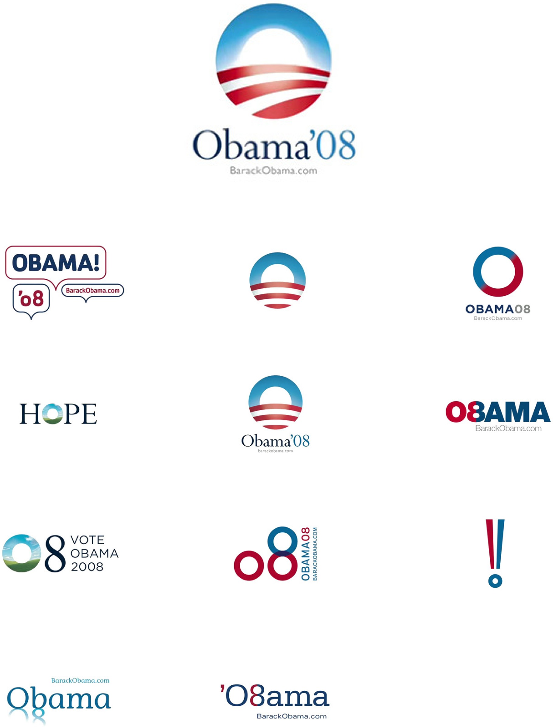
Obama logo: the winner and the runners up as designed by Sol Sender. Which would you have picked?
Source: Sol Sender & VSA Partners
Your app needs to solve a business problem for someone in order to be marketable. For the sake of this lesson, your classmates compose your target market—people like you.
You are asked to identify a problem then describe how your app will solve the problem. Your app should provide some tangible benefits for the target market.
Finally, you are asked to describe a fictional persona in the target market. Having a persona helps you make decisions in the design of the app.
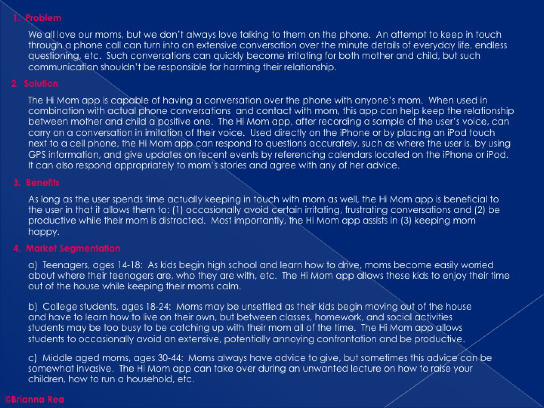
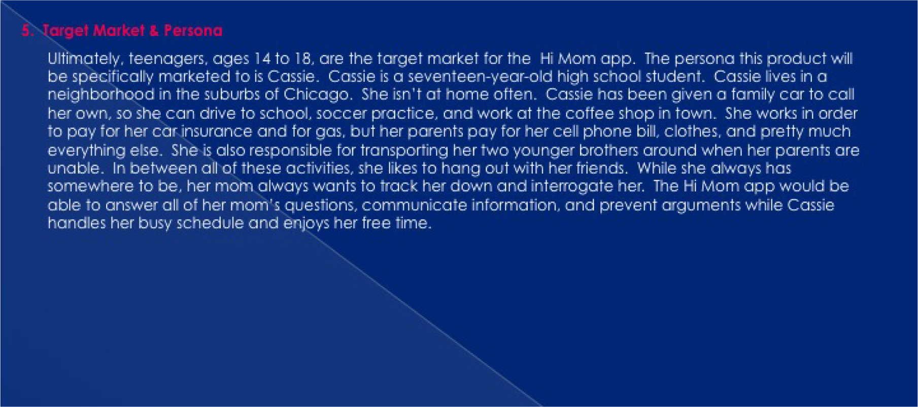
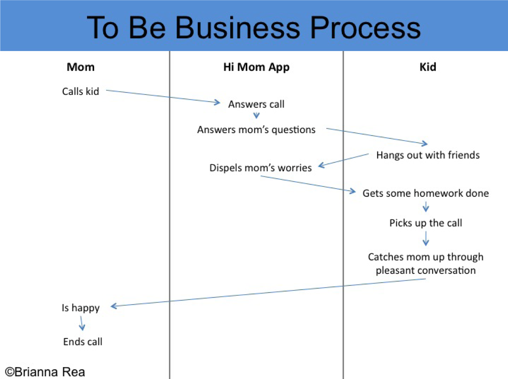
Analyzing the problem and describing the marketability of the Hi Mom app. This app is designed to ease Mom’s worries while giving the student more free time. You should make your own original example.
After analyzing the business problem, you need to set requirements for the design of your app. We will envision requirements using process flow diagrams.
Some students struggle with what they should create for their app screens until they do process flows. The key is to construct an app swim lane in the process flow. Then look at the app swim lane of the To-Be process flow to help determine which screens to create. The screens should follow logically by looking at the action the app is taking (e.g. ask user X or show user X). The connection will not necessarily be one screen per action. In fact you may have multiple screens for each action. It depends upon the level of detail in your process flow.
Creating a planning diagram almost always saves time in the end. It is much easier to add, update, and remove actions from a process diagram than it is to add, update, and remove screens from your app.
Process flows also highlight the importance of doing business process management and business process redesign and why business process is so important to information systems.
How different will your As-Is and To-Be diagrams be? If you are migrating an existing computerized process to the iPhone, they may be fairly similar. However, if you are comparing a non-computerized process to one that uses an iPhone, then they are likely to be quite different.
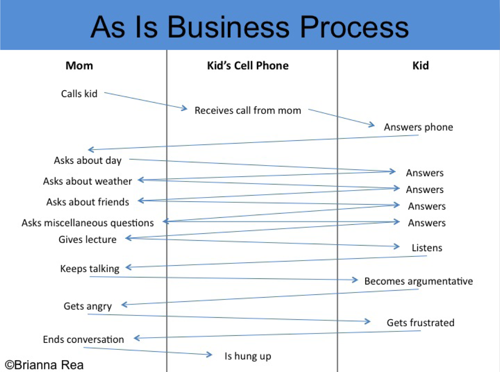
Continuing the analysis (As-Is) and setting the requirements (To-Be) for the Hi Mom app. You should make your own original process flows to match your app.
Now that we have discussed target markets, laws of branding, icon design, and process flows, you are ready to design your iPhone app. Your app should have a close relationship with your process flows. In other words, the actions identified for the app in the process flows should be illustrated in the mockups.
Fortunately, the iPhone interface is highly standardized, which means you have fewer decisions to make about the placement and style of interface elements. This allows you to focus more on the content of your app.
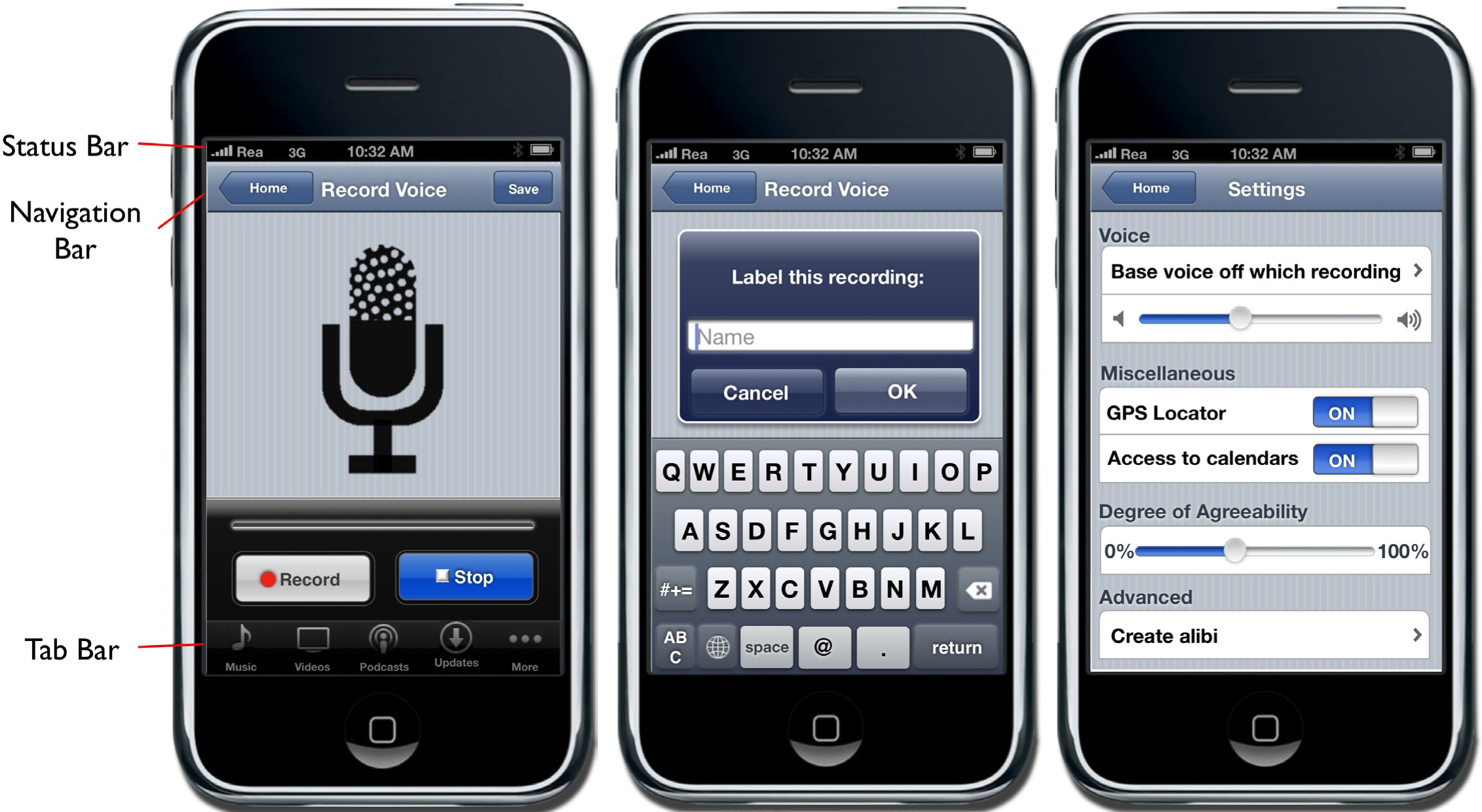
The status bar should appear at the very top of the screen and display important information about the device itself. The status bar displays information such as the current time, battery level, network provider, and network strength.
The navigation bar appears at the top of the screen directly under the status bar and displays the title of the page currently being viewed.
The tab bar always appears at the bottom of the screen and should appear on every screen of your app. The tab bar allows the user to switch modes or views very easily.
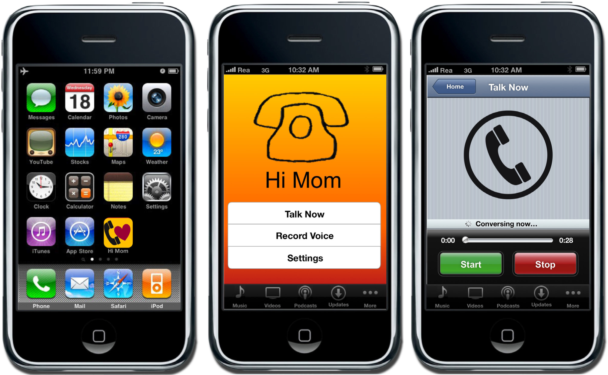
Multiple screenshots from the Hi Mom app. You should make your own original screen shots using the MockApp template and library.
To create your iPhone app, you need access to all of the screen elements on the iPhone. Fortunately, there is a wonderful PowerPoint template called MockApp, which contains a comprehensive set of iPhone screen elements. MockApp is located at MockApp.com.
When you download MockApp you will have access to two files—a template and a library. The template is simply a series of blank iPhone screens that you populate with the appropriate screen elements from the library.
Your task is to copy screen elements from the library and then paste them into the template. You then rearrange and relabel screen elements to simulate a working app.
Because PowerPoint supports hyperlinks among slides, you can even simulate buttons that navigate among screens in your app. In this manner, you can create a photo realistic mockup.
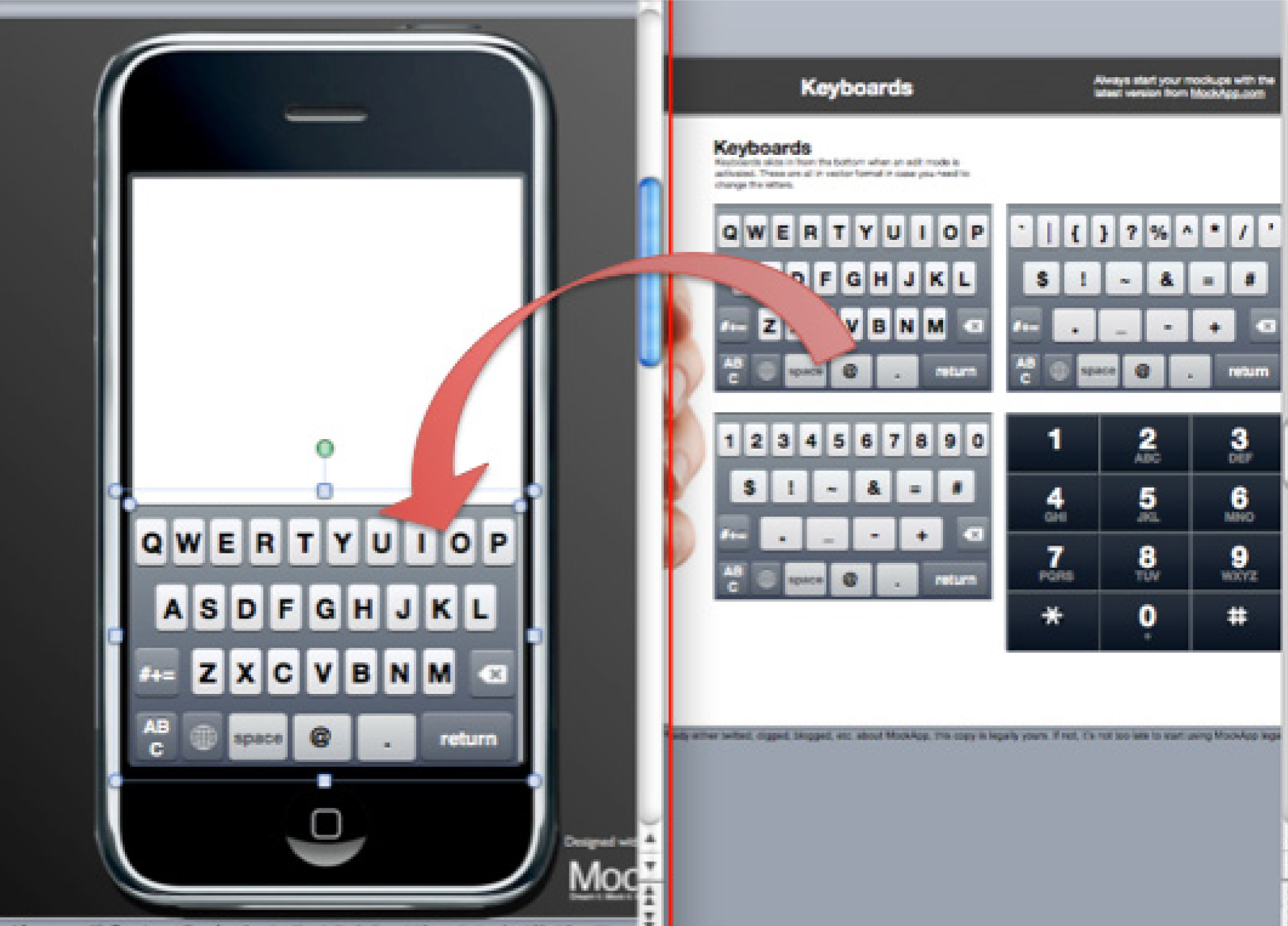
The MockApp template and library are depicted here opened simultaneously in overlapping windows. We recommend setting up in this way. The library consists of a series of PowerPoint slides each having an array of iPhone screen elements. The library slide shown here is for keyboards—but there are many other library slides. Copy elements off any of these library slides and paste them into the blank iPhone template. Then customize the text to suit your app. MockApp.com screen shot reprinted with permission from Dotan Saguy.
The following techniques, found in the PowerPoint section of the software reference, may be useful in completing the assignments for this chapter. iPhone Interface Map • Hyperlink • Shape-Insert
When brainstorming iPhone Apps it is sometimes helpful to look at other apps already developed. The best way to check out other apps is on the iTunes store (iTunes is free). However, even if you do not have iTunes loaded, you can check out apps at the following link: http://app-store.appspot.com/
We can not overstate the importance of the assignments in this chapter. The rest of the course will build on what you create here. Your app will be viewed by your classmates so make it something you can be proud of.
Your classmates will “buy” your app in a future assignment, so the app needs to appeal to them either for their own consumption or to be given as a gift. You will also construct financial projections for your app in a future chapter. Finally, your report at the end of the course will be a culmination of all the deliverables you have constructed about your app to that point.
Setup
Start a blank PowerPoint presentation. Using a 12 point font, complete the following exercise using complete sentences and paragraphs.
Content and Style
Deliverables
Electronic submission: Submit a PowerPoint file containing your responses.
Paper submission: Print out your responses.
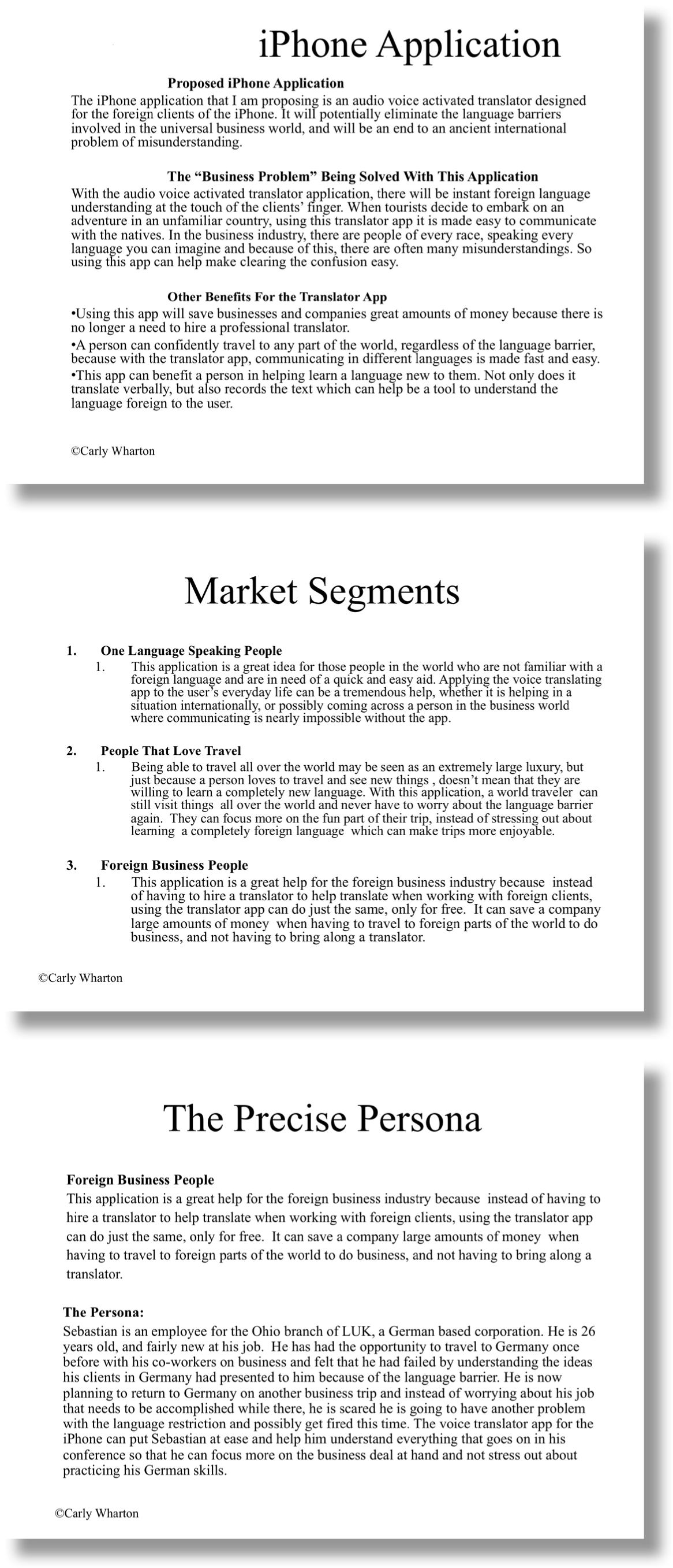
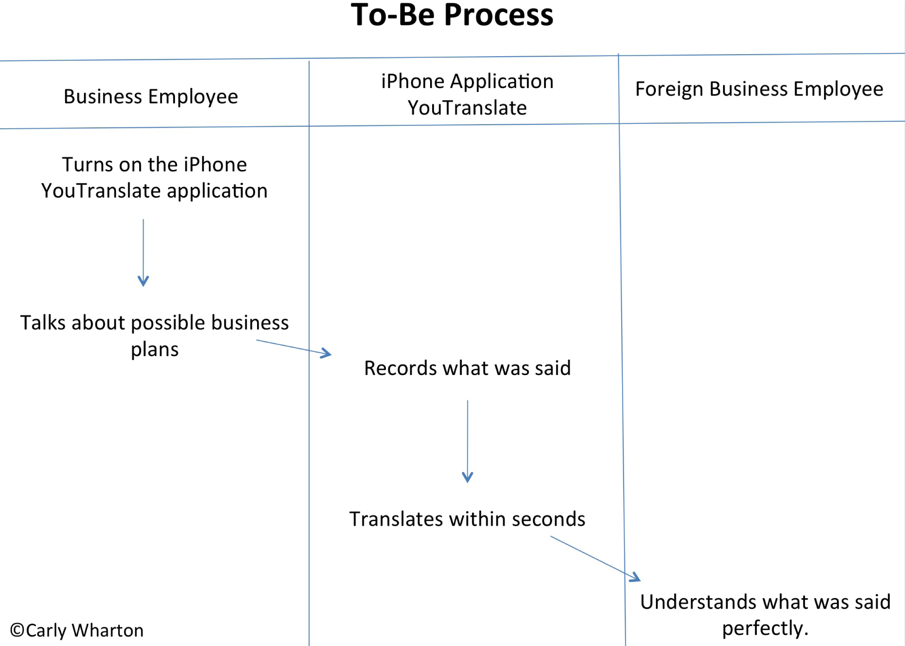
A sample student write-up for the L1 exercise. You Translate is an app that does translation. You should make your own original example.
By creating As-Is and To-Be process flow diagrams, you will be able to analyze the benefits of the app. Here you show us how your persona engages in a business process with, and without, your app. The app should build a strong case that the To-Be process is a significant improvement over the as-is version. Create both the As-Is and the To-Be process flow diagrams of the use of the iPhone app. The As-Is diagrams should model how the persona performs the task without the app. The To-Be diagram will describe how the task is completed using the app.
Setup
Start a blank PowerPoint presentation. Using a 12 point font, complete the following exercise using complete sentences and paragraphs.
Content and Style
Deliverables
Electronic submission: Submit your PowerPoint file.
Paper submission: Create a color printout by printing directly from PowerPoint.
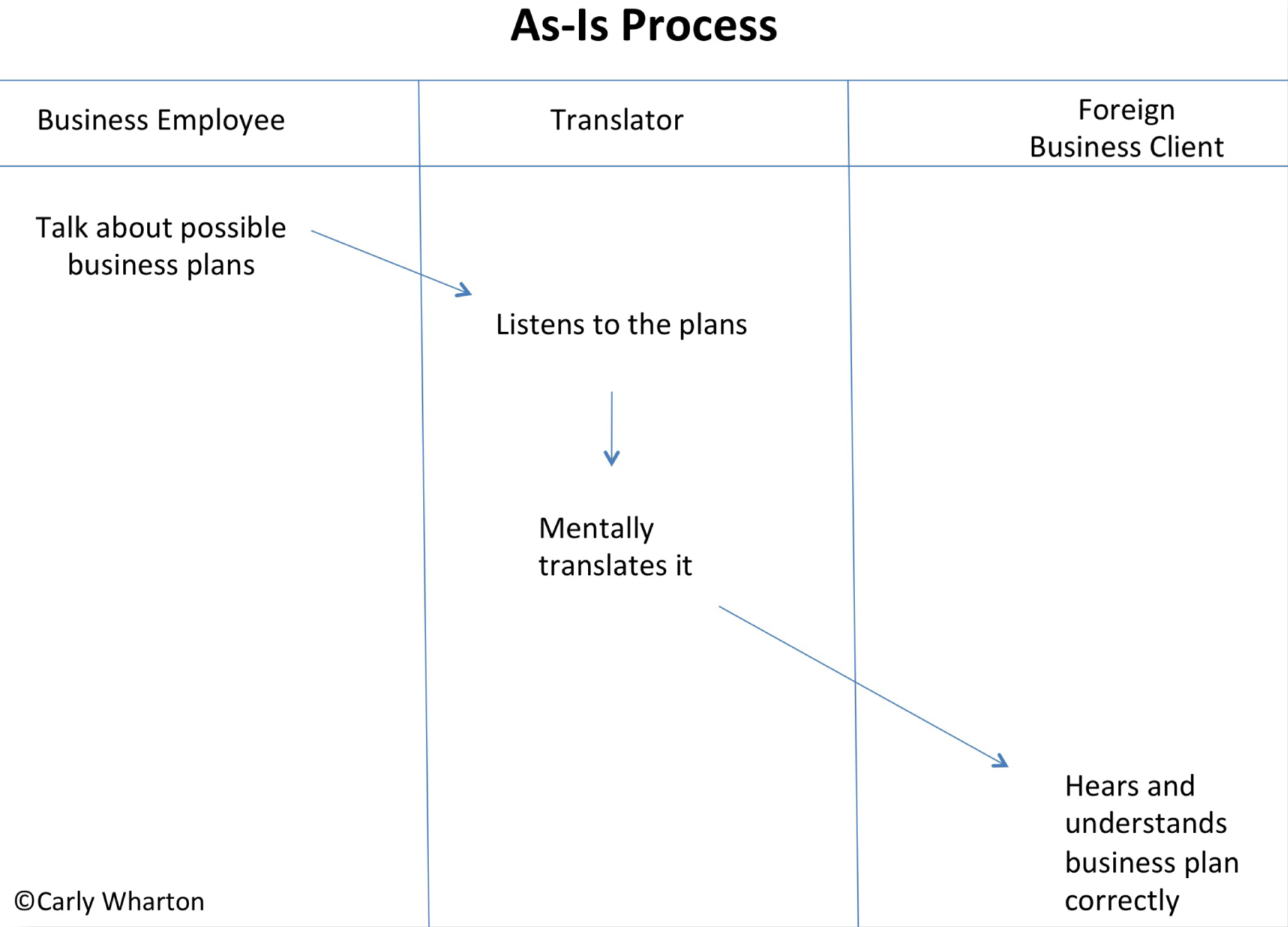
Sample student process flows for the You Translate app. You should make your own original process flows to match your app.
In this assignment you will create an iPhone app mockup based on your analysis. PowerPoint allows you to create a mockup of an application before doing any coding. This mockup acts as a visual model to use in a product proposal. Using the templates provided, design a creative and useful iPhone app.
Setup
Complete the free registration to obtain the files to design your app from MockApp.com. MockApp contains three files—the library of icons used by an iPhone app, and two templates—one that allows you to demo in PowerPoint and one that allows you to demo on an iPhone. You will use the one that allows you to demo in PowerPoint. Note that Mac users can also choose the Keynote versions of the MockApp files.
Build your app in the MockApp template file. Do not build your app in the same file that you used for either the L1 or L2 assignments. The dimensions of the PowerPoint files are different and your images will distort.
Content and Style
Deliverables
Electronic submission: Save and submit your PowerPoint file.
Paper submission: Create a color printout by printing directly from PowerPoint.
Sample screen shots for the You Translate app. You should make your own original screen shots using the MockApp template and library.


