For the purposes of this course we will consider your iPhone app to be a fully functional and marketable product. Now the challenge is to build a store to market the app. Building the store will be a community project. Each student will build a piece of the store. But before we build the store, we need to design it.
Part of the beauty of the iPhone interface is its predictability. All iPhone applications share the same interface elements. Apple ensures this uniformity by reviewing every app before it is published on the iTunes store. It’s not that way on the web. To have uniformity on a website the designer must enforce his/her own design standards. In general the website will be more successful with more repeat business if it follows industry standard conventions for website design. Most of those conventions fall under the heading of usability—literally, how usable or easy to navigate is the site?
The problem with usability is that you only notice it when it is absent. It is like the phone system—it only gets your attention when it doesn’t work. We expect sites to be usable and get upset when they are not. Why then do so many sites have usability issues? Because site designers lose sight of the end user. Mastering some common sense rules or heuristics of usability can go a long way toward making sure that designers create a satisfying experience for the end user.
As you go through this chapter you will note some overlap between usability and graphic design principles. For example, creating contrast between the type and page background is also a usability principle.
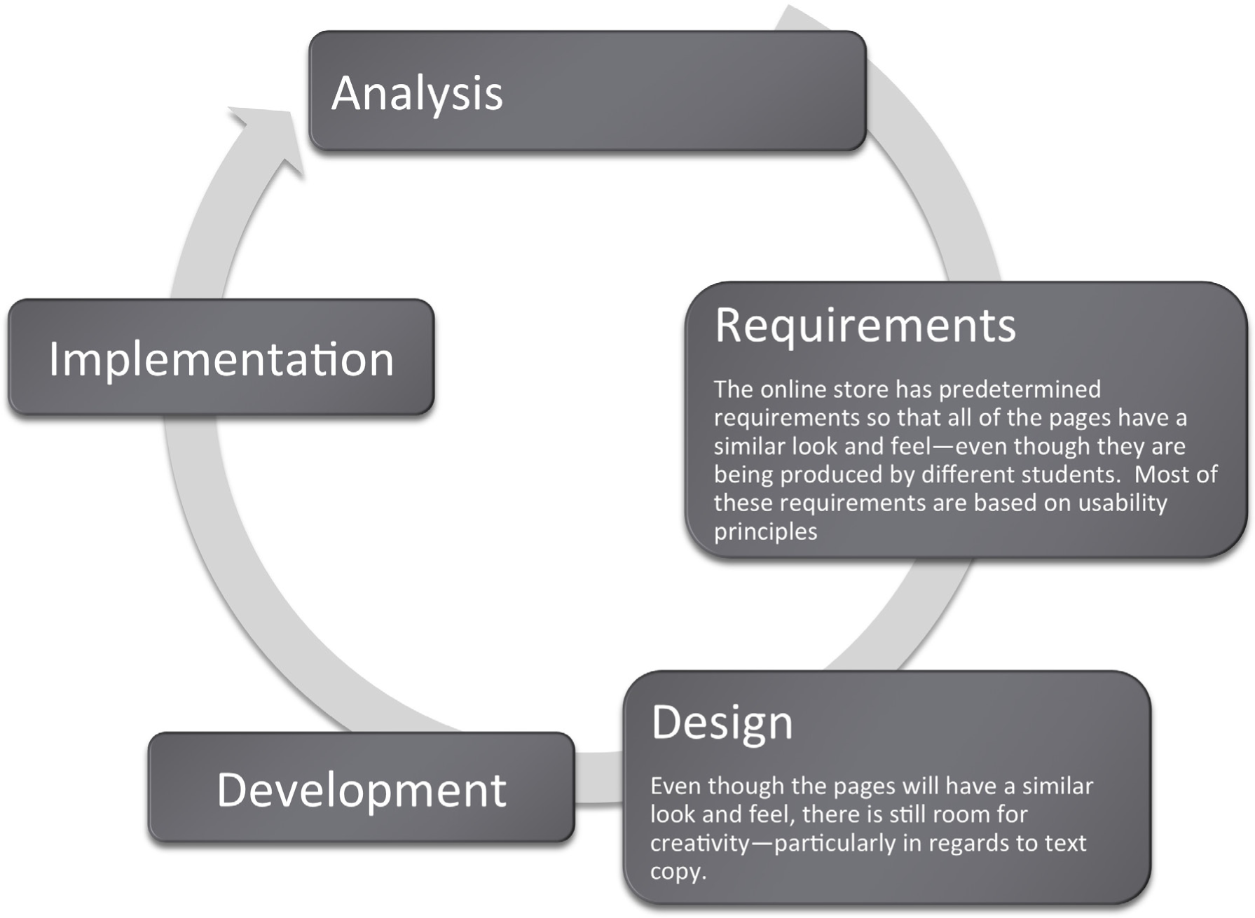
Many information systems projects are conceived of in a life cycle that progresses in stages from analysis to implementation. The diagram below shows the stages that we touch in the current chapter:
Web designers have met the need for user-friendly websites by following standard conventions for easy navigation and other site design elements. Internet users should not have to learn how to use a specific site; they should already know how to navigate the site based on prior web experience.
The concept of usability is very familiar to us in other settings. For example, most automobile manufacturers put the pedals, turn signals, and light controls in the same place regardless of car make or model. This way, consumers will not need a tutorial each time they purchase a new car, because they can base their knowledge on previous vehicles. There is also some standardization of icons used in computer operating systems. For example, an icon with a drawing of a printer on it will most likely enable a user to print a document. Similarly, the standardization of websites with regard to usability makes it possible for users to navigate without learning new conventions.
Usability refers to sites that are well-organized, easy to navigate, designed with the consumer in mind, and rigorously tested. These sites allow marketers to deliver the product message to their target markets. Sites that fail to meet these objectives will be abandoned by frustrated users.
Usability also refers to how easy it is to complete tasks, such as purchasing an item or scheduling a meeting. Usability is influenced by site organization, following convention, features of the site, fonts, and colors. Both usability and graphic design are subsets of information design. However, they overlap and reinforce one another.
The most recognizable name in usability is Jakob Nielsen.Nielsen has written numerous books and articles, and has spoken publicly on the subject of website usability. His website is www.useit.com. Yet, Nielsen’s own website sacrifices visual appeal for usability. So are usability and creativity at opposite ends of the spectrum? The solution is to balance the two for the betterment of both.
Ultimately, we need a way to evaluate how usable a site is. Nielsen has developed specific design elements to look for in a website. This site demonstrates how to properly balance usability and creativity in a website.
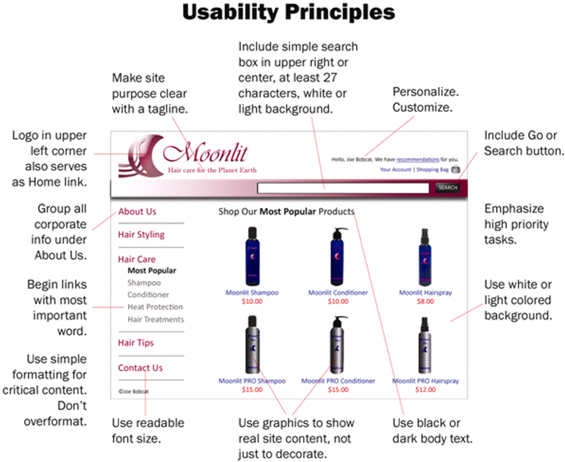
Potential customers typically look at a company’s website before doing business with them. The first site page they come across is the homepage, and the design and usability of the homepage can make or break a possible business deal. The following list compiled by Jakob Nielsen is composed of ten things that can be used to increase the usability of a homepage and, therefore, enhance your website business value.All of these guidelines are quoted from Jakob Nielsen, Top Ten Guidelines for Site Usability, copyright © 2003-2007, ISSN 1548-5552.
Images were placed by the authors to illustrate Nielsen’s concepts.
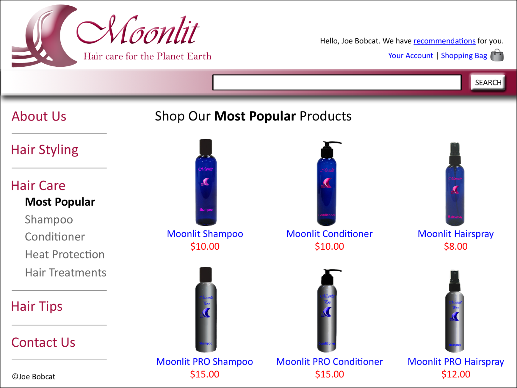
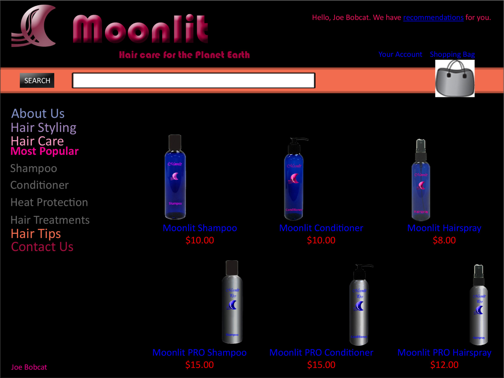
Usability in Action. The site above exhibits good graphic design and usability. The site below does not.
Start the page with a tagline that summarizes what the site or company does, especially if you’re new or less than famous. Even well-known companies presumably hope to attract new customers and should tell first-time visitors about the site’s purpose. It is especially important to have a good tagline if your company’s general marketing slogan is bland and fails to tell users what they’ll gain from using the site.
Begin the TITLE tag with the company name, followed by a brief description of the site. Don’t start with words like “The” or “Welcome to” unless you want to be alphabetized under “T” or “W.”
Finding out about the company is rarely a user’s first task, but sometimes people do need details about who you are. Good corporate information is especially important if the site hopes to support recruiting, investor relations, or PR, but it can also serve to increase a new or lesser-known company’s credibility. An “About <company-name>” section is the best way to link users to more in-depth information than can be presented on the homepage. [See also my report with 50 guidelines for the design of “about us” areas of corporate websites.]
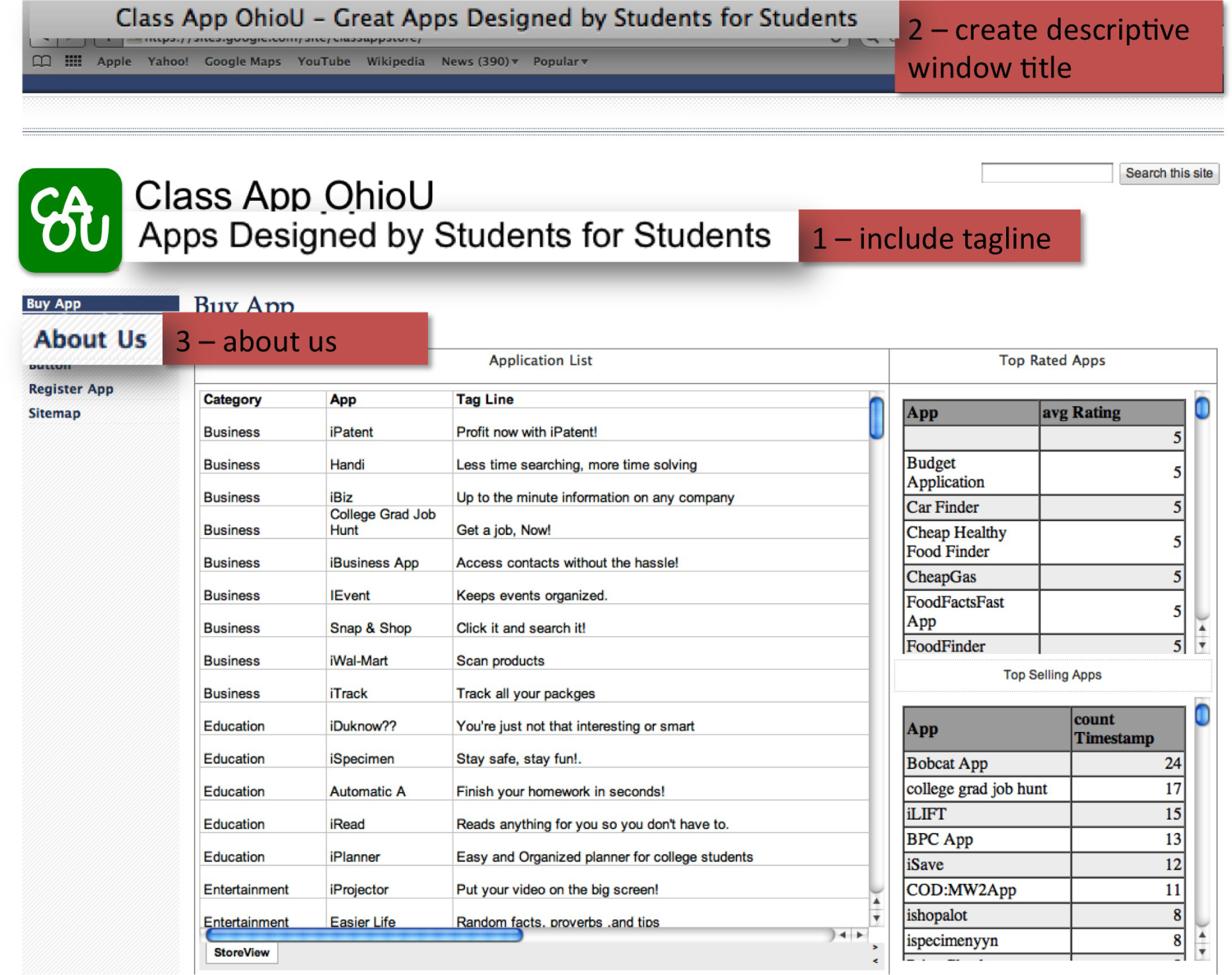
Usability principles in action: 1. Include a one-sentence tagline. 2. Write a window title with good visibility in search engines and bookmark lists. 3. Group all corporate information in one distinct area.
Your homepage should offer users a clear starting point for the main one to four tasks they’ll undertake when visiting your site.
Search is an important part of any big website. When users want to search, they typically scan the homepage looking for “the little box where I can type,” so your search should be a box. Make your search box at least 25 characters wide, so it can accommodate multiple words without obscuring parts of the user’s query.
[Update: Based on more recent findings, my recommendation is now to make the search box 27 characters wide. This and other new guidelines are covered in my tutorial on fundamental Guidelines for Web Usability at the User Experience 2007 conference in Las Vegas and Barcelona.]
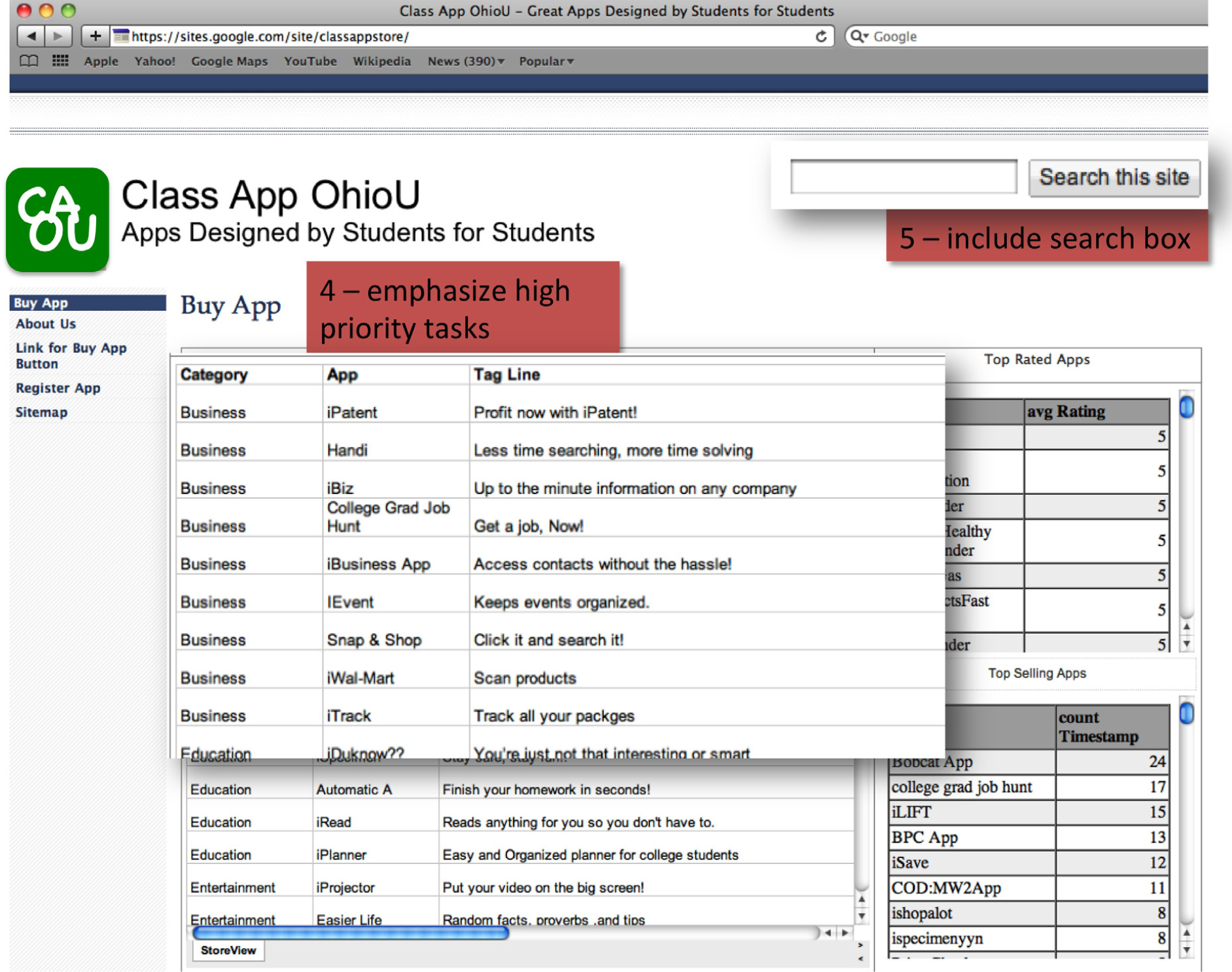
Usability principles in action: 4. Emphasize the site’s top high-priority tasks. 5. Include a search input box.
Don’t just describe what lies beneath the homepage. Specifics beat abstractions, and you have good stuff. Show some of your best or most recent content.
Users scan down the page, trying to find the area that will serve their current goal. Links are the action items on a homepage, and when you start each link with a relevant word, you make it easier for scanning eyes to differentiate it from other links on the page. A common violation of this guideline is to start all links with the company name, which adds little value and impairs users’ ability to quickly find what they need.
Users will often remember articles, products, or promotions that were featured prominently on the homepage, but they won’t know how to find them once you move the features inside the site. To help users locate key items, keep a short list of recent features on the homepage and supplement it with a link to a permanent archive of all other homepage features.
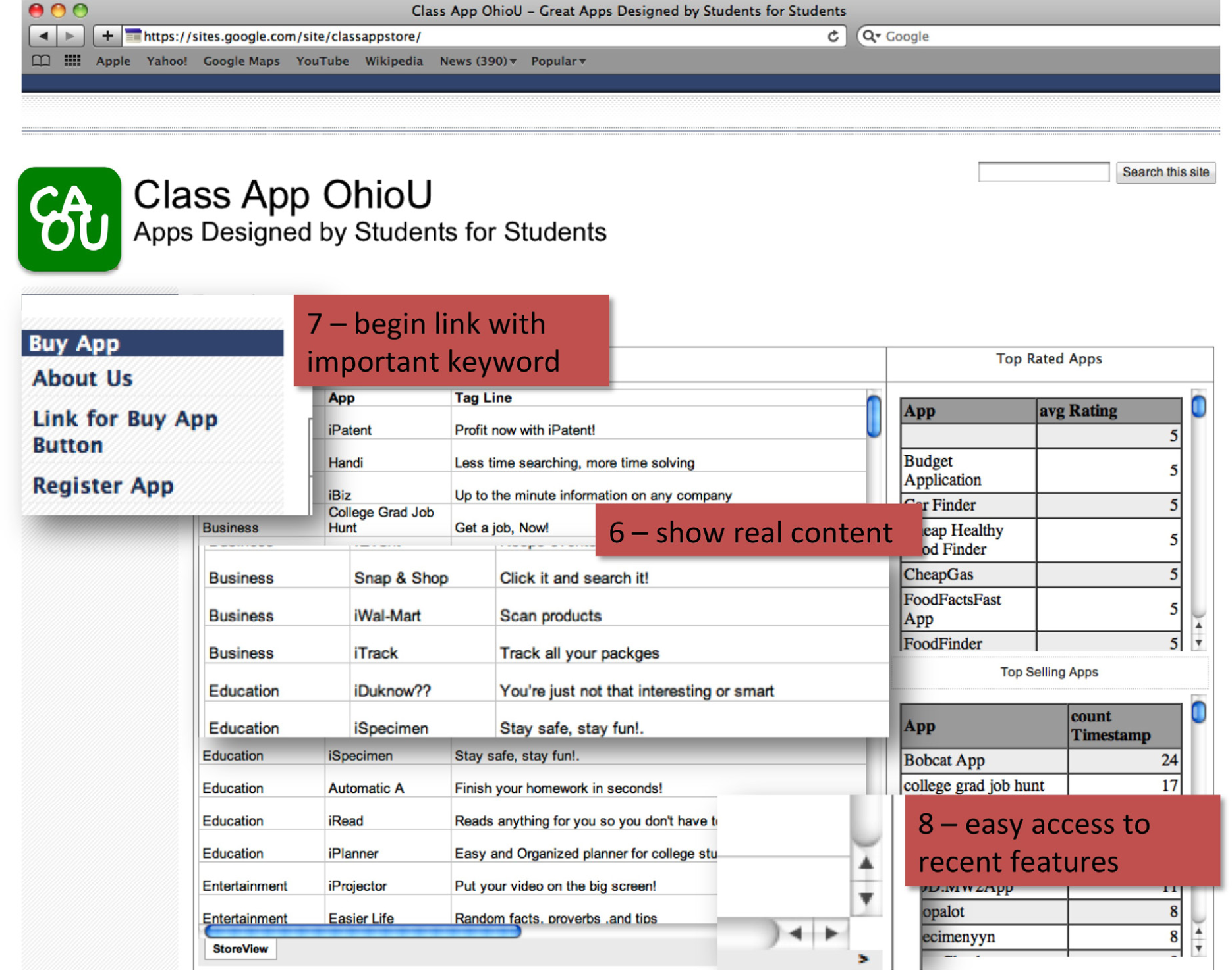
Usability principles in action: 6. Show examples of real site content. 7. Begin link names with the most important keyword 8. Offer easy access to recent homepage features.
You might think that important homepage items require elaborate illustrations, boxes, and colors. However, users often dismiss graphics as ads and focus on the parts of the homepage that look more likely to be useful.
Don’t just decorate the page with stock art. Images are powerful communicators when they show items of interest to users, but will backfire if they seem frivolous or irrelevant. For example, it’s almost always best to show photos of real people actually connected to the topic, rather than pictures of models.
As important as usability is—it is only a piece of the design process. How are websites designed in the real world? A professional team might include some or all of the following individuals:
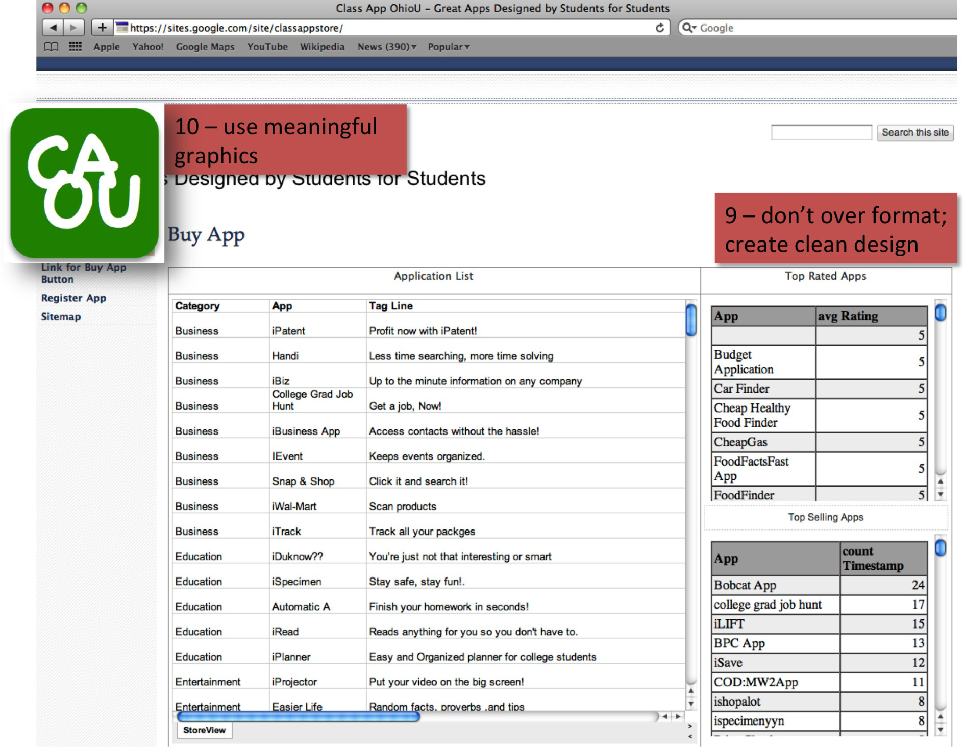
Usability principles in action: 9. Don’t over-format critical content, such as navigation areas. 10. Use meaningful graphics.
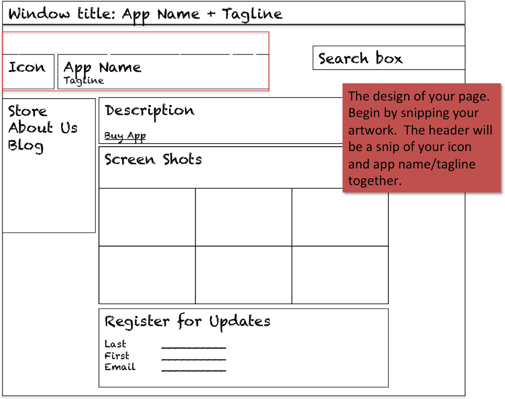
This chapter has shown examples from the homepage of the Class App store. But what about your pages? To be thematically consistent your pages must follow a consistent structure. The key is to roughly maintain the structure as well as thematic colors from the home page of the store. The user should always be aware that he or she is on the same site. Here is a guide to follow: