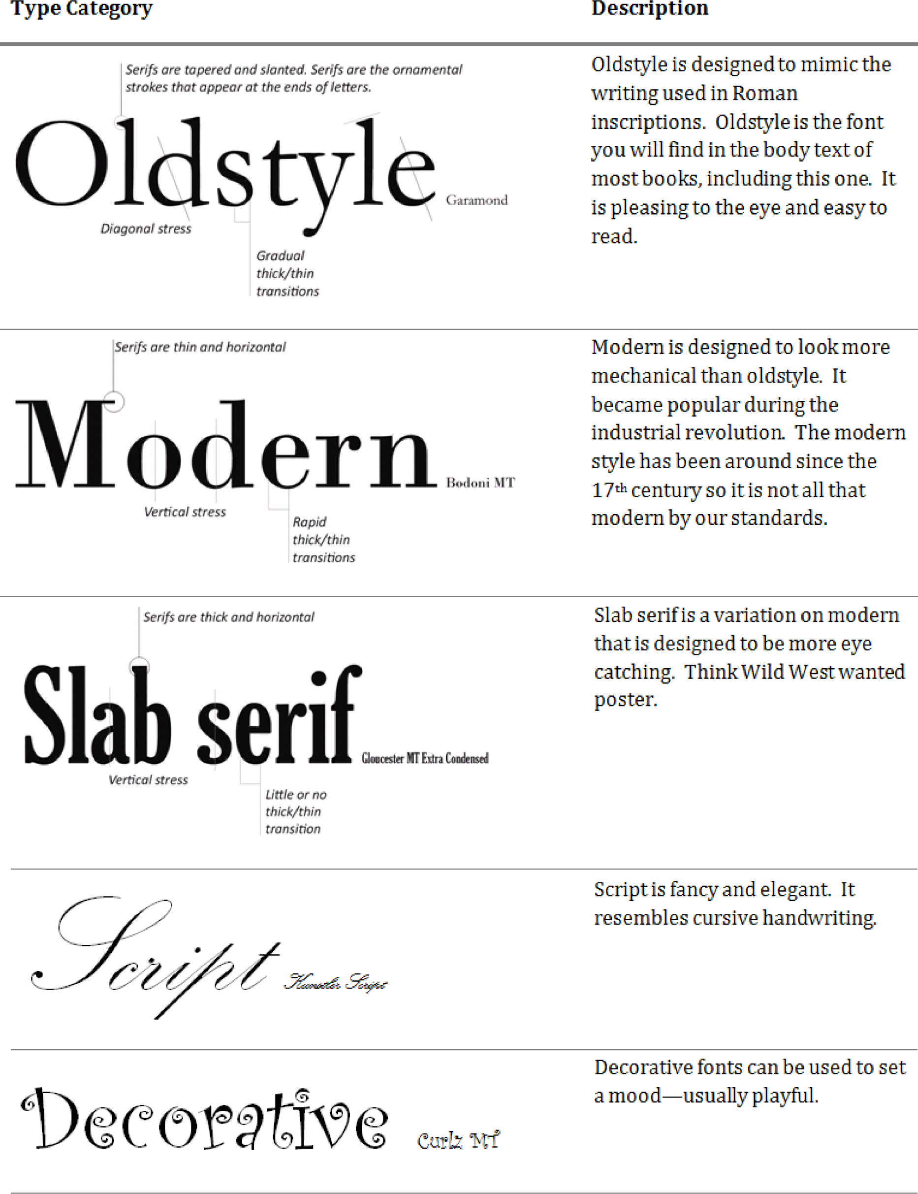
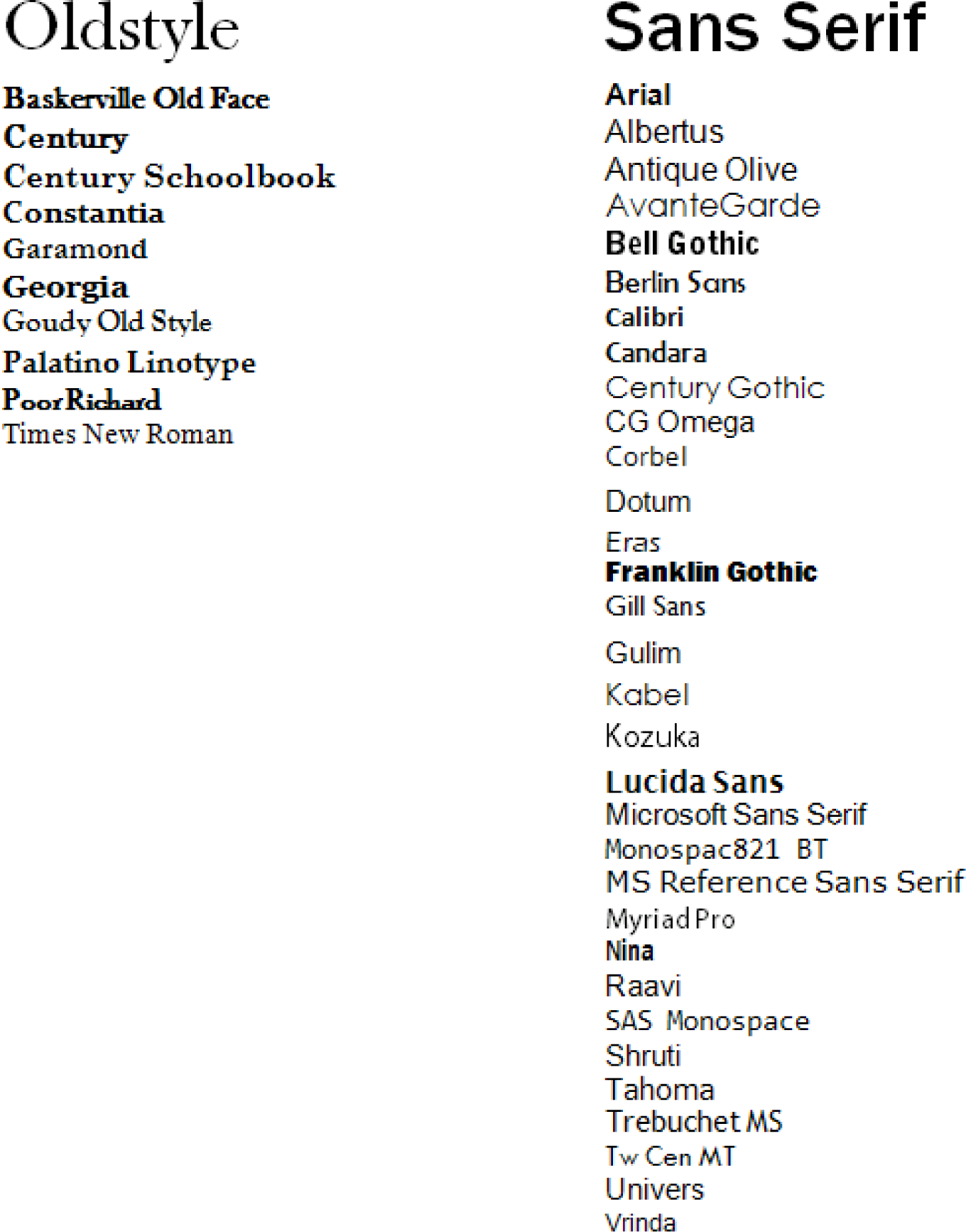
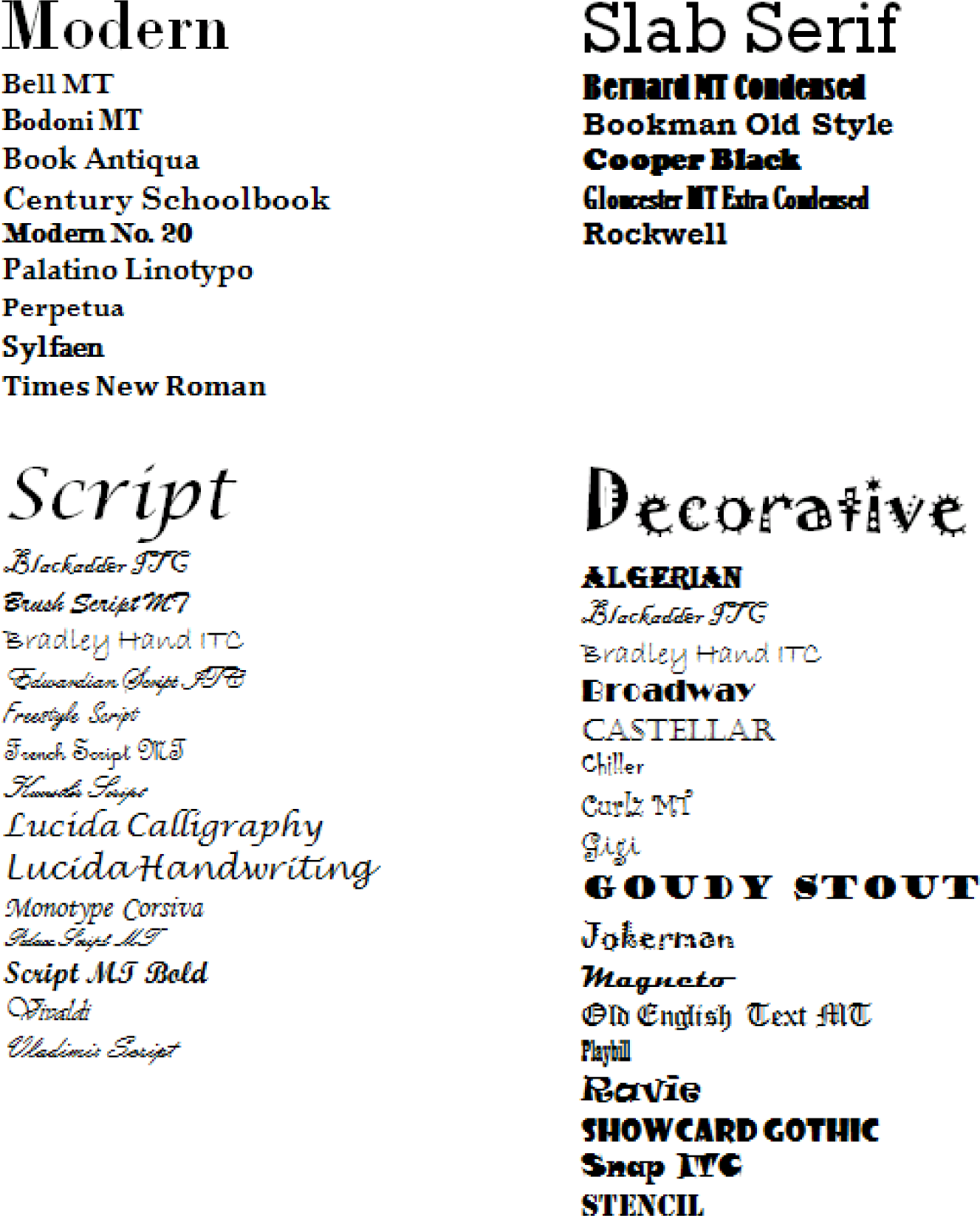
In earlier chapters, we discussed the difference between serif and sans serif fonts. However, as you might imagine, the story is far more complex than that. There are many more specific font categories. These categories are based on fonts that share certain characteristics. We consider five basic font classifications though there are more. To create contrast, mix fonts from different classifications. Never mix two fonts from the same category—it will look like a mistake. The classifications are adapted from Robin Williams and are shown here enlarged to highlight the differences.

Normally, this is done to create contrast and visual interest.
The rule for combining fonts is very simple—you may combine fonts in a document as long as each font comes from a different category. For example any of the combinations on the opposing page will work.
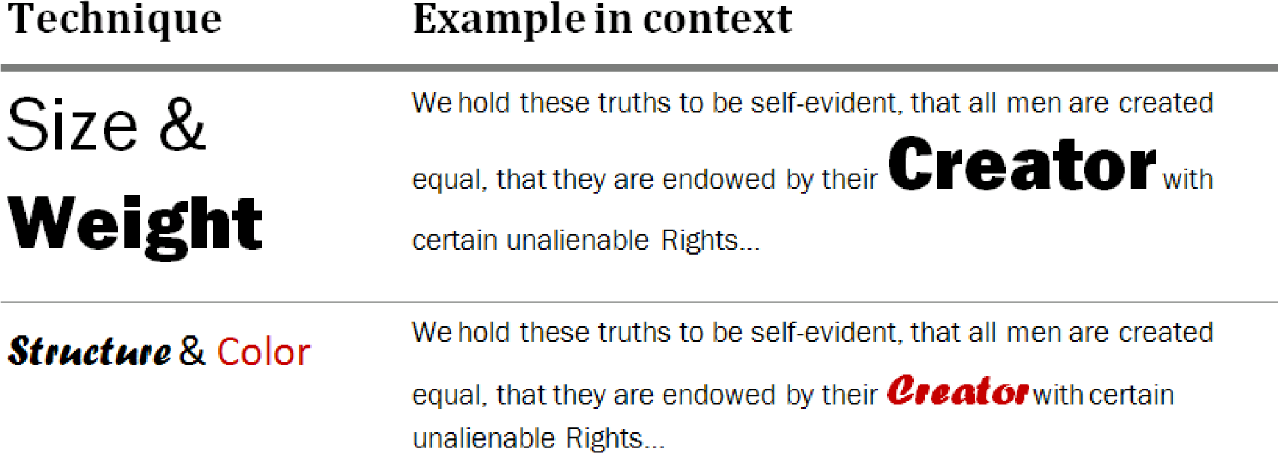
Want even more drama? Contrasting techniques may also be used in combination for dramatic effect. See examples on opposite page.
Examples of Combining Fonts

Examples of Combining Contrasting Techniques


