The process of data classification combines raw data into predefined classes, or bins. These classes may be represented in a map by some unique symbols or, in the case of choropleth maps, by a unique color or hue (for more on color and hue, see Chapter 8 "Geospatial Analysis II: Raster Data", Section 8.1 "Basic Geoprocessing with Rasters"). Choropleth mapsA mapping technique that uses graded differences in shading, color, or symbolology to define average values of some property or quantity. are thematic maps shaded with graduated colors to represent some statistical variable of interest. Although seemingly straightforward, there are several different classification methodologies available to a cartographer. These methodologies break the attribute values down along various interval patterns. Monmonier (1991)Monmonier, M. 1991. How to Lie with Maps. Chicago: University of Chicago Press. noted that different classification methodologies can have a major impact on the interpretability of a given map as the visual pattern presented is easily distorted by manipulating the specific interval breaks of the classification. In addition to the methodology employed, the number of classes chosen to represent the feature of interest will also significantly affect the ability of the viewer to interpret the mapped information. Including too many classes can make a map look overly complex and confusing. Too few classes can oversimplify the map and hide important data trends. Most effective classification attempts utilize approximately four to six distinct classes.
While problems potentially exist with any classification technique, a well-constructed choropleth increases the interpretability of any given map. The following discussion outlines the classification methods commonly available in geographic information system (GIS) software packages. In these examples, we will use the US Census Bureau’s population statistic for US counties in 1997. These data are freely available at the US Census website (http://www.census.gov).
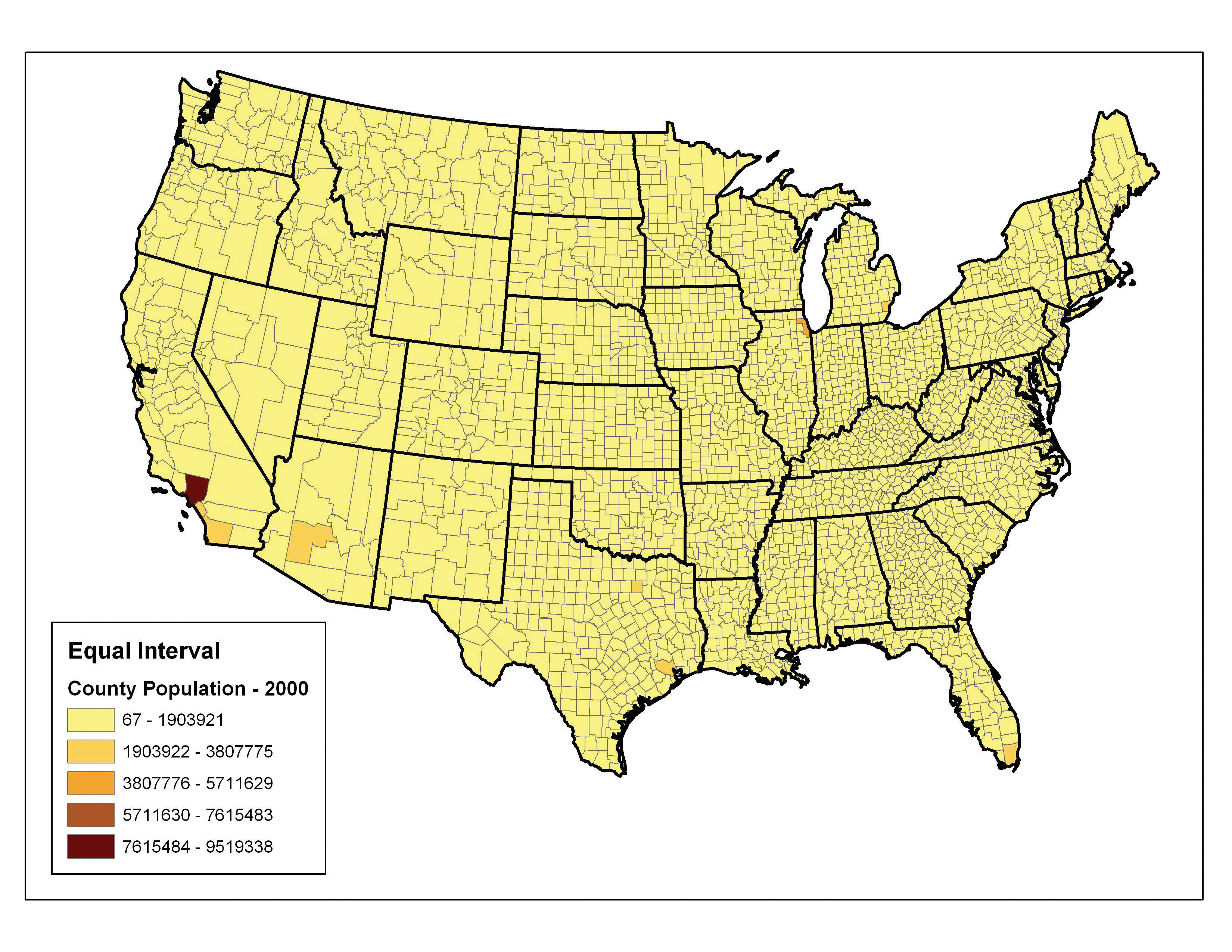
The equal intervalA choropleth mapping technique that sets the value ranges in each category to an equal size. (or equal step) classification method divides the range of attribute values into equally sized classes. The number of classes is determined by the user. The equal interval classification method is best used for continuous datasets such as precipitation or temperature. In the case of the 1997 Census Bureau data, county population values across the United States range from 40 (Yellowstone National Park County, MO) to 9,184,770 (Los Angeles County, CA) for a total range of 9,184,770 − 40 = 9,184,730. If we decide to classify this data into 5 equal interval classes, the range of each class would cover a population spread of 9,184,730 / 5 = 1,836,946 (Figure 6.19 "Equal Interval Classification for 1997 US County Population Data"). The advantage of the equal interval classification method is that it creates a legend that is easy to interpret and present to a nontechnical audience. The primary disadvantage is that certain datasets will end up with most of the data values falling into only one or two classes, while few to no values will occupy the other classes. As you can see in Figure 6.19 "Equal Interval Classification for 1997 US County Population Data", almost all the counties are assigned to the first (yellow) bin.
Figure 6.19 Equal Interval Classification for 1997 US County Population Data
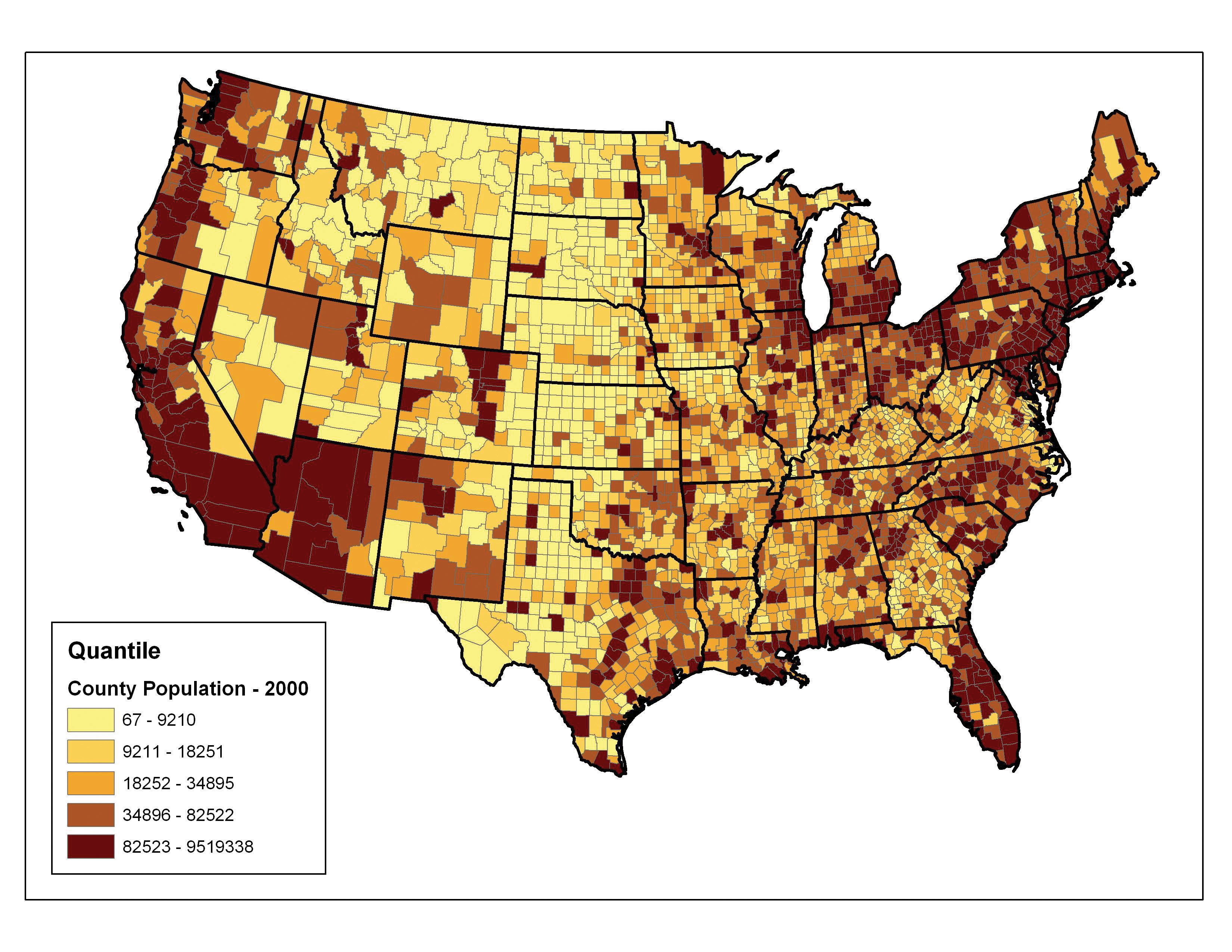
The quantileA choropleth mapping technique that classifies data into a predefined number of categories with an equal number of units in each category. classification method places equal numbers of observations into each class. This method is best for data that is evenly distributed across its range. Figure 6.20 "Quantiles" shows the quantile classification method with five total classes. As there are 3,140 counties in the United States, each class in the quantile classification methodology will contain 3,140 / 5 = 628 different counties. The advantage to this method is that it often excels at emphasizing the relative position of the data values (i.e., which counties contain the top 20 percent of the US population). The primary disadvantage of the quantile classification methodology is that features placed within the same class can have wildly differing values, particularly if the data are not evenly distributed across its range. In addition, the opposite can also happen whereby values with small range differences can be placed into different classes, suggesting a wider difference in the dataset than actually exists.
Figure 6.20 Quantiles
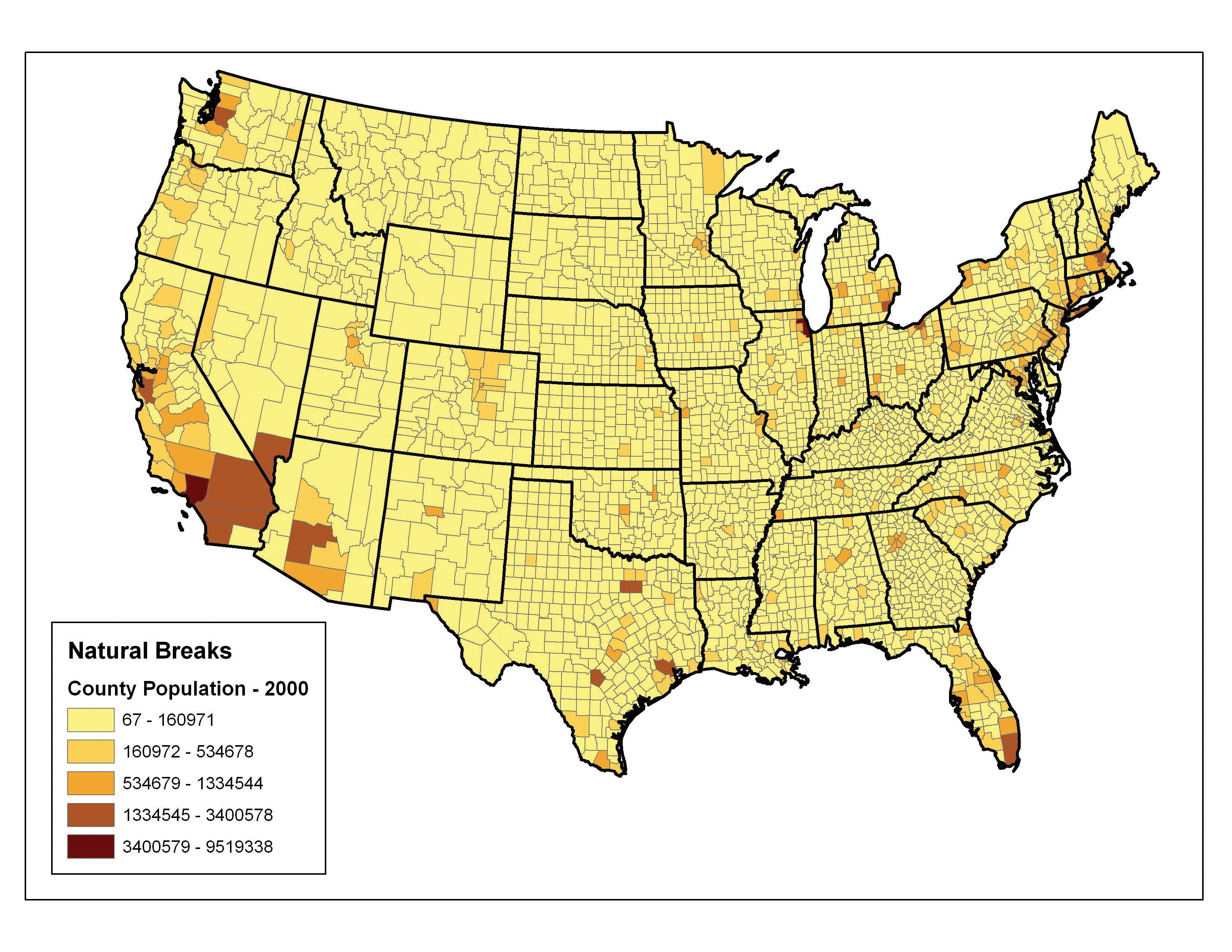
The natural breaks (or Jenks)A choropleth mapping technique that places class breaks in gaps between clusters of values. classification method utilizes an algorithm to group values in classes that are separated by distinct break points. This method is best used with data that is unevenly distributed but not skewed toward either end of the distribution. Figure 6.21 "Natural Breaks" shows the natural breaks classification for the 1997 US county population density data. One potential disadvantage is that this method can create classes that contain widely varying number ranges. Accordingly, class 1 is characterized by a range of just over 150,000, while class 5 is characterized by a range of over 6,000,000. In cases like this, it is often useful to either “tweak” the classes following the classification effort or to change the labels to some ordinal scale such as “small, medium, or large.” The latter example, in particular, can result in a map that is more comprehensible to the viewer. A second disadvantage is the fact that it can be difficult to compare two or more maps created with the natural breaks classification method because the class ranges are so very specific to each dataset. In these cases, datasets that may not be overly disparate may appear so in the output graphic.
Figure 6.21 Natural Breaks
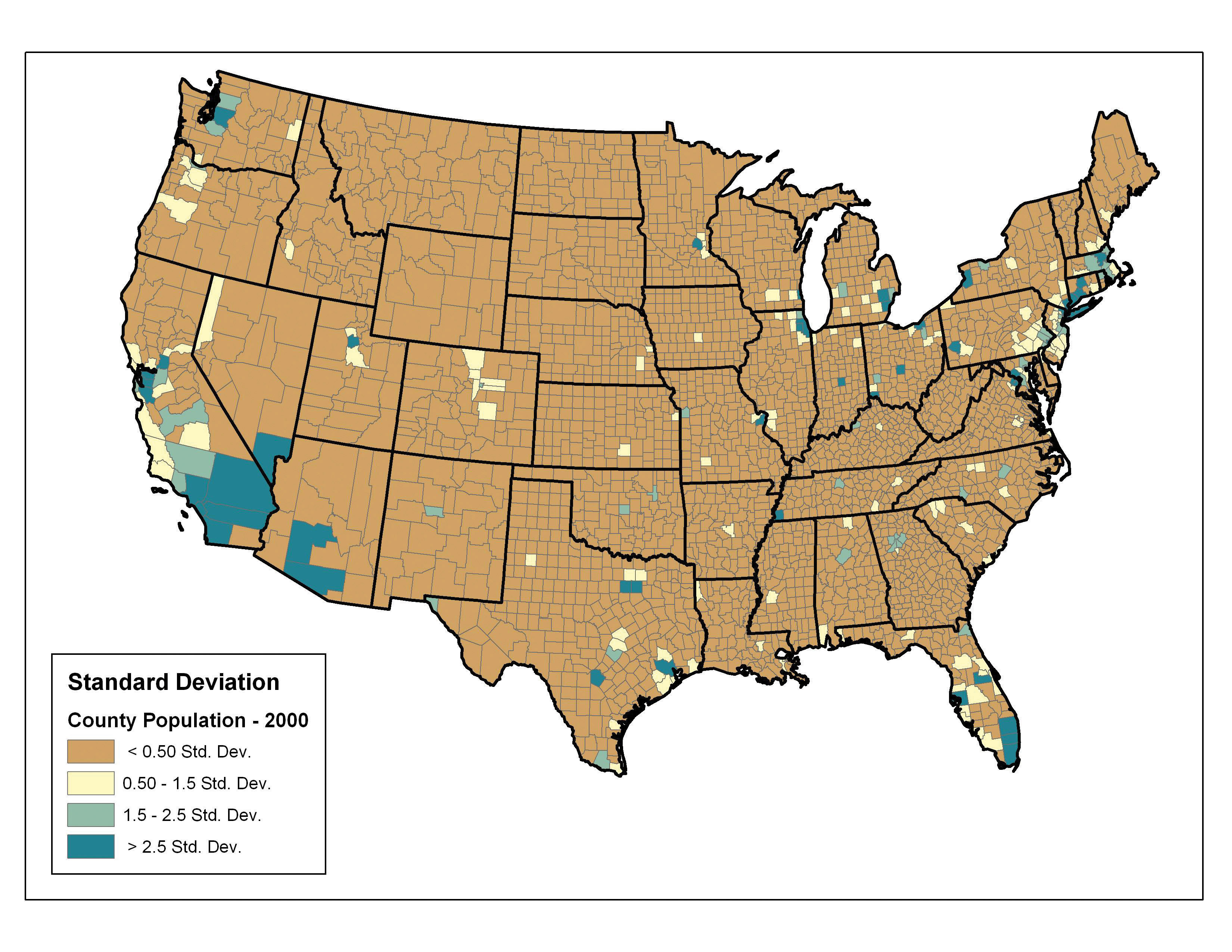
Finally, the standard deviation classification method forms each class by adding and subtracting the standard deviation from the mean of the dataset. The method is best suited to be used with data that conforms to a normal distribution. In the county population example, the mean is 85,108, and the standard deviation is 277,080. Therefore, as can be seen in the legend of Figure 6.22 "Standard Deviation", the central class contains values within a 0.5 standard deviation of the mean, while the upper and lower classes contain values that are 0.5 or more standard deviations above or below the mean, respectively.
Figure 6.22 Standard Deviation
In conclusion, there are several viable data classification methodologies that can be applied to choropleth maps. Although other methods are available (e.g., equal area, optimal), those outlined here represent the most commonly used and widely available. Each of these methods presents the data in a different fashion and highlights different aspects of the trends in the dataset. Indeed, the classification methodology, as well as the number of classes utilized, can result in very widely varying interpretations of the dataset. It is incumbent upon you, the cartographer, to select the method that best suits the needs of the study and presents the data in as meaningful and transparent a way as possible.


