4.1 Choosing a Chart Type
Learning Objectives
- Construct a line chart to show a time series trend.
- Learn how to adjust the Y axis scale.
- Construct a line chart to present a comparison of two trends.
- Learn how to use a column chart to show a frequency distribution.
- Create a separate chart sheet for a chart embedded in a worksheet.
- Construct a column chart that compares two frequency distributions.
- Learn how to use a pie chart to show the percent of total for a data set.
- Construct a stacked column chart to show how a percent of total changes over time.
This section reviews the most commonly used Excel chart types. To demonstrate the variety of chart types available in Excel, it is necessary to use a variety of data sets. Therefore, instead of addressing a specific theme, we will use a variety of themes. This is necessary not only to demonstrate the construction of charts but also to explain how to choose the right type of chart given your data and the idea you intend to communicate.
Before we begin, let’s review a few key points you need to consider before creating any chart in Excel. The first is identifying your idea or message. It is important to keep in mind that the primary purpose of a chart is to present quantitative information to an audience. Therefore, you must first decide what message or idea you wish to present. This is critical in helping you select specific data from a worksheet that will be used in a chart. Throughout this chapter, we will reinforce the intended message first before creating each chart.
The second key point is selecting the right chart type. The chart type you select will depend on the data you have and the message you intend to communicate.
The third key point is identifying the values that should appear on the X and Y axes. One of the ways to identify which values belong on the X and Y axes is to sketch the chart on paper first. If you can visualize what your chart is supposed to look like, you will have an easier time using Excel to construct an effective chart that accurately communicates your message. Table 4.1 "Key Steps before Constructing an Excel Chart" provides a brief summary of these points.
Integrity Check
Carefully Select Data When Creating a Chart
Just because you have data in a worksheet does not mean it must all be placed onto a chart. When creating a chart, it is common for only specific data points to be used. To determine what data should be used when creating a chart, you must first identify the message or idea that you want to communicate to an audience.
Table 4.1 Key Steps before Constructing an Excel Chart
| Step |
Description |
| 1. Define your message. |
Identify the main idea you are trying to communicate to an audience. If there is no main point or important message that can be revealed by a chart, you might want to question the necessity of creating a chart. |
| 2. Identify the data you need. |
Once you have a clear message, identify the data on a worksheet that you will need to construct a chart. In some cases, you may need to create formulas or consolidate items into broader categories. |
| 3. Select a chart type. |
The type of chart you select will depend on the message you are communicating and the data you are using. |
| 4. Identify the values for the X and Y axes. |
After you have selected a chart type, you may find that drawing a sketch is helpful in identifying which values should be on the X and Y axes. (The X axis is horizontal, and the Y axis is vertical.) |
Time Series Trend: Line Chart 1
Lesson Video: Line Chart 1 (Time Series Trend)
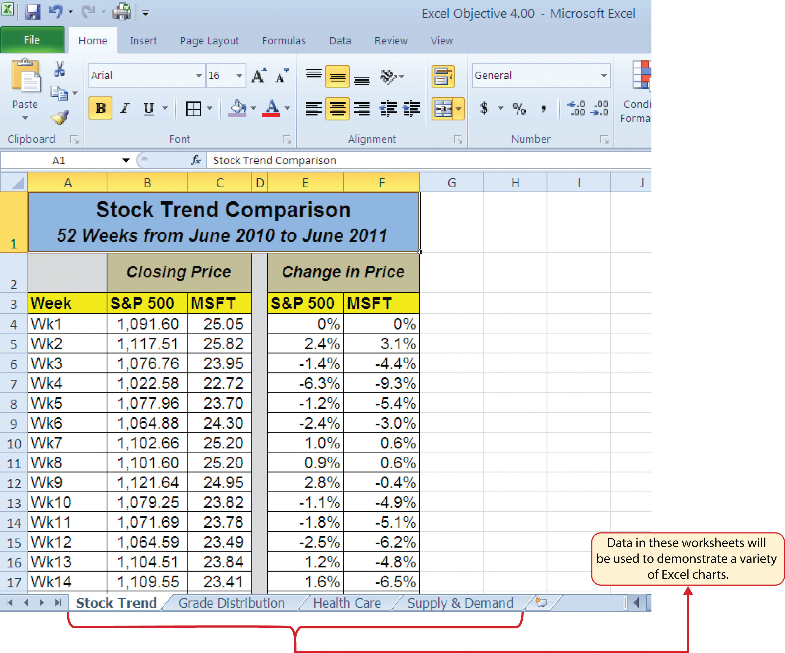
The first chart we will demonstrate is a line chart. Figure 4.1 "52 Week Data for the S&P 500 and Microsoft" shows part of the data that will be used to create two line charts. The first line chart will show the trend of the S&P 500An aggregate price index for five hundred of the largest publicly traded US companies. stock index. This is an aggregate price index of five hundred of the largest publicly traded companies. This chart will be used to communicate a simple message: to show how the index has performed over a fifty-two-week period. We can use this chart in a presentation to show whether stock prices have been increasing, decreasing, or remaining constant over the designated period of time.
Before we create the line chart, it is important to identify why it is an appropriate chart type given the message we wish to communicate and the data we have. When presenting the trend for any data over a designated period of time, the most commonly used chart types are the line chart and the column chart. With the column chart, you are limited to a certain number of bars or data points. As you increase the number of bars on a column chart, it becomes increasingly difficult to read. As you scroll through the data on the worksheet shown in Figure 4.1 "52 Week Data for the S&P 500 and Microsoft", you will see that there are fifty-two points of data used to construct the chart. This is generally too many data points to put on a column chart, which is why we are using a line chart. Our line chart will show the closing price for the S&P 500 on the Y axisThe vertical axis of a chart. and the week number on the X axisThe horizontal axis of a chart.. The following steps explain how to construct this chart:
- Highlight the range A3:B55 on the Stock Trend worksheet.
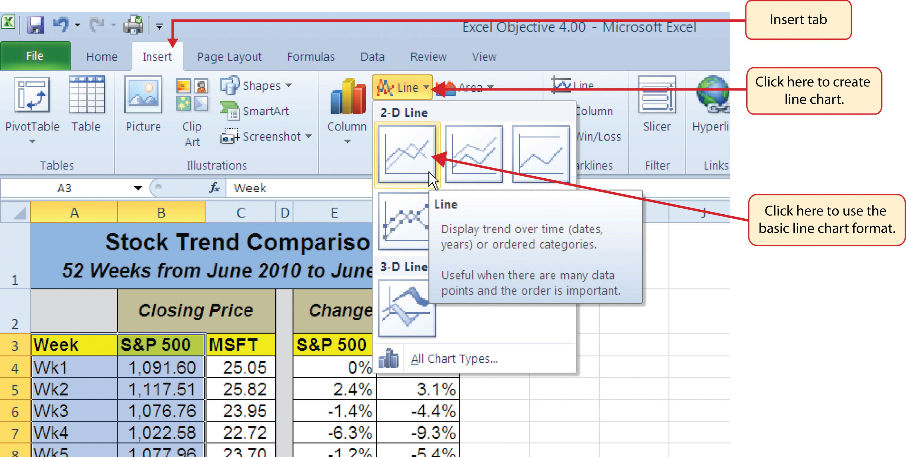
- Click the Insert tab of the Ribbon.
- Click the Line button in the Charts group of commands (see Figure 4.2 "Selecting the Basic Line Chart").
- Click the first option from the list, which is a basic line chart (see Figure 4.2 "Selecting the Basic Line Chart"). This adds, or embeds, the line chart to the worksheet, as shown in Figure 4.3 "Embedded Line Chart in the Stock Trend Worksheet".
Why?
Line Chart vs. Column Chart
We can use both a line chart and a column chart to illustrate a trend over time. However, a line chart is far more effective when there are many periods of time being measured. For example, if we are measuring fifty-two weeks, a column chart would require fifty-two bars. A general rule of thumb is to use a column chart when twenty bars or less are required. A column chart becomes difficult to read as the number of bars exceeds twenty.
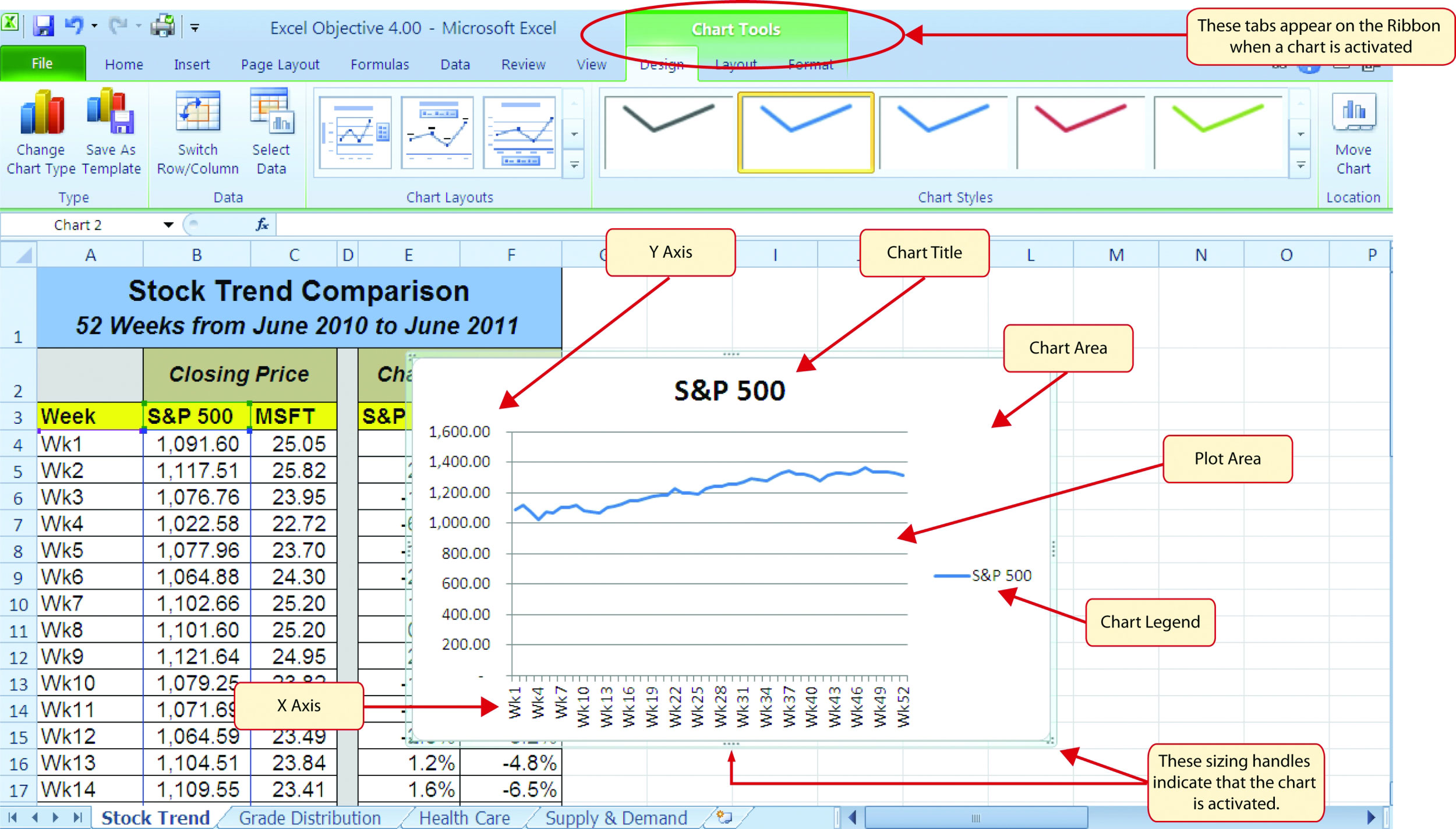
Figure 4.3 "Embedded Line Chart in the Stock Trend Worksheet" shows the embedded line chart in the Stock Trend worksheet. Notice that three additional tabs, or contextual tabsHidden tabs on the Ribbon that contain commands related to a specific object. Contextual tabs become visible when the related object is added or activated., are added to the Ribbon. We will demonstrate the commands in these tabs throughout this chapter. These tabs appear only when the chart is activated.
As shown in Figure 4.3 "Embedded Line Chart in the Stock Trend Worksheet", the embedded chartAny chart that is created and placed within a worksheet. is not placed in an ideal location on the worksheet since it is covering several cell locations that contain data. The following steps demonstrate common adjustments that are made when working with embedded charts:
-
Moving a chart: Click and drag the upper left corner of the chart to the center of cell H2.
-
Resizing a chart: Place the mouse pointer over the left middle sizing handle, hold down the ALT key on your keyboard, and click and drag the chart so it “snaps” to the left side of Column H.
- Repeat step 2 to resize the chart so the top “snaps” to the top of Row 2, the bottom “snaps” to the bottom of Row 17, and the right side “snaps” to the right side of Column P.
-
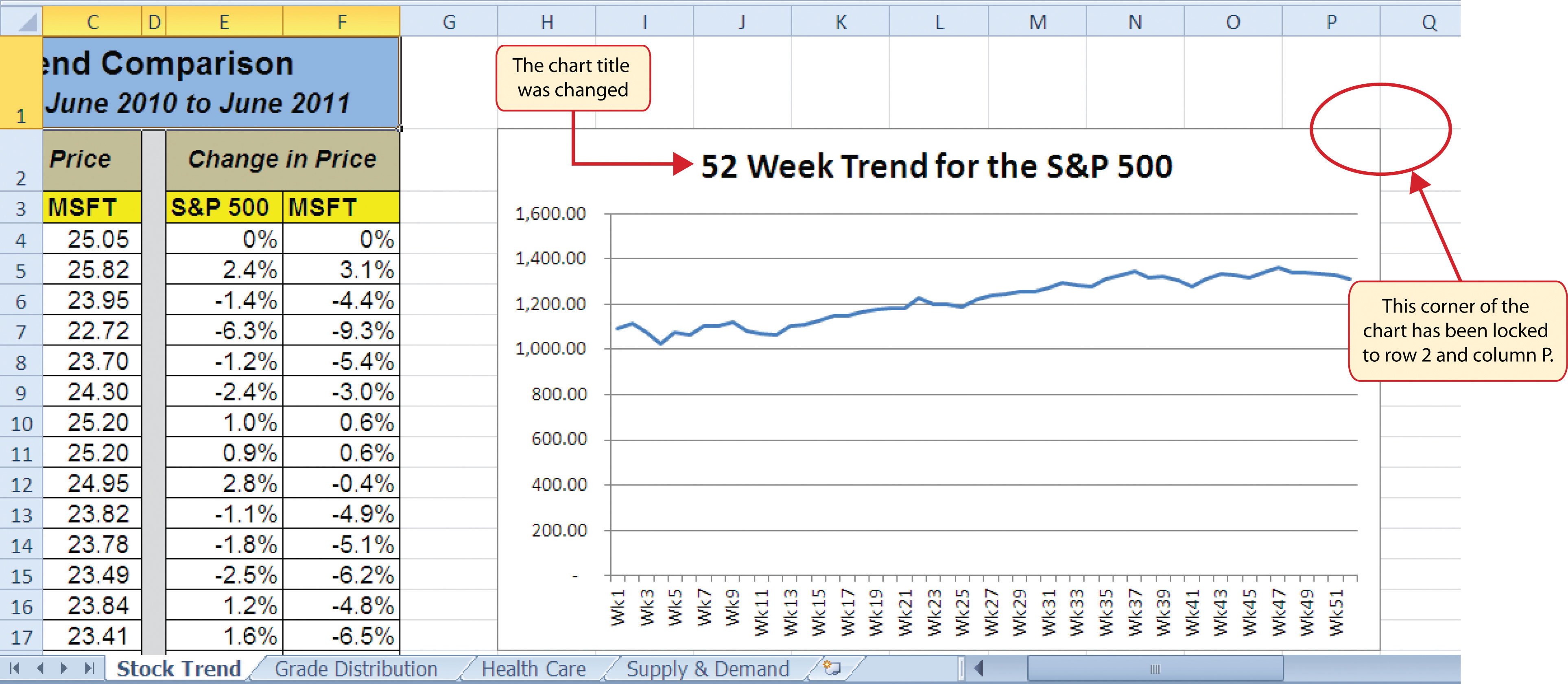
Adjusting the chart title: Click the chart title once. Then click in front of the letter S. You should see a blinking cursor in front of the letter S. This allows you to modify the title of the chart.
- Type the following in front of the letter S in the chart title: 52 Week Trend for the.
-
Removing the legend: Click the legend once and press the DELETE key on your keyboard. This removes the legend from the chart. Since the chart contains only one data series, the legend is not necessary. Once you remove the legend, the plot area automatically expands.
Figure 4.4 "Line Chart Moved and Resized" shows the line chart after it is moved and resized. You can also see that the title of the chart has been edited to read 52 Week Trend for the S&P 500. Also notice that the sizing handles do not appear around the perimeter of the chart. This is because the chart has been deactivated. To activate the chart, click anywhere inside the chart perimeter.
Integrity Check
The X Axes on Line Charts Use Labels, Not Values
When using line charts in Excel, keep in mind that anything placed on the X axis is considered a descriptive label, not a numeric value. This is important because there will never be a change in the spacing of any items placed on the X axis of a line chart. If you need to create a line chart using numeric data on the X axis, you must use a scatter chart type.
Skill Refresher: Inserting a Line Chart
- Highlight a range of cells that contain data that will be used to create the chart.
- Click the Insert tab of the Ribbon.
- Click the Line button in the Charts group.
- Select a format option from the Line Chart drop-down menu.
Adjusting the Y Axis Scale
Follow-along file: Continue with Excel Objective 4.00. (Use file Excel Objective 4.01 if starting here.)
Lesson Video: Adjusting the Y Axis Scale
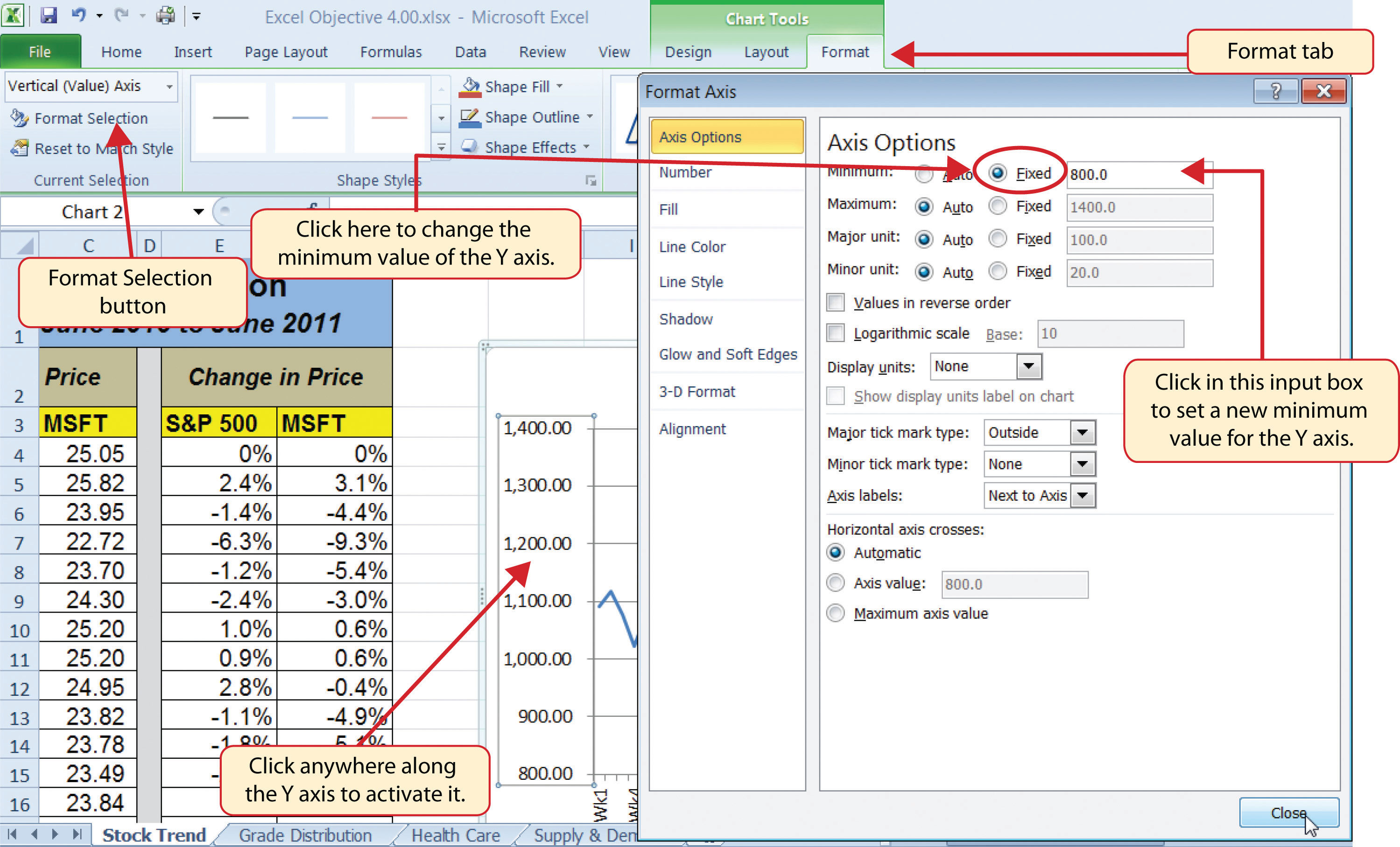
After creating an Excel chart, you may find it necessary to adjust the scale of the Y axis. Excel automatically sets the maximum value for the Y axis based on the data used to create the chart. However, the minimum value is usually set to zero. Depending on the data you are using to create the chart, setting the minimum value to zero can substantially minimize the graphical presentation of a trend. For example, the trend shown in Figure 4.4 "Line Chart Moved and Resized" appears to be increasing slightly. However, the S&P 500 increased by over 20% during this period, which is substantial. The presentation of this trend can be improved if the minimum value started at eight hundred. While it is certainly possible for the S&P 500 to fall below eight hundred, it is most likely remote. The following steps explain how to make this adjustment to the Y axis:
- Click anywhere on the Y axis on the 52 Week Trend for the S&P 500 line chart (Stock Trend worksheet).
- Click the Format tab in the Chart Tools section of the Ribbon.
-
Click the Format Selection button in the Current Selection group of commands (see Figure 4.5 "Format Axis Dialog Box"). This opens the Format Axis dialog box.
- Click the Fixed option next to the “Minimum” axis option in the Format Axis dialog box.
- Click the input box for the “Minimum” axis option and delete the zero. Then type the number 800. As soon as you make this change, the Y axis on the chart adjusts.
- Click the Close button at the bottom of the Format Axis dialog box.
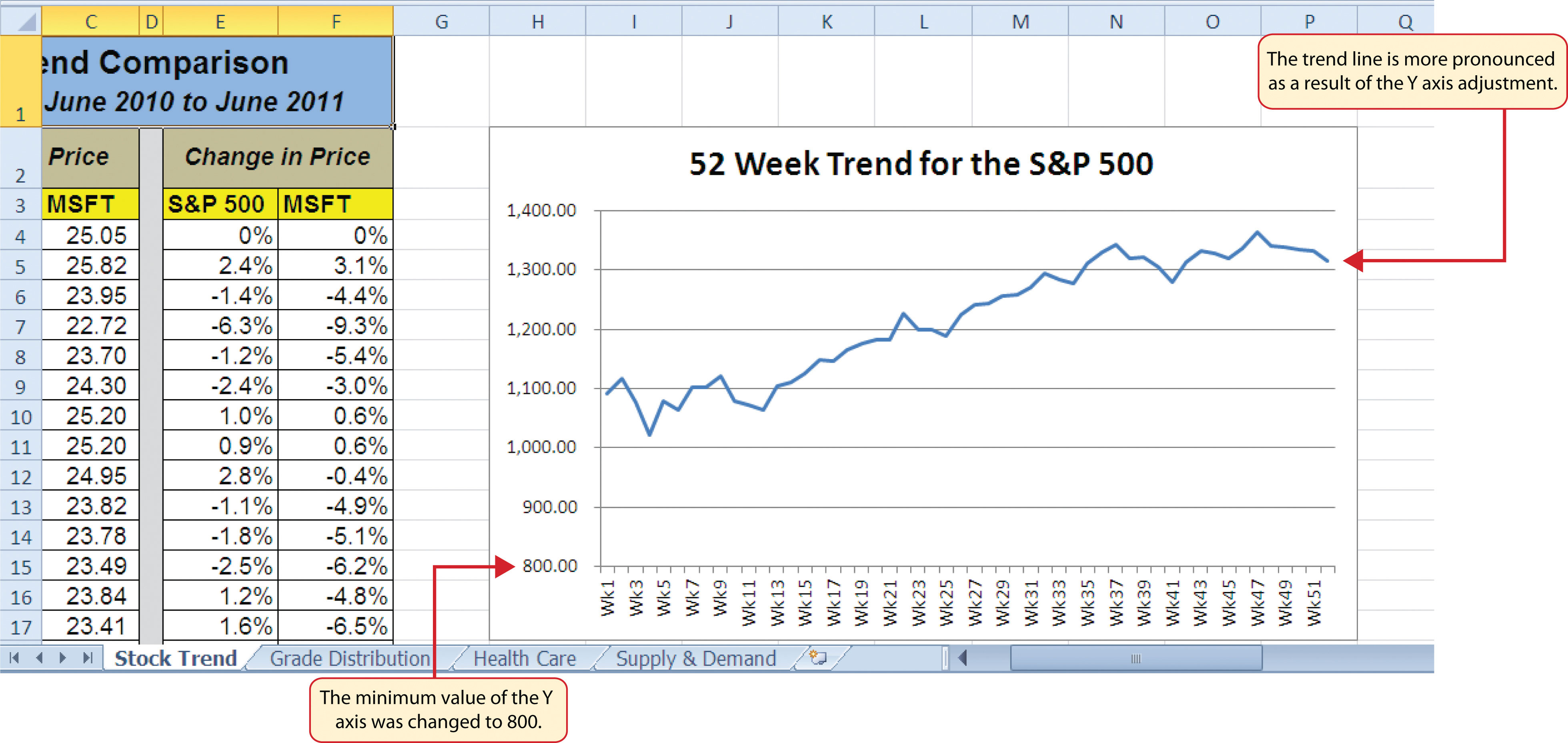
Figure 4.6 "Adjusted Y Axis for the S&P 500 Chart" shows the change in the presentation of the trendline. Notice that with the Y axis starting at 800, the trend for the S&P 500 is more pronounced and reflects the substantial increase over the 52-week period. This adjustment makes it easier for the audience to see the magnitude of the trend.
Skill Refresher: Adjusting the Y Axis Scale
- Click anywhere along the Y axis to activate it.
- Click the Format tab in the Chart Tools section of the Ribbon.
- Click the Format Selection button in the Current Selection group of commands.
- In the Format Axis dialog box, click the Fixed option next to any axis option where you wish to change the value.
- Click in the input box next to the desired axis option and then type the new scale value.
- Click the Close button at the bottom of the Format Axis dialog box.
Trend Comparisons: Line Chart 2
Follow-along file: Continue with Excel Objective 4.00. (Use file Excel Objective 4.02 if starting here.)
Lesson Video: Line Chart 2 (Trend Comparisons)
We will now create a second line chart using the data in the Stock Trend worksheet. The purpose of this chart is to compare two trends: the change in value for the S&P 500 and the Microsoft common stock. Chapter 3 "Logical and Lookup Functions" presented a personal investment portfolio where the investments were compared to a benchmark. The S&P 500 is a benchmark that is commonly used to judge the performance of individual stocks. The purpose and message of this chart is to show whether Microsoft is performing better or worse than the S&P 500 index. This type of analysis can be used to determine whether a stock should be sold, purchased, or held.
Before creating the chart to compare the S&P 500 and Microsoft, it is important to review the data in the range E4:F55 on the Stock Trend worksheet. We cannot use the price data for Microsoft and the S&P 500 because the values are not comparable. That is, the data for Microsoft is in a range of $22.00 to $28.00, but the data for the S&P 500 is in a range of 1,022 to 1,363. If we used these values to create a chart, we would not be able to see any substantial change in the trend for either the S&P 500 or Microsoft. Therefore, formulas were used to calculate the percent change in value for the S&P 500 and Microsoft for each week. For example, looking at cells E5 and F5 on the Stock Trend worksheet, you see that the S&P 500 increased 2.4% in week 2, whereas Microsoft increased 3.1%. The percent change calculations now provide an appropriate method of comparison. This is a very important step to consider when comparing trends.
The construction of this second line chart will be similar to the first line chart. The X axis will be the 52 weeks in the range A4:A55. However, the Y axis will be the percentages in the range E4:F55. This creates a problem because Columns B, C, and D will not be used in this chart. Therefore, we cannot simply highlight one contiguous range of cells to create the chart. In this chapter we will demonstrate two options for charting data that is not in a contiguous range. The following steps demonstrate the first option:
- Highlight the range A3:A55 on the Stock Trend worksheet.
- Hold down the CTRL key on your keyboard and highlight the range E3:F55.
- Click the Insert tab of the Ribbon.
- Click the Line button in the Charts group of commands.
-
Click the first option from the list, which is a basic line chart.
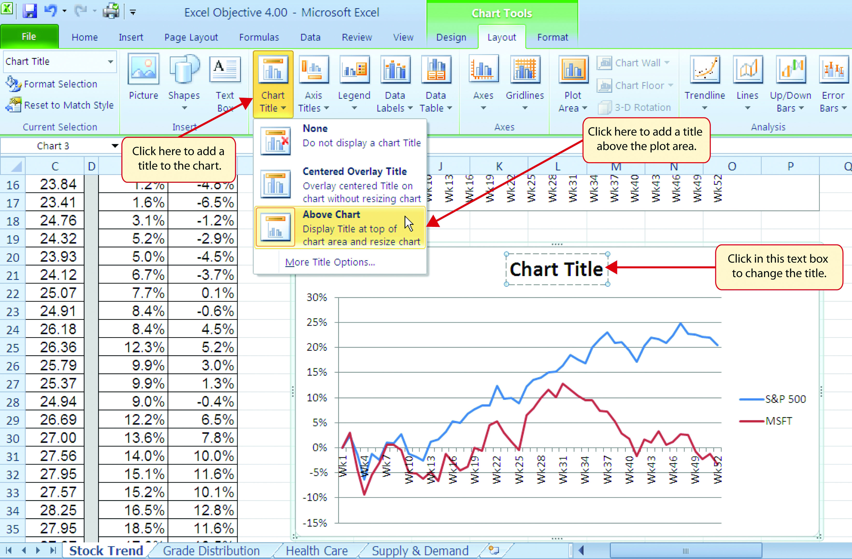
Figure 4.7 "Trend Comparison Line Chart" shows the appearance of the line chart comparing the S&P 500 and Microsoft before it is moved and resized. Notice that Excel does not add a title to the chart.
- Move the chart so the upper left corner is in the middle of cell H20.
- Resize the chart so the left side is locked to the left side of Column H, the right side is locked to the right side of Column P, the top is locked to the top of Row 20, and the bottom is locked to the bottom of Row 35.
- Click the Layout tab in the Chart Tools section of the Ribbon.
- Click the Chart Title button in the Labels group of commands. Select the Above Chart option from the drop-down list (see Figure 4.8 "Adding a Title to a Chart"). This adds a generic title above the plot area of the chart.
- Click in the text box containing the chart title. Delete the generic chart title and replace it with the following: 52 Week Trend Comparison.
Figure 4.9 "Final Trend Comparison Line Chart" shows that Microsoft has not performed as well as the S&P 500 benchmark. From week 31 to week 52, Microsoft is showing a significant decline compared to the S&P 500, which continues to grow. What makes this chart effective is that an audience can quickly see how Microsoft compares with the S&P 500 over the 52-week period.
Integrity Check
Comparing Trends with Incompatible Values
When creating a chart to compare the trends of two or more data series, the values for each data series must be compatible. In other words, the values for each data series must be within a reasonable range in order for an effective comparison to be made. If the variance between the values in your data series is never less than a multiple of 2 (i.e., 500 × 2 = 1000 or 1000 ÷ 2 = 500), calculate the percent change for each point in time on your worksheet. The percent change must be calculated with respect to the first data point for each series. Then create your chart using the percentages instead of the actual values for each data series.
Frequency Distribution: Column Chart 1
Follow-along file: Continue with Excel Objective 4.00. (Use file Excel Objective 4.03 if starting here.)
Lesson Video: Column Chart 1 (Frequency Distribution)
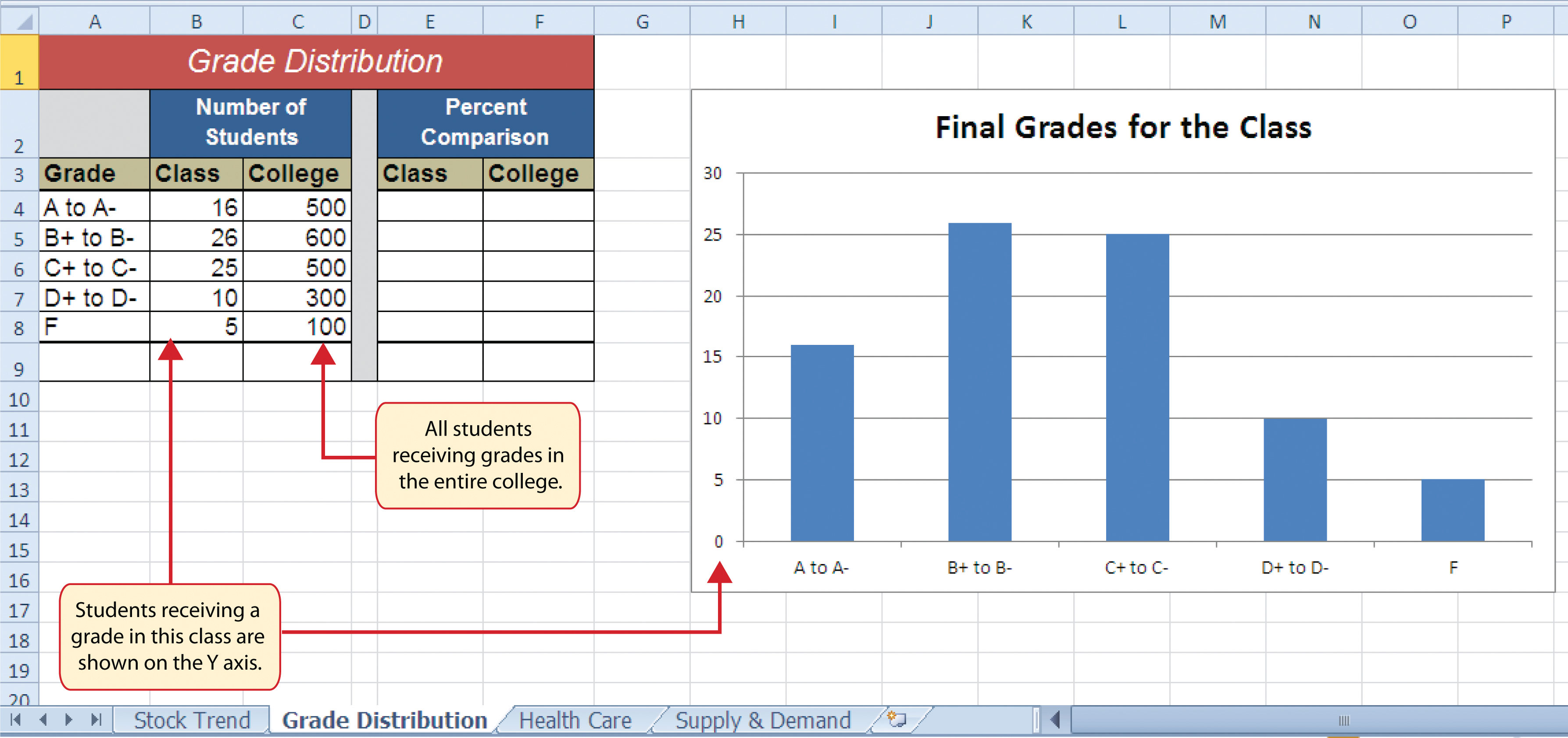
A column chart is commonly used to show trends over time so long as the data are limited to approximately twenty points or less. For example, in Chapter 1 "Fundamental Skills" we showed a sales trend over a twelve-month period. Another common use for column charts is frequency distributions. A frequency distributionThe number of occurrences for an established set of categories. shows the number of occurrences by established categories. For example, a common frequency distribution used in most academic institutions is a grade distribution. A grade distribution shows the number of students that achieve each level of a typical grading scale (A, A−, B+, B, etc.). The Grade Distribution worksheet contains final grades for a hypothetical academic class. To show the grade frequency distribution, the numbers of students appear on the Y axis and the grade categories appear on the X axis. The following steps explain how to create this chart:
- Highlight the range A3:B8 on the Grade Distribution worksheet. Column B shows the number of students that achieved a grade within the grade category shown in Column A.
- Click the Column button in the Charts group section on the Insert tab of the Ribbon. Select the first format from the drop-down list of options, which is the Clustered Column format.
- Click and drag the chart so the upper left corner is in the middle of cell H2.
- Resize the chart so the left side is locked to the left side of Column H, the right side is locked to the right side of Column P, the top is locked to the top of Row 2, and the bottom is locked to the bottom of Row 16.
- Click the legend one time and press the DELETE key on your keyboard. Since the chart presents only one data series, the legend is not necessary.
- Click the title of the chart twice so the cursor is placed in front of the word Class.
- Type the following in front of the word Class: Final Grades for the.
- Click any cell location on the Grade Distribution worksheet to deactivate the chart.
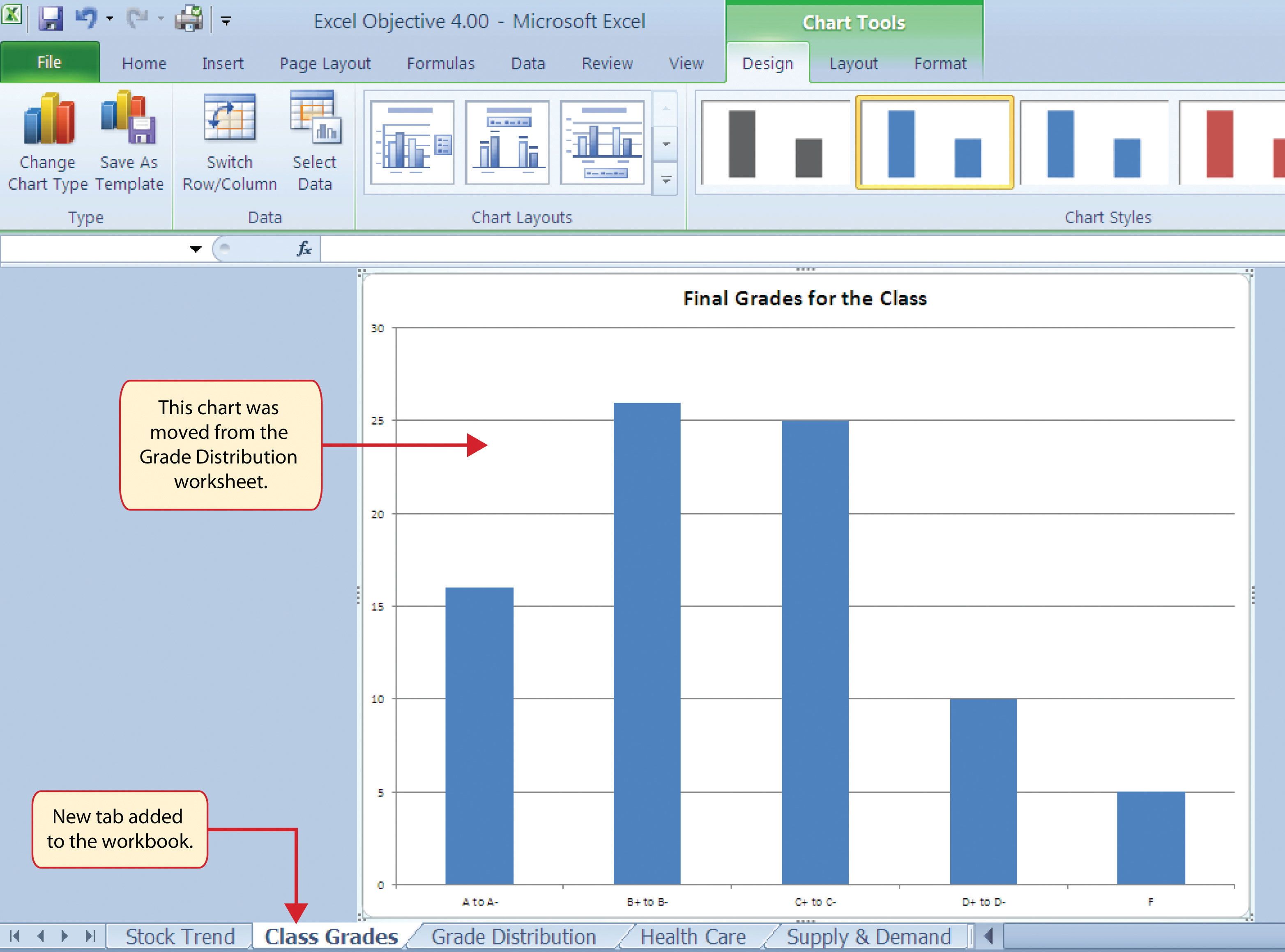
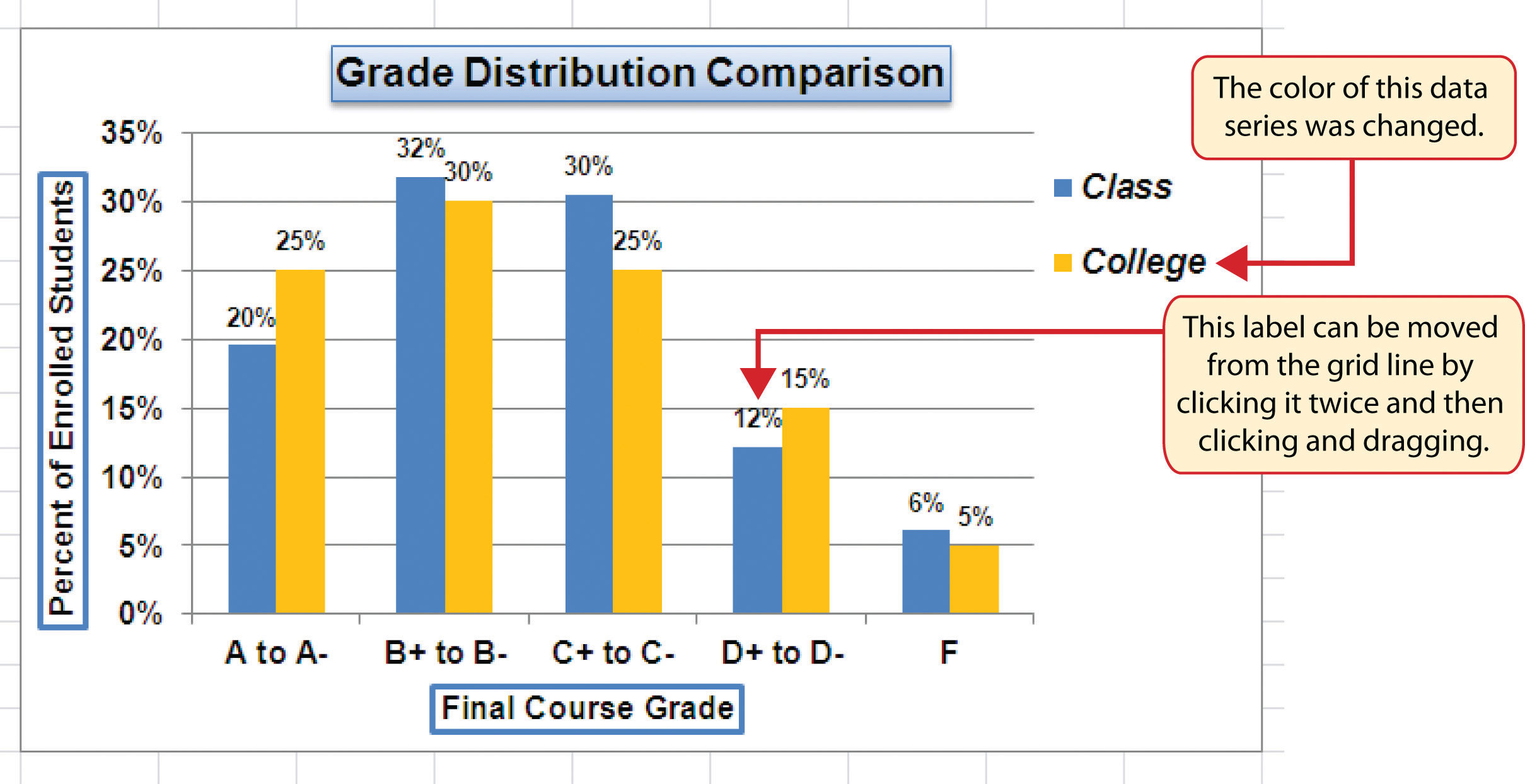
Figure 4.10 "Grade Frequency Distribution Chart" shows the completed grade frequency distribution chart. By looking at the chart, you can immediately see that the greatest number of students earned a final grade in the B+ to B− or the C+ to C− categories.
Why?
Column Chart vs. Bar Chart
When using charts to show frequency distributions, the difference between a column chart and a bar chart is really a matter of preference. Both are very effective in showing frequency distributions. However, if you are showing a trend over a period of time, a column chart is preferred over a bar chart. This is because a period of time is typically shown horizontally, with the oldest date on the far left and the newest date on the far right. Therefore, the descriptive categories for the chart would have to fall on the X axis, which is the configuration of a column chart. On a bar chart, the descriptive categories are displayed vertically along the Y axis.
Creating a Chart Sheet
Follow-along file: Continue with Excel Objective 4.00. (Use file Excel Objective 4.04 if starting here.)
Lesson Video: Chart Sheets
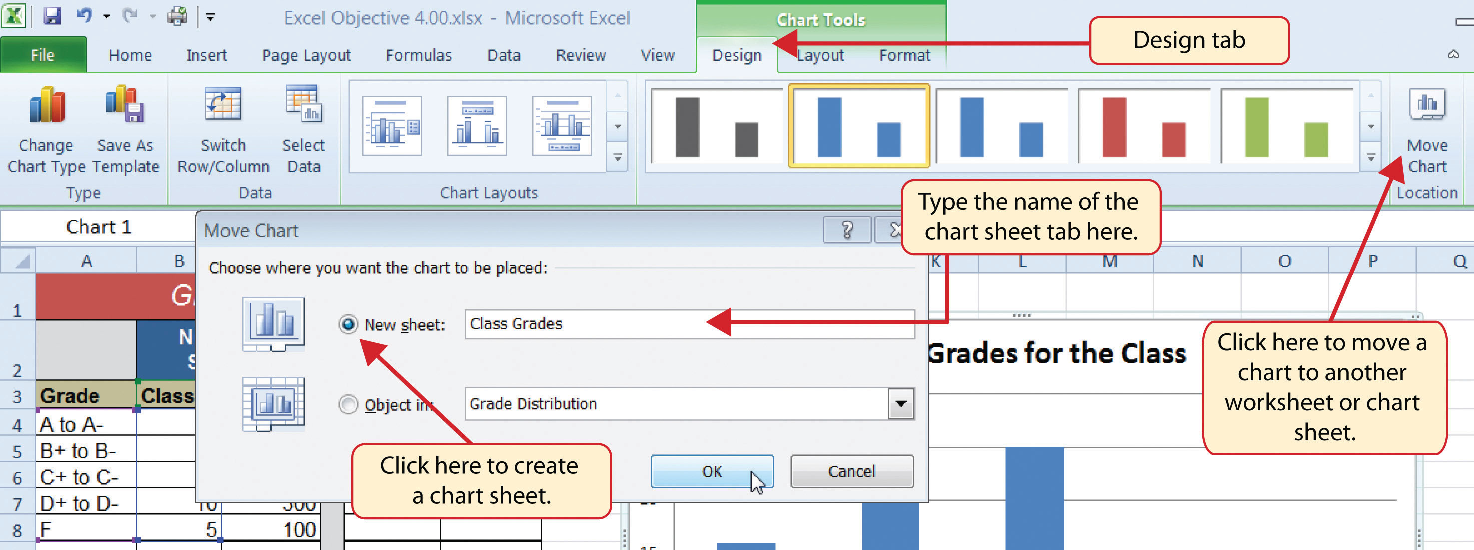
The charts we have created up to this point have been added to, or embedded in, an existing worksheet. Charts can also be placed in a dedicated worksheet called a chart sheetAn Excel worksheet that is designated for a chart.. It is called a chart sheet because it can contain only an Excel chart. Chart sheets are useful if you need to create several charts using the data in a single worksheet. If you embed several charts in one worksheet, it can be cumbersome to navigate and browse through the charts. It is easier to browse through charts when they are moved to a chart sheet because a separate sheet tab is added to the workbook for each chart. The following steps explain how to move the grade frequency distribution chart to a dedicated chart sheet:
- Click anywhere on the Final Grades for the Class chart on the Grade Distribution worksheet.
- Click the Move Chart button in the Design tab of the Chart Tools set of commands. This opens the Move Chart dialog box. You can use this dialog box to move the chart to a different worksheet or create a dedicated chart sheet.
- Click the New sheet option on the Move Chart dialog box.
- The entry in the input box for assigning a name to the chart sheet tab should automatically be highlighted once you click the New sheet option (see Figure 4.11 "Moving a Chart to a Chart Sheet"). Type Class Grades. This replaces the generic name in the input box.
- Click the OK button at the bottom of the Move Chart dialog box. This adds a new chart sheet to the workbook with the name Class Grades.
Figure 4.12 "Chart Sheet Added to the Workbook" shows the Final Grades for the Class column chart in a separate chart sheet. Notice the new sheet tab added to the workbook matches the tab name entered into the Move Chart dialog box. Since the chart is moved to a separate chart sheet, it no longer is displayed in the Grade Distribution worksheet.
Frequency Comparison: Column Chart 2
Follow-along file: Continue with Excel Objective 4.00. (Use file Excel Objective 4.05 if starting here.)
Lesson Video: Column Chart 2 (Frequency Comparison)
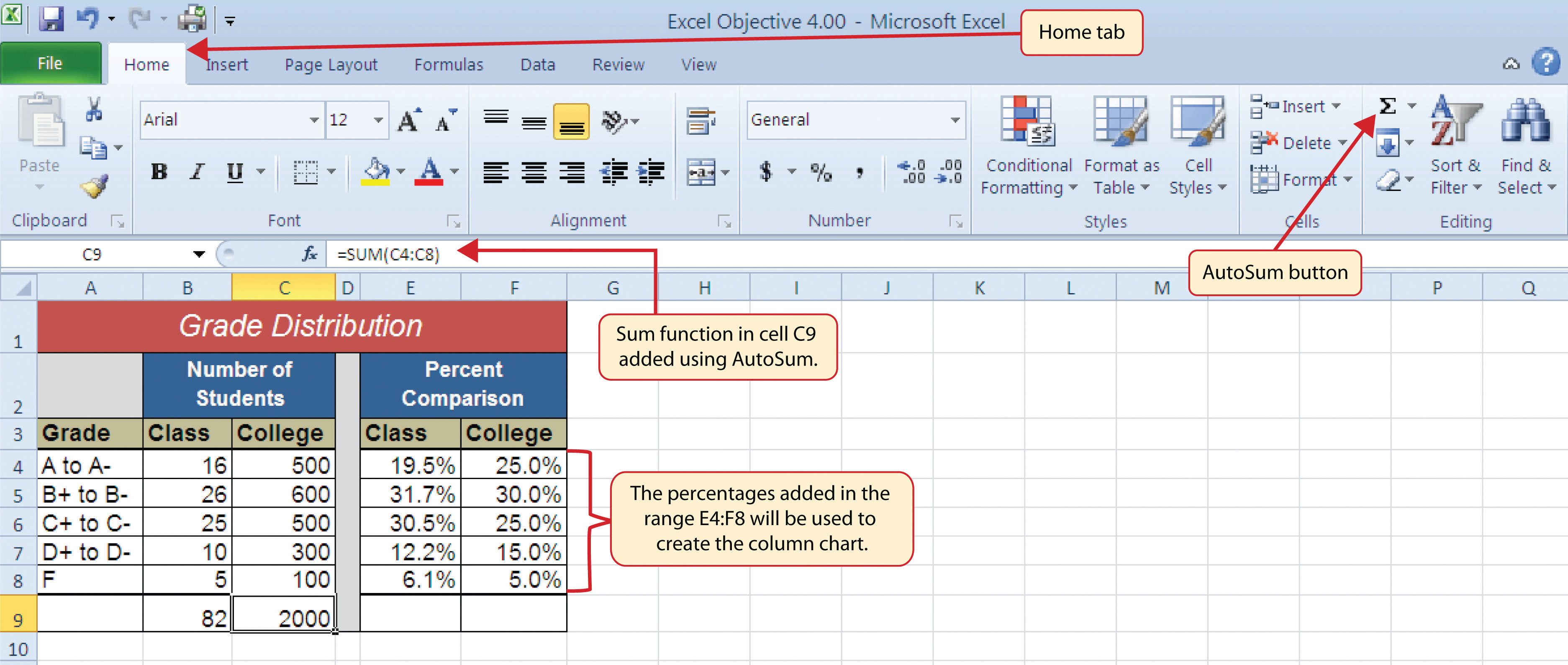
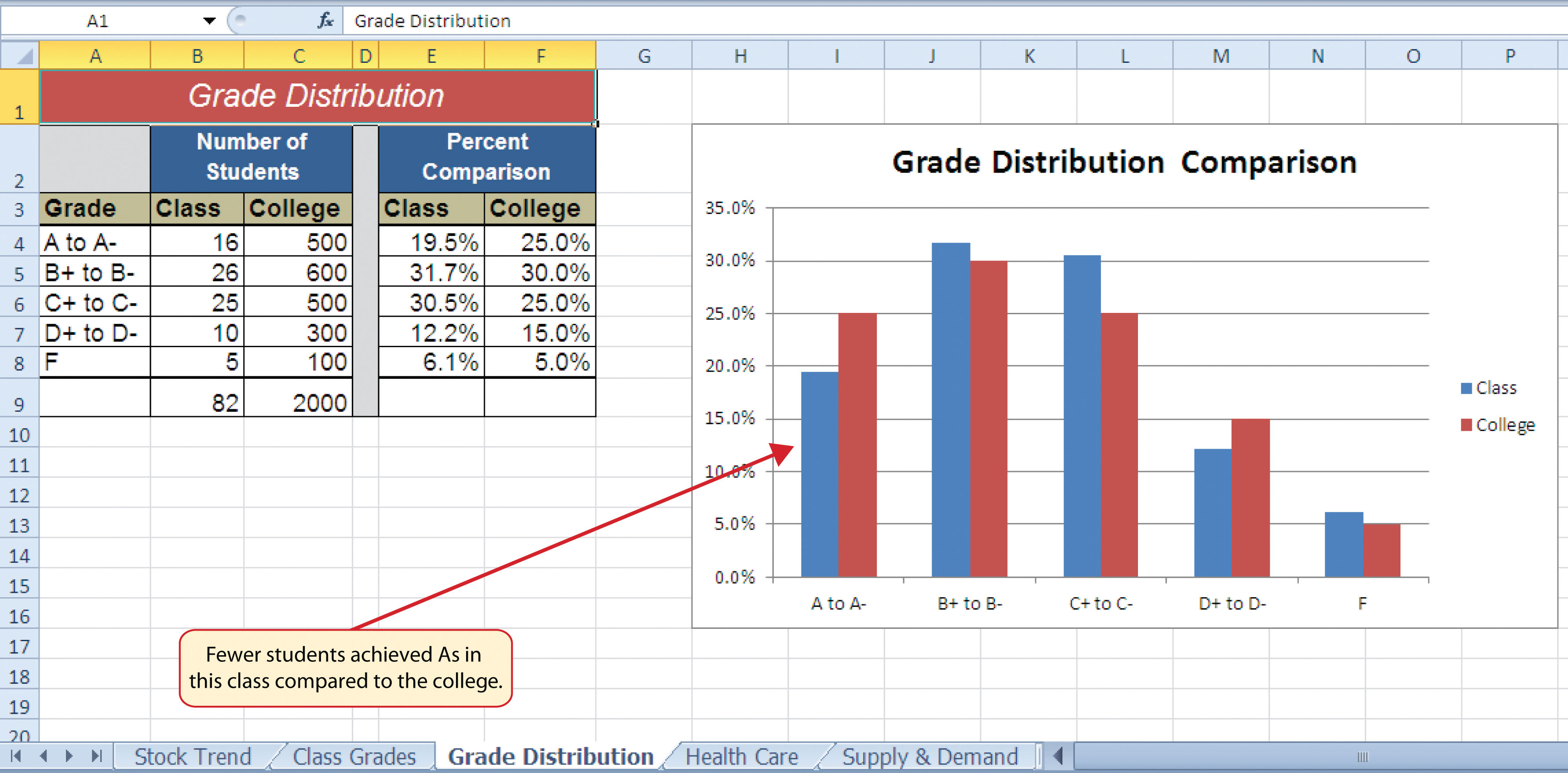
We will create a second column chart to show a comparison between two frequency distributions. Column C on the Grade Distribution worksheet contains data showing the number of students who received grades within each category for the entire college. We will use a column chart to compare the grade distribution for the class (Column B) with the overall grade distribution for the college (Column C). However, since the number of students in the class is significantly different from the total number of students in the college, we must calculate percentages in order to make an effective comparison. The following steps explain how to calculate the percentages:
- Highlight the range B9:C9 on the Grade Distribution worksheet.
- Click the AutoSum button in the Editing group of commands on the Home tab of the Ribbon. This automatically adds SUM functions that sum the values in the range B4:B8 and C4:C8.
- Activate cell E4 on the Grade Distribution worksheet.
- Enter a formula that divides the value in cell B4 by the total in cell B9. Add an absolute reference to cell B9 in the formula =B4/$B$9.
- Copy the formula in cell E4 and paste it into the range E5:E8 using the Paste Formulas command.
- Activate cell F4 on the Grade Distribution worksheet.
- Enter a formula that divides the value in cell C4 by the total in cell C9. Add an absolute reference to cell C9 in the formula =C4/$C$9.
- Copy the formula in cell F4 and paste it into the range F5:F8 using the Paste Formulas command.
Figure 4.13 "Completed Grade Distribution Percentages" shows the completed percentages added to the Grade Distribution worksheet. The column chart uses the grade categories in the range A4:A8 on the X axis and the percentages in the range E4:F8 on the Y axis. Similar to the trend comparison line chart, this chart uses data that is not in a contiguous range. The following steps explain a second method for creating charts with data that is not in a contiguous range:
- Activate cell H2 on the Grade Distribution worksheet. It is important to note that this is a blank cell that is not adjacent to any data on the worksheet.
- Click the Insert tab of the Ribbon.
- Click the Column button in the Charts group of commands. Select the first option from the drop-down list of chart formats, which is the Clustered Column. This adds a blank chart to the worksheet.
- Click and drag the blank chart so the upper left corner is in the middle of cell H2.
- Resize the blank chart so the left side is locked to the left side of Column H, the right side is locked to the right side of Column P, the top is locked to the top of Row 2, and the bottom is locked to the bottom of Row 16.
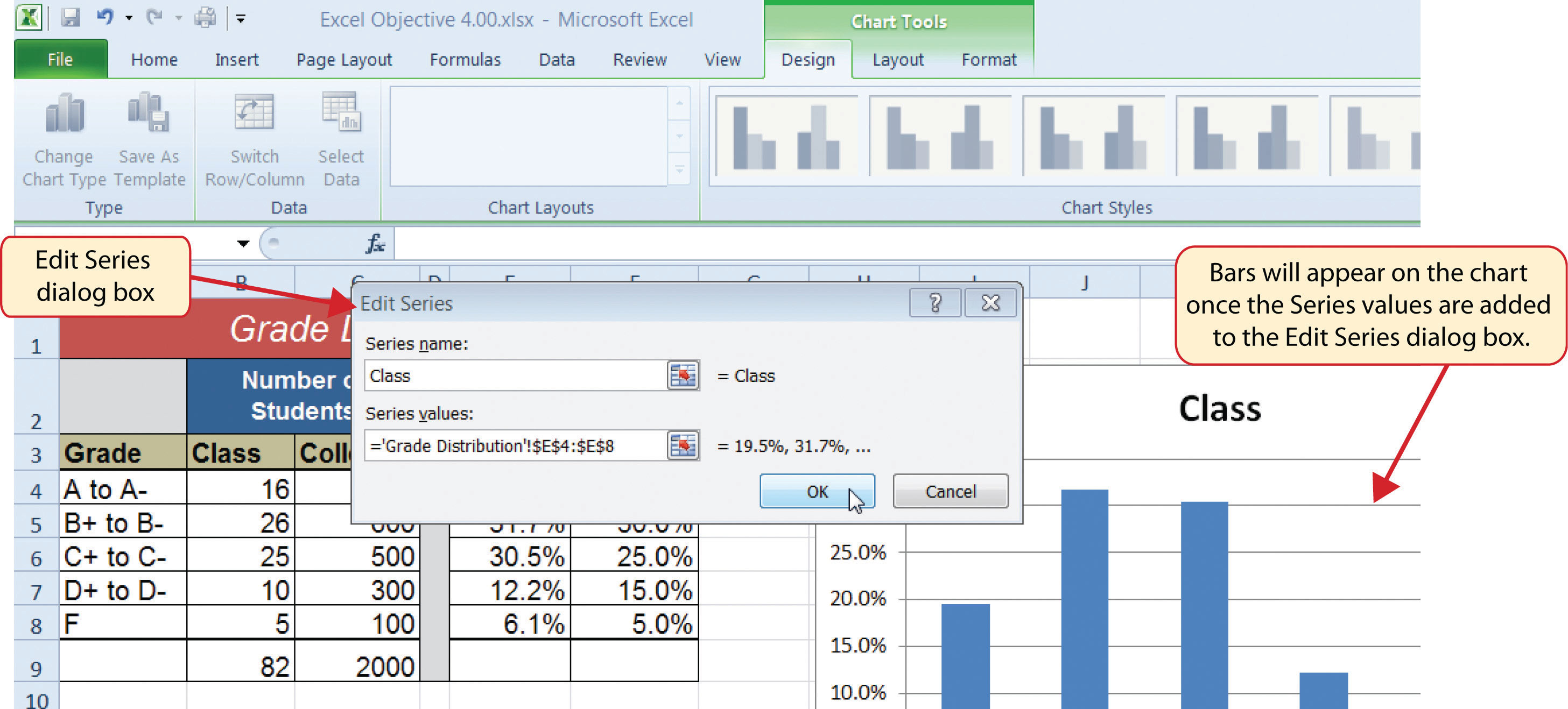
- Click the Select Data button in the Design tab of the Chart Tools section of the Ribbon. This opens the Select Data Source dialog box.
- Click the Add button on the Select Data Source dialog box. This opens the Edit Series dialog box.
- In the Series name input box on the Edit Series dialog box, type the word Class.
- Press the TAB key on your keyboard to advance to the Series values input box on the Edit Series dialog box.
- Highlight the range E4:E8 on the Grade Distribution worksheet. This automatically adds the range to the Series values input box. You also see bars added to the column chart (see Figure 4.14 "Completed Data Series for the Class Grade Distribution").
-
Click the OK button on the Edit Series dialog box.
- Click the Add button on the Select Data Source dialog box.
- In the Series name input box on the Edit Series dialog box, type the word College.
- Press the TAB key on your keyboard to advance to the Series values input box on the Edit Series dialog box.
- Highlight the range F4:F8 on the Grade Distribution worksheet. This automatically adds the range to the Series values input box. You also see bars added to the column chart.
- Click the OK button on the Edit Series dialog box.
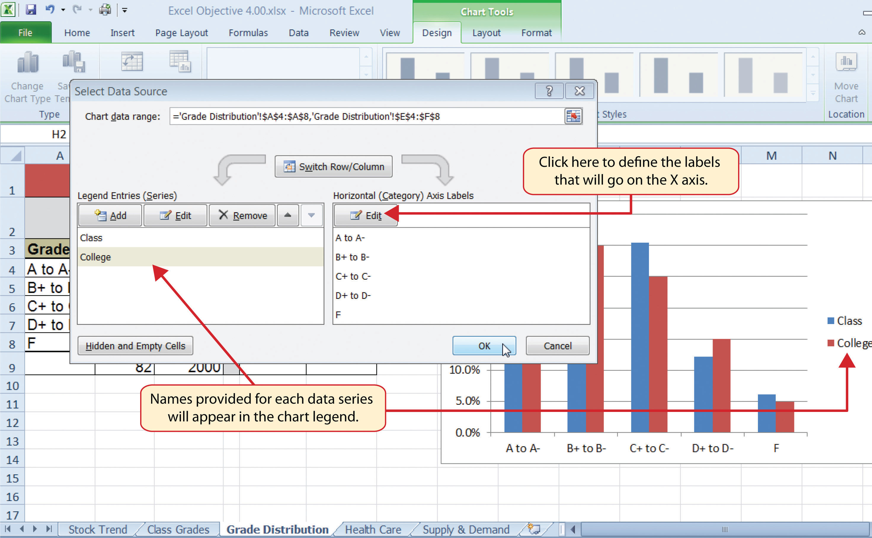
- Click the Edit button on the right side of the Select Data Source dialog box under the Horizontal (Category) Axis Labels section. This is used to define the labels that will appear on the X axis of the chart and opens the Axis Labels dialog box.
- Highlight the range A4:A8 on the Grade Distribution worksheet. This adds the range to the Axis Labels dialog box, and the labels appear on the X axis on the column chart (see Figure 4.15 "Final Settings for the Select Data Source Dialog Box").
- Click the OK button on the Axis Labels dialog box.
-
Click the OK button on the Select Data Source dialog box.
- Click the Chart Title button on the Layout tab of the Chart Tools section of the Ribbon. Select the Above Chart option from the drop-down list.
- Click in the text box containing the chart title. Delete the generic chart title and replace it with the following: Grade Distribution Comparison.
Figure 4.16 "Completed Grade Distribution Column Chart" shows the final appearance of the column chart. The column chart is an appropriate type for this data because there are fewer than twenty data points and we can easily see the comparison for each category. An audience can quickly see that the class issued fewer As compared to the college. However, the class had more Bs and Cs compared with the college population.
Integrity Check
Too Many Bars on a Column Chart?
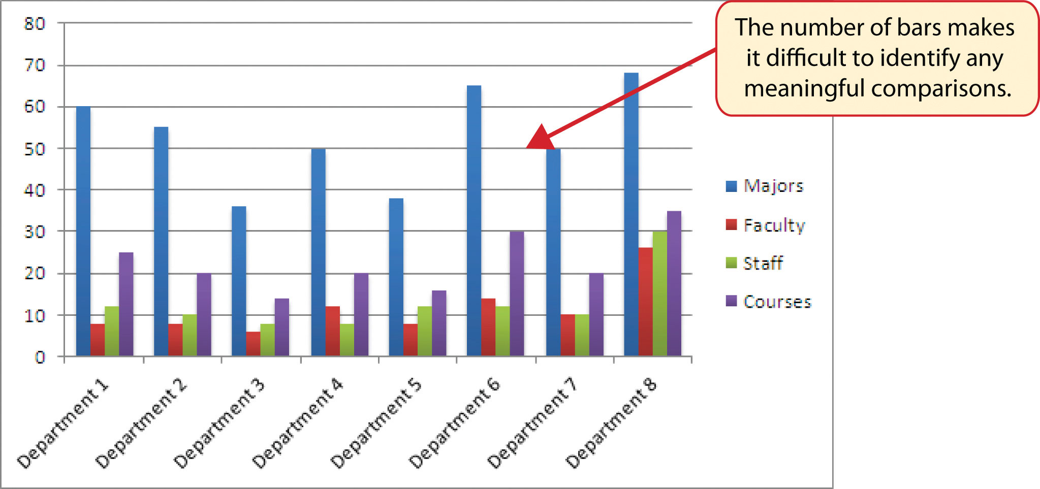
Although there is no specific limit for the number of bars you should use on a column chart, a general rule of thumb is twenty bars or less. Figure 4.17 "Poor Use of a Column Chart" contains a total of thirty-two bars. This is considered a poor use of a column chart because it is difficult to identify meaningful trends or comparisons. The data used to create this chart might be better used in two or three different column charts, each with a distinct idea or message.
Skill Refresher: Charts: Using Data in a Noncontiguous Range
- Click a blank cell location that is not adjacent to any data on the worksheet.
- Click the Insert tab of the Ribbon.
- Select a chart type and format in the Charts group of commands.
- Click the Select Data button in the Design tab of the Chart Tools section of the Ribbon.
- Click the Add button on the Select Data Source dialog box.
- In the Edit Series dialog box, type a name in the Series name input box or highlight a cell location on the worksheet that contains a description for the data series.
- Press the TAB key on your keyboard to advance to the Series values input box.
- Highlight the range of cells on the worksheet that contain the data that will appear on the Y axis for the series identified in step 6.
- Click the OK button on the Edit Series dialog box.
- Repeat steps 5 through 9 for each data series that you need to add to the chart.
- Click the Edit button on the right side of the Select Data Source dialog box.
- Highlight the range of cells that contain the descriptions for the X axis.
- Click the OK button on the Axis Labels dialog box.
- Click the OK button on the Select Data Source dialog box.
Percent of Total: Pie Chart
Follow-along file: Continue with Excel Objective 4.00. (Use file Excel Objective 4.06 if starting here.)
Lesson Video: Pie Chart (Percent of Total)
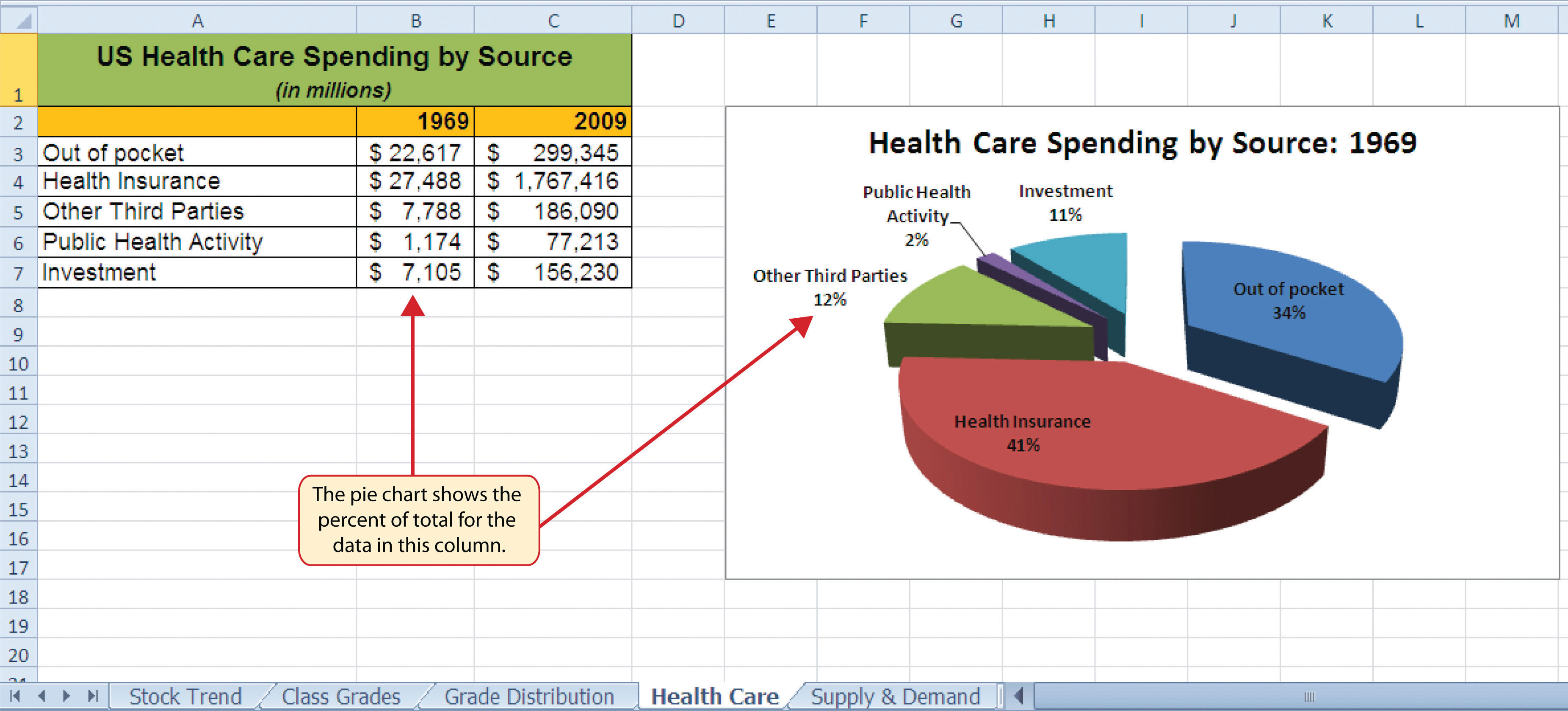
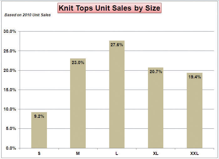
The next chart we will demonstrate is a pie chart. A pie chartA chart used to show the percent of total for each component of a data set. is used to show a percent of total for a data set at a specific point in time. The data we will use to demonstrate a pie chart is related to the overall spending activity in the health-care industry. The Health Care worksheet contains data that shows total spending in the United States for the years 1969 and 2009. In 1969, the total amount spent in the United States for health-related expenses was over $66 billion. The pie chart shows how this $66 billion was funded. The following steps explain how to accomplish this:
- Highlight the range A2:B7 on the Health Care worksheet.
- Click the Insert tab of the Ribbon.
- Click the Pie button in the Charts group of commands.
- Select the “Exploded pie in 3-D” option from the drop-down list of options.
- Click and drag the pie chart so the upper left corner is in the middle of cell E2.
-
Resize the pie chart so the left side is locked to the left side of Column E, the right side is locked to the right side of Column M, the top is locked to the top of Row 2, and the bottom is locked to the bottom of Row 17 (see Figure 4.18 "Pie Chart Moved and Resized").
- Click the chart legend once and press the DELETE key on your keyboard. A pie chart typically shows labels next to each wedge. Therefore, the legend is not needed.
- Click the Data Labels button in the Layout tab of the Chart Tools section of the Ribbon.
- Select More Data Label Options from the drop-down list. This opens the Format Data Labels dialog box.
- Click the box next to the Value option under the Label Options section in the Format Data Labels dialog box. This removes the check mark (see Figure 4.19 "Final Settings in the Format Data Labels Dialog Box").
- Click the Percentage option under the Label Options section in the Format Data Labels dialog box. A green check should appear in the box next to this option (see Figure 4.19 "Final Settings in the Format Data Labels Dialog Box").
- Click the Category Name option under the Label Options section in the Format Data Labels dialog box. A green check should appear in the box next to this option (see Figure 4.19 "Final Settings in the Format Data Labels Dialog Box").
- Click the Close button at the bottom of the Format Data Labels dialog box.
-
Click the Home tab of the Ribbon and then click the Bold button. This should bold the data labels on the pie chart.
- Click the chart title twice.
- Click in front of the year 1969 and type Health Care Spending by Source:.
Figure 4.20 "Final Health Care Pie Chart" shows the completed pie chart. You can quickly see that Health Insurance and Out of Pocket made up the majority of health-care spending in 1969. Similar to the column chart, the key to creating an effective pie chart is the number of categories presented on the chart. Although there are no specific limits for the number of categories you can use on a pie chart, a good rule of thumb is ten or less. As the number of categories exceeds ten, it becomes more difficult to identify key categories that make up the majority of the total. In this example, it is easy to see that two categories compose 75% of the total.
Skill Refresher: Inserting a Pie Chart
- Highlight a range of cells that contain the data you will use to create the chart.
- Click the Insert tab of the Ribbon.
- Click the Pie button in the Charts group.
- Select a format option from the Pie Chart drop-down menu.
Percent of Total Trend: Stacked Column Chart
Follow-along file: Continue with Excel Objective 4.00. (Use file Excel Objective 4.07 if starting here.)
Lesson Video: Stacked Column Chart (Percent of Total Trend)
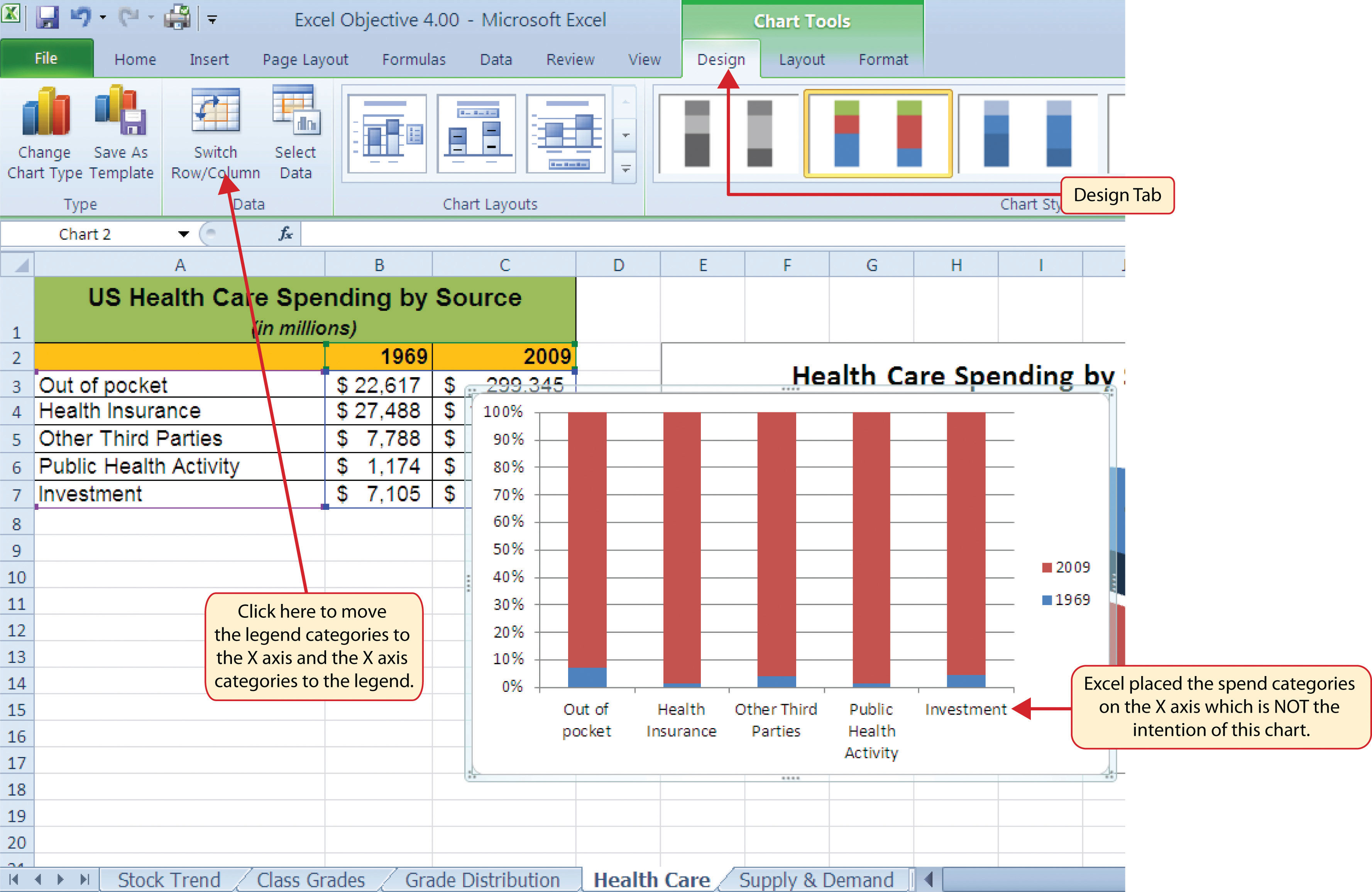
The last chart type we will demonstrate is the stacked column chartA chart used to show how a percent of total changes over time or between two or more entities.. We use a stacked column chart to show how a percent of total changes over time. For example, the data on the Health Care worksheet shows spending by source for 1969 and 2009. A stacked column chart can show whether there is any change in the percent of total for each source between the two years. The Y axis of the chart shows the percentage from 0% to 100%. The X axis shows the two years: 1969 and 2009. The following steps explain how to create this chart:
- Highlight the range A2:C7 on the Health Care worksheet.
- Click the Insert tab of the Ribbon.
-
Click the Column button in the Charts group of commands. Select the 100% Stacked Column format option from the drop-down list (see Figure 4.21 "Selecting the 100% Stacked Column Format").
Figure 4.22 "Initial Construction of the 100% Stacked Column Chart" shows the column chart that is created after selecting the 100% Stacked Column format option. As mentioned, the goal of this chart is to show the percentages on the Y axis and the years 1969 and 2009 on the X axis. However, notice that Excel places the spend sources on the X axis. The remaining steps explain how to correct this problem and complete the chart:
- Click the Switch Row/Column button in the Design tab on the Chart Tools section of the Ribbon. This reverses the legend and current X axis categories (see Figure 4.22 "Initial Construction of the 100% Stacked Column Chart").
- Click and drag the chart so the upper left corner is in the middle of cell E19.
- Resize the chart so the left side is locked to the left side of Column E, the right side is locked to the right side of Column N, the top is locked to the top of Row 19, and the bottom is locked to the bottom of Row 37.
- Click the legend one time and press the DELETE key on your keyboard.
- Click the Layout tab on the Chart Tools section of the Ribbon.
- Click the Data Table button in the Labels group of commands and select the Show Data Table with Legend Keys option from the drop-down menu. This is another way of displaying a legend for a column chart along with the numerical values that make up each component.
- Click the Chart Title button in the Layout tab of the Chart Tools section of the Ribbon.
- Select the Above Chart option for the drop-down menu.
- Click the chart title two times. Delete the generic chart title name and type Change in Health Care Spend Source.
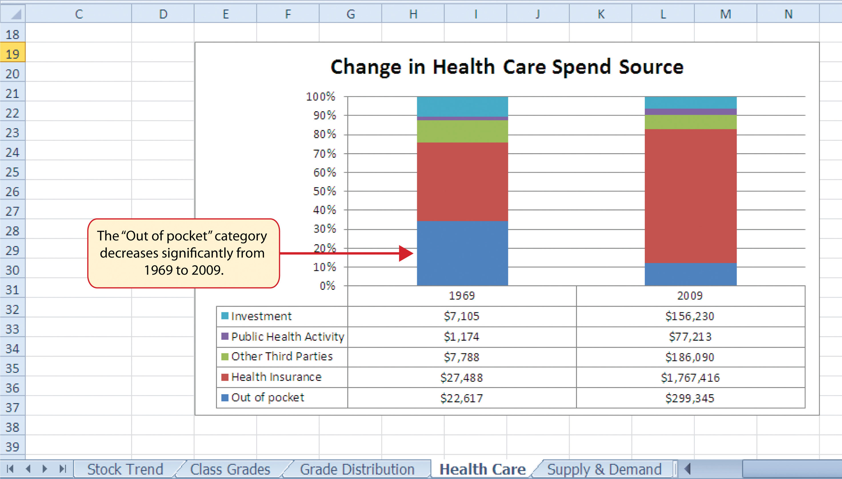
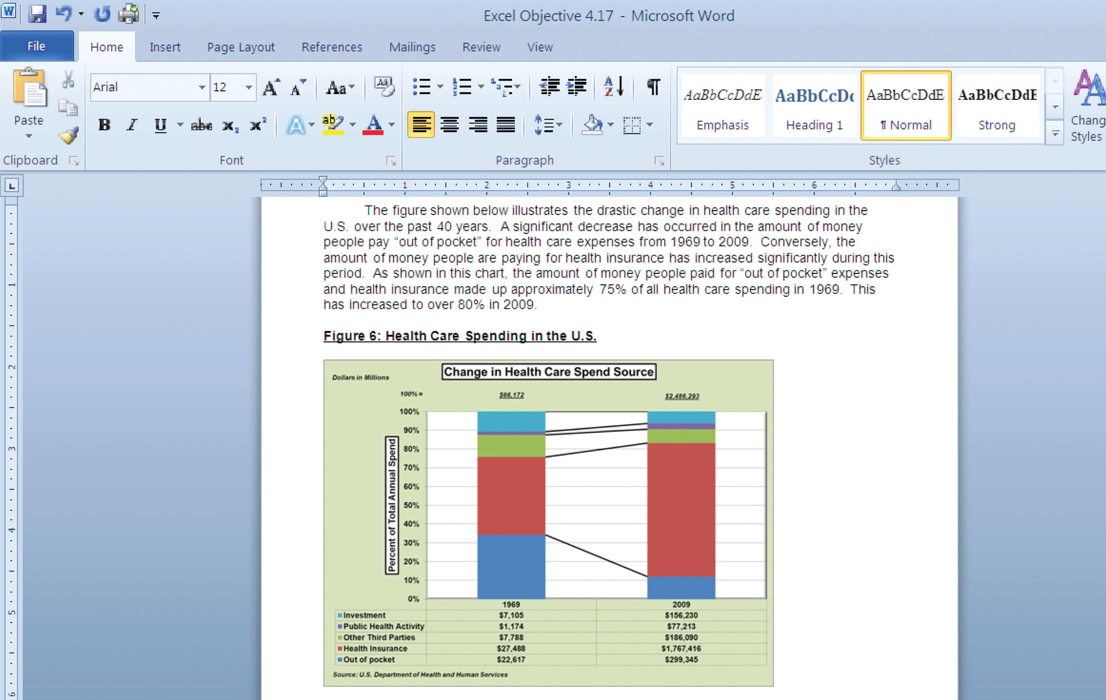
Figure 4.23 "Final 100% Stacked Column Chart" shows the final stacked column chart. Notice that the Out of Pocket category, or the amount of cash people paid for health-care expenses, decreased significantly from 1969 to 2009. However, the Health Insurance category increased significantly from 1969 to 2009. Overall, the chart shows that the total out-of-pocket and health insurance expense increased significantly from 1969 to 2009. These two categories made up approximately 75% of total health-care spending in 1969. By 2009, these two categories increased to over 80% of total health-care spending.
Skill Refresher: Inserting a Stacked Column Chart
- Highlight a range of cells that contain data that will be used to create the chart.
- Click the Insert tab of the Ribbon.
- Click the Column button in the Charts group.
- Select the Stacked Column format option from the Column Chart drop-down menu to show the values of each category on the Y axis. Select the 100% Stacked Column option to show the percent of total for each category on the Y axis.
Key Takeaways
- Identifying the message you wish to convey to an audience is a critical first step in creating an Excel chart.
- Both a column chart and a line chart can be used to present a trend over a period of time. However, a line chart is preferred over a column chart when presenting data over long periods of time.
- The number of bars on a column chart should be limited to approximately twenty bars or less.
- For column, line, and bar charts, the X axis can be used only for labels, not for numeric values.
- When creating a chart to compare trends, the values for each data series must be within a reasonable range. If there is a wide variance between the values in the two data series (two times or more), the percent change should be calculated with respect to the first data point for each series.
- When working with frequency distributions, the use of a column chart or a bar chart is a matter of preference. However, a column chart is preferred when working with a trend over a period of time.
- A pie chart is used to present the percent of total for a data set.
- A stacked column chart is used to show how a percent total changes over time.
Exercises
-
You need to create a chart showing the past year sales results for the university bookstore. Your chart will show the total sales by month for twelve months. Which of the following is the best chart type?
- pie chart
- line chart
- scatter chart
- either line or column chart
-
Which of the following should you do first to create an effective chart in Excel?
- Identify a chart type.
- Define the message you need to communicate.
- Determine which values belong on the Y axis.
- Highlight all the data on your worksheet.
-
Which of the following is the most efficient method for adding labels to each section of a pie chart?
- Use the Data Labels button in the Layout tab of the Ribbon.
- Click the Text Box button in the Layout tab of the Ribbon and add labels next to each section of the chart.
- Use the Legend button in the Layout tab of the Ribbon to reposition the legend around each section of the chart.
- Click the Select Data button in the Design tab of the Ribbon to select and arrange specific data points to be placed on the chart.
-
You have established a personal budget for your household. The spending section of the budget is broken down into five major categories. To show how the percent of total for each spend category has changed over a three-year period of time, it would be best to use which of the following chart types?
- column chart
- line chart
- stacked column chart
- pie chart
4.2 Formatting Charts
Learning Objectives
- Apply formatting commands to the X and Y axes.
- Enhance the visual appearance of the chart title and chart legend by using various formatting techniques.
- Assign titles to the X and Y axes that clarify labels and numeric values for the reader.
- Apply labels and formatting techniques to the data series in the plot area of a chart.
- Apply formatting commands to the chart area and the plot area of a chart.
- Employ series lines and annotations to enhance trends and provide additional information on a chart.
You can use a variety of formatting techniques to enhance the appearance of a chart once you have created it. Formatting commands are applied to a chart for the same reason they are applied to a worksheet: they make the chart easier to read. However, formatting techniques also help you qualify and explain the data in a chart. For example, you can add footnotes explaining the data source as well as notes that clarify the type of numbers being presented (i.e., if the numbers in a chart are truncated, you can state whether they are in thousands, millions, etc.). These notes are also helpful in answering questions if you are using charts in a live presentation. We will demonstrate these formatting techniques using the column chart and stacked column chart from the previous section.
X and Y Axis Formats
Follow-along file: Continue with Excel Objective 4.00. (Use file Excel Objective 4.08 if starting here.)
Lesson Video: X and Y Axis Formats
There are numerous formatting commands we can apply to the X and Y axes of the chart. Although adjusting the font size, style, and color are common, many more options are available through the Format Axis dialog box (see Figure 4.5 "Format Axis Dialog Box"). The following steps demonstrate a few of these formatting techniques on the Grade Distribution Comparison chart:
- Click anywhere along the X axis (horizontal axis) of the Grade Distribution Comparison chart on the Grade Distribution worksheet.
- Click the Home tab of the Ribbon.
- Change the font style to Arial. Notice that as the mouse pointer hovers over a font style, you can preview the change on the chart before you make a selection.
- Change the font size to 11 points and bold the font. The final appearance of the X axis is shown in Figure 4.24 "Formatted X Axis".
- Click anywhere along the Y axis to activate it.
-
Repeat steps 3 and 4.
- Click the Format tab in the Chart Tools section of the Ribbon.
- Click the Format Selection button in the Current Selection group of commands. This opens the Format Axis dialog box.
- Click Number from the list of options on the left side of the Format Axis dialog box (see Figure 4.25 "Formatting Numbers on the Y Axis"). The commands in this section of the Format Axis dialog box are used to format numbers that appear on the X and Y axes of a chart.
- Click in the Decimal places input box and change the value to 0 (see Figure 4.25 "Formatting Numbers on the Y Axis").
- Click the Close button at the bottom of the Format Axis dialog box. The formatting adjustments are shown in Figure 4.26 "Completed X and Y Axis Formats".
Skill Refresher: Formatting the X and Y Axis
- Click anywhere along the X or Y axis to activate it.
- Click either the Home tab or Design tab of the Ribbon.
- Select any of the available formatting commands in these tabs.
Skill Refresher: X and Y Axis Number Formats
- Click anywhere along the X or Y axis to activate it.
- Click the Layout tab in the Chart Tools section of the Ribbon.
- Click the Format Selection button in the Current Selection group of commands.
- Click Number from the list of options on the left side of the Format Axis dialog box.
- Select a number format and set decimal places on the right side of the Format Axis dialog box.
- Click the Close button at the bottom of the Format Axis dialog box.
Chart Legend and Title Formats
Follow-along file: Continue with Excel Objective 4.00. (Use file Excel Objective 4.09 if starting here.)
Lesson Video: Chart Legend and Title Formats
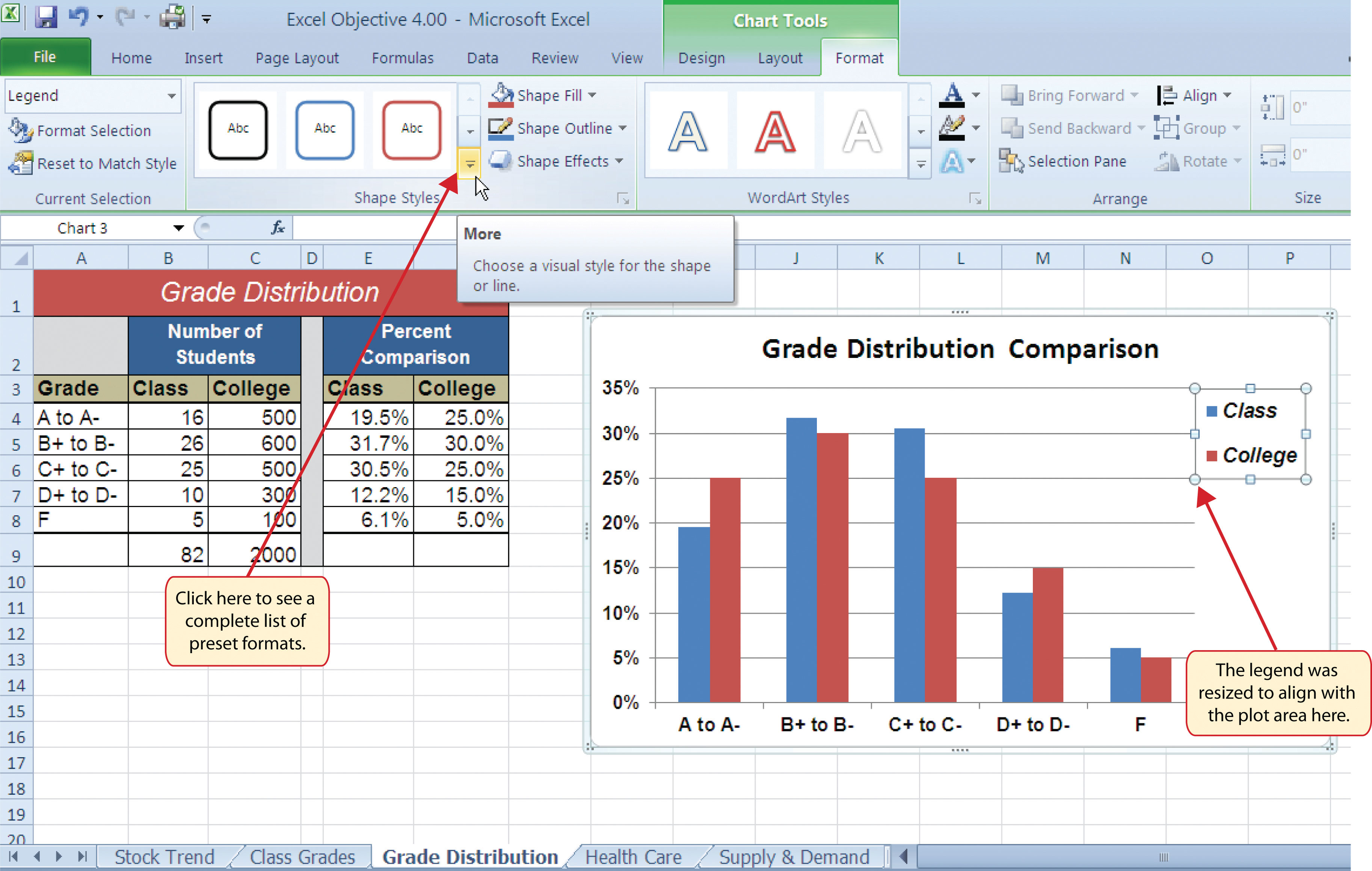
The next items we will format on the Grade Distribution Comparison chart are the chart legend and title. Similar to the how we formatted the X and Y axes, we can format these items by activating them and using the formatting commands in the Home tab or the Format tab of the Ribbon. The following steps explain how to add these formats:
- Click the legend on the Grade Distribution Comparison chart in the Grade Distribution worksheet.
-
Click and drag the legend so the top of the legend aligns with the 35% line next to the plot area (see Figure 4.27 "Moving the Legend").
- Change the font style in the Home tab of the Ribbon to Arial.
- Change the font size to 12 points.
- Click the bold and italics commands in the Home tab of the Ribbon.
- Click and drag the left sizing handle so the legend is against the plot area (see Figure 4.28 "Legend Formatted and Resized").
-
Click and drag the lower center sizing handle so the bottom of the legend is aligned with the 25% line of the plot area (see Figure 4.28 "Legend Formatted and Resized").
- Click the chart title to activate it.
- Click the Format tab in the Chart Tools section of the Ribbon.
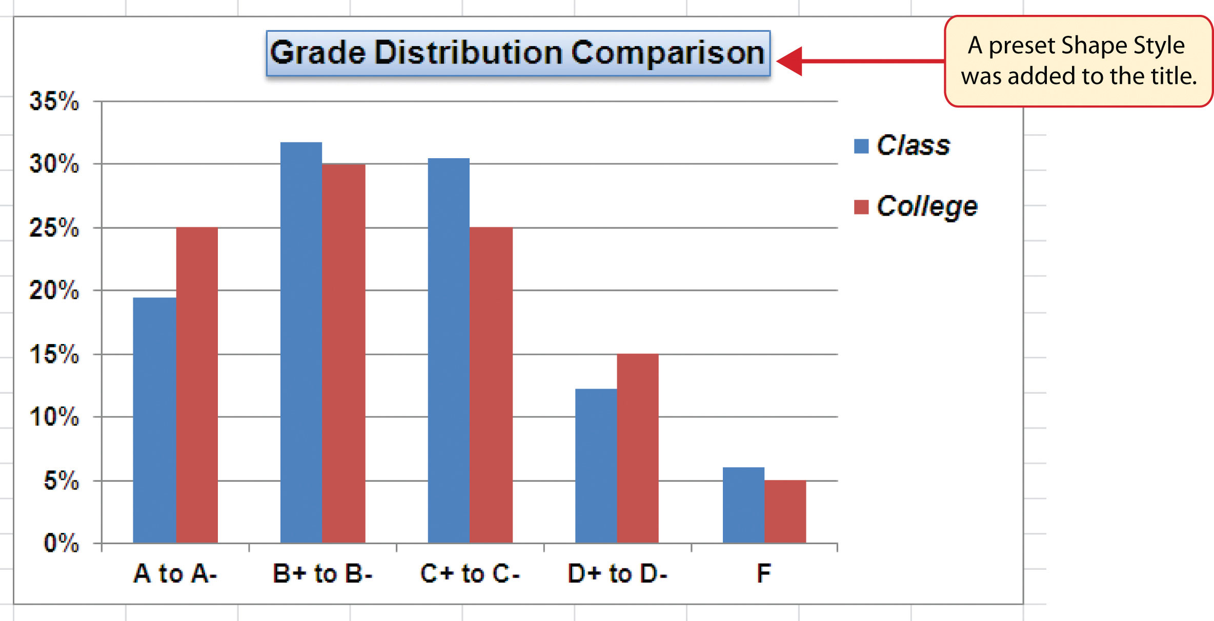
- Click the More down arrow in the Shape Styles group of commands to open the complete set of preset format styles (see Figure 4.28 "Legend Formatted and Resized").
- Click the Subtle Effect - Blue, Accent 1 option, which is in the fourth row, second style from the left. As the mouse hovers over a style, you can preview the appearance on the chart.
- In the Home tab of the Ribbon, change the font style to Arial and reduce the font size to 14 points (see Figure 4.29 "Chart Legend and Title Formatted").
Skill Refresher: Formatting the Chart Legend
- Click the Legend to activate it.
- Click either the Home tab or the Format tab of the Ribbon.
- Select any of the available formatting commands in these tabs.
- Click and drag the legend to move it.
- Click and drag any of the sizing handles to adjust the size of the legend.
Skill Refresher: Formatting the Chart Title
- Click anywhere on the chart title.
- Click either the Home tab or the Format tab of the Ribbon.
- Select any of the available formatting commands in these tabs.
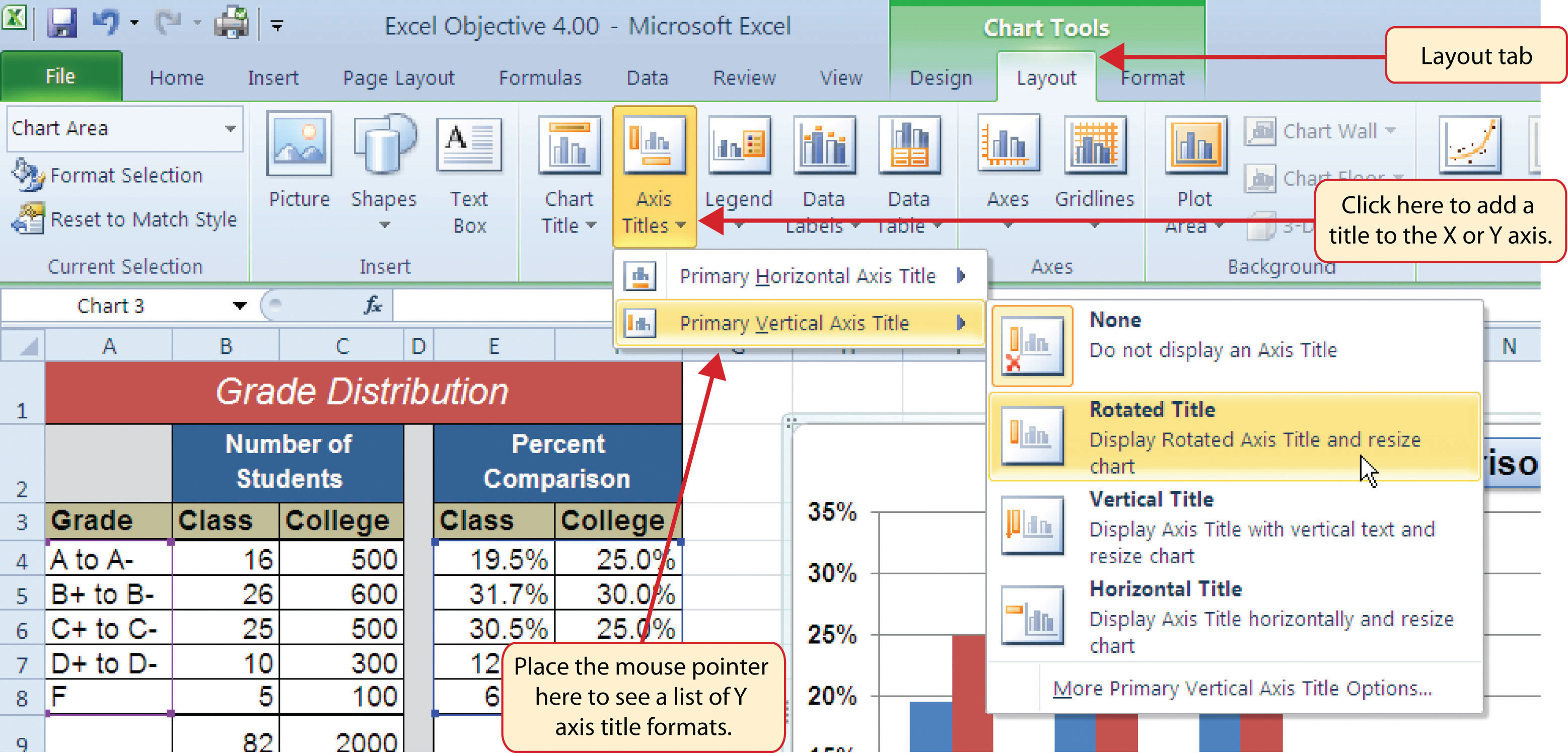
X and Y Axis Titles
Follow-along file: Continue with Excel Objective 4.00. (Use file Excel Objective 4.10 if starting here.)
Lesson Video: X and Y Axis Titles
Titles for the X and Y axes are necessary for defining the numbers and categories presented on a chart. For example, by looking at the Grade Distribution Comparison chart, it is not clear what the percentages along the Y axis represent. The following steps explain how to add titles to the X and Y axes to define these numbers and categories:
- Click anywhere on the Grade Distribution Comparison chart in the Grade Distribution worksheet to activate it.
- Click the Layout tab in the Chart Tools section of the Ribbon.
- Click the Axis Titles button in the Labels group of commands.
-
Place the mouse pointer over the Primary Vertical Axis TitleCommand used to add a title to the Y axis of a chart. option from the drop-down list. This opens a second drop-down list. Select the Rotated Title option from the second drop-down list. This adds a title next to the Y axis (see Figure 4.30 "Selecting a Title for the Y Axis").
- Click the Format tab in the Chart Tools section of the Ribbon.
- Click the Colored Outline - Blue, Accent 1 preset style option in the Shape Styles group of commands.
- Change the font style in the Home tab to Arial. Change the font size to 11 points.
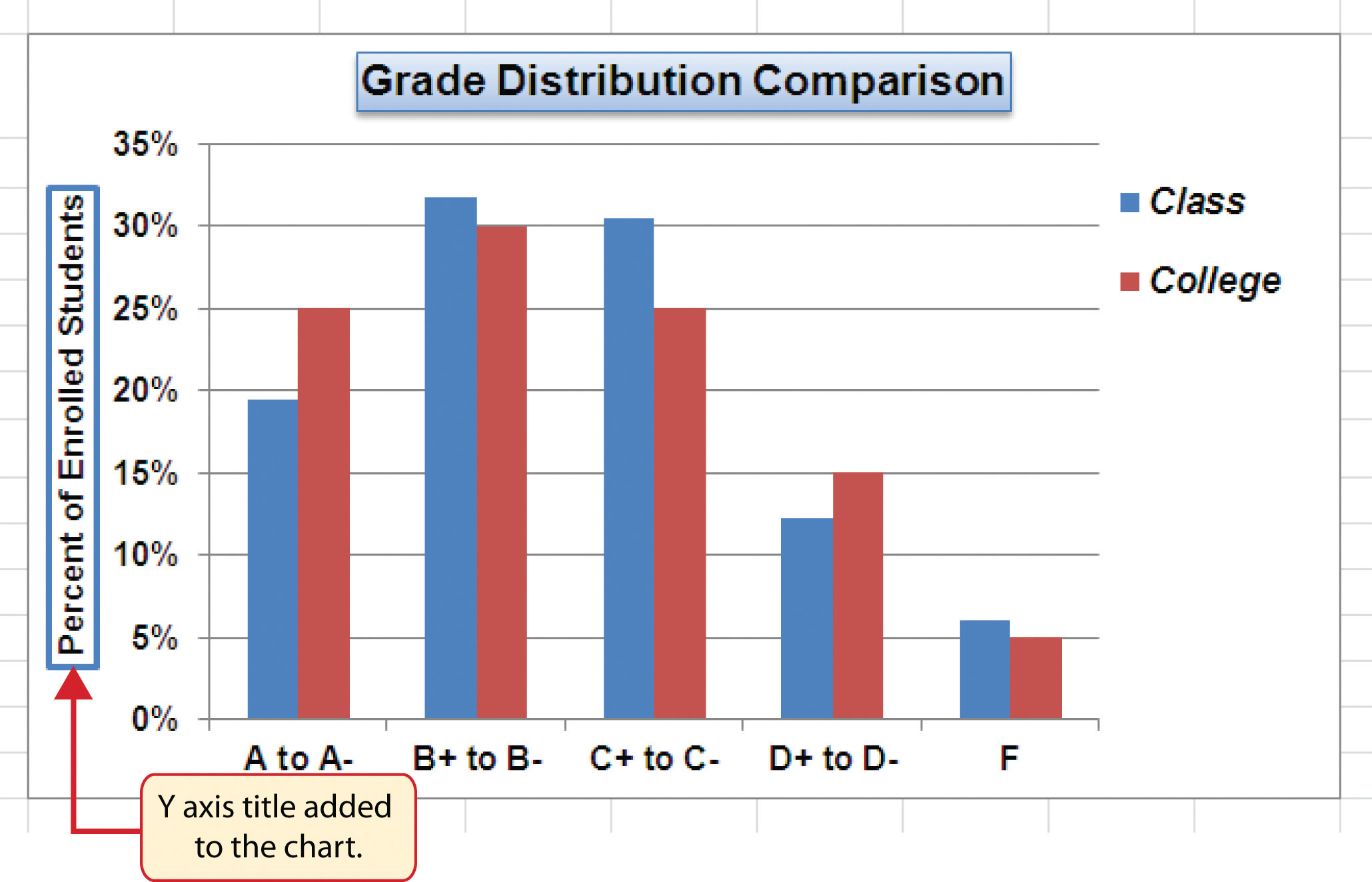
- Click in the beginning of the Y axis title and delete the generic title. Type Percent of Enrolled Students.
-
Click and drag the Y axis title so it is between 0% and 30% in the plot area (see Figure 4.31 "Adding and Formatting the Y Axis Title").
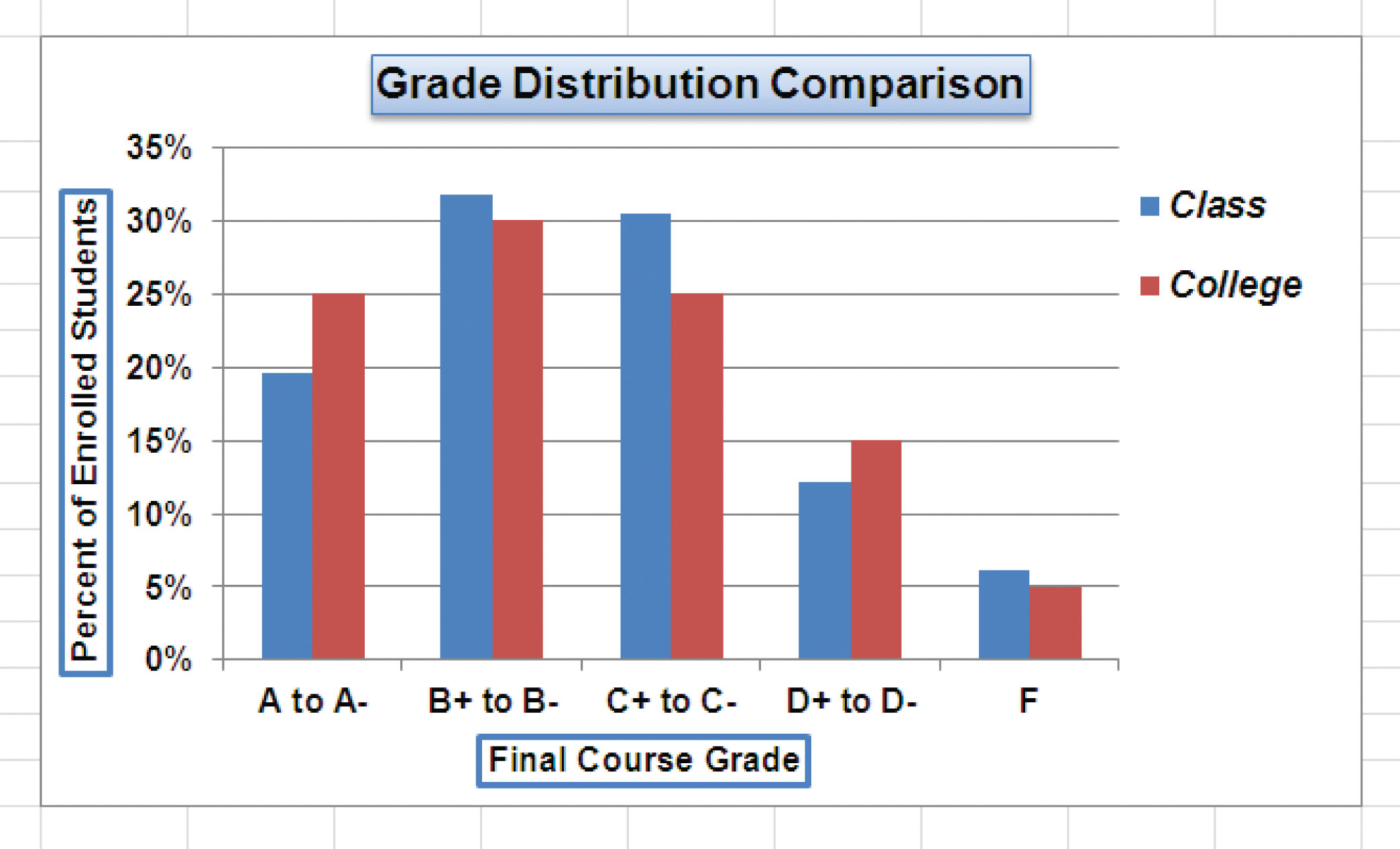
- Click the Layout tab in the Chart Tools section of the Ribbon.
- Click the Axis Titles button in the Labels group of commands.
- Place the mouse pointer over the Primary Horizontal Axis TitleCommand used to add a title to the X axis of a chart. option. Select Title Below Axis from the second drop-down list.
- Click the Format tab in the Chart Tools section of the Ribbon.
- Click the Colored Outline - Blue, Accent 1 preset style option in the Shape Styles group of commands.
- Change the font style in the Home tab to Arial. Change the font size to 11 points.
- Click in the beginning of the X axis title and delete the generic title. Type Final Course Grade.
Figure 4.32 "X and Y Axis Titles Added" shows the added titles for the X and Y axes. The titles provide definitions for the grade categories along the X axis as well as the percentages on the Y axis.
Skill Refresher: X and Y Axis Titles
- Click anywhere on the chart to activate it.
- Click the Layout tab in the Chart Tools section of the Ribbon.
- Click the Axis Titles button in the Labels group of commands.
- Place the mouse pointer over the Primary Horizontal Axis Title (X axis) or the Primary Vertical Axis Title (Y axis) option.
- Select one of the configuration formats from the second drop-down list.
- Click in the axis title to remove the generic title and type a new title.
Data Series Labels and Formats
Follow-along file: Continue with Excel Objective 4.00. (Use file Excel Objective 4.11 if starting here.)
Lesson Video: Data Series Labels and Formats
Adding labels to the data series of a chart is a key formatting feature. A data seriesA quantitative data set that is displayed graphically on a chart. Data sets are typically displayed in the form of columns or lines on a chart. is the item that is being displayed graphically on a chart. For example, the blue bars on the Grade Distribution Comparison chart represent one data series. We can add labels at the end of each bar to show the exact percentage the bar represents. In addition, we can add other formatting enhancements to the data series, such as changing the color of the bars or adding an effect. The following steps explain how to add these labels and formats to the chart:
- Click any red bar representing the College data series on the Grade Distribution Comparison chart in the Grade Distribution worksheet. Clicking one bar automatically activates all bars in the data series. If you click a bar a second time, only that bar is activated.
- Click the Format tab in the Chart Tools section of the Ribbon.
- Click the down arrow on the Shape Fill button in the Shape Styles group of commands.
-
Click the orange color square from the drop-down color palette (see Figure 4.33 "Changing the Color of a Data Series"). As you move the mouse pointer over other colors on the palette, you can preview the change on the data bars.
- Click the Layout tab in the Chart Tools section of the Ribbon.
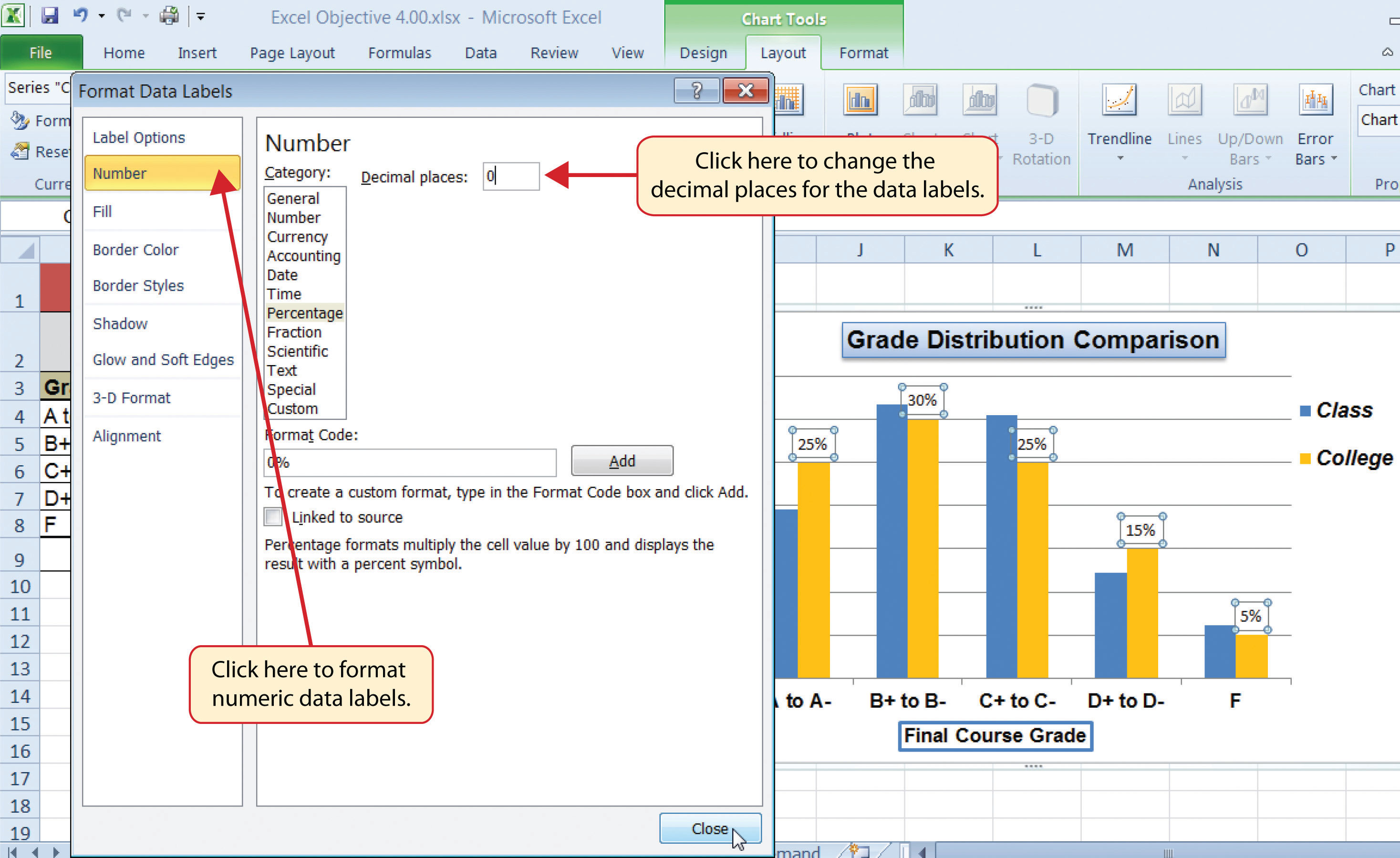
- Click the Data Labels button in the Labels group of commands. Select More Data Label Options at the bottom of the drop-down list to open the Format Data Labels dialog box.
- Click the Number option from the list on the left side of the Format Data Labels dialog box.
- Select Percentage on the right side of the Format Data Labels dialog box (see Figure 4.34 "Adding Labels to a Data Series").
- Click in the Decimal Places input box and change the number of decimal places to zero.
- Click the Close button at the bottom of the Format Data Labels dialog box.
- Click the Home tab of the Ribbon.
- Change the font style to Arial, change the font size to 9 points, and select the Bold command.
- Click any blue bar in the Class data series.
- Repeat steps 5 through 12.
Figure 4.35 "Completed Formatting Adjustments for the Data Series" shows the Grade Distribution Comparison chart with the completed formatting adjustments and labels added to the data series. Note that we can move each individual data label. This might be necessary if two data labels overlap or if a data label falls in the middle of a grid line. To move an individual data label, click it twice, then click and drag.
Skill Refresher: Adding Data Labels
- Click anywhere on the chart to activate it.
- Click the Layout tab in the Chart Tools section of the Ribbon.
- Click the Data Labels button in the Labels group of commands.
- Select one of the preset positions from the drop-down list or select More Data Label Options to open the Format Data Labels dialog box.
Skill Refresher: Formatting a Data Series
- Click any bar or line for a data series.
- Click either the Home tab or the Format tab of the Ribbon.
- Select any of the available formatting commands in these tabs.
Formatting the Plot and Chart Areas
Follow-along file: Continue with Excel Objective 4.00. (Use file Excel Objective 4.12 if starting here.)
Lesson Video: Formatting the Plot and Chart Areas
The last items we will format on the Grade Distribution Comparison chart are the plot and chart areas. We format these areas primarily to enhance the visibility of the data series. The following steps explain how to add these formatting enhancements to the chart:
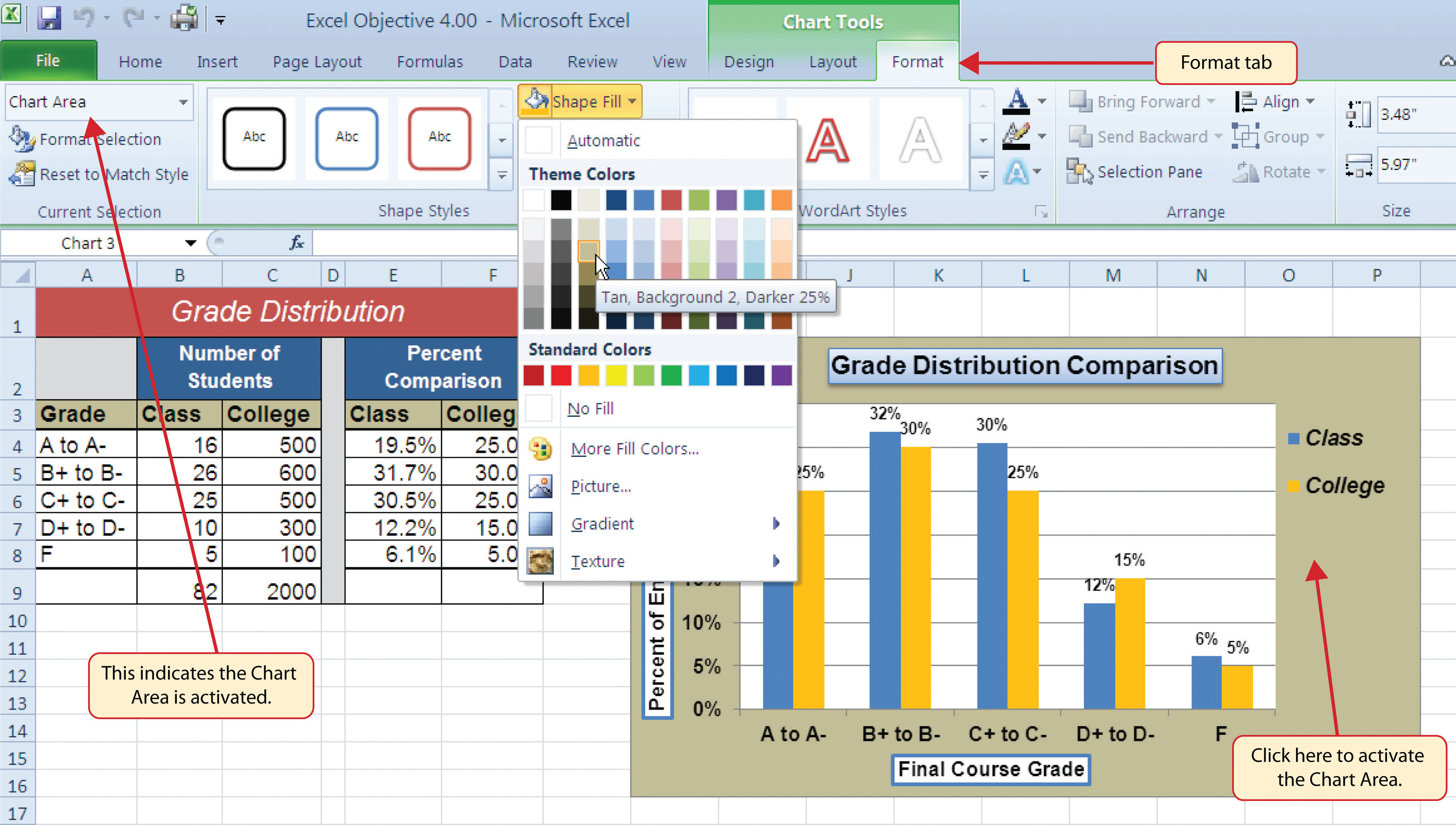
- Click anywhere in the chart area of the Grade Distribution Comparison chart in the Grade Distribution worksheet.
- Click the Format tab in the Chart Tools section of the Ribbon.
- Click the down arrow on the Shape Fill button in the Shape Styles group of commands.
- Select the Tan, Background 2, Darker 25% option from the color palette (see Figure 4.36 "Formatting the Chart Area").
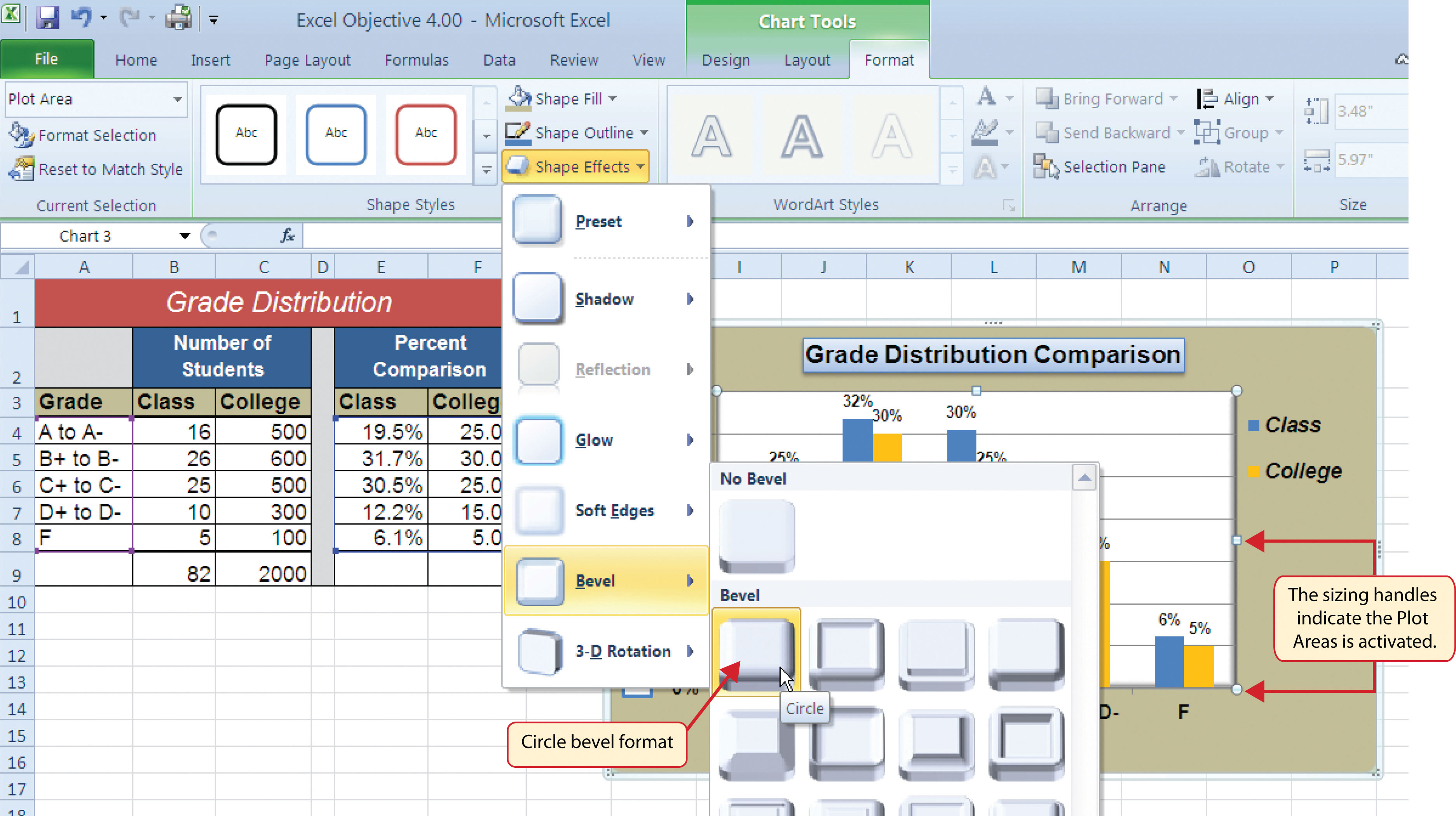
- Click anywhere in the plot area to activate it. Be sure not to click a grid line or one of the data series.
- Click the Format tab in the Chart Tools section of the Ribbon.
- Click the Shape Effects button in the Shape Styles group of commands.
- Place the mouse pointer over the Bevel option from the drop-down list. Then select the Circle bevel option from the second drop-down list (see Figure 4.37 "Putting a Bevel Effect on the Plot Area").
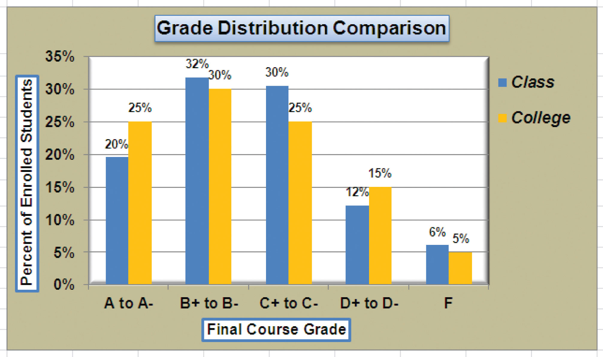
Figure 4.38 "Grade Distribution Comparison Chart with Formats Applied" shows the completed Grade Distribution Comparison chart. The darker shade on the chart area along with the bevel effect on the plot area make the data series the main focal point of the chart.
Skill Refresher: Formatting the Chart Area
- Click anywhere on the chart area.
- Click either the Home tab or the Format tab of the Ribbon.
- Select any of the available formatting commands in these tabs.
Skill Refresher: Formatting the Plot Area
- Click anywhere on the plot area.
- Click either the Home tab or the Format tab of the Ribbon.
- Select any of the available formatting commands in these tabs.
Adding Series Lines and Annotations to a Chart
Follow-along file: Continue with Excel Objective 4.00. (Use file Excel Objective 4.13 if starting here.)
Lesson Video: Adding Series Lines and Annotations
The last formatting features we will demonstrate are adding series lines and annotations to a chart. To demonstrate these skills, we will use the Change in Health Care Spend Source stacked column chart. Series linesLines that are typically used in a stacked column chart to connect the data series between two or more stacks. are commonly used in stacked column charts to show the change from one stack to the next. AnnotationsNotes or comments that explain the nature and source of the data presented on a chart. are useful for clarifying the data presented in a chart or for identifying data sources. In addition to demonstrating these skills, we will review several of the formatting skills that were covered in this section. The following steps include the skills review as well as the new formatting features:
- Locate the Change in Health Care Spend Source chart on the Health Care worksheet. Activate the chart by clicking anywhere inside the chart perimeter.
- Move the chart to a separate chart sheet by clicking the Move Chart button in the Design tab of the Ribbon. Type the following sheet tab label in the New sheet input box: Health Spending Chart. Click the OK button.
- Click anywhere on the X axis to activate it. In the Home tab of the Ribbon, change the font style to Arial, change the font size to 12 points, and select the bold command.
- Activate the Y axis and apply the same formatting adjustments as stated in step 3.
- Add a Y axis title using the Rotated Title option. In the Format tab under the Chart Tools section of the Ribbon, select the first preset style option, Colored Outline - Black, Dark 1, in the Shape Styles group of commands. Then, in the Home tab of the Ribbon, change the font style to Arial and the font size to 14 points.
- Change the wording of the Y axis title to read Percent of Total Annual Spend.
- Activate the title of the chart by clicking it once. In the Format tab under the Chart Tools section of the Ribbon, select the first preset style option, Colored Outline - Black, Dark 1, in the Shape Styles group of commands. Then, in the Home tab of the Ribbon, change the font style to Arial.
- Click anywhere in the chart area to activate it.
- Click the Format tab in the Chart Tools section of the Ribbon and click the down arrow on the Shape Fill button. Select the Olive Green, Accent 3, Lighter 60% option on the color palette.
- Click anywhere on the plot area to activate it. Be sure not to click on a grid line.
- Click the Shape Effects button in the Format tab of the Ribbon. Place the mouse pointer over the Bevel option from the drop-down menu. Select the first option from the Bevel format list, which is the “Circle” bevel option.
- Click and drag down the top center sizing handle of the plot area approximately one inch (see Figure 4.39 "Adjusting the Size of the Plot Area").
-
Click and drag up the bottom center sizing handle approximately three-quarters of an inch (see Figure 4.39 "Adjusting the Size of the Plot Area"). This step and step 12 are necessary to create space at the top and bottom of the chart to add annotations.
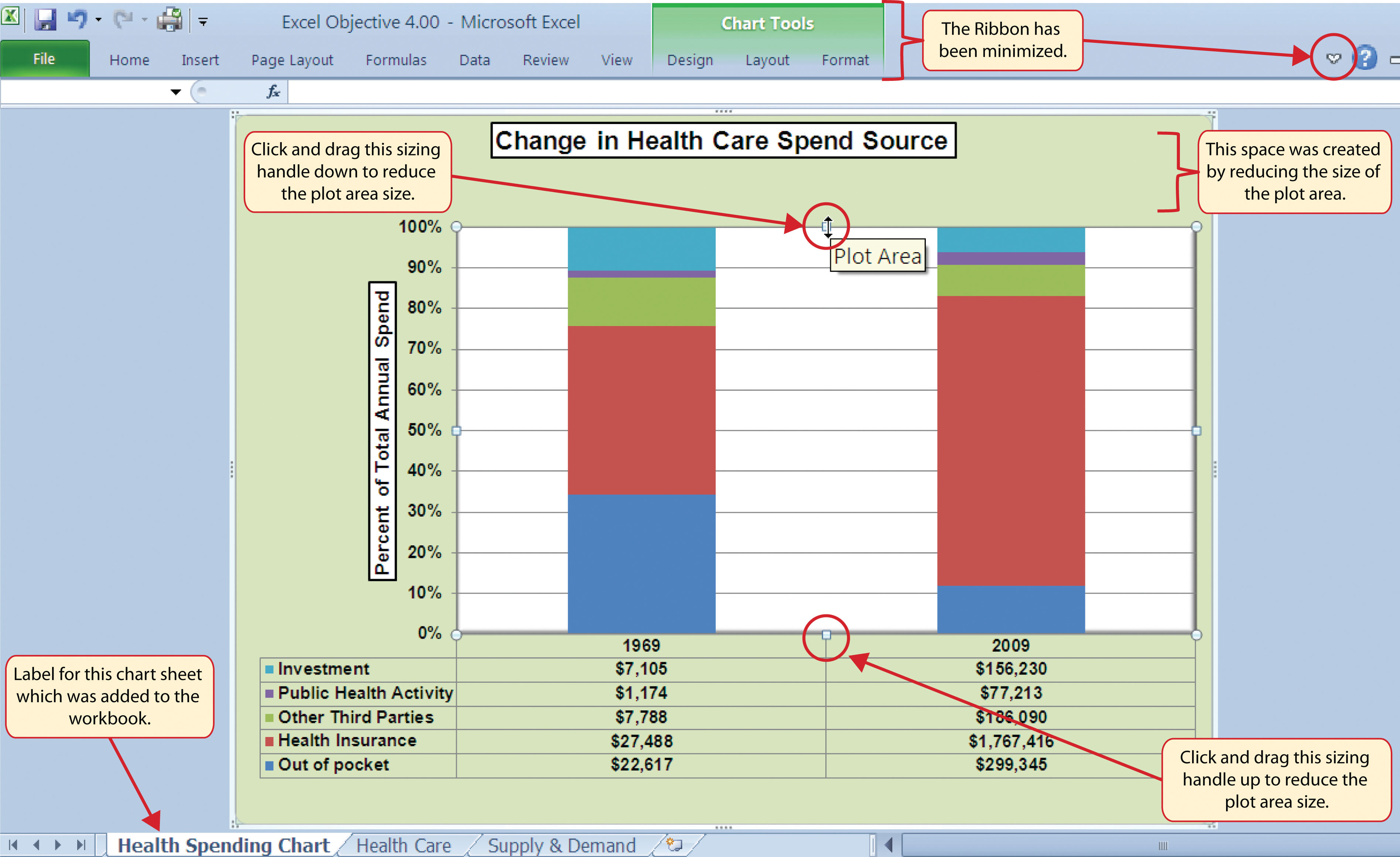
Figure 4.39 "Adjusting the Size of the Plot Area" shows the Change in Health Care Spend Source chart prior to adding the series lines and annotations. Notice that the Ribbon has been minimized to improve the visibility of the chart. The remaining steps will focus on adding lines and annotations:
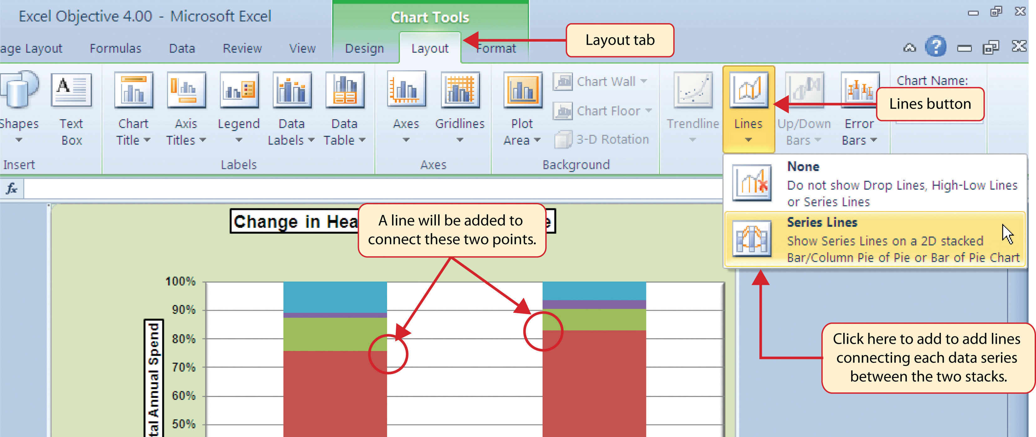
- Click the Layout tab in the Chart Tools section of the Ribbon.
- Click the Lines button in the Analysis group of commands.
-
Click the Series Lines option from the drop-down list. This adds lines to the chart, connecting each data series between the two stacks (see Figure 4.40 "Selecting the Series Lines Option").
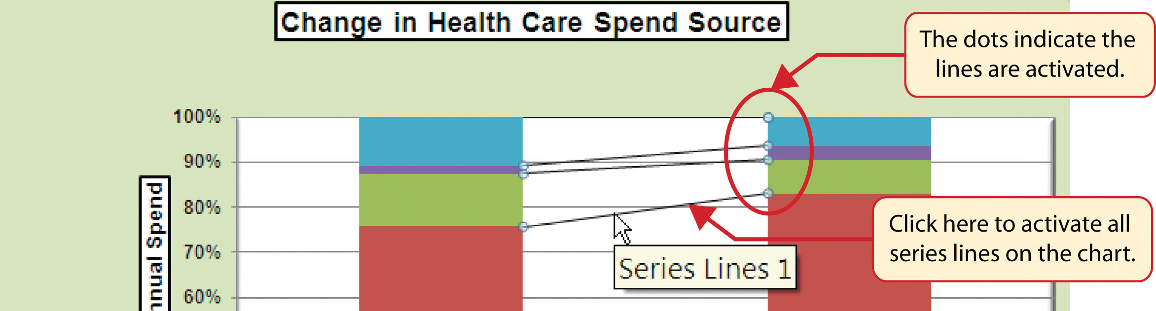
-
Click any of the series lines added to the chart. Clicking one line will activate all lines on the chart (see Figure 4.41 "Activating the Series Lines").
-
Click the Shape Outline button in the Format tab of the Ribbon. Place the mouse pointer over the Weight option and select the “2¼ line weight” option.
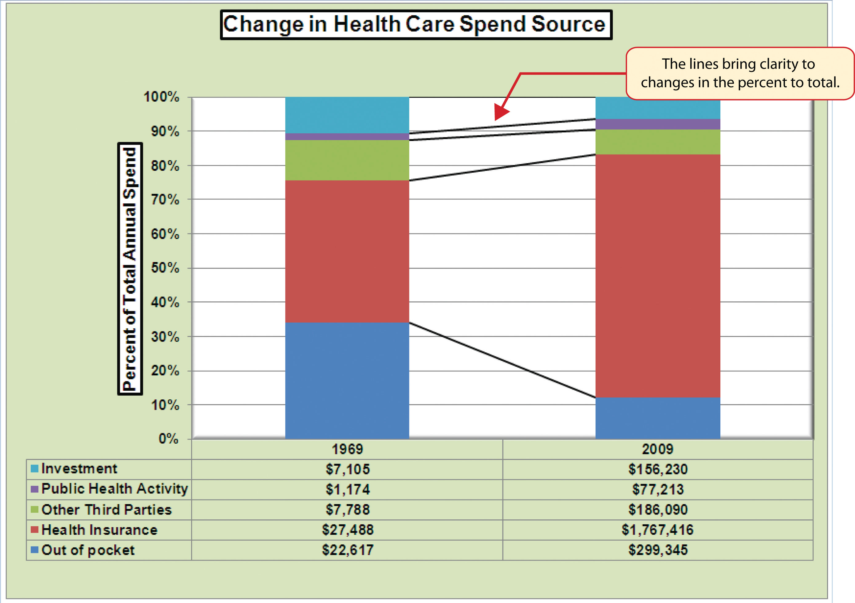
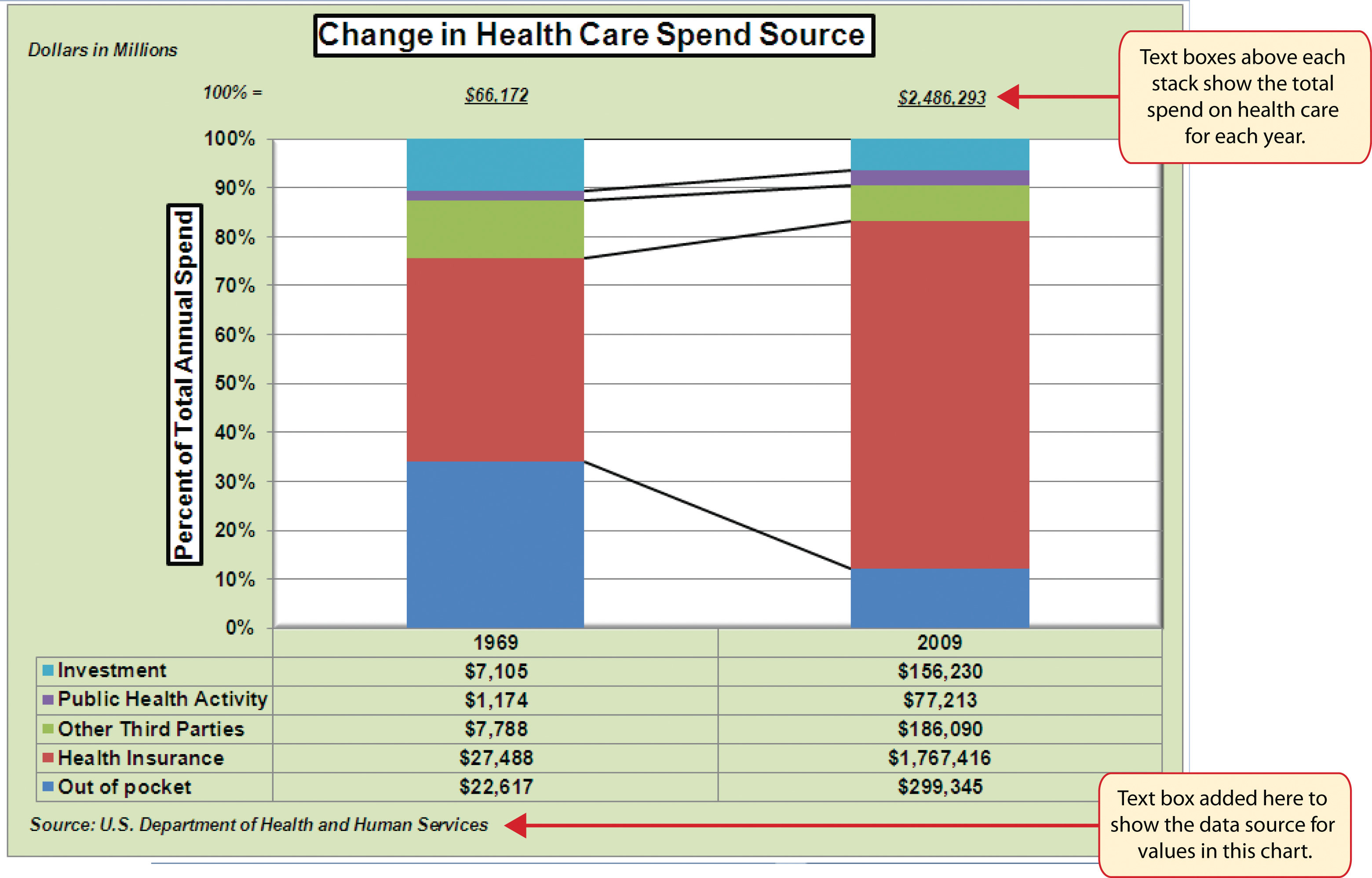
Figure 4.42 "Series Lines Added to the Stacked Column Chart" shows the appearance of the chart with the series lines connecting the two stacks. This formatting enhancement is common for stacked column charts. The lines help focus the audience’s attention to changes in the percent of total trend. In this case, the audience can quickly see the decline in the Out of Pocket category (blue) and the increase in the Health Insurance category (red).
- Click anywhere in the chart area of the Change in Health Care Spend Source chart.
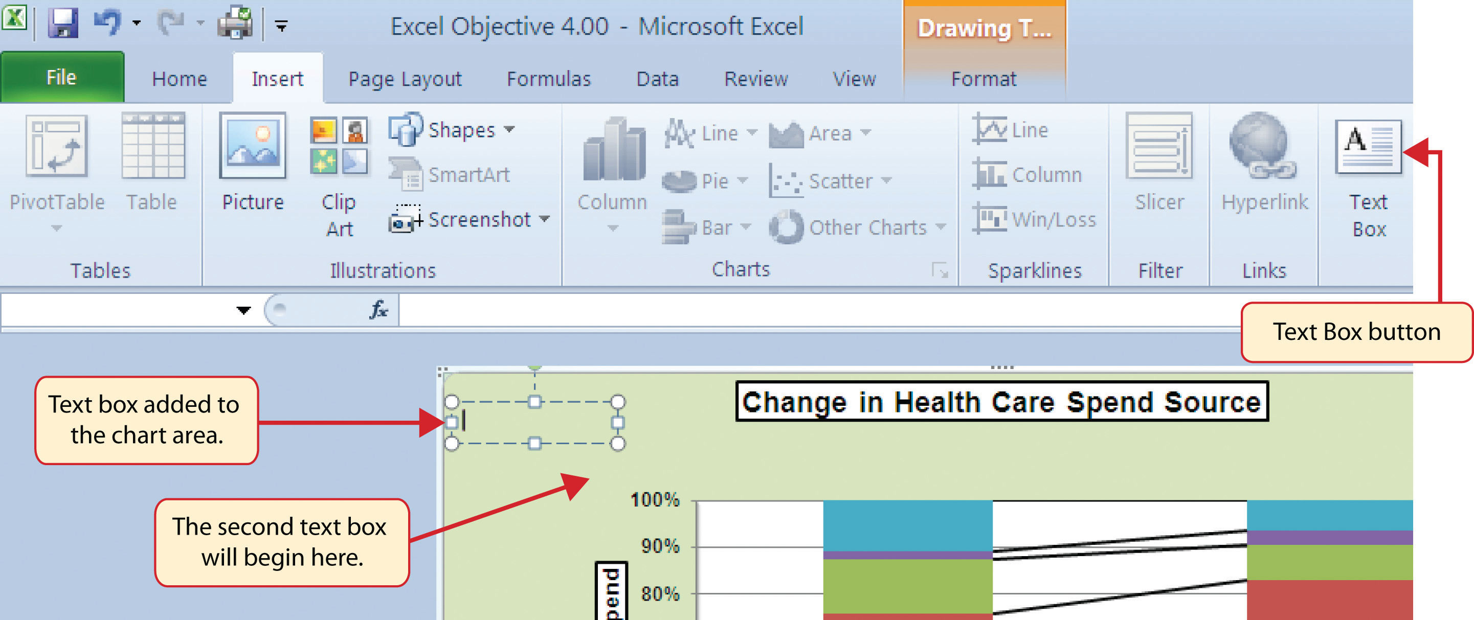
- Click the Text Box button in the Insert tab of the Ribbon (see Figure 4.43 "Lines Added to the Stacked Column Chart").
- Place the mouse pointer on the left edge of the chart area approximately one-quarter inch from the top. Click and drag a rectangle approximately one and a half inches wide and one-quarter inch high (see Figure 4.43 "Lines Added to the Stacked Column Chart").
- Click the Home tab of the Ribbon and change the font style to Arial, change the font size to 10 points, and select the bold and italics commands.
-
Type Dollars in Millions. This tells the audience that the numbers have been truncated and represent denominations in millions. This means you would add six zeros to the end of each number on the chart. Therefore, the Out of Pocket value for 1969 is shown as $22,617 but is actually $22,617,000,000, or $22.6 billion.
- Repeat steps 19–22 to add a second text box to the chart. Begin drawing this text box below the first box approximately one inch in from the left edge of the chart (see Figure 4.43 "Lines Added to the Stacked Column Chart"). Complete the formatting changes in step 22 and select the Align Text Right command.
- Type 100% = in the second text box.
- Repeat steps 19–22 to add a third text box to the chart. Center this text box over the 1969 stack. In addition to the formatting commands in step 22, select the Center align command and the Underline command.
- Type $66,172 in the third text box.
- Repeat steps 19–22 to add a fourth text box to the chart. Center this text box over the 2009 stack. In addition to the formatting commands in step 22, select the Center align command and the Underline command.
- Type $2,486,293 in the fourth text box.
- Repeat steps 19–22 to add a fifth text box to the chart. Begin drawing this text box at the bottom left edge of the chart, just below the data table. The text box will need to be at least four inches wide.
- Type Source: US Department of Health and Human Services in the fifth text box.
Figure 4.44 "Completed Stacked Column Chart with Annotations" shows the completed Change in Health Care Spend Source stacked column chart. The lines and annotations provide key information for understanding the data and interpreting the trends presented on the chart.
Integrity Check
Annotations and Axis Titles
Although adding annotations and axis titles can be a tedious process, doing so maintains a high level of integrity for your charts. People can misinterpret the message being conveyed by the chart if they make inaccurate assumptions about the values displayed. Axis titles and annotations help prevent readers from making false assumptions and ensure that readers see the most accurate representation of the message being conveyed by the chart.
Skill Refresher: Adding Series Lines
- Click anywhere on the chart area.
- Click the Layout tab of the Ribbon.
- Click the Lines button in the Analysis group of commands.
- Click the Series Lines option from the drop-down list.
Skill Refresher: Adding Annotations
- Click anywhere on the chart area.
- Click the Insert tab of the Ribbon.
- Click the Text Box button in the Text group of commands.
- Click and drag the size of the text box needed on the chart.
- Apply any desired format changes from the Home tab of the Ribbon.
- Type the desired text.
Key Takeaways
- Applying appropriate formatting techniques is critical for making a chart easier to read.
- Many formatting commands in the Home tab of the Ribbon can be applied to a chart.
- To change the number format for a data label, you must use the Number section in the Format Data Labels dialog box. You cannot use the Number format commands in the Home tab of the Ribbon.
- To change the number format for the values on the Y axis, and the X axis in the case of a scatter chart, you must use the Number section of the Format Axis dialog box. You cannot use the Number format commands in the Home tab of the Ribbon.
- Axis titles and annotations help prevent false assumptions from being made and ensure that the reader sees the most accurate representation of the information presented on a chart.
Exercises
-
You need to format the numbers along the Y axis of a column chart to US dollars with zero decimal places. Which of the following describes the method that would allow you to accomplish this?
- Activate the Y axis and use any of the number formatting commands in the Home tab of the Ribbon.
- Activate the Y axis and click the Data Labels button in the Layout tab of the Ribbon.
- Activate the Y axis and click the Format Selection button in the Layout tab of the Ribbon.
- Activate the Y axis and click the Axis Titles button in the Layout tab of the Ribbon.
-
Which of the following statements is accurate with regard to changing the color of a data series on a column chart?
- Click one bar on the column chart plot area to activate all bars for that data series. Click the Fill Color button in the Home tab of the Ribbon and select a color.
- Click one bar on the column chart plot area twice to activate all bars for that data series. Click the Shape Fill button in the Format tab of the Ribbon and select a color.
- Click the Legend one time and then click the name of the data series to activate it. Click the Shape Fill button in the Format tab of the Ribbon and select a color.
- Both A and C are valid methods for changing the color of a data series.
-
Which of the following methods is accurate with respect to formatting the legend?
- Click the legend one time and use any of the available formatting commands in the Home tab of the Ribbon.
- Click the Legend button in the Layout tab of the Ribbon and select from the drop-down list of commands.
- Click the legend one time to activate it and use any of the formatting commands in the Design tab of the Ribbon.
- None of the above.
-
Which of the following is the most efficient way to add a title to the Y axis of a chart?
- Add a text box to the plot area and drag it over to the Y axis.
- Type the title into the formula bar. This adds a text box to the plot area that can be dragged over to the Y axis.
- Select the vertical axis option from the Axis Titles button in the Layout tab of the Ribbon.
- Select the axis title option in the Select Data Source dialog box after clicking the Select Data button in the Design tab of the Ribbon.
4.3 The Scatter Chart
Learning Objectives
- Construct a scatter chart to show the supply and demand curves for a market.
- Learn how to adjust the scale of the X and Y axes of a scatter chart.
- Add a trendline and line equation to a data series on a scatter chart.
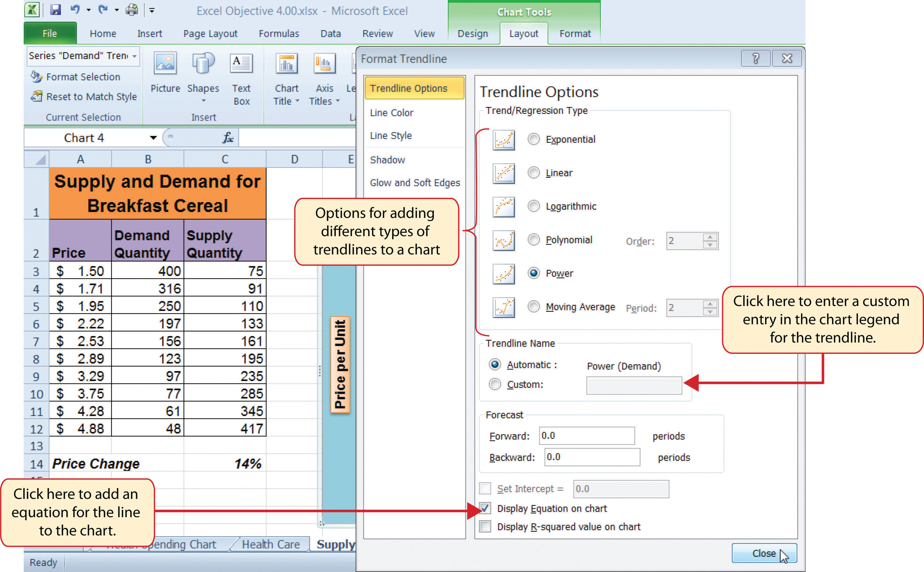
This section focuses on the scatter chartChart used when quantitative or numeric values are required for both the X and Y axes. type. What makes this chart different from the other charts demonstrated in this chapter is that values are used on both the X and Y axes. So far, the charts we have demonstrated in this chapter use categories or qualitative labels for the X axis. This means that the distance between each category on the X axis will always be the same, even if numbers are used. In a scatter chart, the X axis operates just like the Y axis. In other words, the distance between the values on the X axis will vary depending on the value of the number. Depending on the format, we can create the scatter chart to look just like a line chart. Since both the X and Y axes contain quantitative values, the scatter chart is a valuable tool for studying various shapes or functional forms for a line chart. In fact, a common feature used with the scatter chart is the trendline and equation. Excel can evaluate the line that is produced on a scatter chart and produce a mathematical equation. We will demonstrate these features in this section.
Supply and Demand: The Scatter Chart
Follow-along file: Continue with Excel Objective 4.00. (Use file Excel Objective 4.14 if starting here.)
Lesson Video: Supply and Demand (Scatter Chart)
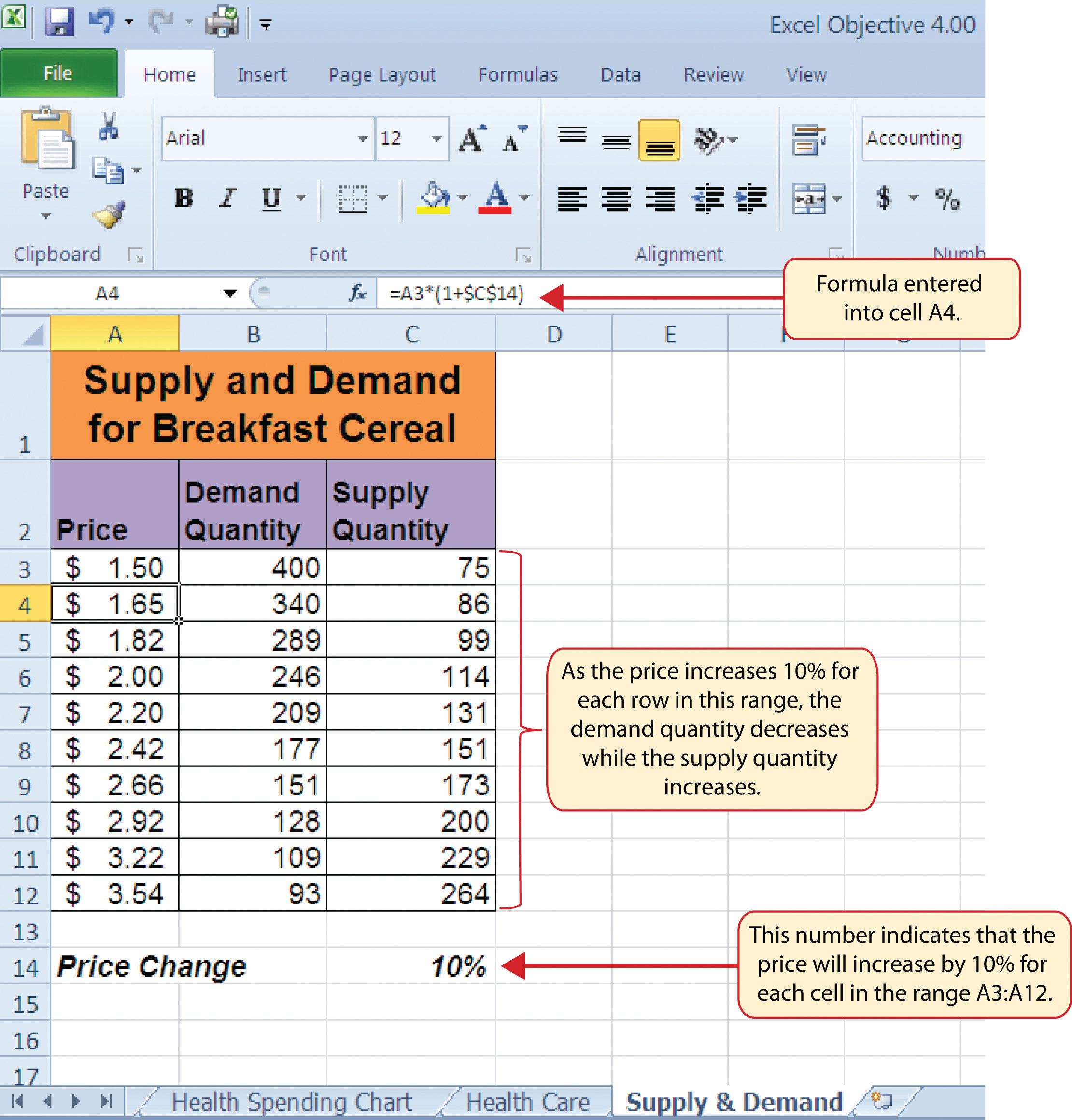
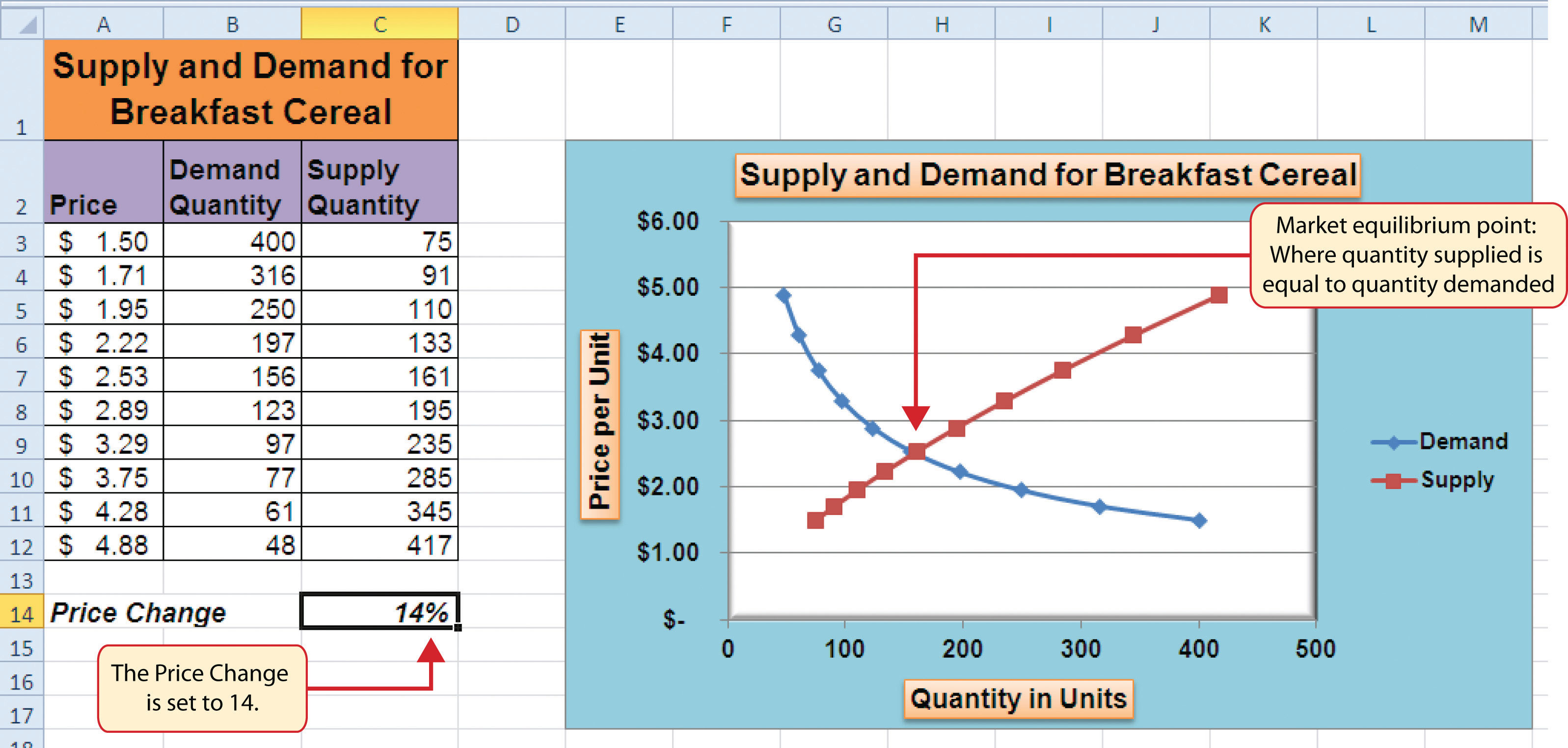
A common use for a scatter chart is the study of supply and demand curves. This is because the data points for both the supply and demand lines require quantitative values on both the X and Y axes. The Y axis contains the price of a certain good or item; the X axis contains the quantity sold for that good or item. Fundamental economic laws state that as prices rise, sellers are willing to increase supply and sell more goods. However, the reverse is true for consumers. As prices rise, consumers purchase fewer goods. The Supply & Demand worksheet contains hypothetical data for the supply and demand of breakfast cereal. There are ten data points to show the change in supply and demand as the price changes in Column A. The values you see in Columns A through C are formula outputs that are driven by the percentage in cell C14. For example, if the percentage in cell C14 is changed to 10, each price listed in Column A will increase, as shown in Figure 4.45 "Hypothetical Supply and Demand Data".
We will use the scatter chart to study the change in quantity supplied and demanded as the price increases over ten data points, as shown in Figure 4.45 "Hypothetical Supply and Demand Data". For many of the charts demonstrated in this chapter, we were able to highlight a range of cells and insert the chart type we needed. This was especially the case when the data was in a contiguous range of cells. However, this method rarely works when creating a scatter chart, even if the data are in a contiguous range. As a result, the method we present here starts with a blank chart and demonstrates how each data series is added to the chart individually. The following steps explain how we create this chart:
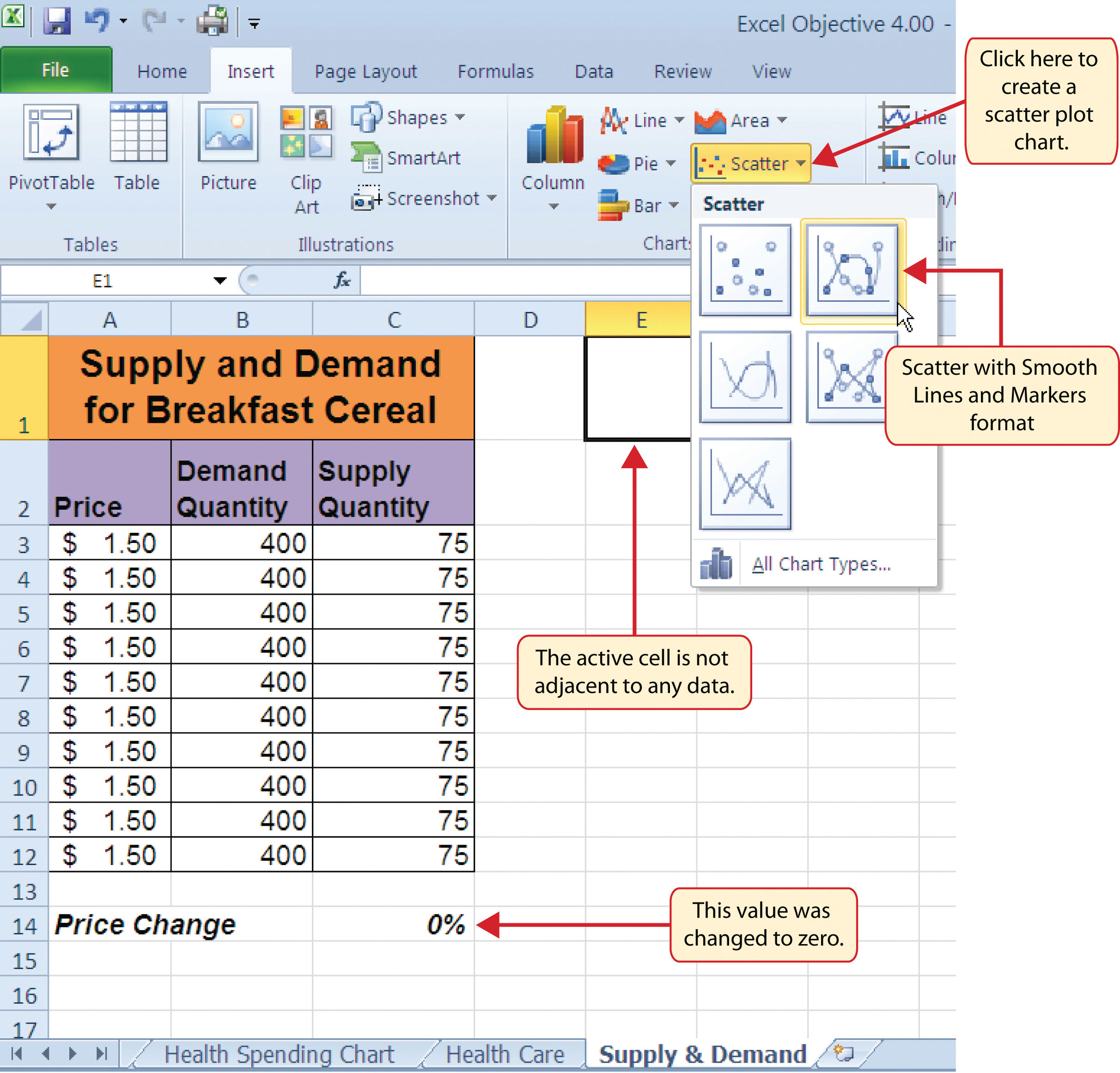
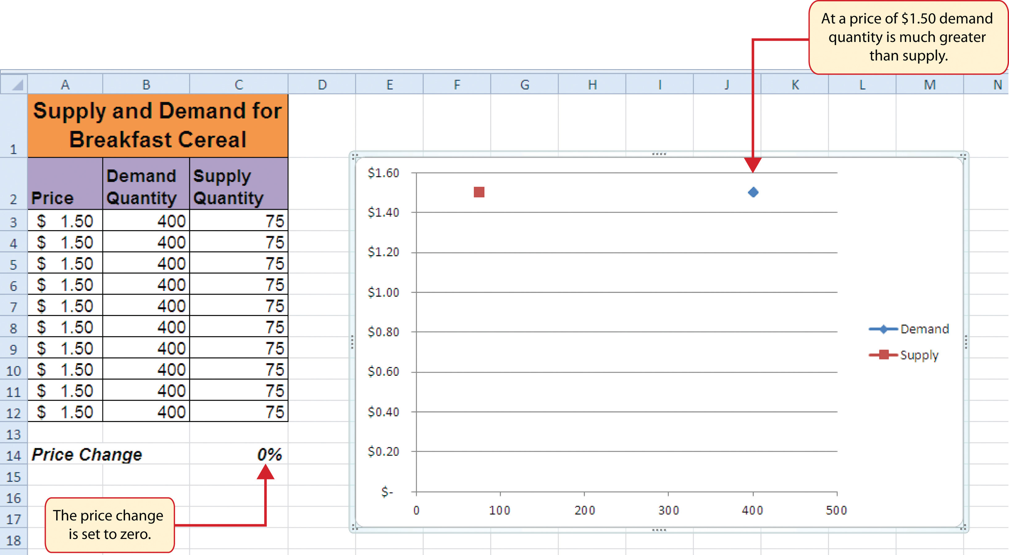
- Change the value in cell C14 on the Supply & Demand worksheet to zero.
- Activate cell E1 on the Supply & Demand worksheet. It is important to note that this cell location is not adjacent to any data on the worksheet.
- Click the Scatter button from the Charts group of commands on the Insert tab of the Ribbon.
-
Select the Scatter with Smooth Lines and Markers format from the drop-down list of options (see Figure 4.46 "Selecting a Scatter Chart Format"). This adds a blank chart to the worksheet.
- Click and drag the chart so the upper left corner is in the center of cell E2.
- Resize the chart so the left side is locked to the left side of Column E, the right side is locked to the right side of Column M, the top is locked to the top of Row 2, and the bottom is locked to the bottom of Row 17.
- Click the Design tab in the Chart Tools section of the Ribbon. Then click the Select Data button in the Data group of commands. This opens the Select Data Source dialog box.
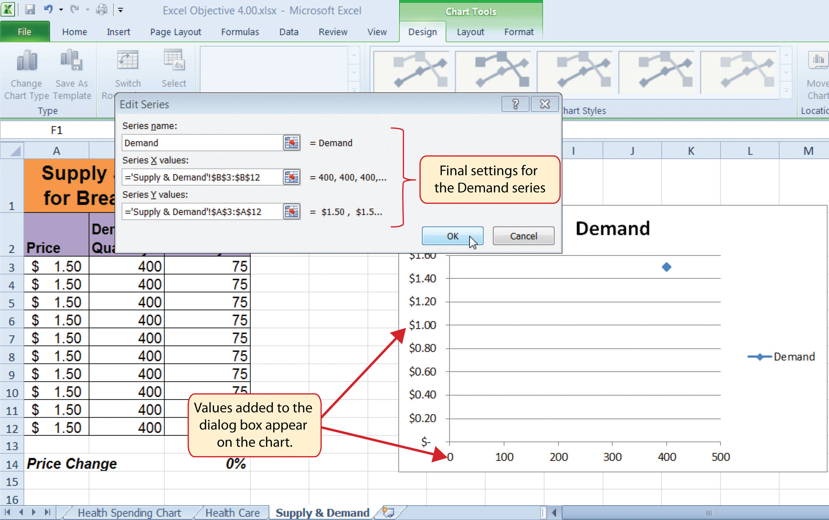
- Click the Add button on the left side of the Select Data Source dialog box. This opens the Edit Series dialog box. Notice on this dialog box there are inputs for defining values for both the X and Y axes. Charts that we previously created using this method only had an input for putting values on the Y axis.
- Type the series name Demand. This should appear in the Series name input box.
- Press the TAB key on your keyboard to advance to the Series X values input box on the Edit Series dialog box.
- Highlight the range B3:B12 on the Supply & Demand worksheet. You will see this range appear in the Series X values input box after it is highlighted.
- Press the TAB key on your keyboard to advance to the Series Y values input box on the Edit Series dialog box.
-
Highlight the range A3:A12 on the Supply & Demand worksheet.
Figure 4.47 "Defining the Demand Data Series" shows the final settings in the Edit Series dialog box for the Demand data series. You will see that as the X and Y axis values are defined in the dialog box, they appear on the chart. The chart in this figure shows the price along the Y axis and quantity along the X axis.
- Click the OK button at the bottom of the Edit Series dialog box.
- Click the Add button on the left side of the Select Data Source dialog box.
- Type the series name Supply. This should appear in the Series name input box.
- Press the TAB key on your keyboard to advance to the Series X values input box on the Edit Series dialog box.
- Highlight the range C3:C12 on the Supply & Demand worksheet. This range appears in the Series X values input box after it is highlighted.
- Press the TAB key on your keyboard to advance to the Series Y values input box on the Edit Series dialog box.
- Highlight the range A3:A12 on the Supply & Demand worksheet.
- Click the OK button at the bottom of the Edit Series dialog box.
- Click the OK button at the bottom of the Select Data Source dialog box.
Why?
For Scatter Charts, Start with a Blank Chart
When creating a scatter chart, it is best to start with a blank chart and add each data series individually. This is because Excel will not always guess correctly which values belong on the X and Y axes since both contain numbers. For other chart types, such as column or line charts, the X axis contains nonnumeric data so it’s easy for Excel to configure the chart you need.
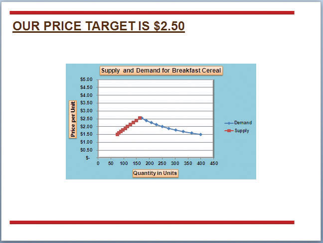
Figure 4.48 "Scatter Chart Showing One Price" shows the appearance of the scatter chart before any formatting enhancements are applied. Notice only two plot points are located on the chart. This is because the price change value in cell C14 is still zero. Therefore, the data are not reflecting any change in price, quantity demanded, or quantity supplied. The chart shows that at the current price of $1.50, suppliers are willing to provide fewer units compared with the number of units consumers are willing to buy.
The following steps explain the formatting enhancements we will apply to the scatter chart shown in Figure 4.48 "Scatter Chart Showing One Price":
- Add a title to the chart by clicking the Chart Title button in the Layout tab of the Chart Tools section of the Ribbon. Use the Above Chart option from the drop-down list.
- Select Subtle Effect - Orange, Accent 6 from the preset style list in the Shape Styles group of commands on the Format tab of the Ribbon.
- Change the font style of the chart title to Arial and the font size to 14 points.
- Change the wording of the chart title as follows: Supply and Demand for Breakfast Cereal.
- Add a title to the Y axis. Use the Rotated Title option from the Primary Vertical Axis Title drop-down list after clicking the Axis Titles button in the Layout tab of the Ribbon.
- Repeat steps 2 and 3 to format the Y axis title. However, change the font size to 12 points.
- Change the wording of the Y axis title as follows: Price per Unit.
- Add a title to the X axis.
- Repeat steps 2 and 3 to format the X axis title. However, change the font size to 12 points.
- Change the wording of the X axis title as follows: Quantity in Units.
- Make the following format changes to the X and Y axis values: font style Arial, font size 11 points, and bold.
-
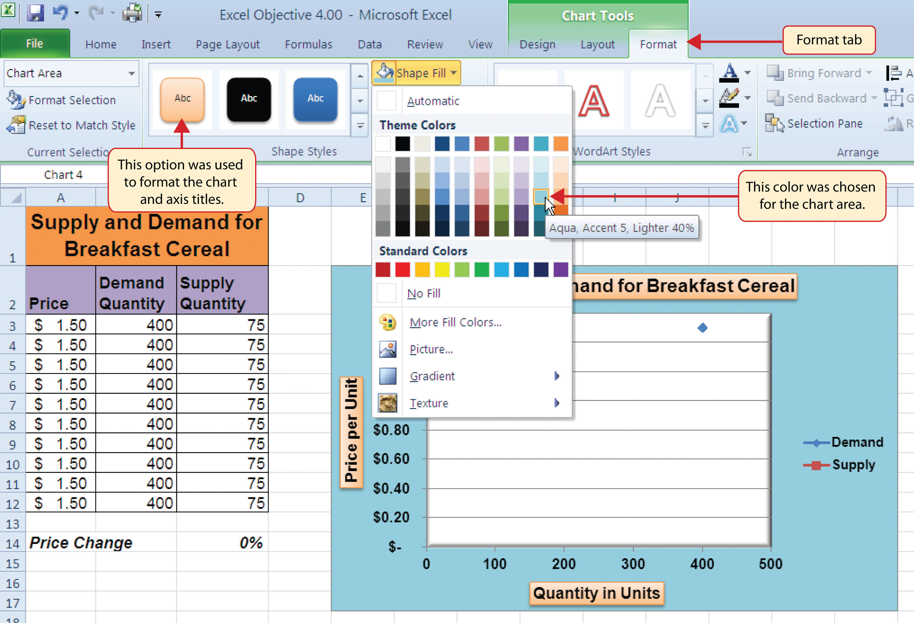
Change the color of the chart area to Aqua, Accent 5, Lighter 40% (see Figure 4.49 "Formatting Enhancements Added to the Scatter Chart").
- Apply a bevel effect to the plot area. Use the Circle format option from the Bevel drop-down list of options.
- Change the font style of the legend to Arial and bold the font.
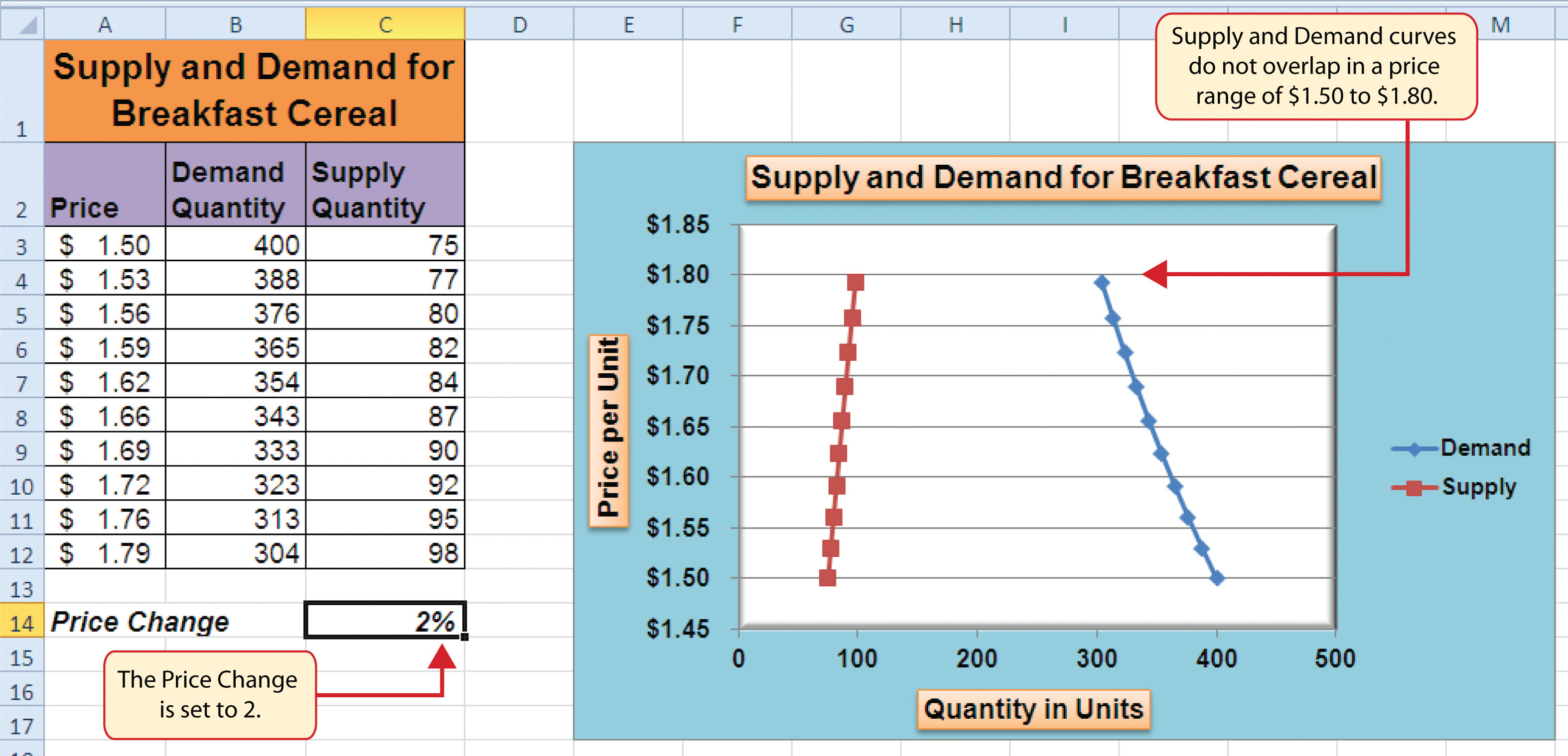
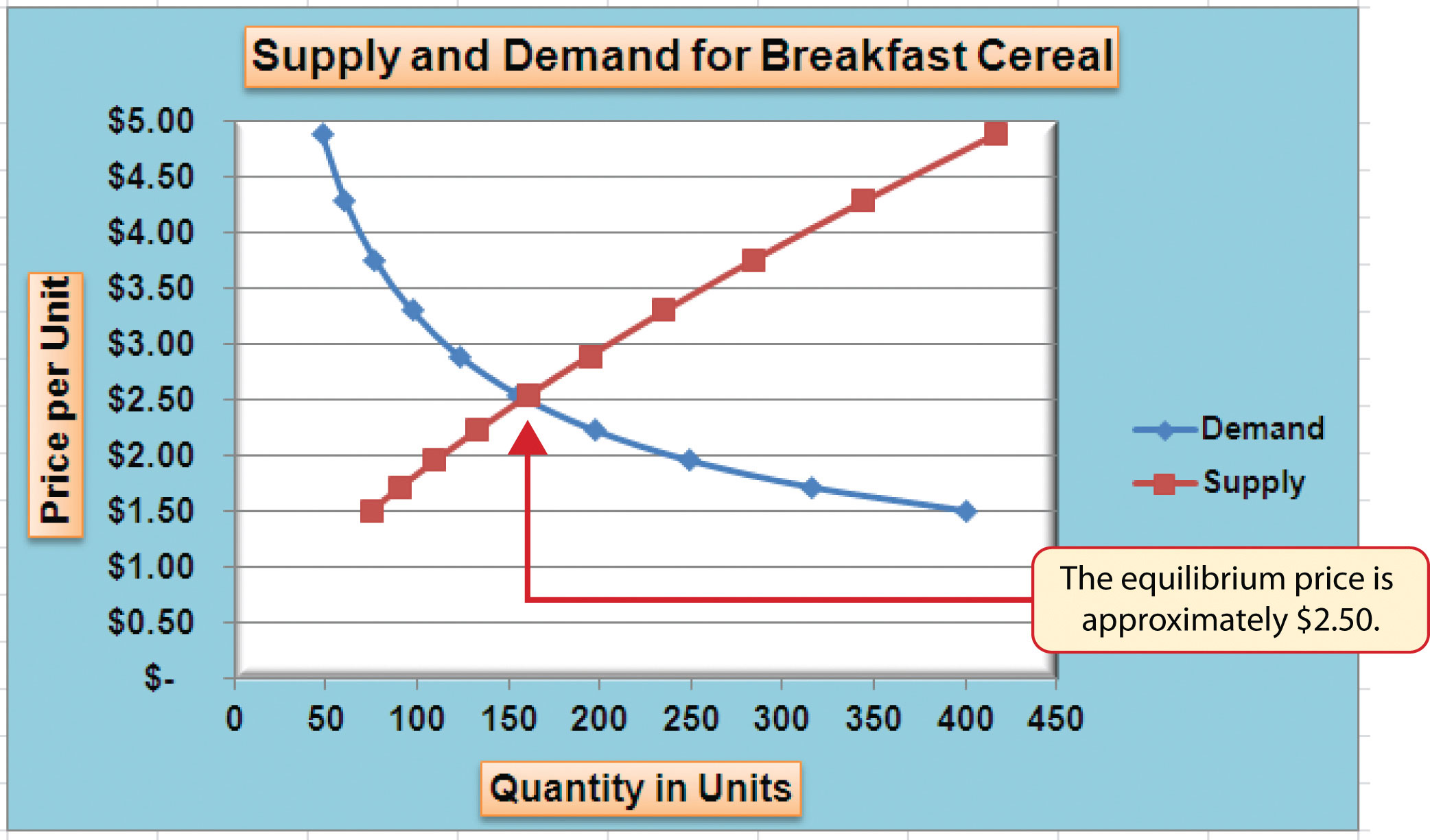
- Change the value in cell C14 to 2. Then change it to 4 and then to 8. Change the value one more time to 14. As you change the values in cell C14, you will see the lines change on the chart.
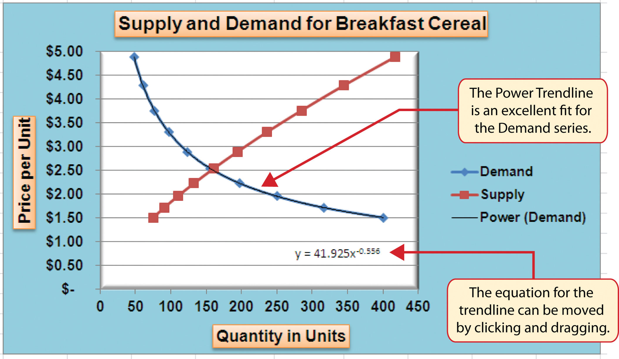
Figure 4.50 "Scatter Chart with Price Change at 2%" shows the completed scatter chart when the Price Change is set to 2%, and Figure 4.51 "Scatter Chart with Price Change at 14%" shows the same chart when the Price Change is set to 14%. The point at which the demand and supply lines intersect on Figure 4.51 "Scatter Chart with Price Change at 14%" is known as the market equilibrium point. The market equilibriumA state in which the quantity demanded equals the quantity supplied at a specific price. is where the quantity demanded equals the quantity supplied at a specific price. The price where quantity demanded equals quantity supplied is referred to as the equilibrium priceThe price where quantity demanded equals quantity supplied..
Skill Refresher: Creating a Scatter Plot Chart
- Click a blank cell that is not adjacent to any data on the worksheet.
- Click the Insert tab of the Ribbon.
- Click the Scatter button in the Charts group of commands.
- Select a format option from the drop-down list.
- Move the blank chart off any cell locations containing data that will be used to create the chart.
- Click the Select Data button in the Design tab of the Chart Tools section of the Ribbon.
- Click the Add button on the Select Data Source dialog box.
- Type a name for the data series in the Series name input box in the Edit Series dialog box.
- Press the TAB key on your keyboard to advance to the Series X values input box.
- Highlight the range of cells on your worksheet that contain values to be plotted on the X axis.
- Press the TAB key on your keyboard to advance to the Series Y values input box.
- Highlight the range of cells on your worksheet that contain values to be plotted on the Y axis.
- Click the OK button in the Edit Series dialog box.
- Repeat steps 7 through 13 for each data series you want to add to the chart.
- Click the OK button at the bottom of the Select Data Source dialog box.
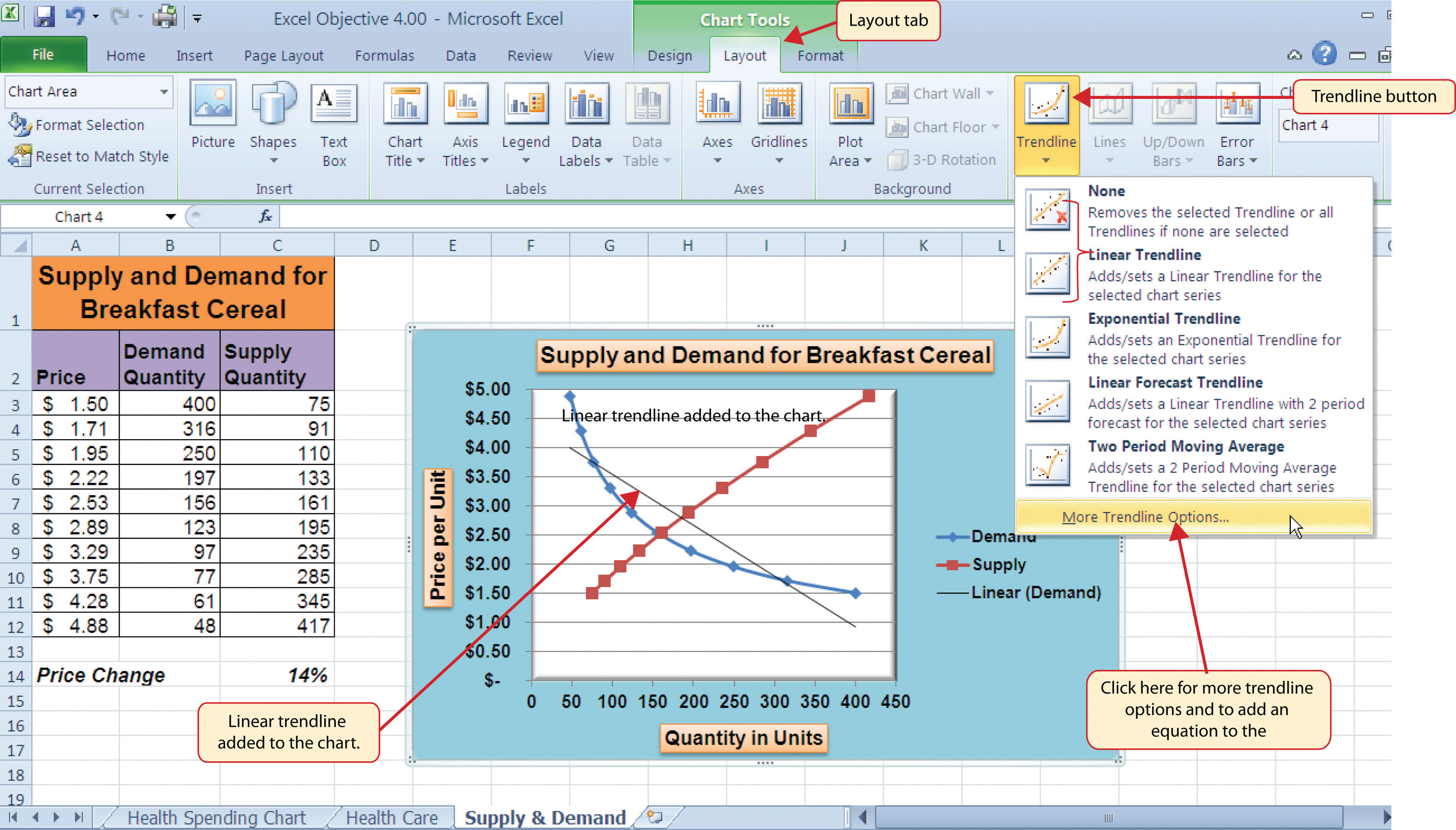
Changing the Scale of the X and Y Axes
Follow-along file: Continue with Excel Objective 4.00. (Use file Excel Objective 4.15 if starting here.)
Lesson Video: Changing the Scale of the X and Y Axes
For all the charts demonstrated in this chapter, Excel has automatically established the scale for the Y axis. For scatter charts, Excel has also established the scale for the X axis. The axis scaleThe minimum and maximum value that appears on the X or Y axis of a chart. is the minimum and maximum value that appears on an axis. For example, in Figure 4.51 "Scatter Chart with Price Change at 14%", the Y axis scale is set to a minimum value of zero and a maximum value of 6.00. Although this is a very convenient feature of Excel, you may want to change the scale in some instances. If you change the value in cell C14 on the Supply & Demand worksheet, the lines jump or shift on the plot area of the chart. This is because Excel keeps rearranging the scale of both the X and Y axes. When studying the shape of lines, it is best to set the scale so it does not change. The following steps explain how to accomplish this:
- Change the value in cell C14 on the Supply & Demand worksheet to zero.
- Click anywhere on the Y axis of the chart.
- Click the Format Selection button in the Layout tab of the Chart Tools section of the Ribbon. This opens the Format Axis dialog box.
- Click the Fixed option next to the Minimum setting under the Axis Options in the Format Axis dialog box. This ensures that the minimum value for the Y axis will always be zero.
- Click the Fixed option next to the Maximum setting under the Axis Options in the Format Axis dialog box.
- Click in the input box next to the Maximum setting. Remove the 1.6 and enter the number 5.0. We will not be studying the behavior of supply and demand beyond a $5.00 price point, so there is no need to extend the Y axis beyond this point.
- Click the Fixed option next to the Major Unit setting under the Axis Options in the Format Axis dialog box.
- Click in the input box next to the Major Unit setting and change the value from 0.2 to 0.5 (see Figure 4.52 "Setting the Y Axis Scale"). This allows us to measure the plot points in $0.50 intervals along the Y axis. When the axis extends to $5.00, $0.20 intervals may place too many values along the Y axis, making it difficult to read.
-
Click the Close button at the bottom of the Format Axis dialog box.
- Click anywhere along the X axis of the chart.
- Click the Format Selection button in the Layout tab of the Chart Tools section of the Ribbon. This opens the Format Axis dialog box for the X axis.
- Click the Fixed option next to the Minimum setting under the Axis Options in the Format Axis dialog box. This ensures that the minimum value for the X axis will always be zero.
- Click the Fixed option next to the Maximum setting under the Axis Options in the Format Axis dialog box.
- Click in the input box next to the Maximum setting. Remove the 500.0 and enter the number 450.0. The number of units supplied or demanded will not exceed 450 based on the price points in our study. There is no need to extend the X axis to 500.
- Click the Fixed option next to the Major Unit setting under the Axis Options in the Format Axis dialog box.
- Click in the input box next to the Major Unit setting and change the value from 100.0 to 50.0. This allows us to measure the plot points in 50-unit intervals along the X axis.
- Click the Close button at the bottom of the Format Axis dialog box.
- Change the value in cell C14 to 2. Then change it to 4 and then to 8. Change the value one more time to 14. As you change the values in cell C14, the lines change but they no longer jump or shift since the scale of both axes is fixed.
Figure 4.53 "Final Appearance of the Scatter Chart" shows the final appearance of the scatter chart after the scale is set for both the X and Y axes. Notice that market equilibrium is achieved at a price of approximately $2.50.
Adding a Trendline and Equation
Follow-along file: Continue with Excel Objective 4.00. (Use file Excel Objective 4.16 if starting here.)
Lesson Video: Trendline and Equation
A trendline can be applied to a chart to estimate or predict where plot points may occur at various points along the X and Y axes. Excel enables you to add a trendline to a chart and also provides the equation you can use to plot additional points. The following steps explain how to accomplish this:
- Set the value in cell C14 on the Supply & Demand worksheet to 14.
- Click anywhere in the chart area of the scatter chart to activate it.
- Click the Trendline button in the Layout tab of the Ribbon. Select the Linear Trendline option from the drop-down list.
-
Select the Demand option from the Add Trendline dialog box and click the OK button. This adds a new line to the plot area of the chart as well as the legend.
Figure 4.54 "Adding a Linear Trendline" shows the scatter chart after adding a linear trendline. Notice that the line goes through only two points on the demand line. This indicates that this trendline may not be a good fit for the line that has been created on the chart.
Finding the right shape for a trendline may require trying a few different options. As shown in Figure 4.54 "Adding a Linear Trendline", the linear trendline is not a good fit for the shape of the demand line. The remaining steps will demonstrate how to remove a trendline and access more trendline options:
- Click the Trendline button in the Layout tab of the Ribbon. Select the None option from the drop-down list. This removes the trendline from the chart.
- Click the Trendline button in the Layout tab of the Ribbon again. This time, select More Trendline Options from the drop-down list.
- Select the Demand option from the Add Trendline dialog box and click OK. This opens the Format Trendline dialog box.
- Select the Power option from the Format Trendline dialog box.
- Click the “Display Equation on chart” option at the bottom of the Format Trendline dialog box (see Figure 4.55 "The Format Trendline Dialog Box").
- Click the Close button at the bottom of the Format Trendline dialog box.
Figure 4.56 "Scatter Chart with a Power Trendline" shows the scatter chart with the Power trendline added for the demand series. Notice that the line fits perfectly over the demand series in the plot area. In fact, it may be difficult to see the line in the figure. This indicates that the trendline is an excellent fit for the demand line. As a result, we can be confident in using this line to predict other demand values along the X and Y axes. You can also see that the equation for this trendline has been added to the plot area of the chart. We can use the equation to calculate the price for each quantity value substituted for X. For example, if the number 150 is substituted for X in the equation, the result is a price of $2.59. Based on the values used to create the chart, this result appears to be accurate.
Skill Refresher: Adding a Trendline
- Click anywhere on the chart area.
- Click the Layout tab of the Ribbon.
- Click the Trendline button.
- Select one of the preset trendline options from the drop-down list or select More Trendline Options to open the Add Trendline dialog box.
- Select a data series in the Add Trendline dialog box and click the OK button.
- Select the “Display Equation on chart” option from the Format Trendline dialog box to add the trendline equation to the chart.
- Click the Close button at the bottom of the dialog box.
Key Takeaways
- When creating a scatter chart, it is best to start with a blank chart and add each data series individually. The highlight and click method is less reliable since numeric values are assigned to both the X and Y axes. As a result, Excel often guesses incorrectly which values are assigned to the X and Y axes.
- Finding the best fit for a trendline is often a matter of trial and error. You may have to try a few different trendlines to determine which form is the best fit for your data series.
- You must open the Format Trendline dialog box to add the line equation to the plot area of the chart.
Exercises
-
Which of the following is the best chart type to use if you need to create a line chart where both the X and Y axes contain numeric values?
- line chart
- scatter chart
- either a line chart or a scatter chart
- area chart
-
Which of the following methods allows you to set the scale of the Y axis?
- Activate the Y axis and click the Scale button in the Page Layout tab of the Ribbon.
- Activate the Y axis and click the Format Selection button in the Layout tab of the Ribbon.
- Activate the Y axis and click the Axes button in the Layout tab of the Ribbon; select the Primary Vertical Axis option and then select More Primary Vertical Axis Options.
- Both B and C are correct.
4.4 Using Charts with Microsoft® Word® and Microsoft® PowerPoint®
Learning Objectives
- Learn how to paste an image of an Excel chart into a Word document.
- Learn how to paste a link to an Excel chart into a PowerPoint slide.
Charts that are created in Excel are commonly used in Microsoft Word documents or for presentations that use Microsoft PowerPoint slides. Excel provides options for pasting an image of a chart into either a Word document or a PowerPoint slide. You can also establish a link to your Excel charts so that if you change the data in your Excel file, it is automatically reflected in your Word or PowerPoint files. We will demonstrate both methods in this section.
Pasting a Chart Image into Word
Lesson Video: Pasting a Chart Image into Word
Excel charts can be valuable tools for explaining quantitative data in a written report. Reports that address business plans, public policies, budgets, and so on all involve quantitative data. For this example, we will assume that the Change in Health Care Spend Source stacked column chart (see Figure 4.44 "Completed Stacked Column Chart with Annotations") is being used in a written policy report. The following steps demonstrate how to paste an image, or picture, of this chart into a Word document:
- Click below the figure heading in the Word document that reads: Figure 6: Health Care Spending in the U.S. The image of the stacked column chart will be placed below this heading.
- Open the Excel Objective 4.16 follow-along file.
- Activate the Change in Health Care Spend Source chart in the Health Spending Chart worksheet.
- Click the Copy button in the Home tab of the Ribbon.
- Go back to the Excel Objective 4.17 Word document by clicking the file in the taskbar.
- Click the drop-down arrow below the Paste button in the Home tab of the Ribbon. Click the Picture option from the drop-down list, which is the last option on the far right (see Figure 4.57 "Paste Picture Option for Word").
- Click anywhere on the picture of the chart to activate it.
-
Click the Format tab under the Picture Tools section of the Ribbon (see Figure 4.58 "Changing the Size of a Picture in Word").
- Click the down arrow on the Shape Width button in the Size group of commands (see Figure 4.58 "Changing the Size of a Picture in Word"). Continue to click the down arrow until the width of the picture is 5.5. As you reduce the width of the picture, the height is automatically reduced as well.
Figure 4.59 "Final Appearance of Pasting a Chart Image into Word" shows the final appearance of the Change in Health Care Spend Source chart pasted into a Word document. It is best to use either the Shape Width or Shape Height buttons to reduce the size of the chart. Using either button automatically reduces the height and width of the chart in proper proportion. If you choose to use the sizing handles to resize the chart, holding the SHIFT key while clicking and dragging on a corner sizing handle will also keep the chart in proper proportion.
Skill Refresher: Pasting a Chart Image into Word
- Activate an Excel chart and click the Copy button in the Home tab of the Ribbon.
- Click on the location in the Word document where the Excel chart will be pasted.
- Click the down arrow of the Paste button in the Home tab of the Ribbon.
- Click the Picture option from the drop-down list.
- Click the Format tab in the Picture Tools section of the Ribbon.
- Resize the picture by clicking the up or down arrow on the Shape Width or Shape Height buttons.
Pasting a Linked Chart Image into PowerPoint
Lesson Video: Pasting a Linked Chart Image into PowerPoint
Microsoft PowerPoint is perhaps the most commonly used tool for delivering live presentations. The charts used in a live presentation are critical for efficiently delivering your ideas to an audience. Similar to written documents, a wide range of presentations may require the explanation of quantitative data. This demonstration includes a PowerPoint slide that could be used in a presentation for setting prices for a hypothetical breakfast cereal company. We will paste the scatter chart showing the supply and demand for breakfast cereal into this PowerPoint slide. However, instead of pasting an image, as demonstrated in the Word document, we will establish a linkA dynamic connection between two files, worksheets, or cell locations. Any change in the source file will be reflected in the file, worksheet, or cell that contains the link. to the Excel file. As a result, if we change the chart in the Excel file, the change will be reflected in the PowerPoint file. The following steps explain how to accomplish this:
- Open the Excel Objective 4.16 follow-along file.
- Activate the scatter chart in the Supply & Demand worksheet.
- Click the Copy button in the Home tab of the Ribbon.
- Go back to the Excel Objective 4.18 PowerPoint file by clicking the file in the taskbar.
- Click the down arrow below the Paste button in the Home tab of the Ribbon in the PowerPoint file.
-
Select the Keep Source Formatting & Link Data option from the drop-down list (see Figure 4.60 "Creating a Link to an Excel Chart in PowerPoint"). This pastes an image of the Excel chart into the PowerPoint slide. In addition, a link is created so that any changes made to the chart appear on the PowerPoint slide.
-
Click anywhere in the plot area of the scatter chart pasted into the PowerPoint slide. You will see the same Excel Chart Tools tabs added to the Ribbon (see Figure 4.61 "Modifying an Excel Chart Pasted into a PowerPoint Slide").
- Click the down arrow next to the Shape Fill button in the Format tab of the Ribbon. Select the white color block from the palette (see Figure 4.61 "Modifying an Excel Chart Pasted into a PowerPoint Slide").
- Go back to the Excel Objective 4.16 file by clicking it in the taskbar.
- In the Supply & Demand worksheet, change the value in cell C14 to 6.
- Go back to the Excel Objective 4.18 PowerPoint file by clicking it in the taskbar.
- Click the Design tab in the Chart Tools section of the Ribbon. Click the Refresh Data button (see Figure 4.62 "Refreshing a Linked Excel Chart Pasted into a PowerPoint Slide"). The change made in the Excel workbook is now reflected on the PowerPoint slide.
Integrity Check
Refreshing Linked Charts in PowerPoint and Word
When creating a link to a chart in Word or PowerPoint, you must refresh the data if you make any changes in the Excel workbook. This is especially true if you make changes in the Excel file prior to opening the Word or PowerPoint file that contains a link to a chart. To refresh the chart, make sure it is activated, then click the Refresh Data button in the Design tab of the Ribbon. Forgetting this step can result in old or erroneous data being displayed on the chart.
Figure 4.62 "Refreshing a Linked Excel Chart Pasted into a PowerPoint Slide" shows the appearance of the scatter chart in the PowerPoint slide after the color of the plot area was changed back to white. Figure 4.63 "Final Chart Linked to a PowerPoint Slide" shows the appearance of the scatter plot after the change was made in the Supply & Demand worksheet in the Excel file. The change that was made in the Excel file will appear in the PowerPoint file after clicking the Refresh Data button.
Integrity Check
Severed Link?
When creating a link to an Excel chart in Word or PowerPoint, you must keep the Excel workbook in its original location on your computer or network. If you move or delete the Excel workbook, you will get an error message when you try to update the link in your Word or PowerPoint file. You will also get an error if the Excel workbook is saved on a network drive that your computer cannot access. These errors occur because the link to the Excel workbook has been severed. Therefore, if you know in advance that you will be using a USB drive to pull up your documents or presentation, move the Excel workbook to your USB drive before you establish the link in your Word or PowerPoint file.
Skill Refresher: Pasting a Linked Chart Image into PowerPoint
- Activate an Excel chart and click the Copy button in the Home tab of the Ribbon.
- Click in the PowerPoint slide where the Excel chart will be pasted.
- Click the down arrow of the Paste button in the Home tab of the Ribbon.
- Click the Keep Source Formatting & Link Data option from the drop-down list.
- Click the Refresh Data button in the Design tab of the Ribbon to ensure any changes in the Excel file are reflected in the chart.
Key Takeaways
- When pasting an image of an Excel chart into a Word document or PowerPoint file, use the Picture option from the Paste drop-down list of options.
- When creating a link to a chart in Word or PowerPoint, you must refresh the data if you make any changes in the Excel workbook.
Exercises
-
When pasting an image of an Excel chart into a Word document, which of the following commands would you use?
- Click the Paste button in the Home tab of the Ribbon.
- Click the down arrow below the Paste button in the Home tab of the Ribbon, and select the Picture option from the drop-down list.
- Click the down arrow below the Paste button in the Home tab of the Ribbon, and select the Embed Workbook option from the drop-down list.
- Click the Object button in the Insert tab of the Ribbon.
-
Which of the following is true with respect to creating a linked chart image in a PowerPoint slide?
- The image will always reflect any changes that are made in the Excel workbook.
- You will not be able to run PowerPoint in slide show mode unless the Excel workbook is open.
- You must activate the image and click the Refresh Data button in the Design tab of the Ribbon to ensure any changes made in the Excel workbook are reflected in the image pasted into the PowerPoint slide.
- You must have the Excel workbook open in order for the image to be refreshed in the PowerPoint slide.
4.5 Chapter Assignments and Tests
To assess your understanding of the material covered in the chapter, please complete the following assignments.
Careers in Practice (Skills Review)
Fashion Industry Size Analysis (Comprehensive Review Part A)
Starter File: Chapter 4 CiP Exercise 1
Difficulty: Level 1 Easy
If you are contemplating a career in the fashion industry, you will likely be working with an apparel size analysis report. Understanding the most commonly purchased sizes is critical for any company in the fashion industry. For example, in the apparel manufacturing industry, you have to know how many units to manufacture in each size for a particular garment. In addition, you have to know the exact garment specifications for the sizes small, medium, large, and so on. If you are pursuing a career on the retail side of the fashion industry, your job may be a little more complicated. You have to know how many units of each size of a particular garment to ship to each store. There is nothing more devastating to a fashion company’s sales than luring customers into a store with a great-looking garment and not having their sizes available. The charts presented in this chapter can be valuable tools in analyzing size information for garments. This exercise uses the concept of the frequency distribution and frequency comparison to analyze demand by garment size for the knit tops department of an apparel manufacturing company. The information displayed on these charts can be used to establish the production plan for manufacturing the garments for this department. Begin this exercise by opening the file named Chapter 4 CiP Exercise 1.
- Highlight the range A4:A8 on the Size Analysis worksheet.
- Hold down the CTRL key on your keyboard and highlight the range C4:C8.
- Click the Column button in the Insert tab of the Ribbon. Select the 2-D Clustered Column format option from the drop-down list.
- Move the column chart to a new chart sheet by clicking the Move Chart button in the Design tab of the Ribbon. The sheet tab label should read Tops Size Chart.
- Remove the legend by clicking it once and pressing the DELETE key on your keyboard.
- Click the Chart Title button in the Layout tab of the Chart Tools section of the Ribbon. Select the Above Chart option from the drop-down list.
- Format the chart title by selecting Subtle Effect - Red, Accent 2 from the preset shape style formats in the Format tab of the Ribbon. Change the font style of the chart title to Arial and change the font size to 24 points.
- Click in the chart title and delete text. Type Knit Tops Unit Sales by Size.
- Click any of the bars in the plot area of the chart. Click the down arrow on the Shape Fill button in the Format tab of the Ribbon. Select the Tan, Background 2, Darker 25% color from the drop-down palette.
- Click the Data Labels button in the Layout tab of the Ribbon. Select the Inside End option from the drop-down list.
- Click any data label on the bars of the chart one time. Use the formatting commands in the Home tab of the Ribbon to change the font style to Arial, change the font size to 14 points, and bold the font.
- Use the formatting commands in the Home tab of the Ribbon to format the X and Y axes. Click anywhere on the axis to activate it. Then change the font style to Arial, change the font size to 14 points, and bold the font.
- Click anywhere on the plot area of the chart to activate it. Click and drag down the top center sizing handle approximately one inch. There should be about one inch of space between the bottom of the chart title and the top of the plot area.
- Click the Text Box button in the Insert tab of the Ribbon. Starting from the far upper left side of the chart area, approximately one-half inch below the top, click and drag a box that is approximately two and a half inches wide and one-half inch high.
- Format the text box using the commands in the Home tab of the Ribbon. Change the font style to Arial, change the font size to 12 points, and select the bold and italics commands.
- Type the following in the text box: Based on 2010 Unit Sales.
- Click cell G4 on the Size Analysis worksheet.
- Click the Column button in the Insert tab of the Ribbon and select the 3-D Clustered Column format from the drop-down list.
- Move the chart so the upper left corner is in the center of cell G2.
- Resize the chart so the left side is locked to the left side of Column G, the right side is locked to the right side of Column N, the top is locked to the top of Row 2, and the bottom is locked to the bottom of Row 18.
- Click the Select Data button in the Design tab of the Ribbon.
- Click the Add button on the Select Data Source dialog box.
- Type Knit Tops in the Series name input box. Then press the TAB key on your keyboard, highlight the range C4:C8, and click the OK button on the Edit Series dialog box.
- Click the Add button again on the Select Data Source dialog box.
- Type the word Company in the Series name input box. Then press the TAB key on your keyboard, highlight the range E4:E8, and click the OK button on the Edit Series dialog box.
- Click the Edit button on the right side of the Select Data Source dialog box.
- Highlight the range A4:A8 and click the OK button on the Axis Labels dialog box. Then click the OK button on the Select Data Source dialog box.
- Add a chart title above the plot area of the chart. The title should state the following: Size Comparison 2010 Unit Sales. Select the Underline command in the Home tab of the Ribbon.
- Add a title to the Y axis. Select the Rotated Title format from the drop-down list under the Primary Vertical Axis Title option in the Axis Titles button on the Layout tab of the Ribbon. The title should state: Percent of Total Unit Sales. Change the font size of the title to 12 points and select the Underline command in the Home tab of the Ribbon.
- Click anywhere on the Y axis to activate it. Then click the Format Selection button in the Layout tab of the Ribbon.
- Click the Number option on the left side of the Format Axis dialog box. Click in the Decimal Places input box and change the value to zero. Then click the Close button at the bottom of the Format Axis dialog box.
- Use the formatting commands in the Home tab of the Ribbon to format the X and Y axes. Click anywhere on the axis to activate it. Then change the font size to 12 points and bold the font.
- Click and drag the legend so the top border of the legend aligns with the top line of the chart plot area. Use the formatting commands in the Home tab of the Ribbon to increase the font size of the legend to 12 points and select the bold and italics commands.
- Click anywhere on the plot area to activate it. Then click the down arrow on the Shape Fill button in the Format tab of the Ribbon. Select the Tan, Background 2, Darker 10% option from the color palette.
- Click any of the bars representing the Knit Tops data series. Then click the down arrow on the Shape Fill button in the Format tab of the Ribbon. Select the Olive Green, Accent 3, Lighter 40% option from the color palette.
- Save the workbook by adding your name in front of the current workbook name (i.e., “your name Chapter 4 CiP Exercise 1”).
- Close the workbook and Excel.
Careers in Practice (Skills Review)
Fashion Retail Markdown Analysis (Comprehensive Review Part B)
Starter File: Chapter 4 CiP Exercise 1 (Continued from Comprehensive Review Part A)
Difficulty: Level 2 Moderate
The following exercise continues the fashion industry theme that was presented in part A of this exercise. In this exercise, we focus on the retail side of the fashion industry. Markdowns are a critical component for operating a successful fashion retail business. When an item is marked down, the price is reduced by a certain amount with the expectation that it will increase the number of units sold. This is also known as putting an item on sale. You have probably seen, and perhaps taken advantage of, these sales during a visit to your local mall. A surplus of inventory can present considerable losses for a fashion retailer. Therefore, the timing and the amount of discount taken on an item is critical in managing the inventory for these companies. The increase in the number of units sold will depend on the size of the discount offered on a particular item. The scatter chart demonstrated in this chapter is a valuable tool in analyzing the rate at which unit sales increase when discounts are offered on an item. Begin this exercise by opening the file named Chapter 4 CiP Exercise 1 or continue with this file if you completed Comprehensive Review Part A.
- Click cell E2 on the Markdown Analysis worksheet.
- Click the Scatter button on the Insert tab of the Ribbon. Select the Scatter with Smooth Lines and Markers format option.
- Move the chart so the upper left corner is in the center of cell E2.
- Resize the chart so the left side is locked to the left side of Column E, the right side is locked to the right side of Column M, the top is locked to the top of Row 2, and the bottom is locked to the bottom of Row 18.
- Click the Select Data button in the Design tab of the Ribbon. Then click the Add button on the Select Data Source dialog box.
-
Complete the inputs for the Edit Series dialog box as follows:
- Series Name: Markdowns and Unit Sales
- Series X Values: A3:A17
- Series Y Values: C3:C17
- Click the OK button on the Edit Series and Select Data Source dialog boxes.
- Remove the legend from the chart.
- Click anywhere on the Y axis to activate it. Click the Format Selection button in the Format tab of the Ribbon.
- Change the scale of the Y axis so the minimum value is set to 100 units. Then click the Close button at the bottom of the Format Axis dialog box.
- Change the scale of the X axis so the maximum value is set to 70%.
- Format the X and Y axes to an Arial font style, bold, and font size of 12 points.
- Add an X axis title that reads Discount Applied to Original Price. Format the title with the Subtle Effect - Blue, Accent 1 preset shape style. Change the font style to Arial, bold, italics, and font size of 12 points.
- Add a Y axis title that reads Weekly Unit Sales. Use the Rotated Title alignment. Format the title with the Subtle Effect - Blue, Accent 1 preset shape style. Change the font style to Arial, bold, italics, and font size of 12 points.
- Format the chart title with the Subtle Effect - Blue, Accent 1 preset shape style. Change the font style to Arial and change the font size to 16 points.
- Change the color of the chart area to Tan, Background 2, Darker 25%. Notice that when a discount is offered up to 20% off the original price, there is very little change in the number of units sold. This is typical in the fashion industry. If customers are not willing to pay full price for a particular style or color, it usually takes a substantial discount to convince them to buy.
- Save the workbook.
- Close the workbook and Excel.
Careers in Practice (Skills Review)
Personal Spending and Savings Plan
Starter File: Chapter 4 CiP Exercise 2
Difficulty: Level 2 Moderate
Excel can be a valuable tool for constructing a personal budget. As mentioned in Chapter 2 "Mathematical Computations", developing a personal budget is an important exercise for establishing a path to financial security. One of the benefits of developing and maintaining a personal budget is that it allows you to maintain a healthy level of savings. Money that you save can be used to buy personal items. However, it can also be used to sustain your everyday expenses in the event you lose a job or source of income. Without a reasonable level of savings, you may be forced to borrow money, which could come at very high interest expenses in the form of credit cards. Once you accumulate large debt balances at high interest rates, it can take years to pay off that debt, and the interest expense that you pay reduces savings for more important purposes such as college or retirement. What most people do not realize is that even what appears to be the most trivial overage in spending can rapidly eliminate any savings and quickly turn into debt. The purpose of this exercise is to use the charts in this chapter to evaluate a personal expense plan and to analyze the relationship that spending and net income have on your ability to save money. Begin this exercise by opening the file named Chapter 4 CiP Exercise 2.
- Create a pie chart using the data in the Expense Plan worksheet. The chart should show the percent of total for the categories in the range A3:A10 based on the Annual Spend values in the range D3:D10. Use the Exploded Pie in 3-D format.
- Move the pie chart to a separate chart sheet. The tab name for the chart sheet should read Expense Chart.
- Remove the legend from the chart.
- Edit the title of the chart to read Personal Expenses. Format the chart title with an Arial font style, bold, italics, and font size of 20 points.
- Add data labels to each section of the pie chart. Show only the category name and the percentage. Format the percentage to show one decimal place.
- Format the data labels with an Arial font style, bold, and font size of 14 points. Notice that the mortgage and tax categories make up over 50% of total expenses.
- Enter a formula into cell D4 on the Savings worksheet. Your formula should add to the savings balance in cell D2 the result of subtracting the spending value in cell C4 from the net income value in cell B4.
- Enter a formula into cell D5 on the Savings worksheet. Your formula should add to the output in cell D4 the result of subtracting the spending value in cell C5 from the net income value in cell B5. Copy this formula and paste it into the range D6:D15 using the Paste Formulas command.
- Create a line chart using the data in the Savings worksheet. The chart should show the months in the range A4:A15 along the X axis. The Y axis should show the dollar amounts in the range B4:D15. There should be three data series displayed on the chart: Net Income, Spending, and Savings. Use the Line with Markers format option.
- Move the chart so the upper left corner is in the center of cell F3.
- Resize the chart so the left side is locked to the left side of Column F, the right side is locked to the right side of Column O, the top is locked to the top of Row 3, and the bottom is locked to the bottom of Row 18.
- Add a chart title above the plot area that reads Savings Analysis. Format the title with the Subtle Effect - Red, Accent 2 preset shape style. Then change the font style to Arial, bold, and italics.
- Add a title to the Y axis that reads After Tax Dollars. Use the Rotated Title alignment option. Format the title with the Subtle Effect - Red, Accent 2 preset shape style. Then, change the font style to Arial and change the font size to 12 points. Move the title if needed so it is on the far left of the chart area and centered along the Y axis.
- Format the X and Y axes by changing the font style to Arial, making the font bold, and changing the font size to 12 points.
- Change the scale of the Y axis so the minimum value is set to −500.
- Move the legend up so it is aligned with the $4,500 line of the plot area. Expand the width of the legend so it extends to the far right side of the chart area. Then format the legend by changing the font style to Arial and making the font bold.
- Change the color of the chart area to White, Background 1, Darker 15%, which is a shade of gray.
- Add an annotation that begins approximately one inch above the Dec label on the X axis. The annotation should extend approximately one and one-quarter inches wide and approximately one-quarter inch in height. The annotation should read Debt Incurred. Format the annotation by changing the font style to Arial, bold, italics, and font size of 12 points.
- Save the workbook by adding your name in front of the current workbook name (i.e., “your name Chapter 4 CiP Exercise 2”).
- Close the workbook and Excel.
Integrity Check
Starter File: Chapter 4 IC Exercise 3
Difficulty: Level 3 Difficult
The purpose of this exercise is to analyze a worksheet to determine if there are any integrity flaws. Read the following scenario, then open the Excel workbook related to this exercise. You will find a worksheet in the workbook named AnswerSheet. This worksheet is to be used for any written responses required for this exercise.
Scenario
You are working as the director of investment research for a small wealth management firm. Your firm helps people make investment decisions and establish plans for key life events such as saving for college, retirement, and so on. An intern who is working for the firm is evaluating the profit trends for two companies: Big Company and Goode Company. He sends you an Excel workbook and explains the following with respect to his analysis:
- I put a chart together to compare the earnings for the two companies. There is really nothing to look at. Big Company’s profits are so much larger than those for the Goode Company. Based on this chart, I don’t see how we would advise our clients to invest in the Goode Company. We should probably stick with the Big Company.
- Just so you know, the profit numbers on the chart are in thousands. Otherwise, it is a pretty straightforward column chart. I put the profits the companies earned for each quarter on the Y axis and the quarters are shown on the X axis.
Assignment
- How many points of data is the analyst using on the chart? Does it make sense to use a column chart for this analysis? If not, what would be a better choice? Place your answer in the AnswerSheet worksheet.
- Look at the profit values for the two companies. Does it make sense to compare these values? If not, explain why and what alternatives you could pursue. Place your answer in the AnswerSheet worksheet.
- The analyst mentioned that the profit numbers are in terms of thousands. Would this be apparent by looking at the chart? If not, why? Place your answer in the AnswerSheet worksheet.
- Looking at the X axis of the column chart, you will see that the quarters keep repeating 1 through 4 for each year in Column A. Can anything be done to show the year that each set of four quarters represents? Place your answer in the AnswerSheet worksheet.
- Move the chart created by the analyst to a separate chart sheet and label the sheet tab Analyst’s Chart. Make any necessary modifications to the Profit Analysis worksheet to create a chart that presents an appropriate comparison between the Big Company and the Goode Company. Create a new chart comparing the profits of the Big Company and the Goode Company. Pay careful attention to formatting details.
- Do you agree with the analyst’s conclusion that the firm should advise clients to invest in the Big Company over the Goode Company? Place your answer in the AnswerSheet worksheet.
Applying Excel Skills
Hotel Occupancy and Cleaning Expenses
Starter File: Chapter 4 AES Assignment 1
Difficulty: Level 3 Difficult
The purpose of this exercise is to analyze the activity and cost data for a hotel using a scatter chart. The data provided in the Hotel Costs worksheet can be used to establish a trendline on a scatter chart. The equation for the trendline can then be used to determine what the hotel may incur with regard to cleaning costs at different levels of occupancy. This is an alternative to the High Low method presented in Chapter 2 "Mathematical Computations". Your assignment is to create the scatter chart and construct a formula that can be used for planning cleaning costs at different levels of occupancy based on the following requirements:
- Columns B and C in the Hotel Costs worksheet contain occupancy and cleaning cost data for 12 months. Create a scatter chart that shows just the plot points (Scatter with only Markers) for the occupancy and cleaning costs for each month on this worksheet. The chart should be embedded in the Hotel Costs worksheet and should include the appropriate formatting techniques covered in this chapter.
- Adjust the scale of the X and Y axes so the minimum value is 2000.
- Add a linear trendline to the chart and show the equation.
- Use the trendline equation to enter a formula in cell C19 that calculates the estimated cleaning costs based on the occupancy level that is typed into cell C18.
Quality Control Analysis
Starter File: Chapter 4 AES Assignment 2
Difficulty: Level 3 Difficult
The purpose of this exercise is to analyze how cost changes in the operations of a quality control department impact the overall cost of quality for a manufacturing company. The Quality Control worksheet contains two years of cost data for four components of a quality control department: prevention, inspection, internal failure, and external failure. You will see that total quality costs decreased from year 1 to year 2. Create a chart that you believe is most appropriate to present the change in costs from one year to the next. The requirements are as follows:
- The chart should show which components are increasing or decreasing from year 1 to year 2. In addition, the dollar value for each component should appear on the chart for each year.
- The total quality control costs for each year should be specified on the chart.
- The chart should appear in a separate chart sheet.
- You should include appropriate formatting techniques covered in this chapter.
Chapter Skills Test
Starter File: Chapter 4 Skills Test
Difficulty: Level 2 Moderate
Answer the following questions by executing the skills on the starter file required for this test. Answer each question in the order in which it appears. If you do not know the answer, skip to the next question. Open the starter file listed above before you begin this test.
- Create a pie chart using the data in the Market Share worksheet. The pie chart should show the percent of total for only the year 2000. Use the Exploded Pie in 3-D format.
- Move the chart so the upper left corner is in the center of cell E2.
- Resize the chart so the left side is locked to the left side of Column E, the right side is locked to the right side of Column M, the top is locked to the top of Row 2, and the bottom is locked to the bottom of Row 17.
- Remove the legend.
- Change the chart title to the following: Market Share for the Year 2000.
- Add the Category Name and Percentage data labels to the outside end of each section of the pie chart.
- Bold the data labels and change the font style to Arial.
- Create a 100% stacked column chart using the data in the Market Share worksheet. The stacked column chart should show the percentages 0% to 100% along the Y axis. The X axis should show stacks for the year 2000 and 2010. There should only be two stacks, or columns, in the plot area showing the percent of total for each company.
- Move the 100% stacked column chart to a separate chart sheet. The tab name for the chart sheet should read Market Share Chart.
- Remove the legend on the stacked column chart and add a data table with legend keys below the X axis.
- Add a title above the chart that reads 10-Year Change in Market Share.
- Format the chart title using the Subtle Effect - Red, Accent 2 preset shape style. Change the font style to Arial and the font size to 20 points.
- Add a Y axis title that reads Market Share. Use the Rotated Title alignment.
- Format the Y axis title using the Subtle Effect - Red, Accent 2 preset shape style. Change the font style to Arial and the font size to 16 points.
- Format the X and Y axes by changing the font style to Arial, making the font bold, and changing the font size to 14 points.
- Change the fill color of the chart area to Tan, Background 2, Darker 10%.
- Add series lines that connect each section of the two stacks in the plot area.
- Create a column chart showing just the Company Sales in the Sales Data worksheet. The chart should show the Company Sales in the range B3:B13 along the Y axis. The years in the range A3:A13 should appear on the X axis. Use the basic 2-D Clustered Column format. The series name should be Gross Sales.
- Move the column chart to a separate chart sheet. The tab name for the chart sheet should read Company Sales Chart.
- Remove the legend on the column chart. Then format the X and Y axes by changing the font style to Arial, making the font bold, and changing the font size to 16 points.
- Reduce the height of the plot area by approximately one inch. There should be about one inch of space between the bottom of the chart title and the top of the plot area.
- Add an annotation above the Y axis that reads Sales in Millions. Format the annotation with an Arial font style, bold font, italics font, and font size of 14 points.
- Change the color of the bars in the plot area to dark red.
-
Create a line chart comparing the change in sales for the company and overall industry in the Sales Data worksheet. Construct the chart as follows:
- The Y axis should show the growth percentages for the company in the range C3:C13 and the growth percentages for the industry in the range E3:E13.
- The series name for the company growth percentages should be Company.
- The series name for the industry growth percentages should be Industry.
- The years in the range A3:A13 should appear on the X axis.
- Use the Line with Markers format.
- Move the chart so the upper left corner is in the center of cell G2.
- Resize the chart so the left side is locked to the left side of Column G, the right side is locked to the right side of Column P, the top is locked to the top of Row 2, and the bottom is locked to the bottom of Row 18.
- Adjust the scale of the Y axis so the maximum value is set to .20.
- Format the values on the Y axis so there are zero decimal places.
- Save the workbook by adding your name in front of the current workbook name (i.e., “your name Chapter 4 Skills Test”).
- Close the workbook and Excel.