Much of the analysis in economics deals with relationships between variables. A variable is simply a quantity whose value can change. A graphA pictorial representation of the relationship between two or more variables. is a pictorial representation of the relationship between two or more variables. The key to understanding graphs is knowing the rules that apply to their construction and interpretation. This section defines those rules and explains how to draw a graph.
To see how a graph is constructed from numerical data, we will consider a hypothetical example. Suppose a college campus has a ski club that organizes day-long bus trips to a ski area about 100 miles from the campus. The club leases the bus and charges $10 per passenger for a round trip to the ski area. In addition to the revenue the club collects from passengers, it also receives a grant of $200 from the school’s student government for each day the bus trip is available. The club thus would receive $200 even if no passengers wanted to ride on a particular day.
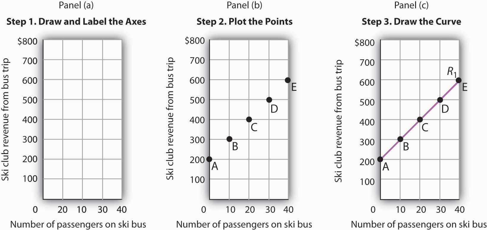
The table in Figure 21.1 "Ski Club Revenues" shows the relationship between two variables: the number of students who ride the bus on a particular day and the revenue the club receives from a trip. In the table, each combination is assigned a letter (A, B, etc.); we will use these letters when we transfer the information from the table to a graph.
Figure 21.1 Ski Club Revenues
The ski club receives $10 from each passenger riding its bus for a trip to and from the ski area plus a payment of $200 from the student government for each day the bus is available for these trips. The club’s revenues from any single day thus equal $200 plus $10 times the number of passengers. The table relates various combinations of the number of passengers and club revenues.
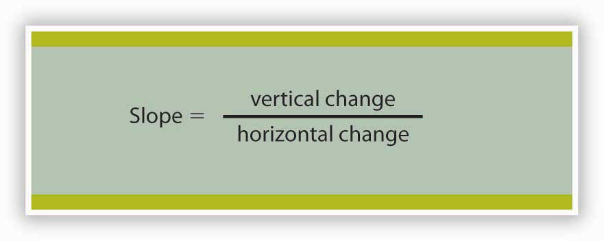
We can illustrate the relationship shown in the table with a graph. The procedure for showing the relationship between two variables, like the ones in Figure 21.1 "Ski Club Revenues", on a graph is illustrated in Figure 21.2 "Plotting a Graph". Let us look at the steps involved.
Figure 21.2 Plotting a Graph
Here we see how to show the information given in Figure 21.1 "Ski Club Revenues" in a graph.
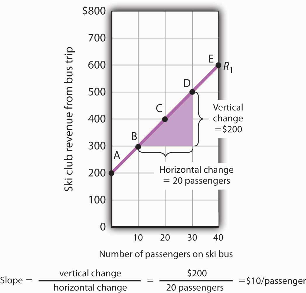
The two variables shown in the table are the number of passengers taking the bus on a particular day and the club’s revenue from that trip. We begin our graph in Panel (a) of Figure 21.2 "Plotting a Graph" by drawing two axes to form a right angle. Each axis will represent a variable. The axes should be carefully labeled to reflect what is being measured on each axis.
It is customary to place the independent variable on the horizontal axis and the dependent variable on the vertical axis. Recall that, when two variables are related, the dependent variable is the one that changes in response to changes in the independent variable. Passengers generate revenue, so we can consider the number of passengers as the independent variable and the club’s revenue as the dependent variable. The number of passengers thus goes on the horizontal axis; the club’s revenue from a trip goes on the vertical axis. In some cases, the variables in a graph cannot be considered independent or dependent. In those cases, the variables may be placed on either axis; we will encounter such a case in the chapter that introduces the production possibilities model. In other cases, economists simply ignore the rule; we will encounter that case in the chapter that introduces the model of demand and supply. The rule that the independent variable goes on the horizontal axis and the dependent variable goes on the vertical usually holds, but not always.
The point at which the axes intersect is called the originThe point at which the axes of a graph intersect. of the graph. Notice that in Figure 21.2 "Plotting a Graph" the origin has a value of zero for each variable.
In drawing a graph showing numeric values, we also need to put numbers on the axes. For the axes in Panel (a), we have chosen numbers that correspond to the values in the table. The number of passengers ranges up to 40 for a trip; club revenues from a trip range from $200 (the payment the club receives from student government) to $600. We have extended the vertical axis to $800 to allow some changes we will consider below. We have chosen intervals of 10 passengers on the horizontal axis and $100 on the vertical axis. The choice of particular intervals is mainly a matter of convenience in drawing and reading the graph; we have chosen the ones here because they correspond to the intervals given in the table.
We have drawn vertical lines from each of the values on the horizontal axis and horizontal lines from each of the values on the vertical axis. These lines, called gridlines, will help us in Step 2.
Each of the rows in the table in Figure 21.1 "Ski Club Revenues" gives a combination of the number of passengers on the bus and club revenue from a particular trip. We can plot these values in our graph.
We begin with the first row, A, corresponding to zero passengers and club revenue of $200, the payment from student government. We read up from zero passengers on the horizontal axis to $200 on the vertical axis and mark point A. This point shows that zero passengers result in club revenues of $200.
The second combination, B, tells us that if 10 passengers ride the bus, the club receives $300 in revenue from the trip—$100 from the $10-per-passenger charge plus the $200 from student government. We start at 10 passengers on the horizontal axis and follow the gridline up. When we travel up in a graph, we are traveling with respect to values on the vertical axis. We travel up by $300 and mark point B.
Points in a graph have a special significance. They relate the values of the variables on the two axes to each other. Reading to the left from point B, we see that it shows $300 in club revenue. Reading down from point B, we see that it shows 10 passengers. Those values are, of course, the values given for combination B in the table.
We repeat this process to obtain points C, D, and E. Check to be sure that you see that each point corresponds to the values of the two variables given in the corresponding row of the table.
The graph in Panel (b) is called a scatter diagram. A scatter diagramA graph that shows individual points relating values of the variable on one axis to values of the variable on the other. shows individual points relating values of the variable on one axis to values of the variable on the other.
The final step is to draw the curve that shows the relationship between the number of passengers who ride the bus and the club’s revenues from the trip. The term “curve” is used for any line in a graph that shows a relationship between two variables.
We draw a line that passes through points A through E. Our curve shows club revenues; we shall call it R1. Notice that R1 is an upward-sloping straight line. Notice also that R1 intersects the vertical axis at $200 (point A). The point at which a curve intersects an axis is called the interceptThe point at which a curve intersects an axis. of the curve. We often refer to the vertical or horizontal intercept of a curve; such intercepts can play a special role in economic analysis. The vertical intercept in this case shows the revenue the club would receive on a day it offered the trip and no one rode the bus.
To check your understanding of these steps, we recommend that you try plotting the points and drawing R1 for yourself in Panel (a). Better yet, draw the axes for yourself on a sheet of graph paper and plot the curve.
In this section, we will see how to compute the slope of a curve. The slopes of curves tell an important story: they show the rate at which one variable changes with respect to another.
The slopeThe ratio of the change in the value of the variable on the vertical axis to the change in the value of the variable on the horizontal axis measured between two points on the curve. of a curve equals the ratio of the change in the value of the variable on the vertical axis to the change in the value of the variable on the horizontal axis, measured between two points on the curve. You may have heard this called “the rise over the run.” In equation form, we can write the definition of the slope as
Equation 21.1
Equation 21.1 is the first equation in this text. Figure 21.3 "Reading and Using Equations" provides a short review of working with equations. The material in this text relies much more heavily on graphs than on equations, but we will use equations from time to time. It is important that you understand how to use them.
Figure 21.3 Reading and Using Equations
Many equations in economics begin in the form of Equation 21.1, with the statement that one thing (in this case the slope) equals another (the vertical change divided by the horizontal change). In this example, the equation is written in words. Sometimes we use symbols in place of words. The basic idea though, is always the same: the term represented on the left side of the equals sign equals the term on the right side. In Equation 21.1 there are three variables: the slope, the vertical change, and the horizontal change. If we know the values of two of the three, we can compute the third. In the computation of slopes that follow, for example, we will use values for the two variables on the right side of the equation to compute the slope.
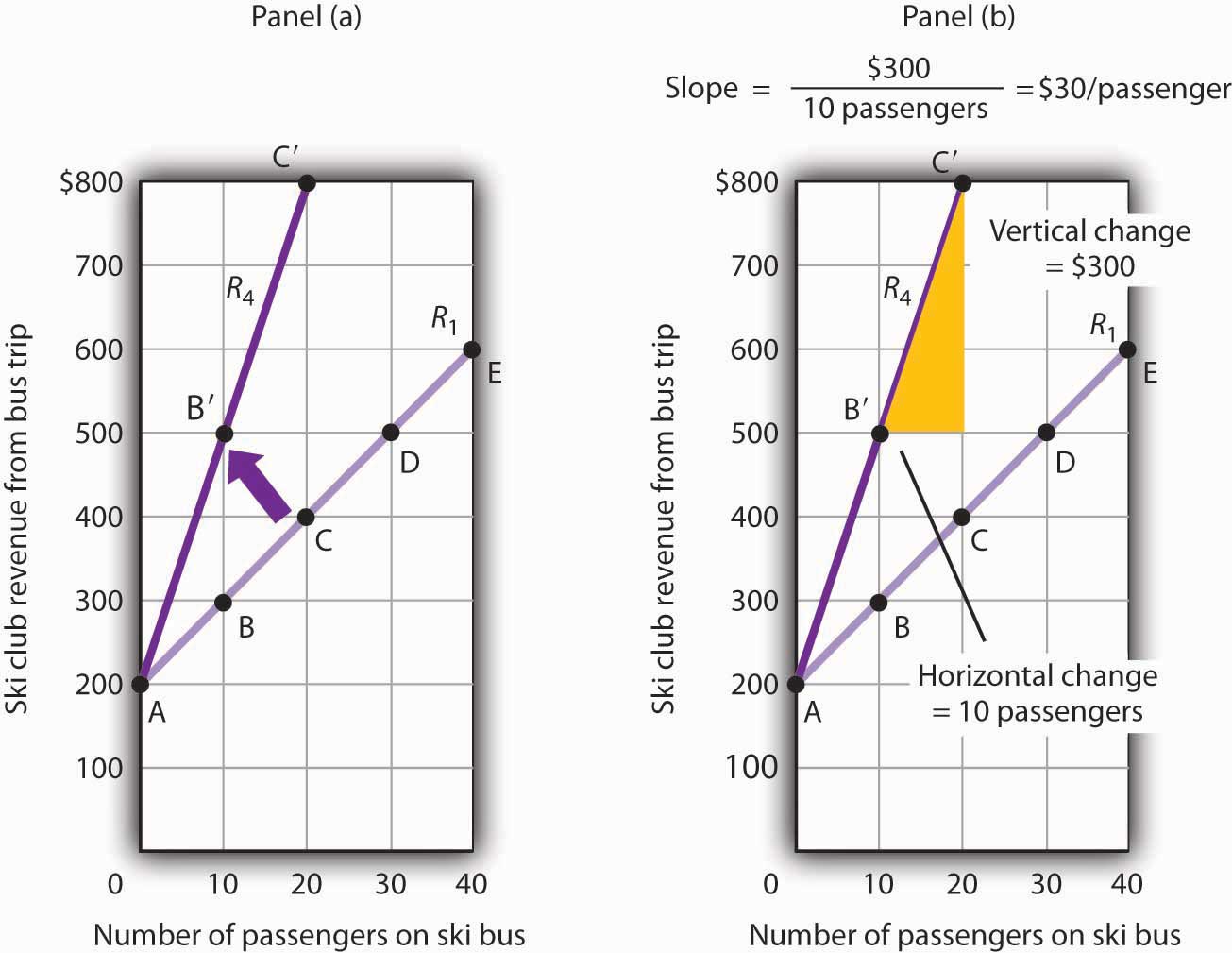
Figure 21.4 "Computing the Slope of a Curve" shows R1 and the computation of its slope between points B and D. Point B corresponds to 10 passengers on the bus; point D corresponds to 30. The change in the horizontal axis when we go from B to D thus equals 20 passengers. Point B corresponds to club revenues of $300; point D corresponds to club revenues of $500. The change in the vertical axis equals $200. The slope thus equals $200/20 passengers, or $10/passenger.
Figure 21.4 Computing the Slope of a Curve
We have applied the definition of the slope of a curve to compute the slope of R1 between points B and D. That same definition is given in Equation 21.1. Applying the equation, we have:
The slope of this curve tells us the amount by which revenues rise with an increase in the number of passengers. It should come as no surprise that this amount equals the price per passenger. Adding a passenger adds $10 to the club’s revenues.
Notice that we can compute the slope of R1 between any two points on the curve and get the same value; the slope is constant. Consider, for example, points A and E. The vertical change between these points is $400 (we go from revenues of $200 at A to revenues of $600 at E). The horizontal change is 40 passengers (from zero passengers at A to 40 at E). The slope between A and E thus equals $400/(40 passengers) = $10/passenger. We get the same slope regardless of which pair of points we pick on R1 to compute the slope. The slope of R1 can be considered a constant, which suggests that it is a straight line. When the curve showing the relationship between two variables has a constant slope, we say there is a linear relationshipRelationship that exists between two variables when the curve between them has a constant slope. between the variables. A linear curveA curve with constant slope. is a curve with constant slope.
The fact that the slope of our curve equals $10/passenger tells us something else about the curve—$10/passenger is a positive, not a negative, value. A curve whose slope is positive is upward sloping. As we travel up and to the right along R1, we travel in the direction of increasing values for both variables. A positive relationshipRelationship that exists between two variables when both variables move in the same direction. between two variables is one in which both variables move in the same direction. Positive relationships are sometimes called direct relationships. There is a positive relationship between club revenues and passengers on the bus. We will look at a graph showing a negative relationship between two variables in the next section.
A negative relationshipRelationship that exists between two variables when the variables move in opposite directions. is one in which two variables move in opposite directions. A negative relationship is sometimes called an inverse relationship. The slope of a curve describing a negative relationship is always negative. A curve with a negative slope is always downward sloping.
As an example of a graph of a negative relationship, let us look at the impact of the cancellation of games by the National Basketball Association during the 1998–1999 labor dispute on the earnings of one player: Shaquille O’Neal. During the 1998–1999 season, O’Neal was the center for the Los Angeles Lakers.
O’Neal’s salary with the Lakers in 1998–1999 would have been about $17,220,000 had the 82 scheduled games of the regular season been played. But a contract dispute between owners and players resulted in the cancellation of 32 games. Mr. O’Neal’s salary worked out to roughly $210,000 per game, so the labor dispute cost him well over $6 million. Presumably, he was able to eke out a living on his lower income, but the cancellation of games cost him a great deal.
We show the relationship between the number of games canceled and O’Neal’s 1998–1999 basketball earnings graphically in Figure 21.5 "Canceling Games and Reducing Shaquille O’Neal’s Earnings". Canceling games reduced his earnings, so the number of games canceled is the independent variable and goes on the horizontal axis. O’Neal’s earnings are the dependent variable and go on the vertical axis. The graph assumes that his earnings would have been $17,220,000 had no games been canceled (point A, the vertical intercept). Assuming that his earnings fell by $210,000 per game canceled, his earnings for the season were reduced to $10,500,000 by the cancellation of 32 games (point B). We can draw a line between these two points to show the relationship between games canceled and O’Neal’s 1998–1999 earnings from basketball. In this graph, we have inserted a break in the vertical axis near the origin. This allows us to expand the scale of the axis over the range from $10,000,000 to $18,000,000. It also prevents a large blank space between the origin and an income of $10,500,000—there are no values below this amount.
Figure 21.5 Canceling Games and Reducing Shaquille O’Neal’s Earnings
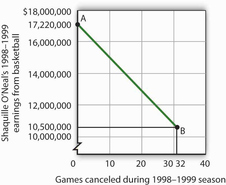
If no games had been canceled during the 1998–1999 basketball season, Shaquille O’Neal would have earned $17,220,000 (point A). Assuming that his salary for the season fell by $210,000 for each game canceled, the cancellation of 32 games during the dispute between NBA players and owners reduced O’Neal’s earnings to $10,500,000 (point B).
What is the slope of the curve in Figure 21.5 "Canceling Games and Reducing Shaquille O’Neal’s Earnings"? We have data for two points, A and B. At A, O’Neal’s basketball salary would have been $17,220,000. At B, it is $10,500,000. The vertical change between points A and B equals -$6,720,000. The change in the horizontal axis is from zero games canceled at A to 32 games canceled at B. The slope is thus
Notice that this time the slope is negative, hence the downward-sloping curve. As we travel down and to the right along the curve, the number of games canceled rises and O’Neal’s salary falls. In this case, the slope tells us the rate at which O’Neal lost income as games were canceled.
The slope of O’Neal’s salary curve is also constant. That means there was a linear relationship between games canceled and his 1998–1999 basketball earnings.
When we draw a graph showing the relationship between two variables, we make an important assumption. We assume that all other variables that might affect the relationship between the variables in our graph are unchanged. When one of those other variables changes, the relationship changes, and the curve showing that relationship shifts.
Consider, for example, the ski club that sponsors bus trips to the ski area. The graph we drew in Figure 21.2 "Plotting a Graph" shows the relationship between club revenues from a particular trip and the number of passengers on that trip, assuming that all other variables that might affect club revenues are unchanged. Let us change one. Suppose the school’s student government increases the payment it makes to the club to $400 for each day the trip is available. The payment was $200 when we drew the original graph. Panel (a) of Figure 21.6 "Shifting a Curve: An Increase in Revenues" shows how the increase in the payment affects the table we had in Figure 21.1 "Ski Club Revenues"; Panel (b) shows how the curve shifts. Each of the new observations in the table has been labeled with a prime: A′, B′, etc. The curve R1 shifts upward by $200 as a result of the increased payment. A shift in a curveChange in the graph of a relationship between two variables that implies new values of one variable at each value of the other variable. implies new values of one variable at each value of the other variable. The new curve is labeled R2. With 10 passengers, for example, the club’s revenue was $300 at point B on R1. With the increased payment from the student government, its revenue with 10 passengers rises to $500 at point B′ on R2. We have a shift in the curve.
Figure 21.6 Shifting a Curve: An Increase in Revenues
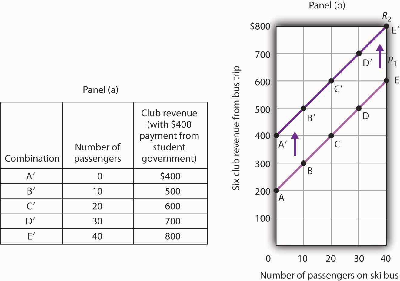
The table in Panel (a) shows the new level of revenues the ski club receives with varying numbers of passengers as a result of the increased payment from student government. The new curve is shown in dark purple in Panel (b). The old curve is shown in light purple.
It is important to distinguish between shifts in curves and movements along curves. A movement along a curveChange from one point on the curve to another that occurs when the dependent variable changes in response to a change in the independent variable. is a change from one point on the curve to another that occurs when the dependent variable changes in response to a change in the independent variable. If, for example, the student government is paying the club $400 each day it makes the ski bus available and 20 passengers ride the bus, the club is operating at point C′ on R2. If the number of passengers increases to 30, the club will be at point D′ on the curve. This is a movement along a curve; the curve itself does not shift.
Now suppose that, instead of increasing its payment, the student government eliminates its payments to the ski club for bus trips. The club’s only revenue from a trip now comes from its $10/passenger charge. We have again changed one of the variables we were holding unchanged, so we get another shift in our revenue curve. The table in Panel (a) of Figure 21.7 "Shifting a Curve: A Reduction in Revenues" shows how the reduction in the student government’s payment affects club revenues. The new values are shown as combinations A″ through E″ on the new curve, R3, in Panel (b). Once again we have a shift in a curve, this time from R1 to R3.
Figure 21.7 Shifting a Curve: A Reduction in Revenues
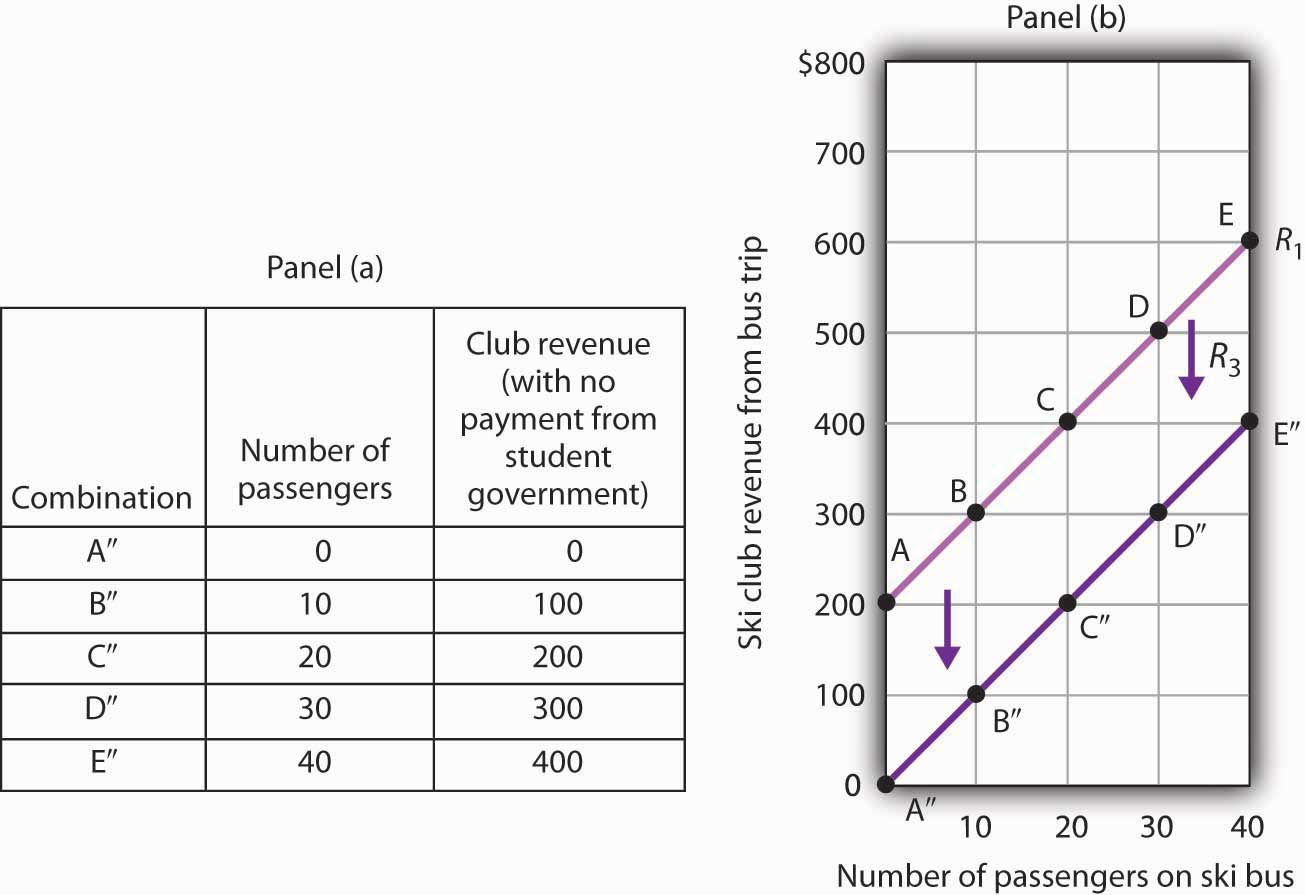
The table in Panel (a) shows the impact on ski club revenues of an elimination of support from the student government for ski bus trips. The club’s only revenue now comes from the $10 it charges to each passenger. The new combinations are shown as A″ – E″. In Panel (b) we see that the original curve relating club revenue to the number of passengers has shifted down.
The shifts in Figure 21.6 "Shifting a Curve: An Increase in Revenues" and Figure 21.7 "Shifting a Curve: A Reduction in Revenues" left the slopes of the revenue curves unchanged. That is because the slope in all these cases equals the price per ticket, and the ticket price remains unchanged. Next, we shall see how the slope of a curve changes when we rotate it about a single point.
A rotation of a curveChange In a curve that occurs when its slope changes with one point on the curve fixed. occurs when we change its slope, with one point on the curve fixed. Suppose, for example, the ski club changes the price of its bus rides to the ski area to $30 per trip, and the payment from the student government remains $200 for each day the trip is available. This means the club’s revenues will remain $200 if it has no passengers on a particular trip. Revenue will, however, be different when the club has passengers. Because the slope of our revenue curve equals the price per ticket, the slope of the revenue curve changes.
Panel (a) of Figure 21.8 "Rotating a Curve" shows what happens to the original revenue curve, R1, when the price per ticket is raised. Point A does not change; the club’s revenue with zero passengers is unchanged. But with 10 passengers, the club’s revenue would rise from $300 (point B on R1) to $500 (point B′ on R4). With 20 passengers, the club’s revenue will now equal $800 (point C′ on R4).
Figure 21.8 Rotating a Curve
A curve is said to rotate when a single point remains fixed while other points on the curve move; a rotation always changes the slope of a curve. Here an increase in the price per passenger to $30 would rotate the revenue curve from R1 to R4 in Panel (a). The slope of R4 is $30 per passenger.
The new revenue curve R4 is steeper than the original curve. Panel (b) shows the computation of the slope of the new curve between points B′ and C′. The slope increases to $30 per passenger—the new price of a ticket. The greater the slope of a positively sloped curve, the steeper it will be.
We have now seen how to draw a graph of a curve, how to compute its slope, and how to shift and rotate a curve. We have examined both positive and negative relationships. Our work so far has been with linear relationships. Next we will turn to nonlinear ones.
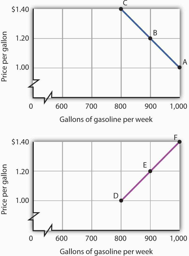
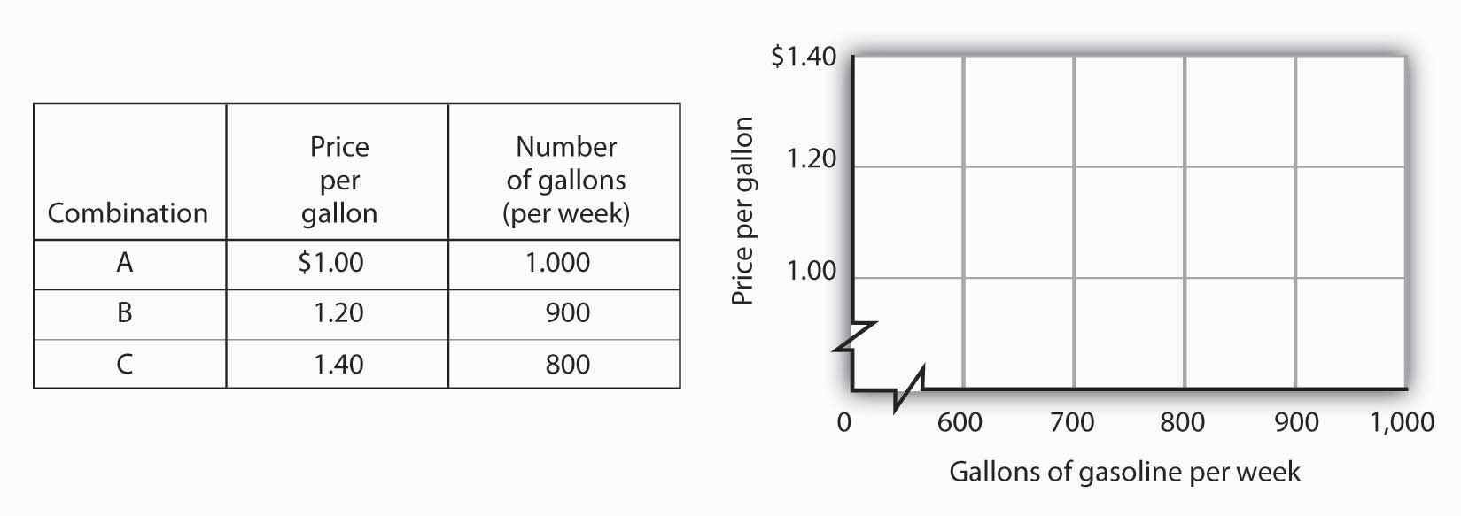
The following table shows the relationship between the number of gallons of gasoline people in a community are willing and able to buy per week and the price per gallon. Plot these points in the grid provided and label each point with the letter associated with the combination. Notice that there are breaks in both the vertical and horizontal axes of the grid. Draw a line through the points you have plotted. Does your graph suggest a positive or a negative relationship? What is the slope between A and B? Between B and C? Between A and C? Is the relationship linear?
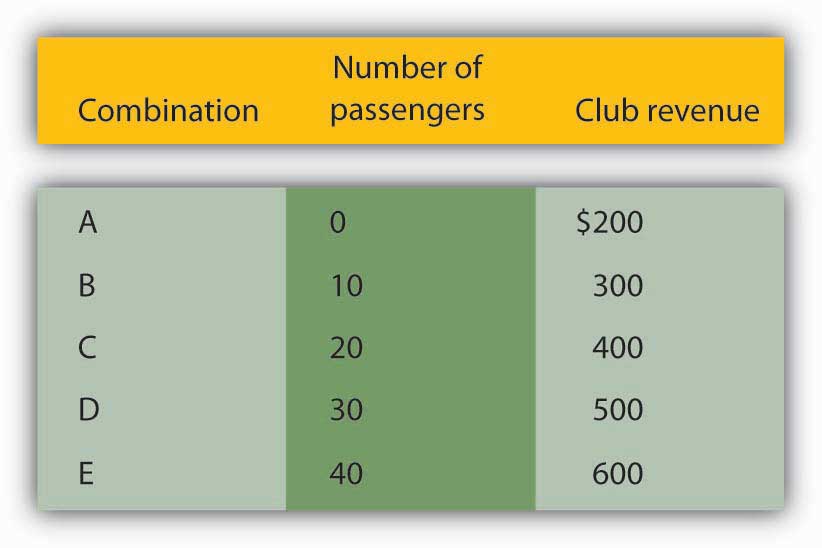
Now suppose you are given the following information about the relationship between price per gallon and the number of gallons per week gas stations in the community are willing to sell.
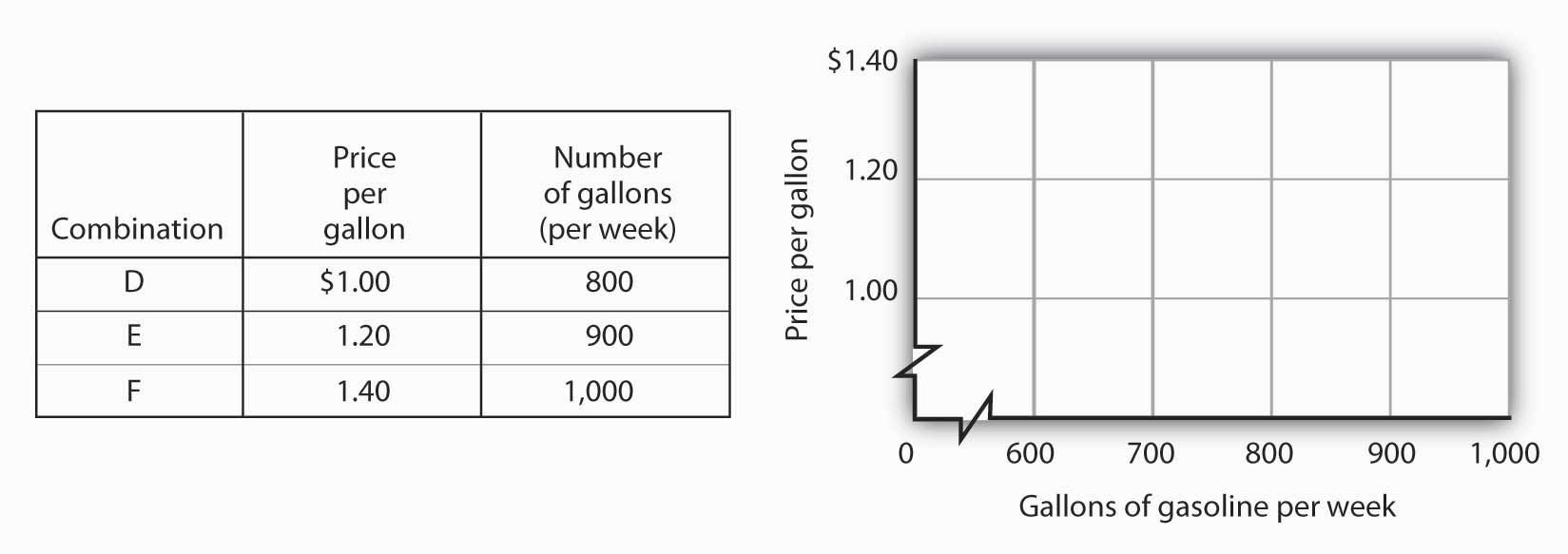
Plot these points in the grid provided and draw a curve through the points you have drawn. Does your graph suggest a positive or a negative relationship? What is the slope between D and E? Between E and F? Between D and F? Is this relationship linear?
Here is the first graph. The curve’s downward slope tells us there is a negative relationship between price and the quantity of gasoline people are willing and able to buy. This curve, by the way, is a demand curve (the next one is a supply curve). We will study demand and supply soon; you will be using these curves a great deal. The slope between A and B is −0.002 (slope = vertical change/horizontal change = −0.20/100). The slope between B and C and between A and C is the same. That tells us the curve is linear, which, of course, we can see—it is a straight line.
Here is the supply curve. Its upward slope tells us there is a positive relationship between price per gallon and the number of gallons per week gas stations are willing to sell. The slope between D and E is 0.002 (slope equals vertical change/horizontal change = 0.20/100). Because the curve is linear, the slope is the same between any two points, for example, between E and F and between D and F.