You often see pictures representing numerical information. These pictures may take the form of graphs that show how a particular variable has changed over time, or charts that show values of a particular variable at a single point in time. We will close our introduction to graphs by looking at both ways of conveying information.
One of the most common types of graphs used in economics is called a time-series graph. A time-series graphA graph that shows how the value of a particular variable or variables has changed over some period of time. shows how the value of a particular variable or variables has changed over some period of time. One of the variables in a time-series graph is time itself. Time is typically placed on the horizontal axis in time-series graphs. The other axis can represent any variable whose value changes over time.
The table in Panel (a) of Figure 21.13 "A Time-Series Graph" shows annual values of the unemployment rate, a measure of the percentage of workers who are looking for and available for work but are not working, in the United States from 1998 to 2007. The grid with which these values are plotted is given in Panel (b). Notice that the vertical axis is scaled from 3 to 8%, instead of beginning with zero. Time-series graphs are often presented with the vertical axis scaled over a certain range. The result is the same as introducing a break in the vertical axis, as we did in Figure 21.5 "Canceling Games and Reducing Shaquille O’Neal’s Earnings".
Figure 21.13 A Time-Series Graph
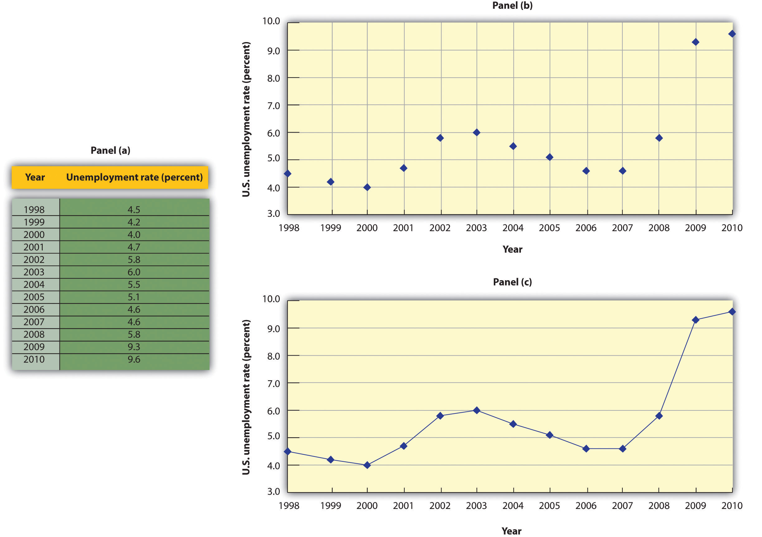
Panel (a) gives values of the U.S. unemployment rate from 1998 to 2010. These points are then plotted in Panel (b). To draw a time-series graph, we connect these points, as in Panel (c).
The values for the U.S. unemployment rate are plotted in Panel (b) of Figure 21.13 "A Time-Series Graph". The points plotted are then connected with a line in Panel (c).
The scaling of the vertical axis in time-series graphs can give very different views of economic data. We can make a variable appear to change a great deal, or almost not at all, depending on how we scale the axis. For that reason, it is important to note carefully how the vertical axis in a time-series graph is scaled.
Consider, for example, the issue of whether an increase or decrease in income tax rates has a significant effect on federal government revenues. This became a big issue in 1993, when President Clinton proposed an increase in income tax rates. The measure was intended to boost federal revenues. Critics of the president’s proposal argued that changes in tax rates have little or no effect on federal revenues. Higher tax rates, they said, would cause some people to scale back their income-earning efforts and thus produce only a small gain—or even a loss—in revenues. Op-ed essays in The Wall Street Journal, for example, often showed a graph very much like that presented in Panel (a) of Figure 21.14 "Two Tales of Taxes and Income". It shows federal revenues as a percentage of gross domestic product (GDP), a measure of total income in the economy, since 1960. Various tax reductions and increases were enacted during that period, but Panel (a) appears to show they had little effect on federal revenues relative to total income.
Figure 21.14 Two Tales of Taxes and Income
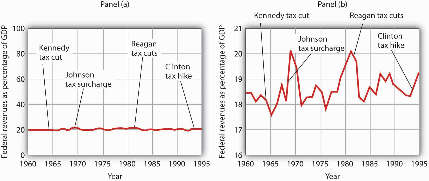
A graph of federal revenues as a percentage of GDP emphasizes the stability of the relationship when plotted with the vertical axis scaled from 0 to 100, as in Panel (a). Scaling the vertical axis from 16 to 21%, as in Panel (b), stresses the short-term variability of the percentage and suggests that major tax rate changes have affected federal revenues.
Laura Tyson, then President Clinton’s chief economic adviser, charged that those graphs were misleading. In a Wall Street Journal piece, she noted the scaling of the vertical axis used by the president’s critics. She argued that a more reasonable scaling of the axis shows that federal revenues tend to increase relative to total income in the economy and that cuts in taxes reduce the federal government’s share. Her alternative version of these events does, indeed, suggest that federal receipts have tended to rise and fall with changes in tax policy, as shown in Panel (b) of Figure 21.14 "Two Tales of Taxes and Income".
Which version is correct? Both are. Both graphs show the same data. It is certainly true that federal revenues, relative to economic activity, have been remarkably stable over the past several decades, as emphasized by the scaling in Panel (a). But it is also true that the federal share has varied between about 17 and 20%. And a small change in the federal share translates into a large amount of tax revenue.
It is easy to be misled by time-series graphs. Large changes can be made to appear trivial and trivial changes to appear large through an artful scaling of the axes. The best advice for a careful consumer of graphical information is to note carefully the range of values shown and then to decide whether the changes are really significant.
John Maynard Keynes, one of the most famous economists ever, proposed in 1936 a hypothesis about total spending for consumer goods in the economy. He suggested that this spending was positively related to the income households receive. One way to test such a hypothesis is to draw a time-series graph of both variables to see whether they do, in fact, tend to move together. Figure 21.15 "A Time-Series Graph of Disposable Income and Consumption" shows the values of consumption spending and disposable income, which is after-tax income received by households. Annual values of consumption and disposable income are plotted for the period 1960–2007. Notice that both variables have tended to move quite closely together. The close relationship between consumption and disposable income is consistent with Keynes’s hypothesis that there is a positive relationship between the two variables.
Figure 21.15 A Time-Series Graph of Disposable Income and Consumption
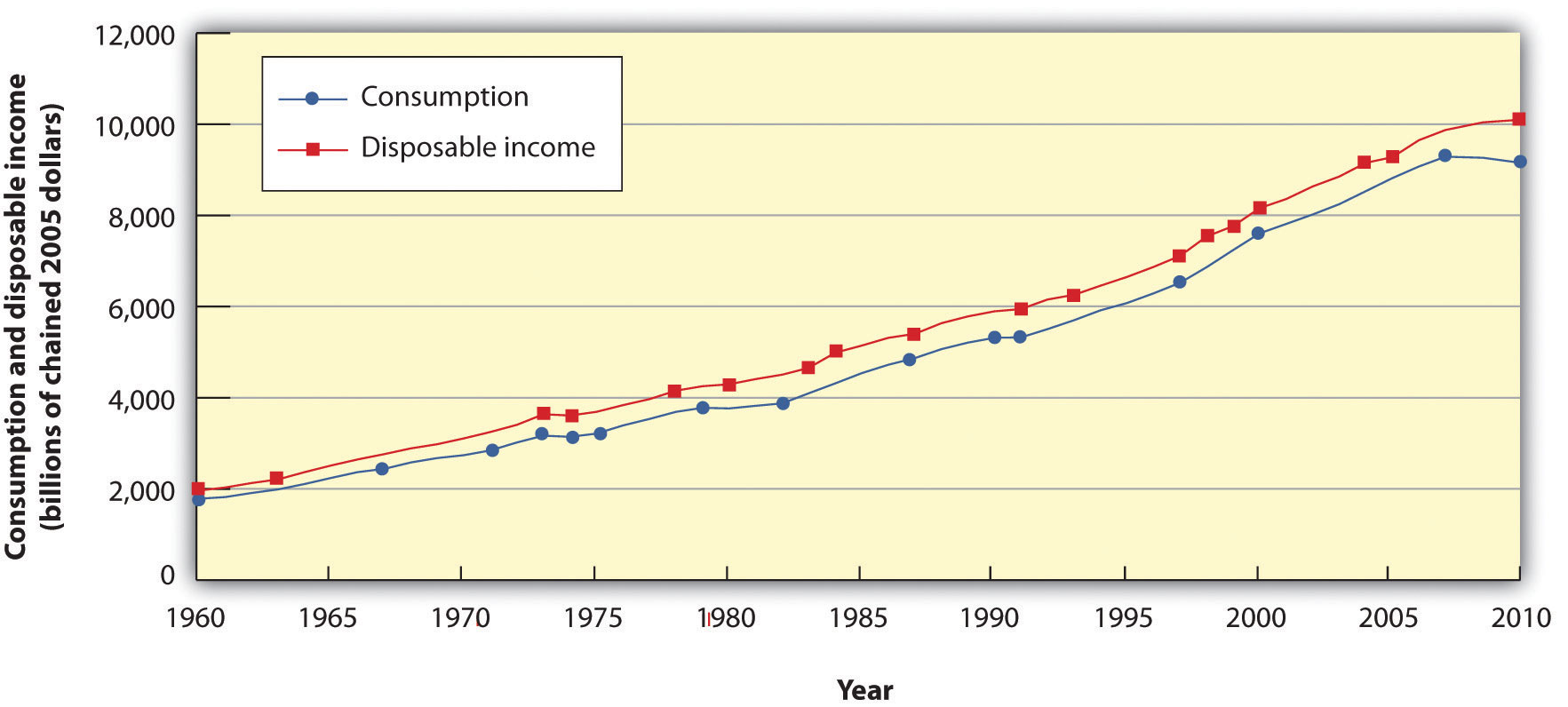
Plotted in a time-series graph, disposable income and consumption appear to move together. This is consistent with the hypothesis that the two are directly related.
Source: Department of Commerce
The fact that two variables tend to move together in a time series does not by itself prove that there is a systematic relationship between the two. Figure 21.16 "Stock Prices and a Mystery Variable" shows a time-series graph of monthly values in 1987 of the Dow Jones Industrial Average, an index that reflects the movement of the prices of common stock. Notice the steep decline in the index beginning in October, not unlike the steep decline in October 2008.
Figure 21.16 Stock Prices and a Mystery Variable
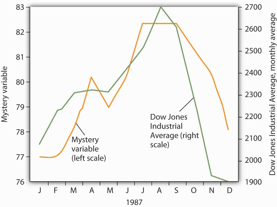
The movement of the monthly average of the Dow Jones Industrial Average, a widely reported index of stock values, corresponded closely to changes in a mystery variable, X. Did the mystery variable contribute to the crash?
It would be useful, and certainly profitable, to be able to predict such declines. Figure 21.16 "Stock Prices and a Mystery Variable" also shows the movement of monthly values of a “mystery variable,” X, for the same period. The mystery variable and stock prices appear to move closely together. Was the plunge in the mystery variable in October responsible for the stock crash? The answer is: Not likely. The mystery value is monthly average temperatures in San Juan, Puerto Rico. Attributing the stock crash in 1987 to the weather in San Juan would be an example of the fallacy of false cause.
Notice that Figure 21.16 "Stock Prices and a Mystery Variable" has two vertical axes. The left-hand axis shows values of temperature; the right-hand axis shows values for the Dow Jones Industrial Average. Two axes are used here because the two variables, San Juan temperature and the Dow Jones Industrial Average, are scaled in different units.
We can use a table to show data. Consider, for example, the information compiled each year by the U.S. National Center for Education Statistics. The table in Panel (a) of Figure 21.17 "Bachelor’s Degrees Earned by Field, 2009" shows the results of the 2009 survey. In the groupings given, economics is included among the social sciences.
Figure 21.17 Bachelor’s Degrees Earned by Field, 2009
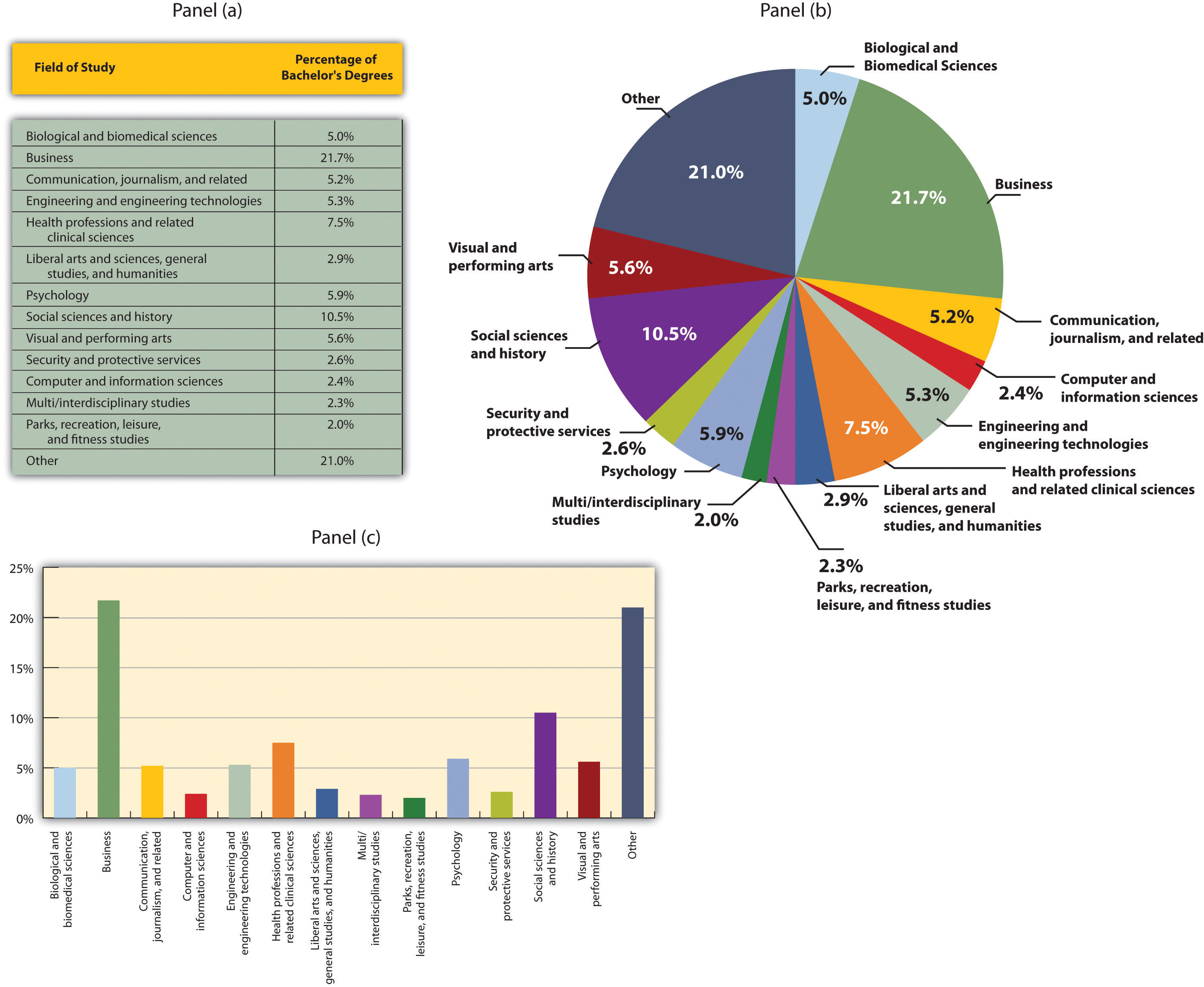
Panels (a), (b), and (c) show bachelor’s degrees earned by field in 2009 in United States. All three panels present the same information. Panel (a) is an example of a table, Panel (b) is an example of a pie chart, and Panel (c) is an example of a vertical bar chart.
Source: Statistical Abstracts of the United States, 2012, Table 302. Bachelor’s Degrees Earned by Field, 1980 to 2009, based on data from U.S. National Center for Education Statistics, Digest of Educational Statistics. Percentages shown are for broad academic areas, each of which includes several majors.
Panels (b) and (c) of Figure 21.17 "Bachelor’s Degrees Earned by Field, 2009" present the same information in two types of charts. Panel (b) is an example of a pie chart; Panel (c) gives the data in a bar chart. The bars in this chart are horizontal; they may also be drawn as vertical. Either type of graph may be used to provide a picture of numeric information.
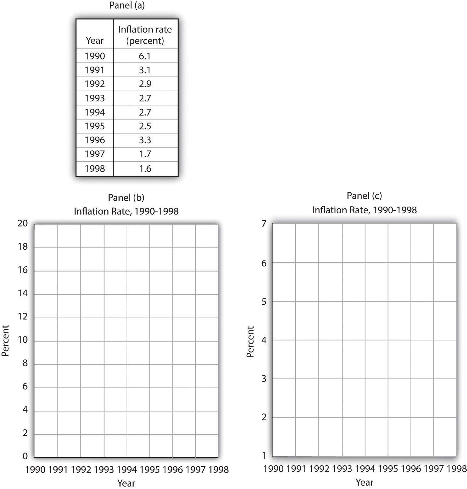
The table in Panel (a) shows a measure of the inflation rate, the percentage change in the average level of prices below. Panels (b) and (c) provide blank grids. We have already labeled the axes on the grids in Panels (b) and (c). It is up to you to plot the data in Panel (a) on the grids in Panels (b) and (c). Connect the points you have marked in the grid using straight lines between the points. What relationship do you observe? Has the inflation rate generally increased or decreased? What can you say about the trend of inflation over the course of the 1990s? Do you tend to get a different “interpretation” depending on whether you use Panel (b) or Panel (c) to guide you?
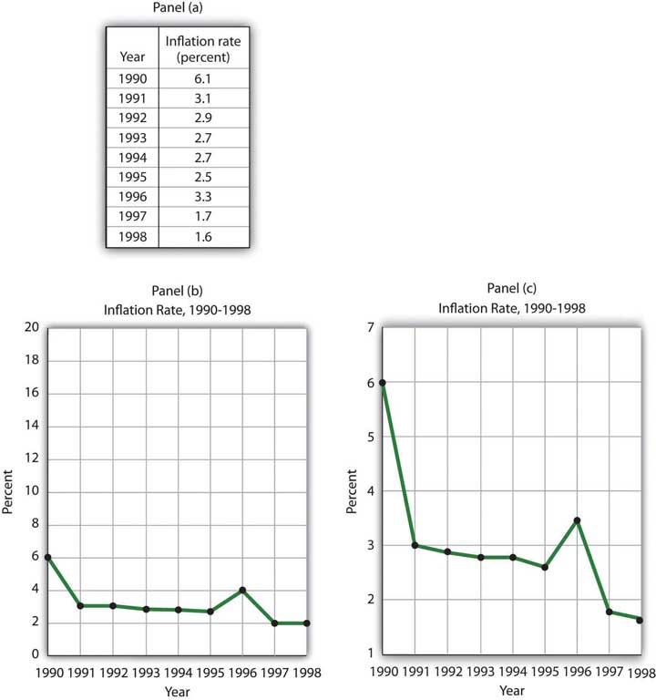
Here are the time-series graphs, Panels (b) and (c), for the information in Panel (a). The first thing you should notice is that both graphs show that the inflation rate generally declined throughout the 1990s (with the exception of 1996, when it increased). The generally downward direction of the curve suggests that the trend of inflation was downward. Notice that in this case we do not say negative, since in this instance it is not the slope of the line that matters. Rather, inflation itself is still positive (as indicated by the fact that all the points are above the origin) but is declining. Finally, comparing Panels (b) and (c) suggests that the general downward trend in the inflation rate is emphasized less in Panel (b) than in Panel (c). This impression would be emphasized even more if the numbers on the vertical axis were increased in Panel (b) from 20 to 100. Just as in Figure 21.14 "Two Tales of Taxes and Income", it is possible to make large changes appear trivial by simply changing the scaling of the axes.
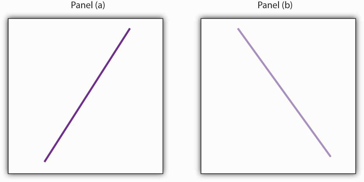
Panel (a) shows a graph of a positive relationship; Panel (b) shows a graph of a negative relationship. Decide whether each proposition below demonstrates a positive or negative relationship, and decide which graph you would expect to illustrate each proposition. In each statement, identify which variable is the independent variable and thus goes on the horizontal axis, and which variable is the dependent variable and goes on the vertical axis.
Suppose you have a graph showing the results of a survey asking people how many left and right shoes they owned. The results suggest that people with one left shoe had, on average, one right shoe. People with seven left shoes had, on average, seven right shoes. Put left shoes on the vertical axis and right shoes on the horizontal axis; plot the following observations:
| Left shoes | 1 | 2 | 3 | 4 | 5 | 6 | 7 |
| Right shoes | 1 | 2 | 3 | 4 | 5 | 6 | 7 |
Is this relationship positive or negative? What is the slope of the curve?
Suppose your assistant inadvertently reversed the order of numbers for right shoe ownership in the survey above. You thus have the following table of observations:
| Left shoes | 1 | 2 | 3 | 4 | 5 | 6 | 7 |
| Right shoes | 7 | 6 | 5 | 4 | 3 | 2 | 1 |
Is the relationship between these numbers positive or negative? What’s implausible about that?
Suppose some of Ms. Alvarez’s kitchen equipment breaks down. The following table gives the values of bread output that were shown in Figure 21.9 "A Nonlinear Curve". It also gives the new levels of bread output that Ms. Alvarez’s bakers produce following the breakdown. Plot the two curves. What has happened?
| A | B | C | D | E | F | G | |
|---|---|---|---|---|---|---|---|
| Bakers/day | 0 | 1 | 2 | 3 | 4 | 5 | 6 |
| Loaves/day | 0 | 400 | 700 | 900 | 1,000 | 1,050 | 1,075 |
| Loaves/day after breakdown | 0 | 380 | 670 | 860 | 950 | 990 | 1,005 |
Steven Magee has suggested that there is a relationship between the number of lawyers per capita in a country and the country’s rate of economic growth. The relationship is described with the following Magee curve.
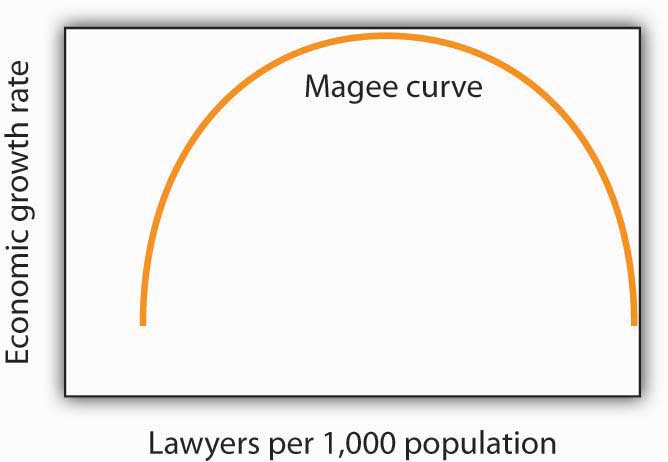
What do you think is the argument made by the curve? What kinds of countries do you think are on the upward- sloping region of the curve? Where would you guess the United States is? Japan? Does the Magee curve seem plausible to you?
Draw graphs showing the likely relationship between each of the following pairs of variables. In each case, put the first variable mentioned on the horizontal axis and the second on the vertical axis.


