While you could custom design a template for your schematic report, it is far easier to begin with a template and then modify it to fit your needs. We recommend the Pitchbook template. In spite of its name, the template is fairly reserved in its appearance. We recommend Pitchbook, because of its fonts, layouts, and table of contents.
The font in Pitchbook is Calibri, a Microsoft font designed to be read well on screen and in print. The body text size is 11 point. Curiously, minor section headings within a slide are set even smaller at 10 point, though they still stand out since there are set in white text on a colored background. The only disproportionate font is found in the major section headings that run down the right hand side of the page. These are set in 22 point white text on a large colored background. Why would we want the most prominent visual element on the screen to be the section that we happen to be in? Is navigation within say a hundred page report so onerous? To put this in perspective, consider that most textbooks bury the section name inconspicuously in a discreet footer—and usually set the footer in a smaller font than the body text. However, this defect can be remedied by modifying the slide master to reduce both the font size and background size of the major section headings.
The layouts that Pitchbook provides are versatile and have a consistent look and feel. Each slide can have a layout appropriate to its content—whether that is section title, heading only, or 1 up, 2 up, 3 up, 4 up, or 5 up. No matter which layout is chosen the heading and body text styles remain the same.
The table of contents in Pitchbook is just another layout called Agenda. Note how this name gives away the intention of presenting rather than reading the Pitchbook. We mention table of contents separately because though it may seem like a minor thing, a table of contents is often missing in reports.

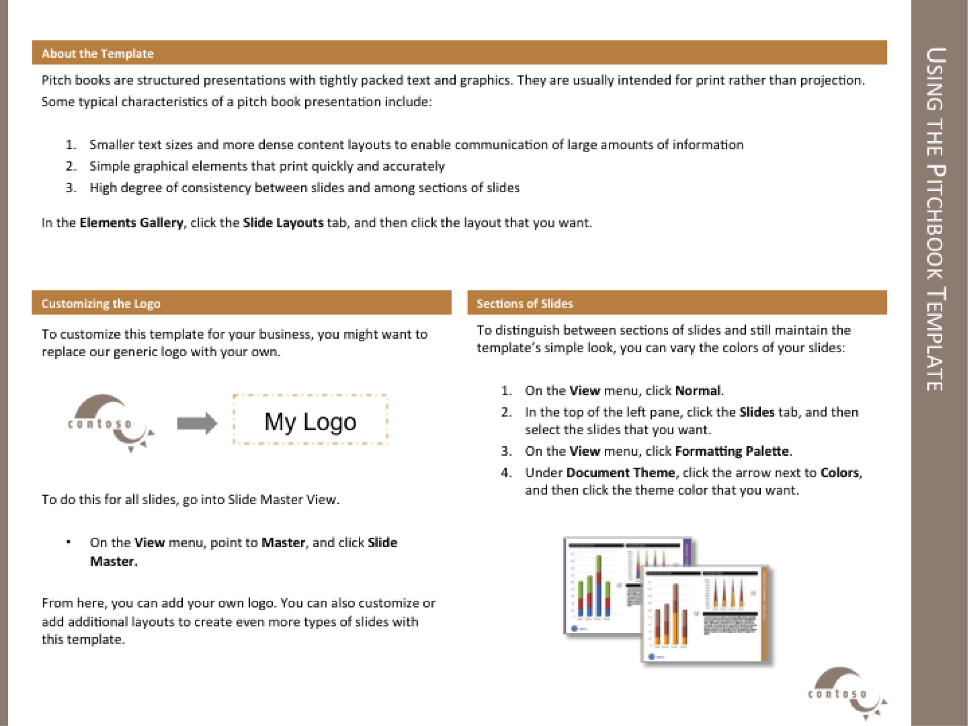
The Pitchbook template includes a slide with instructions on how to customize the template.
Every deck is based on a theme. The themeDefines a set of background elements, colors, and fonts as well as a set of slide layouts. specifies a coherent set of colors, fonts, backgrounds, and slide layoutsThe organization of items on a page. For example, a 2up layout consists of two blocks of images and/or text.. Even the blank white background with which PowerPoint starts up is a theme called Office. Best practice is to choose a theme ahead of adding content to your presentation. That way you can ensure that the content fits well within the structure of a particular theme.
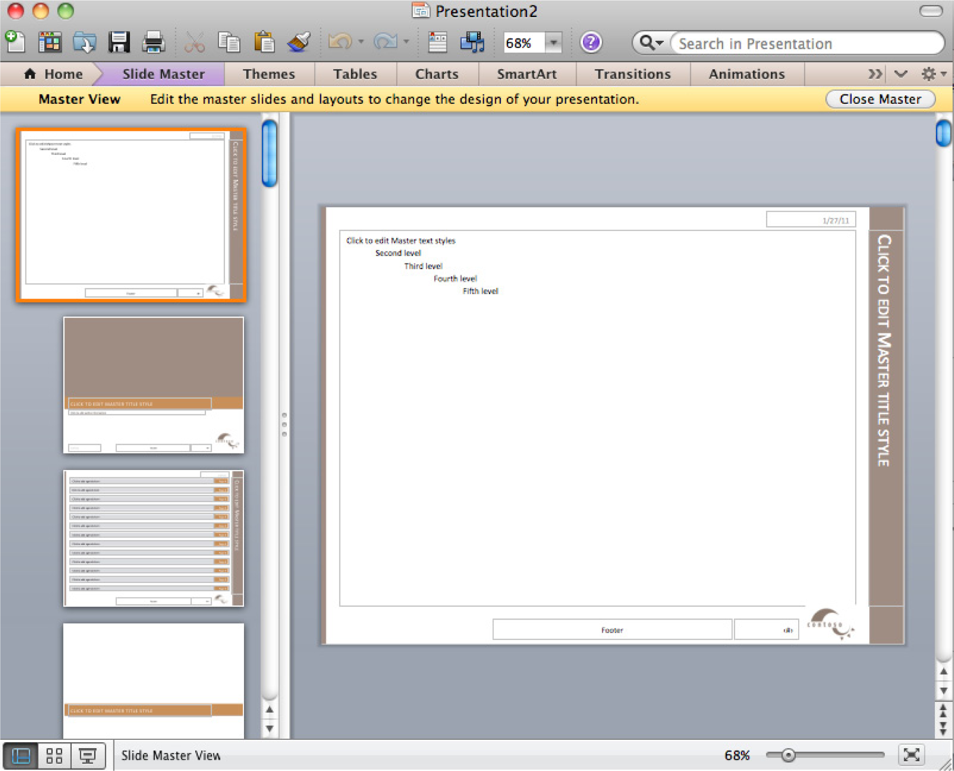
Every theme is defined by a slide masterModel slides that define the theme elements. The slide master defines the background elements, colors, and fonts. The layout masters provide a menu of possible layouts to apply to a slide.. The master is a series of model slides that define the theme and its layouts. Any change to the slide master affects every slide in the presentation. If you want to modify the theme, for example by changing the text size on the section heading, then you should do so on the slide master.
The slide master consists of a large master slide and smaller layout masters. The master slide is where most of the background elements, fonts, and colors are defined. The layout masters define the placement of items on each slide. Every slide can have a different layout and yet still look like it belongs to the presentation. For example 1 up, 2 up, 3 up, 4 up, and so forth are all different slide layouts. Furthermore, 2 up in one theme may have different spacing than 2 up in another. These differences are part of the reason that it is so critical to choose the theme in advance.
A templateA model report in which the theme is predefined. In some templates even some of the slides are already created. For example, the Pitchbook template includes a title slide, a table of contents slide, and a section heading slide. takes this process one step further. A template is a theme with content slides already preloaded. Templates help ensure that the content appears in a particular order.
For our purposes we begin with the Pitchbook template because of its theme. The theme specifies small fonts and clear section headings. That Pitchbook has slides already made is of no consequence to us and in fact we will replace those slides with our own content. What we want is the theme with its layouts.
First we will customize the Pitchbook template to correct its minor flaws.

Slide master (top) with layout masters below it.
Setup
Start MS PowerPoint.
Choose a template. We recommend using the PowerPoint Pitchbook template. You may opt for a different template or even create your own but these designs should be cleared in advance.
(File > New > Presentations > Business > Pitchbook)
Content and Style
Customize Pitchbook as follows:
Deliverables
Electronic submission: Post your PowerPoint file.
Paper submission: Create a printout of each slide of your report. Print two slides per page.

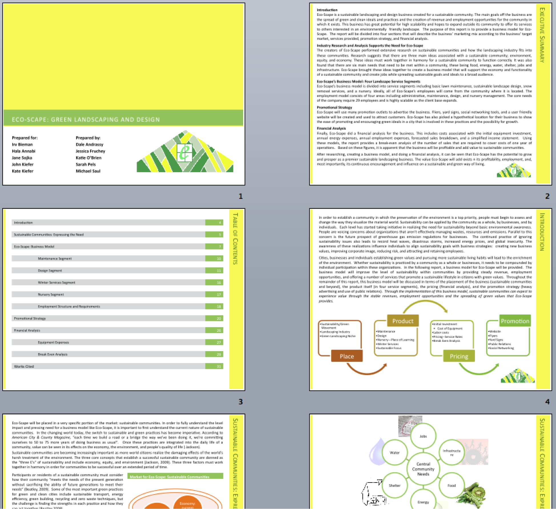
Sample pages from a schematic report. Note that the colors have been changed to match the brand.