Web sites with high volumes of traffic have the opportunity to test regularly and make sure that they are optimizing conversions. Online retailers such as Amazon.com make frequent small changes, hardly noticed by their visitors, to ensure that they are converting as many visitors into buyers as possible. Likewise, the high volume of traffic to Google’s home page allows it to test new features with a small percentage of visitors before rolling them out to all users.
Firefox is a free, open-source browser that is currently used by about 47 percent of the market, and it is gaining market share. When launching version 3 of the browser, Firefox 3, Firefox developer Mozilla (http://www.mozilla.org) aimed to enter the Guinness Book of Records for most software downloads in twenty-four hours starting June 17, 2008. The aim was 5 million downloads. Firefox 2.0 registered 1.6 million downloads on the first day it was made available on October 24, 2006.
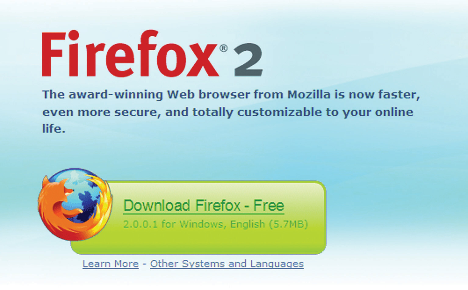
Mozilla wanted visitors to the Web site to perform one action: download Firefox. With a publicized record attempt, it was necessary to make the process as smooth as possible. The landing page for Firefox 2 was already successful. FutureNow conversion analyst Josh Hay noted that “their Call to Action does so many things right. The non-standard shape stands out from the background of the page, and has been given a persuasive color that draws the eyes to it. They’ve even used it to reinforce their brand. Within the Call to Action, Firefox lists the benefit and tells the visitor exactly what he is getting.”Josh Hay, “Large Red Buttons? Oh My!” FutureNow, February 15, 2007, http://www.grokdotcom.com/2007/02/15/large-red-buttons-oh-my (accessed June 20, 2010).
Figure 15.6 Firefox 2 Download Available for Free from http://www.mozilla.com/firefox

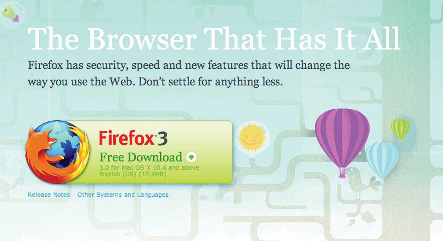
Figure 15.7 Firefox 3 Download Available for Free from http://www.mozilla.com/firefox

So, with something that works, what can be done to make it work better?
With the new download page, the download button is in the same basic design, but with a few nuanced changes.
First, the name and version of the browser has changed position on the page. It has moved from a large on-page heading and onto the actual download button. The text on the button has also changed, from “Download Firefox—Free” to “Free Download.” There is also a little image on the Firefox 3 download button that was not used on the Firefox 2 landing page—an arrow to indicate the download action. The information about the version of the browser has also been split over two lines in the Firefox 3 download button.
The download button and the placement of the Firefox logo (the fox around the globe) have had a subtle revision. The logo is now clearly integrated into the download button. On the Firefox 3 page, the hyperlinks are not underlined, emphasizing the single purpose of the download button.
Did it work? Mozilla records that there were over 8 million downloads of Firefox 3 in its first twenty-four hours of release—over 5,500 downloads a minute! Mozilla’s commitment to optimizing the all-important Firefox 3 landing page paid off.