An important aspect of economics is economic statistics, and an army of economists collects and analyzes these statistics. This chapter presents an overview of the economic activity of the United States. How much do you need to know about these statistics? It would be ridiculous to memorize them. At the same time, it would be undesirable to be ignorant of how we are changing and how we are not.I apologize to those using the book in foreign countries; this chapter is about the United States not because it is more important but because I know it better. Encourage your professor to write a chapter on your country! All of the statistics in this chapter come from Fedstats, http://www.fedstats.gov/, from FRED, http://research.stlouisfed.org/fred2/, and from the NBER, http://www.nber.org/.
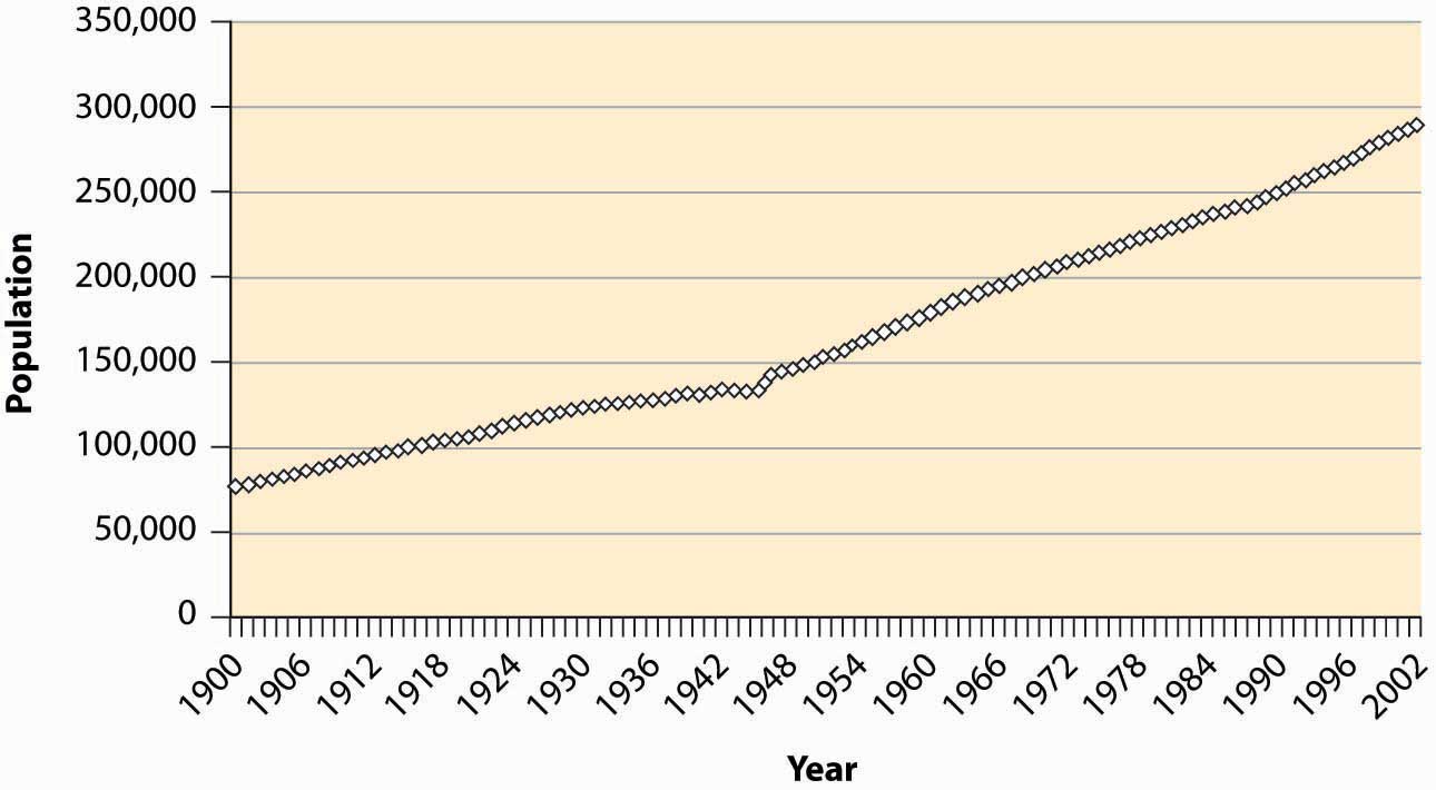
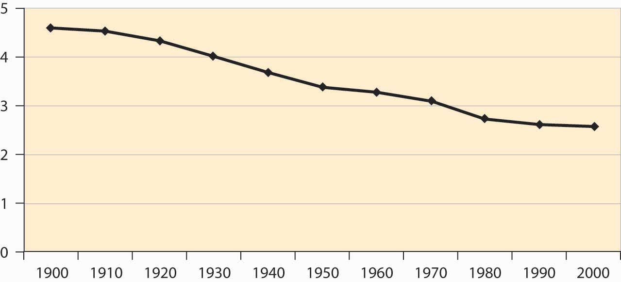
There are about 300 million people in the United States, up from 76 million in 1900.
Figure 4.1 U.S. resident population
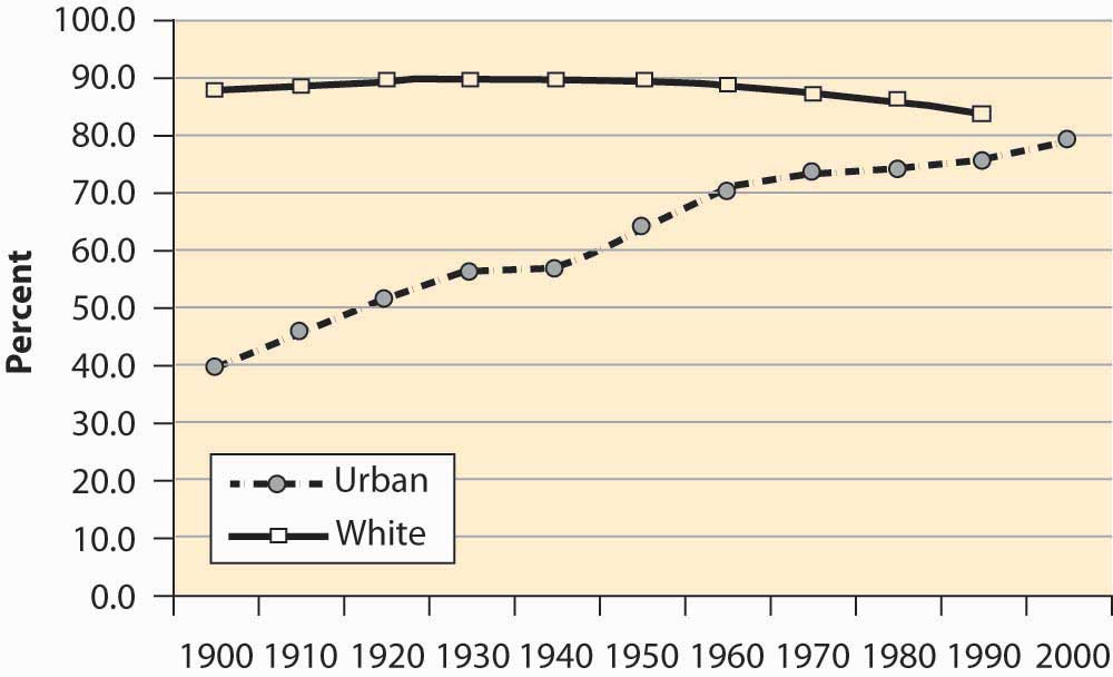
During the last century, the U.S. population has become primarily an urban population, growing from 40% to 80% urban. The population is primarily white, with 12%–13% African American and 4% classified as other. These proportions are relatively stable over the century, with the white population falling from 89% to 83%. The census is thought to understate minority populations because of greater difficulties in contacting minorities. The census does not attempt to classify people but instead accepts people’s descriptions of their own race.
Figure 4.2 U.S. urban and white population
The U.S. population has been aging significantly, with the proportion of seniors (over 65 years of age) tripling over the past century, and the proportion of young people dropping by over one-third. Indeed, the proportion of children between 0 and 5 years old has dropped from 12.1% of the population to under 7%.
Figure 4.3 Population proportions by age group
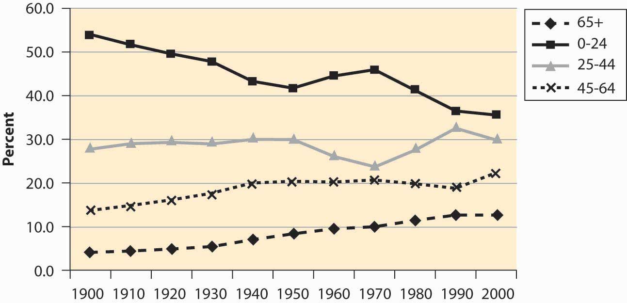
The baby boomA dramatic increase in births for the years 1946 to 1964.—a dramatic increase in births for the years 1946–1964—is visible in Figure 4.3 "Population proportions by age group" as the population in the 0–24 age group begins increasing in 1950, peaking in 1970, and then declining significantly as the baby boom moves into the 25- to 44-year-old bracket. There is a slight “echo” of the baby boom, most readily seen by looking at the 0–5 age bracket, as in Figure 4.4 "Proportion of population under age 5".
Figure 4.4 Proportion of population under age 5
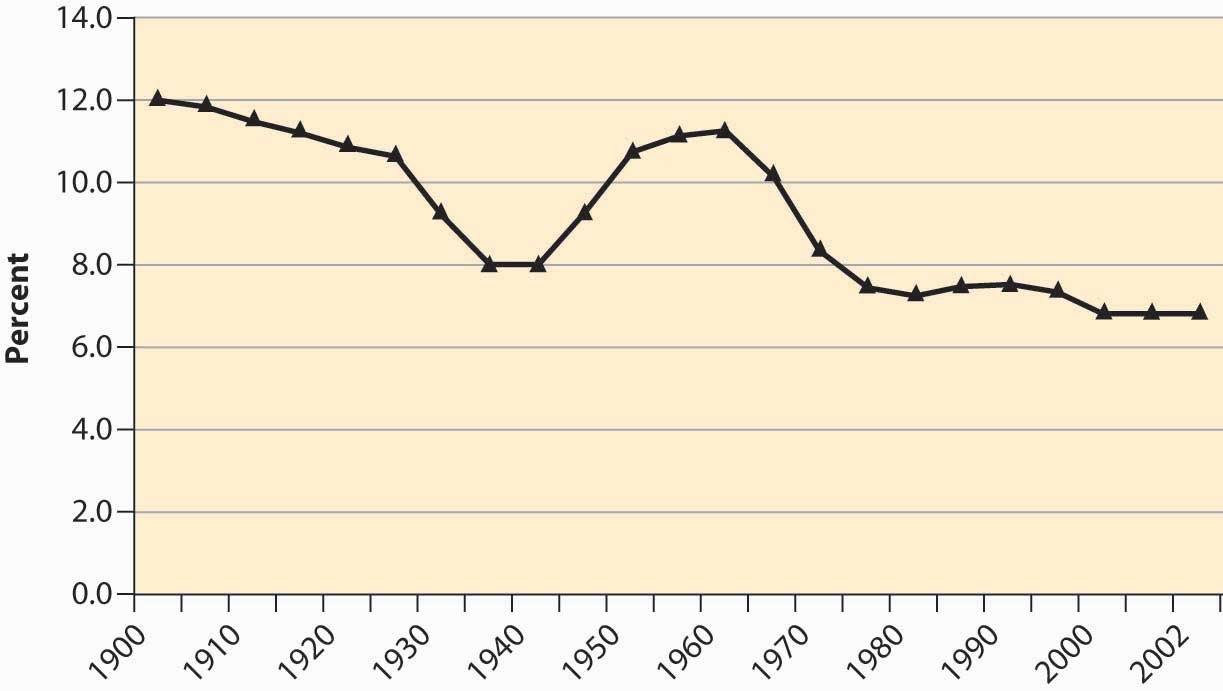
The aging of the American population is a consequence of greater life expectancy. When social security was created in 1935, the average American male lived to be slightly less than 60 years old. The social security benefits, which didn’t start until age 65, thus were not being paid to a substantial portion of the population.
Figure 4.5 U.S. life expectancy at birth
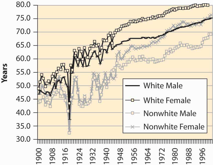
Figure 4.5 "U.S. life expectancy at birth" shows life expectancy at birth, thus including infant mortality. The significant drop in life expectancy in 1918—to nearly 30 years old for nonwhites—is primarily a consequence of the great influenza, which killed about 2.5% of the people who contracted it and killed more Americans in 1918 than did World War I. The Great Depression (1929–1939) also reduced life expectancy. The steady increase in life expectancy is also visible, with white females now living 80 years on average.
Figure 4.6 U.S. immigrant population (percentages) by continent of origin
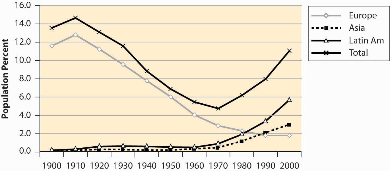
It is said that the United States is a country of immigrants, and a large fraction of the population had ancestors who came from elsewhere. Immigration into this United States, however, has been increasing after a long decline, and the fraction of the population that was born in foreign countries is about 11%—one in nine.
Figure 4.7 National origin of immigrants, 1900–2000
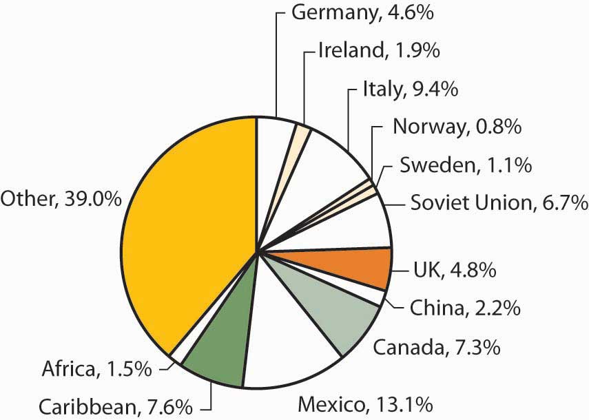
The majority of immigrants during this century came from Europe, but immigration from Europe has been declining for most of the century, while immigration from Asia and Latin America has grown substantially. Figure 4.7 "National origin of immigrants, 1900–2000" aggregates the total country-of-origin data over the century to identify the major sources of immigrants.
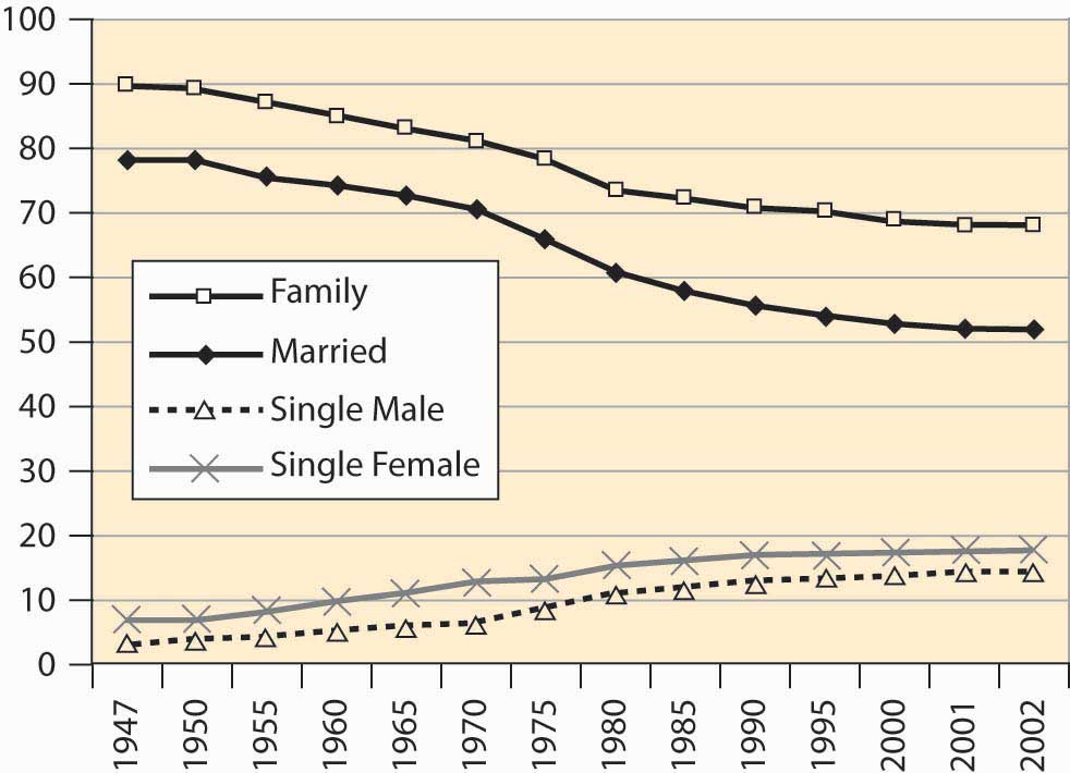
One hears a lot about divorce rates in the United States, with statements like “Fifty percent of all marriages end in divorce.” Although it has grown, the divorced population is actually a small fraction of the population of the United States.
Figure 4.8 Male marital status (percentages)
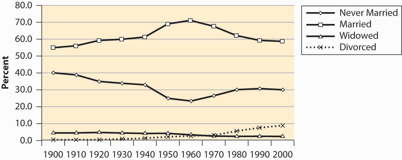
Figure 4.9 Female marital status (percentages)
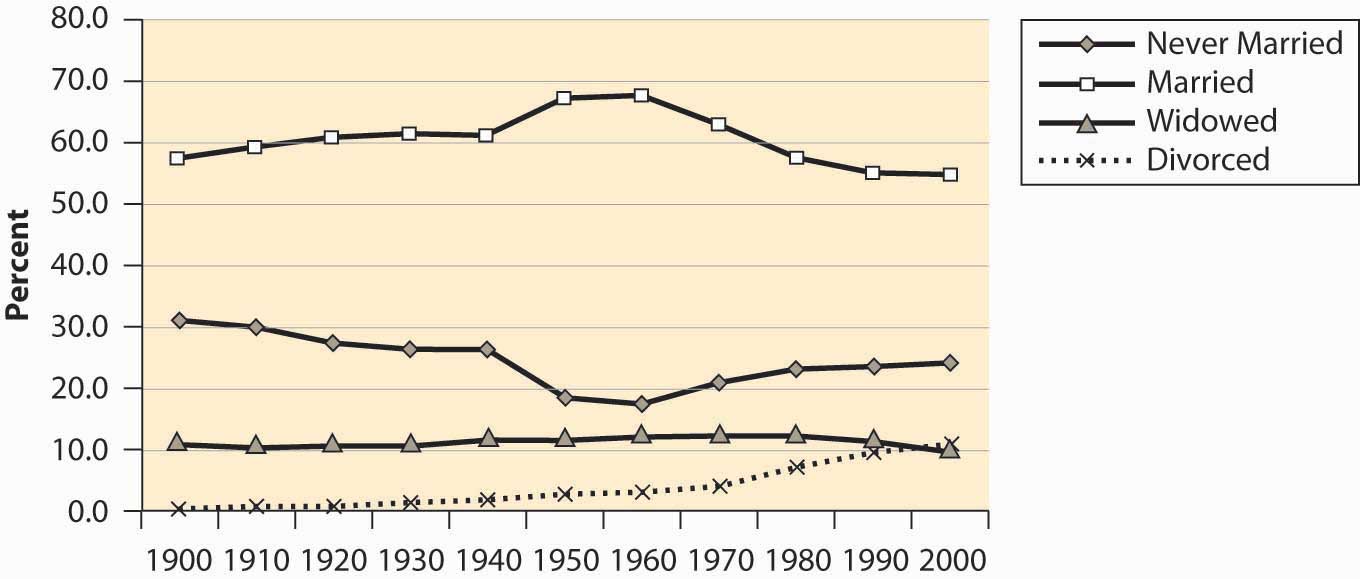
Marriage rates have fallen, but primarily because the “never married” category has grown. Some of the “never married” probably represent unmarried couples, since the proportion of children from unmarried women has risen fairly dramatically. Even so, marriage rates are greater than they were a century ago. However, a century ago there were more unrecorded and common-law marriages than there probably are today.
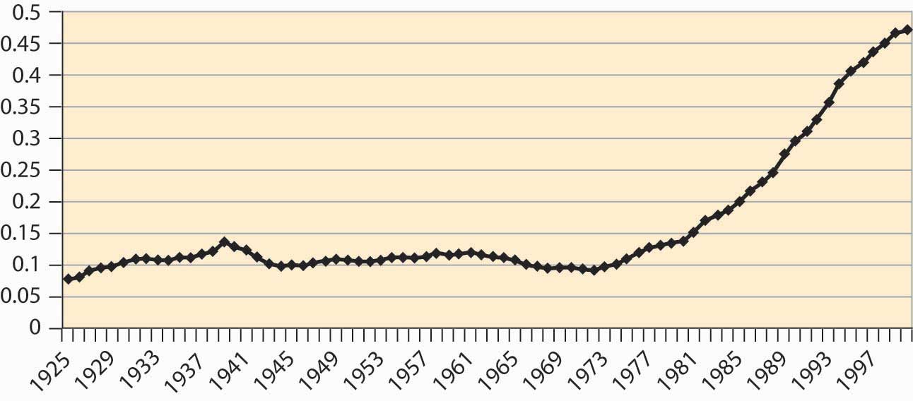
Figure 4.10 Births to unwed mothers (percentages)
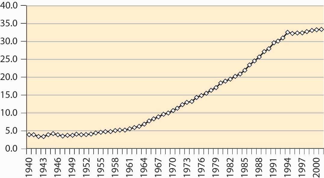
While we are on the subject, however, the much-discussed crisis in teenage pregnancies doesn’t appear to be such a crisis when viewed in terms of the proportion of all births that involve a teenage mother, illustrated in Figure 4.11 "Births to women age 19 or less (percentages)".
Figure 4.11 Births to women age 19 or less (percentages)

Why are the Western nations rich and many other nations poor? What creates the wealth of the developed nations? Modern economic analysis attributes much of the growth of the United States and other developed nations to its educated workforce, and not to natural resources. Japan, with a relative scarcity of natural resources but a highly educated workforce, is substantially richer than Brazil, with its abundance of natural resources.
Figure 4.12 Educational attainment in years (percentage of population)
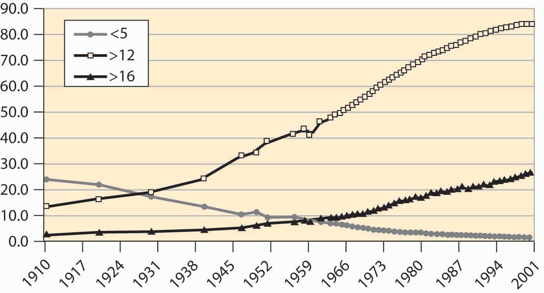
Just less than 85% of the U.S. population completes 12 years of schooling, not counting kindergarten. Not all of these students graduate from high school, but they spend 12 years in school. The proportion that completes only 5 or fewer years of elementary school has dropped from about one quarter of the population to a steady 1.6%. At least 4 years of university now represents a bit more than one quarter of the population, which is a dramatic increase, illustrated in Figure 4.12 "Educational attainment in years (percentage of population)". Slightly fewer women (25% vs. 28%)complete 4 years of university, although women are more likely to complete 4 years of high school.
Graduation rates are somewhat below the number of years completed, so that slightly less than three quarters of the U.S. population actually obtain their high school degree. Of those obtaining a high school degree, nearly half obtain a university or college degree.
Figure 4.13 Graduation rates (percentages)
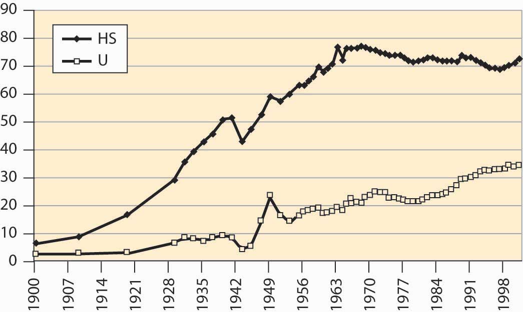
There are several interesting things to see in Figure 4.13 "Graduation rates (percentages)". First, high school completion dropped significantly during World War II (1940–1945) but rebounded afterward. Second, after World War II, college graduation spiked when many U.S. soldiers were sent to university by the government under a program called the “GI Bill.”The etymology of GI, as slang for U.S. soldiers, is disputed, with candidates including “Government Issue,” “General Infantry,” and “Galvanized Iron”—the latter a reference to trash cans that looked like German World War I artillery.
As the number of high school students rose, the portion of high school graduates going to university fell, meaning that a larger segment of the population became high school educated. This increase represents the creation of the U.S. middle class; previously, high school completion and university attendance was in large part a sign of wealth. The creation of a large segment of the population who graduated from high school but didn’t attend university led to a population with substantial skills and abilities but no inherited wealth and they became the middle class.
High school completion has been declining for 30 years. This is surprising given the high rate of financial return to education in the United States. Much of the reduction in completion can be attributed to an increase in General Education Development (GED) certification, which is a program that grants diplomas (often erroneously thought to be a “General Equivalent Degree”) after successfully passing examinations in five subject areas. Unfortunately, those people who obtain GED certification are not as successful as high school graduates, even marginal graduates, and indeed the GED certification does not seem to help students succeed, in comparison with high school graduation.In performing this kind of analysis, economists are very concerned with adjusting for the type of person. Smarter people are more likely to graduate from high school, but one doesn’t automatically become smart by attending high school. Thus, care has been taken to hold constant innate abilities, measured by various measures like IQ scores and performance on tests, so that the comparison is between similar individuals, some of whom persevere to finish school, some of whom don’t. Indeed, some studies use identical twins.
There are approximately 100 million householdsGroups of people sharing living quarters.—a group of people sharing living quarters—in the United States. The number of residents per household has consistently shrunk during this century, from over four to under three, as illustrated in Figure 4.14 "Household occupancy".
Figure 4.14 Household occupancy
The shrinking size of households reflects not just a reduction in birthrates but also an increase in the number of people living alone as illustrated in Figure 4.15 "Proportion of households by type". More women live alone than men, even though four times as many families with a single adult member are headed by women. This discrepancy—many more women both living on their own and living with children and no partner, even though there are about the same number of men and women born—is accounted for by the greater female longevity already noted.
Figure 4.15 Proportion of households by type
Where do we live? About 60% of households live in single-family detached homes, meaning houses that stand alone. Another 5% or so live in single-family attached houses, such as “row houses.” Slightly over 7.5% live in mobile homes or trailers, and the remainder live in multi-unit housing, including apartments and duplexes. About two thirds of American families own their own homes, up from 43% in 1940. Slightly less than 0.5% of the population is incarcerated in state and federal prisons, as illustrated in Figure 4.16 "Percentage of incarcerated residents". This represents a fourfold increase over 1925 to 1975.
Figure 4.16 Percentage of incarcerated residents
Ten percent of households do not have an automobile, and 97.6% have a telephone. So-called land line telephones may start to fall as apartment dwellers, especially students, begin to rely exclusively on cell phones. Just under 99% of households have complete plumbing facilities (running water, bath or shower, flush toilet), up from 54.7% in 1940.
How much income do these households make? What is the distribution of income? One way of assessing the distribution is to use quintiles to measure dispersion. A quintileOne fifth, or 20%, of a group. is one fifth, or 20%, of a group. Thus the top income quintile represents the top 20% of income earners, the next represents those ranking 60%–80%, and so on. Figure 4.17 "Income shares for three quintiles" shows the earnings of the top, middle, and bottom quintiles.
Figure 4.17 Income shares for three quintiles
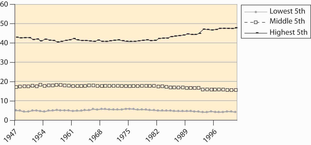
Figure 4.18 Family income
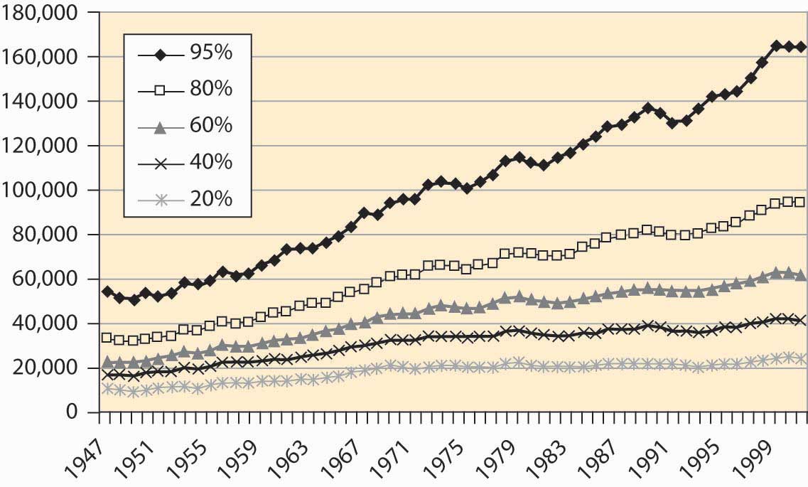
The earnings of the top quintile fell slightly until the late 1960s, when it began to rise. All other quintiles lost income share to the top quintile starting in the mid-1980s. Figures like these suggest that families are getting poorer, except for an elite few. However, families are getting richer, just not as fast as the top quintile.
Figure 4.19 Family income, cumulative percentage change
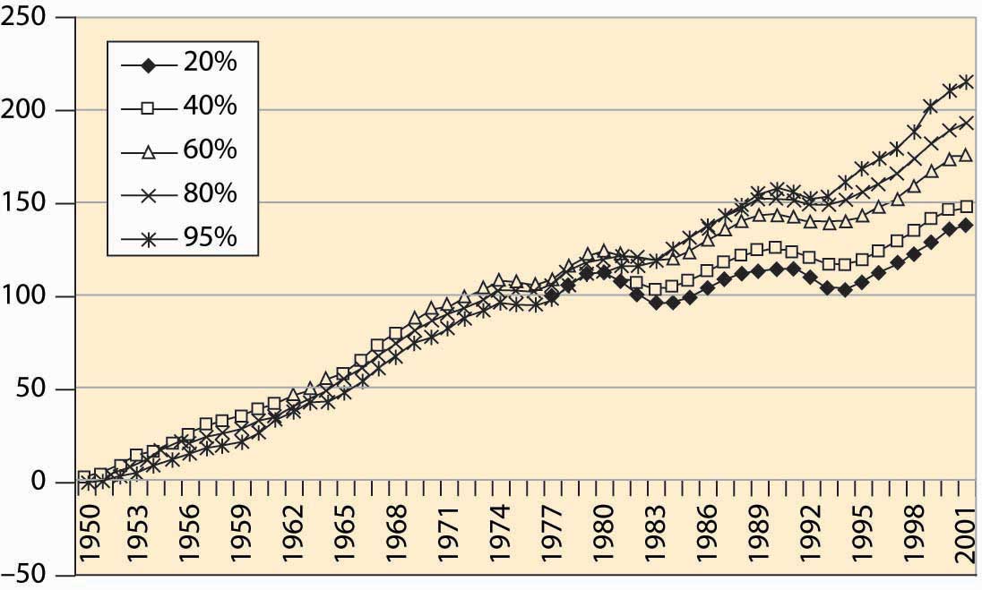
Figure 4.18 "Family income" shows the income, adjusted for inflation to be in 2001 dollars, for families at various points in the income spectrum. For example, the 60% line indicates families for whom 40% of the families have higher income, and 60% have lower income. Incomes of all groups have risen, although the richer families have seen their incomes rise faster than poorer families. That is readily seen when percentage changes are plotted in Figure 4.19 "Family income, cumulative percentage change".
Real income gains in percentage terms have been larger for richer groups, even though the poor have also seen substantially increased incomes.
If the poor have fared less well than the rich in percentage terms, how have African Americans fared? After World War II, African American families earned about 50% of white family income. This ratio has risen gradually, noticeably in the 1960s after the Civil Rights ActLegislation that prohibited segregation based on race in schools, public places, and employment.—legislation that prohibited segregation based on race in schools, public places, and employment—that is credited with integrating workplaces throughout the southern United States. African American family income lagged white income growth throughout the 1980s but has been rising again, a trend illustrated in Figure 4.20 "Black family income as a percentage of white income".
Figure 4.20 Black family income as a percentage of white income
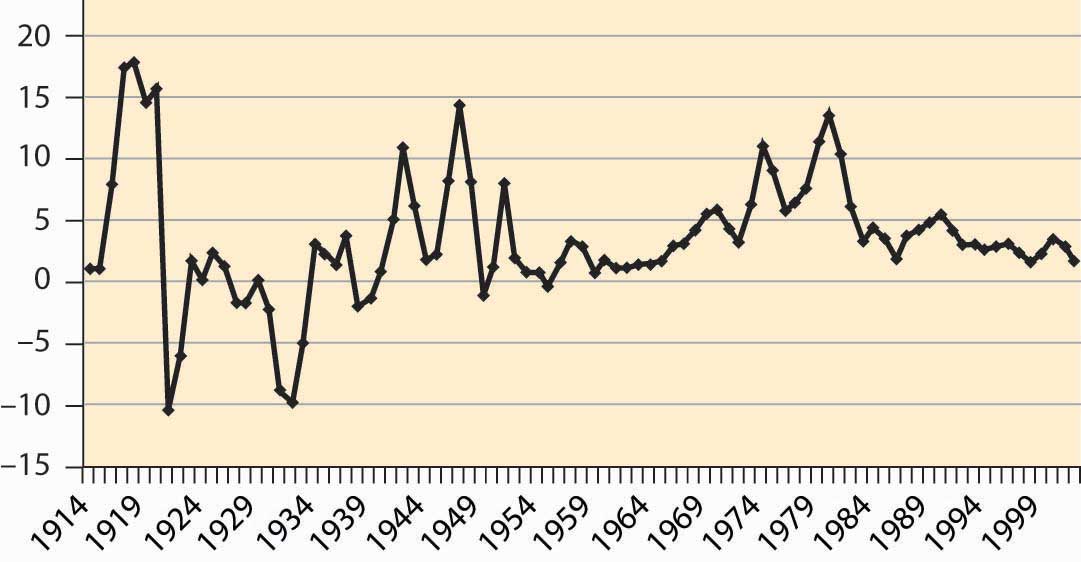
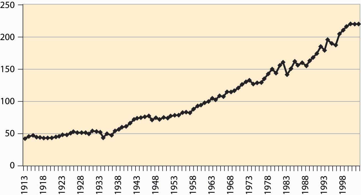
These income measures attempt to actually measure purchasing power, and thus adjust for inflation. How much will $1 buy? This is a complicated question, because changes in prices aren’t uniform—some goods get relatively cheaper, while others become more expensive, and the overall cost of living is a challenge to calculate. The price index typically used is the consumer price index (CPI)A price deflator that adjusts for what it costs to buy a “standard” bundle of food, clothing, housing, electricity, and other items., a price deflator that adjusts for what it costs to buy a “standard” bundle of food, clothing, housing, electricity, and other items. Figure 4.21 "Consumer price index (1982 = 100)" shows the CPI over most of the past century, where 1982 is set as the reference year.
There have been three major inflations in the past century. Both World War I and World War II, with a large portion of the goods and services diverted to military use, saw significant inflations. In addition, there was a substantial inflation during the 1970s, after the Vietnam War in the 1960s. The price level fell during the Great DepressionA prolonged and severe economic downturn from 1929 to 1939., a prolonged and severe economic downturn from 1929 to 1939. Falling price levels create investment problems because inflation-adjusted interest rates, which must adjust for deflation, are forced to be high, since unadjusted interest rates cannot be negative. Changes in the absolute price level are hard to estimate, so the change is separately graphed in Figure 4.22 "CPI percentage changes".
Figure 4.21 Consumer price index (1982 = 100)
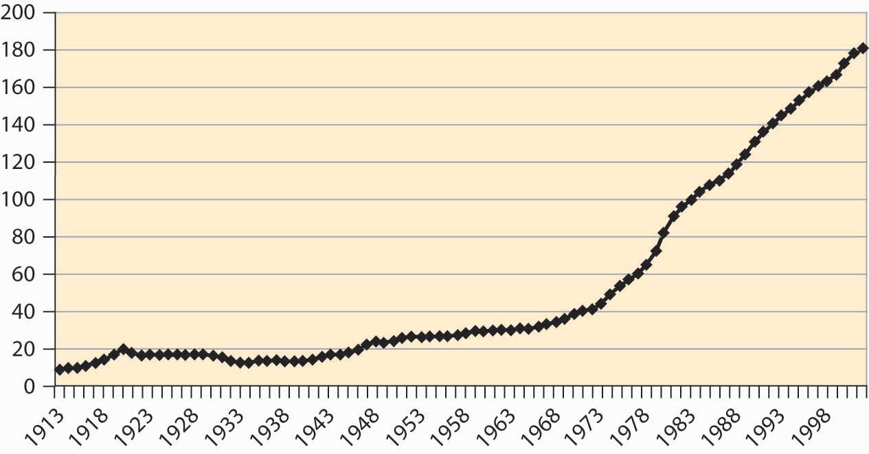
Figure 4.22 CPI percentage changes
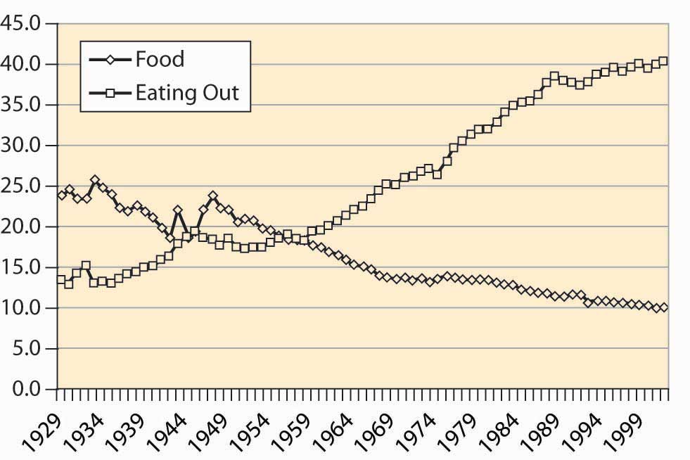
The cost of food has fallen quite dramatically over the past century. Figure 4.23 "Food expenditure as percentage of income, and proportion spent out" shows that the percentage of pre-tax household income spent on food has fallen from 25% to about 10%. This fall is a reflection of greater incomes and the fact that the real cost of food has fallen.
Moreover, a much greater fraction of expenditures on food are spent away from home, a fraction that has risen from under 15% to 40%.
Figure 4.23 Food expenditure as percentage of income, and proportion spent out
How do we spend our income? The major categories are food, clothing, housing, medical, household operation, transportation, and recreation. The percentage of disposable income spent on these categories is shown for the years 1929, 1965, and 2001 in Figure 4.24 "After-tax income shares".
Figure 4.24 After-tax income shares
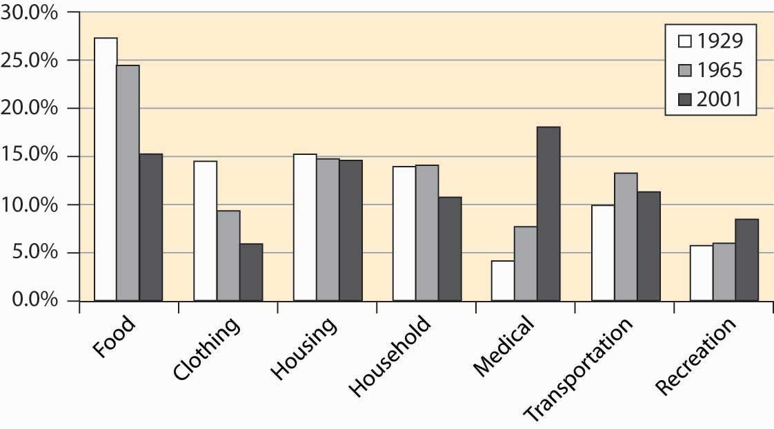
The cost of food has shrunk substantially, but we enjoy more recreation and spend a lot more staying healthy. (The cost of food is larger than in Figure 4.23 "Food expenditure as percentage of income, and proportion spent out" because these figures use after-tax disposable income, rather than pre-tax income.) This is not only a consequence of our aging population but also of the increased technology available.
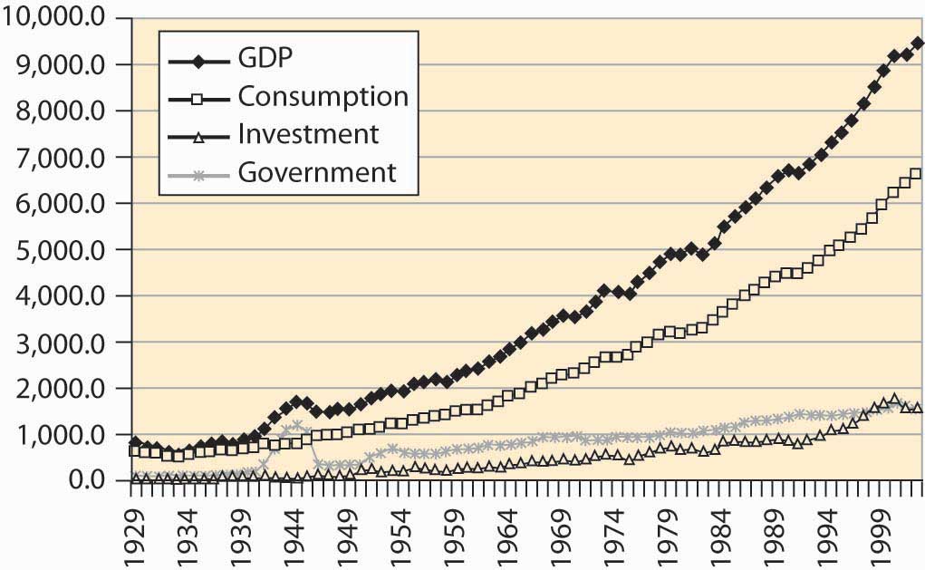
We learned something about where we live and what we buy. Where do we get our income? Primarily, we earn by providing goods and services. Nationally, we produce about $11 trillion worth of goods and services. Broadly speaking, we spend that $11 trillion on personal consumption of goods and services, savings, and government. This, by the way, is often expressed as Y = C + I + G, which states that income (Y) is spent on consumption (C), investment (I, which comes from savings), and government (G). One can consume imports as well, so the short-term constraint looks like Y + M = C + I + G + X, where M is imports and X is exports.
How much does the United States produce? Economists measure output with the gross domestic product (GDP)The value of traded goods and services produced within the borders of the United States., which is the value of traded goods and services produced within the borders of the United States. GDP thus excludes output of Japanese factories owned by Americans but includes the output of U.S. factories owned by the Japanese.
Importantly, GDP excludes nontraded goods and services. Thus, unpaid housework is not included. If you clean your own home, and your neighbor cleans his or her home, the cleaning does not contribute to GDP. On the other hand, if you and your neighbor pay each other to clean each other’s homes, GDP goes up by the payments, even though the actual production of goods and services remains unchanged. Thus, GDP does not measure our total output as a nation, because it neglects unpaid services. Why does it neglect unpaid services? Primarily because we can’t readily measure them. Data on transactions are generated by tax information and reporting requirements imposed on businesses. For the same reason, GDP neglects illegal activities as well, such as illegal drug sales and pirated music sales. Thus, GDP is not a perfect measure of the production of our society. It is just the best measure we have.
Figure 4.25 "Output, consumption, investment, and government" shows the growth in GDP and its components of personal consumption, government expenditures, and investment. The figures are expressed in constant 1996 dollars—that is, adjusted for inflation. The figure for government includes the government’s purchases of goods and services—weapons, highways, rockets, pencils—but does not include transfer payments like social security and welfare programs. Transfer payments are excluded from this calculation because actual dollars are spent by the recipient, not by the government. The cost of making the transfer payments (e.g., printing and mailing the checks), however, is included in the cost of government.
Figure 4.25 Output, consumption, investment, and government
It is often visually challenging to draw useful information from graphs like Figure 4.25 "Output, consumption, investment, and government", because economic activity is growing at a constant percentage. Consequently, economists often use a logarithmic scaleScale on which a straight line gives constant percentage growth. rather than a dollar scale. A logarithmic scale has the useful property that a straight line gives constant percentage growth. Consider a variable x that takes on values xt at time t. Define %∆x to be the percentage change:
Then
Thus, if the percentage change is constant over time, log(xt) will be a straight line over time. Moreover, for small percentage changes,
so that the slope is approximately the growth rate.The meaning of ≈ throughout this book is “to the first order.” Here that means Moreover, in this case the errors of the approximation are modest up to about 25% changes. Figure 4.26 "Major GDP components in log scale" shows these statistics with a logarithmic scale.
Figure 4.26 Major GDP components in log scale
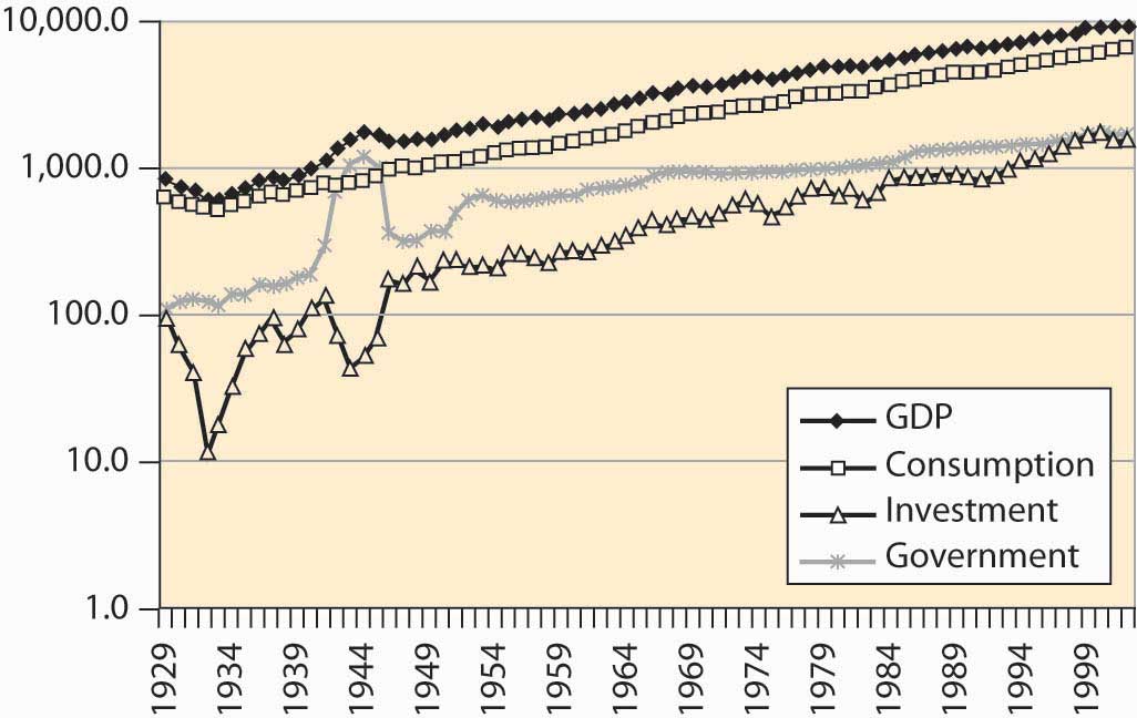
Immediately noticeable is the approximately constant growth rate from 1950 to the present, because a straight line with a log scale represents a constant growth rate. In addition, government has grown much more slowly (although recall that transfer payments, another aspect of government, aren’t shown). A third feature is the volatility of investment—it shows much greater changes than output and consumption. Indeed, during the Great Depression (1929–1939), income fell somewhat, consumption fell less, government was approximately flat, and investment plunged to 10% of its former level.
Some of the growth in the American economy has arisen because there are more of us. Double the number of people, and consume twice as many goods, and individually we aren’t better off. How much are we producing per capita, and how much are we consuming?
U.S. output of goods, services, and consumption has grown substantially over the past 75 years, a fact illustrated in Figure 4.27 "Per capita income and consumption". In addition, consumption has been a steady percentage of income. This is more clearly visible when income shares are plotted in Figure 4.28 "Consumption, investment, and government (% GDP)".
Figure 4.27 Per capita income and consumption

Figure 4.28 Consumption, investment, and government (% GDP)
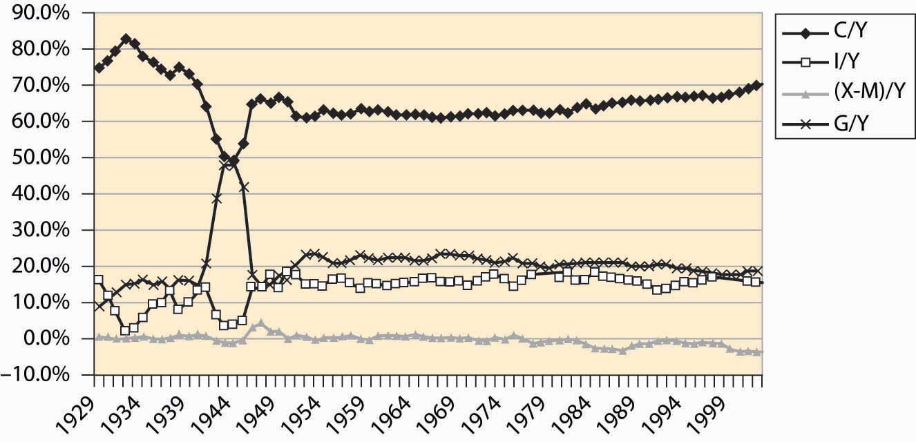
Consumption was a very high portion of income during the Great Depression because income itself fell. Little investment took place. The wartime economy of World War II reduced consumption to below 50% of output, with government spending a similar fraction as home consumers. Otherwise, consumption has been a relatively stable 60%–70% of income, rising modestly during the past 20 years, as the share of government shrank and net imports grew. Net imports rose to 4% of GDP in 2001.
The most basic output of our economic system is food, and the U.S. economy does a remarkable job producing food. The United States has about 941 million acres under cultivation to produce food, which represents 41.5% of the surface area of the United States. Land use for agriculture peaked in 1952, at 1,206 million acres, and has been dwindling ever since, especially in the northeast where farms are being returned to forest through disuse. Figure 4.29 "U.S. agricultural output, 1982 constant dollars" shows the output of agricultural products in the United States, adjusted to 1982 prices.
Figure 4.29 U.S. agricultural output, 1982 constant dollars
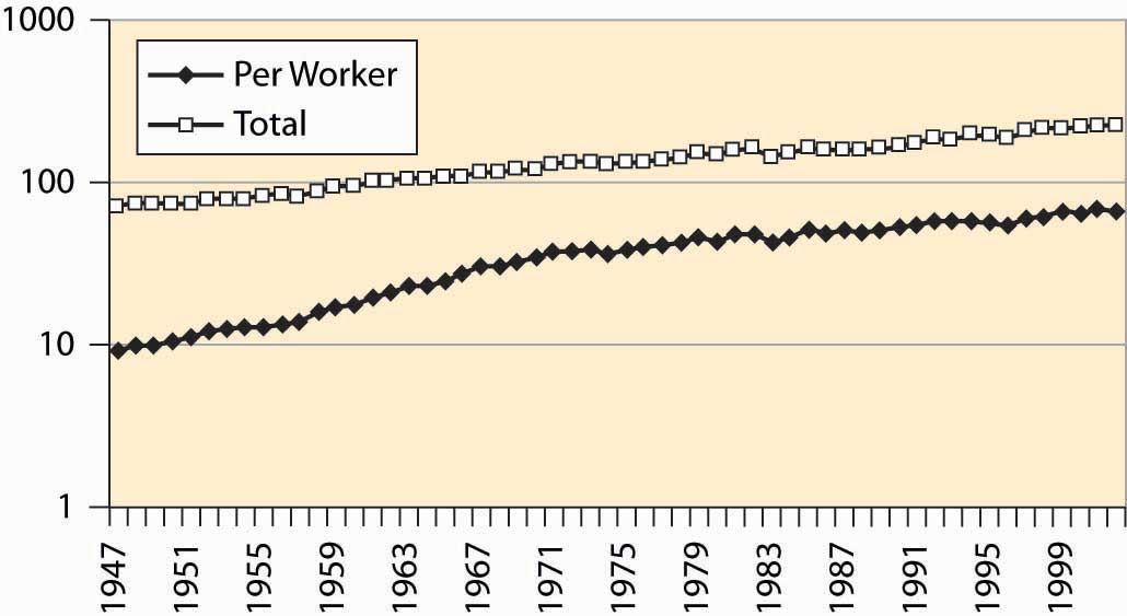
The growth in output is more pronounced when viewed per worker involved in agriculture in Figure 4.30 "Agricultural output, total and per worker (1982 dollars, log scale)".
Figure 4.30 Agricultural output, total and per worker (1982 dollars, log scale)
Where do we work? Economists divide production into goods and services. Goods are historically divided into mining, construction, and manufacturing. Mining includes production of raw materials of all kinds, including metals, oil, bauxite, and gypsum. Construction involves production of housing and business space. Manufacturing involves the production of everything from computers to those little chef’s hats that are placed on turkey legs. Figure 4.31 "Major nonagricultural sectors of U.S. economy (% GDP)" describes the major sectors of the U.S. economy. Because the data come from firms, agriculture is excluded, although goods and services provided to farms would be included.
Figure 4.31 Major nonagricultural sectors of U.S. economy (% GDP)
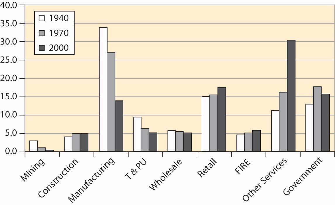
Mining has diminished as a major factor in the U.S. economy, a consequence of the growth of other sectors and the reduction in the prices for raw materials. Contrary to many popular predictions, the prices of raw materials have fallen even as output and population have grown. We will see later in this book that the fall in prices of raw materials—ostensibly in fixed supply given the limited capacity of the earth—means that people expect a relative future abundance, either because of technological improvements in their use or because of large as yet undiscovered pools of the resources. An example of technological improvements is the substitution of fiber optic cable for copper wires. An enormous amount of copper has been recovered from telephone lines, and we can have more telephone lines and use less copper than was used in the past.
Manufacturing has become less important for several reasons. Many manufactured goods cost less, pulling down the overall value. In addition, we import more manufactured goods than in the past. We produce more services. T&PU stands for transportation and public utilities, and includes electricity and telephone services and transportation including rail and air travel. This sector has shrunk as a portion of the entire economy, although the components have grown in absolute terms. For example, the number of airplane trips has grown dramatically, as illustrated in Figure 4.32 "Air travel per capita".
Figure 4.32 Air travel per capita
Electricity production has risen dramatically, as Figure 4.33 "Electricity production (M kwh)" shows.
Figure 4.33 Electricity production (M kwh)
However, energy use more generally has not grown as much, just doubling over the postwar period, which is illustrated in Figure 4.34 "Energy use (quadrillion BTUs)".
Figure 4.34 Energy use (quadrillion BTUs)
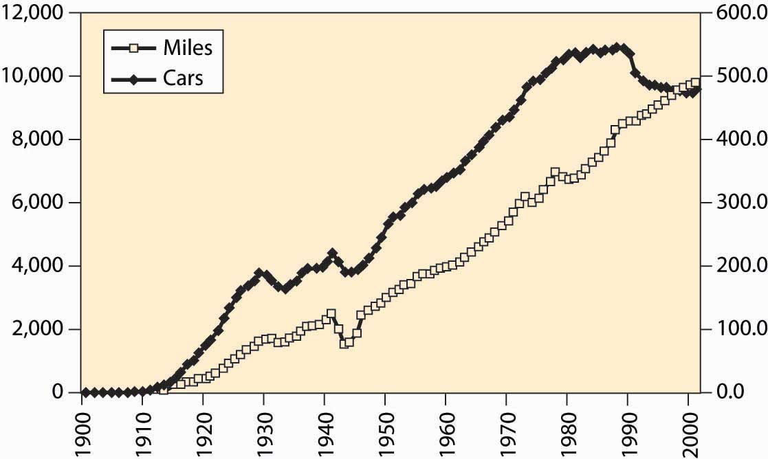
The number of automobiles per capita in the United States peaked in the early 1980s, which looks like a reduction in transportation since then. However, we still drive more than ever, suggesting the change is actually an increase in the reliability of automobiles. Both of these facts are graphed in Figure 4.35 "Cars per thousand population and miles driven per capita", with miles on the left axis and cars per thousand on the right.
Figure 4.35 Cars per thousand population and miles driven per capita
The cost of selling goods—wholesale and retail costs—remains relatively stable, as does “FIRE,” which stands for finance, insurance, and real estate costs. Other services, ranging from restaurants to computer tutoring, have grown substantially. This is the so-called service economy that used to be in the news frequently, but is less so these days.
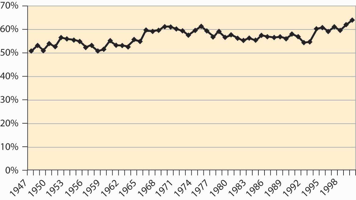
A bit more than 60% of the population works, with the historical percentage graphed in Figure 4.36 "Percentage of population employed (military and prisoners excluded)". The larger numbers in recent years are partially a reflection of the baby boom’s entry into working years, reducing the proportion of elderly and children in American society. However, it is partially a reflection of an increased propensity for households to have two income earners.
Figure 4.36 Percentage of population employed (military and prisoners excluded)
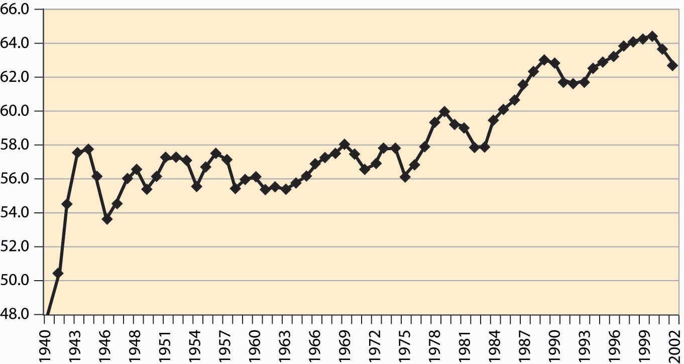
Figure 4.37 Labor force participation rates, all women and married women
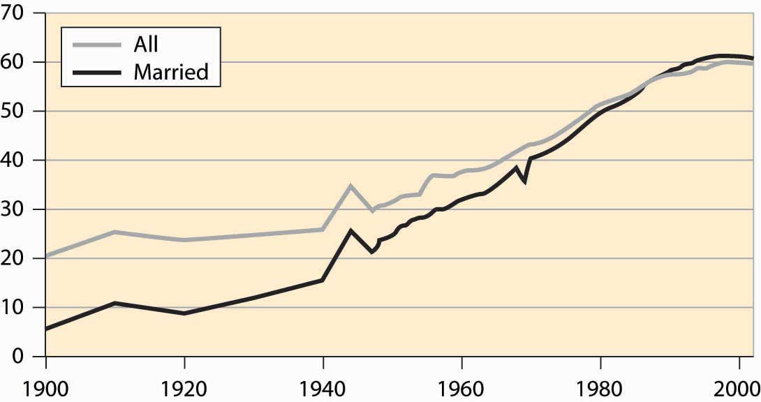
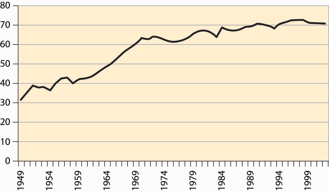
Female participation in the labor force has risen quite dramatically in the United States, as shown in Figure 4.37 "Labor force participation rates, all women and married women". The overall participation rate has roughly tripled during the century and significantly exceeds the rate prevailing during World War II, when many women went to work. In addition, participation of married women has now risen above the level for unmarried women. The participation rate for single women is even higher, currently at 68%, and it is higher than the overall average participation rate of all residents. The difference is primarily elderly women, who are disproportionately more likely to be widowed rather than married or single, and who are less likely to be working.
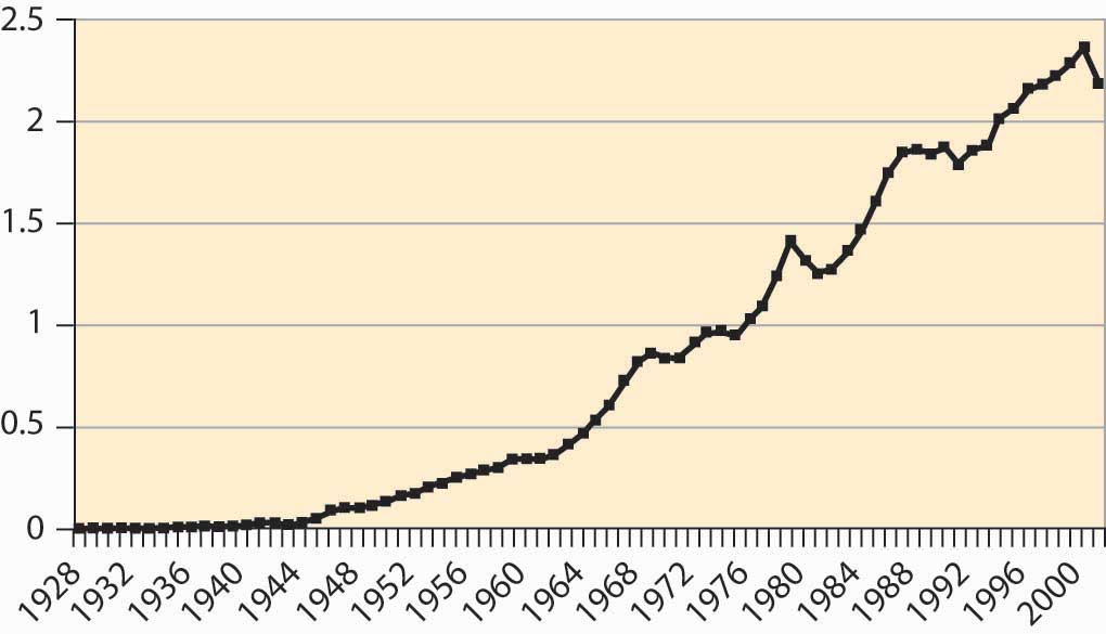
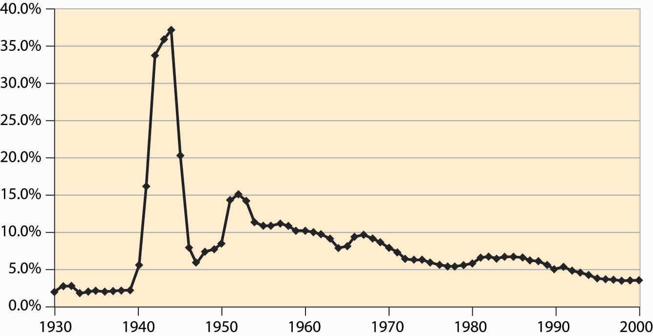
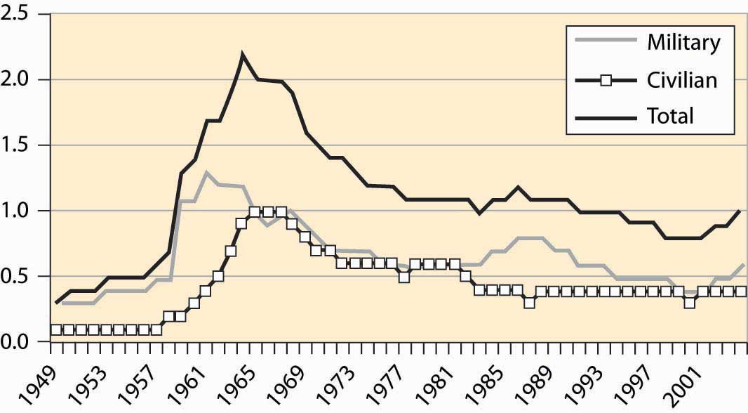
Another sector of the economy that has been of focus in the news is national defense. How much do we spend on the military? In this century, the large expenditure occurred during World War II, when about 50% of GDP was spent by the government and 37% of GDP went to the armed forces. During the Korean War, we spent about 15% of GDP on military goods and less than 10% of GDP during the Vietnam War. The military buildup during Ronald Reagan’s presidency (1980–1988) increased our military expenditures from about 5.5% to 6.5% of GDP—a large percentage change in military expenditures, but a small diversion of GDP. The fall of the Soviet Union led the United States to reduce military expenditures, in what was called the “peace dividend,” but again the effects were modest, as illustrated in Figure 4.38 "Defense as a percentage of GDP".
Figure 4.38 Defense as a percentage of GDP
Historically, defense represents the largest expenditure by the federal government. However, as we see, defense has become a much smaller part of the economy overall. Still, the federal government plays many other roles in the modern U.S. economy.
With a budget over $2 trillion, the federal government represents just under 20% of the U.S. economy. It is one of the largest organizations in the world; only nations are larger organizations, and only a handful of nations are larger.
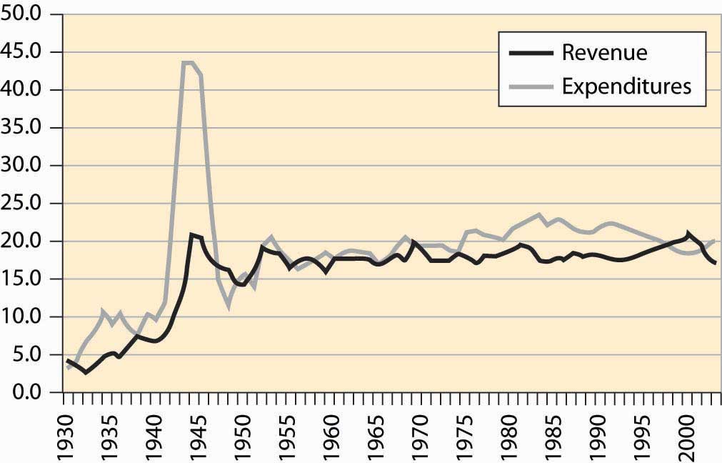
The size of the federal government, as a percentage of GDP, is shown in Figure 4.39 "Federal expenditures and revenues (percent of GDP)". Federal expenditures boomed during World War II (1940–1945), but shrank back to nearly prewar levels shortly afterward, with much of the difference attributable to veterans’ benefits and continuing international involvement. Federal expenditures, as a percentage of GDP, continued to grow until Ronald Reagan’s presidency in 1980, when they began to shrink slightly after an initial growth. Figure 4.39 "Federal expenditures and revenues (percent of GDP)" also shows federal revenues, and the deficit—the difference between expenditures and revenues—is apparent, especially for World War II and 1970 to 1998.
Figure 4.39 Federal expenditures and revenues (percent of GDP)
Much has been written about the federal government’s “abdication” of various services, which are pushed onto state and local government. Usually this behavior is attributed to the Reagan presidency (1980–1988). There is some evidence of this behavior in the postwar data, but the effect is very modest and long term. Most of the growth in state and local government occurred between 1947 and 1970, well before the Reagan presidency; state and local government has been stable since then. Moreover, the expenditure of the federal government, which shows ups and downs, has also been fairly stable. In any event, such effects are modest overall.
Figure 4.40 Federal, state, and local level, and total government receipts (% GDP)
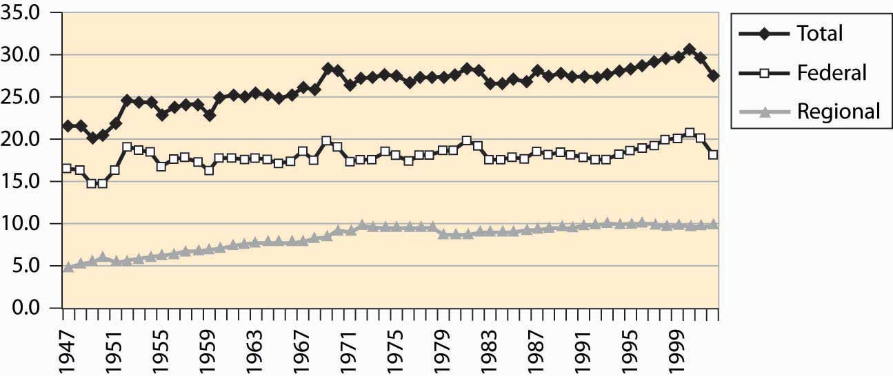
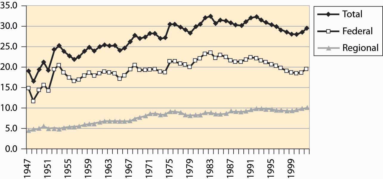
Figure 4.40 "Federal, state, and local level, and total government receipts (% GDP)" sets out the taxation at both the federal and state and local (merged to be regional) level. Figure 4.41 "Federal, regional, and total expenditures (% GDP)" shows expenditures of the same entities. Both figures are stated as a percentage of GDP. State and local taxation and expenditures doubled over the postwar period. The two figures are very similar. The federal government’s expenditures have varied more significantly than its revenues.
Figure 4.41 Federal, regional, and total expenditures (% GDP)
A peculiarity of the U.S. federal government is a preference for “off-budget” expenditures. Originally, such off-budget items involved corporations like Intelsat (which commercialized satellite technology) and RCA (the Radio Corporation of America, which commercialized radio), as well as other semi-autonomous and self-sustaining operations. Over time, however, off-budget items became a way of hiding the growth of government, through a process that became known as “smoke and mirrors.” The scope of these items is graphed in Figure 4.42 "Federal expenditures, on and off budget (% GDP)".
Figure 4.42 Federal expenditures, on and off budget (% GDP)
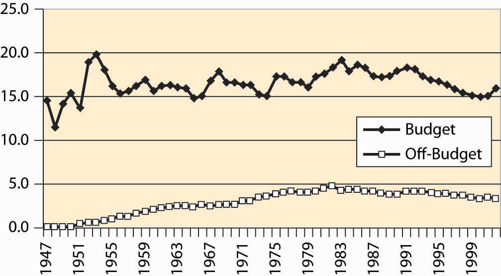
During the 1980s, the public became aware of off-budget items. Political awareness made off-budget items cease to work as a device for evading balanced-budget requirements, and few new ones were created, although they continue to be debated. Sporadically, there are attempts to push social security off-budget.
Figure 4.43 Federal and regional government employment
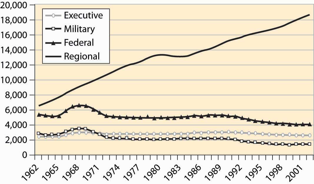
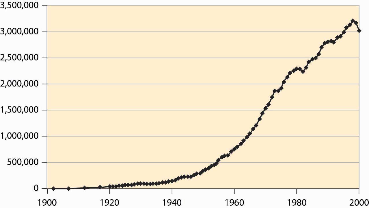
Federal employees include two major categories: uniformed military personnel and the executive branch. State and local government is much larger and has tripled in size since 1962, a fact illustrated in Figure 4.43 "Federal and regional government employment". The biggest growth areas involve public school teachers, police, corrections (prisons), and hospitals. About 850,000 of the federal employees work for the postal service.
Figure 4.44 Major expenditures of the federal government
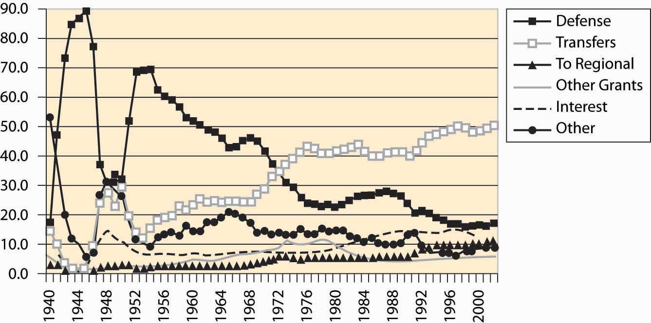
Figure 4.45 Major transfer payments (% of federal budget)
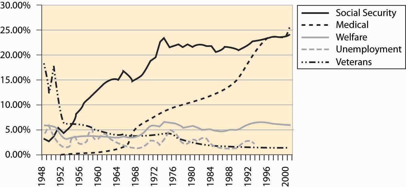
Transfers to individualsDirect payments to individuals in the form of a check. represent almost 50% of federal expenditures. These transfers are direct payments to individuals in the form of a check. Such transfers include social security, Medicare, Medicaid, unemployment insurance, and veteran benefits. Transfers to state and local governments are listed as regional. “Other grants” also involve sending checks, usually with strings attached. Expenditure shares are graphed in Figure 4.44 "Major expenditures of the federal government", while the breakdown of federal transfers is provided in Figure 4.45 "Major transfer payments (% of federal budget)". The growth in social security during the 1950s and 1960s is primarily a consequence of increasing benefit levels. The growth in Medicare and Medicaid payments over the period 1970 to 1990, in contrast, is primarily a consequence of increased costs of existing programs rather than increases in benefit levels.
Figure 4.46 Social security revenue and expenditure ($ millions)
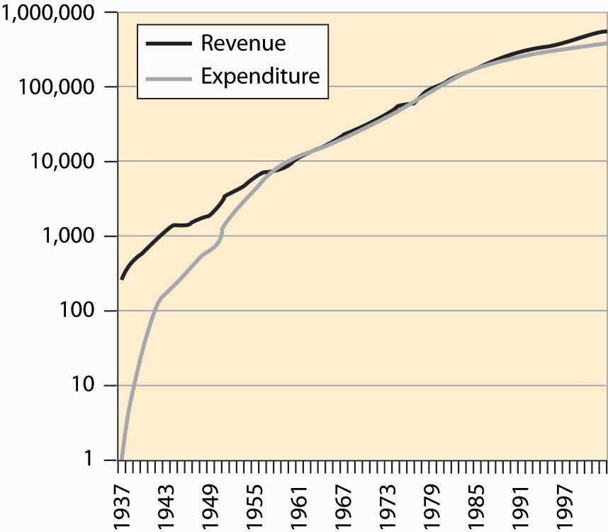
A question you may ask, quite reasonably, is whether the social security program can survive to the time when you retire. A common misunderstanding about social security is that it is an investment program—that the taxes individuals pay in are invested and returned at retirement. As Figure 4.46 "Social security revenue and expenditure ($ millions)" makes clear, for most of its existence the social security program has paid out approximately what it took in.
The social security administration has been ostensibly investing money and has a current value of approximately $1.5 trillion, which is a bit less than four times the current annual expenditure on social security. Unfortunately, this money is “invested” in the federal government, and thus is an obligation of the federal government, as opposed to an investment in the stock market. Consequently, from the perspective of someone who is hoping to retire in, say, 2050, this investment isn’t much comfort, since the investment won’t make it easier for the federal government to make the social security payments. The good news is that the government can print money. The bad news is that when the government prints a lot of money and the obligations of the social security administration are in the tens of trillions of dollars, it isn’t worth very much.
Figure 4.47 Federal debt, total and percent of GDP
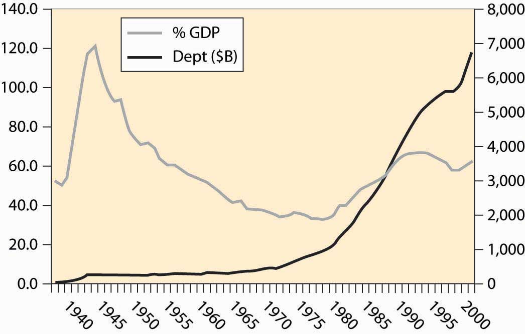
The federal government runs deficits, spending more than it earned. In most of the past 75 years, we see from Figure 4.39 "Federal expenditures and revenues (percent of GDP)" that the government runs a deficit, bringing in less than it spends. Interest has been as high as 15% of the cost of the federal government (see Figure 4.44 "Major expenditures of the federal government"). How large is the debt, and how serious is it? Figure 4.47 "Federal debt, total and percent of GDP" gives the size of the federal debt in absolute dollars and as a percent of GDP. The debt was increased dramatically during World War II (1940–1945), but over the next 25 years little was added to it, so that as a portion of growing GDP, the debt fell.
Starting in the late 1970s, the United States began accumulating debt faster than it was growing, and the debt began to rise. That trend wasn’t stabilized until the 1990s, and then only because the economy grew at an extraordinary rate by historical standards. The expenditures following the September 11, 2001, terrorist attacks, combined with a recession in the economy, have sent the debt rising dramatically, wiping out the reduction of the 1990s.
The national debt isn’t out of control, yet. At 4% interest rates on federal borrowing, we spend about 2.5% of GDP on interest servicing the federal debt. The right evaluation of the debt is as a percentage of GDP; viewed as a percentage, the size of the debt is of moderate size—serious but not critical. The serious side of the debt is the coming retirement of the baby boom generation, which is likely to put additional pressure on the government.
An important distinction in many economic activities is one between a stock and a flow. A stockThe current amount of some material. is the current amount of some material; flowThe rate of change in the amount of some material that exists from one instant to the next. represents the rate of change in the amount of some material that exists from one instant to the next. Your bank account represents a stock of money; expenditures and income represent a flow. The national debt is a stock; the deficit is the addition to the debt and is a flow. If you think about a lake with incoming water and evaporation, the amount of water in the lake is the stock of water, while the incoming stream minus evaporation is the flow.
Table 4.1 Expenditures on agencies as percent of non-transfer expenditures
| Department or Agency | 1977 | 1990 | 2002 |
|---|---|---|---|
| Legislative | 0.4 | 0.4 | 0.5 |
| Judiciary | 0.2 | 0.3 | 0.6 |
| Agriculture | 2.1 | 2.2 | 2.7 |
| Commerce | 3.2 | 0.7 | 0.7 |
| Education | 3.9 | 3.8 | 6.7 |
| Energy | 3.1 | 3.2 | 2.9 |
| Health | 3.7 | 4.6 | 8.3 |
| Defense | 43.8 | 59.2 | 46.9 |
| Homeland Security | - | - | 4.1 |
| Housing & Urban Dev. | 13.4 | 2.9 | 4.3 |
| Interior | 1.6 | 1.3 | 1.4 |
| Justice | 1.0 | 1.7 | 2.7 |
| Labor | 6.1 | 1.7 | 1.7 |
| State | 0.6 | 0.9 | 1.3 |
| Transportation | 2.2 | 2.6 | 2.1 |
| Treasury | 1.7 | 1.6 | 1.4 |
| Veterans | 2.3 | 2.6 | 3.3 |
| Corps of Engineers | 1.0 | 0.6 | 0.6 |
| Environmental P.A. | 1.1 | 1.1 | 1.1 |
| Fed Emergency M.A. | 0.2 | 0.4 | 0.0 |
| GSA | 0.2 | 0.5 | 0.0 |
| Intl Assistance | 2.8 | 2.7 | 1.9 |
| NASA | 1.6 | 2.5 | 2.0 |
| NSF | 0.3 | 0.4 | 0.7 |
Table 4.1 "Expenditures on agencies as percent of non-transfer expenditures" gives the expenditures on various agencies, as a percentage of the discretionary expendituresGovernment expenditures that aren’t transfers., where discretionary is a euphemism for expenditures that aren’t transfers. Transfers, which are also known as entitlements, include social security, Medicare, aid to families with dependent children, unemployment insurance, and veteran’s benefits. Table 4.1 "Expenditures on agencies as percent of non-transfer expenditures" provides the expenditures by what is sometimes known as the “Alphabet Soup” of federal agencies (DOD, DOJ, DOE, FTC, SEC, …).
The National Science Foundation (NSF) provides funding for basic research. The general idea of government-funded research is that it is useful for ideas to be in the public domain and, moreover, that some research isn’t commercially viable but is valuable nevertheless. Studying asteroids and meteors produces little, if any, revenue but could, perhaps, save humanity one day in the event that we needed to deflect a large incoming asteroid. (Many scientists appear pessimistic about actually deflecting an asteroid.) Similarly, research into nuclear weapons might be commercially viable; but, as a society, we don’t want firms selling nuclear weapons to the highest bidder. In addition to the NSF, the National Institutes of Health, also a government agency, funds a great deal of research. How much does the government spend on research and development (R&D)? Figure 4.48 "Federal spending on R&D (% GDP)" shows the history of R&D expenditures. The 1960s “space race” competition between the United States and the Soviet Union led to the greatest federal expenditure on R&D, and it topped 2% of GDP. There was a modest increase during the Reagan presidency (1980–1988) in defense R&D, which promptly returned to earlier levels.
Figure 4.48 Federal spending on R&D (% GDP)
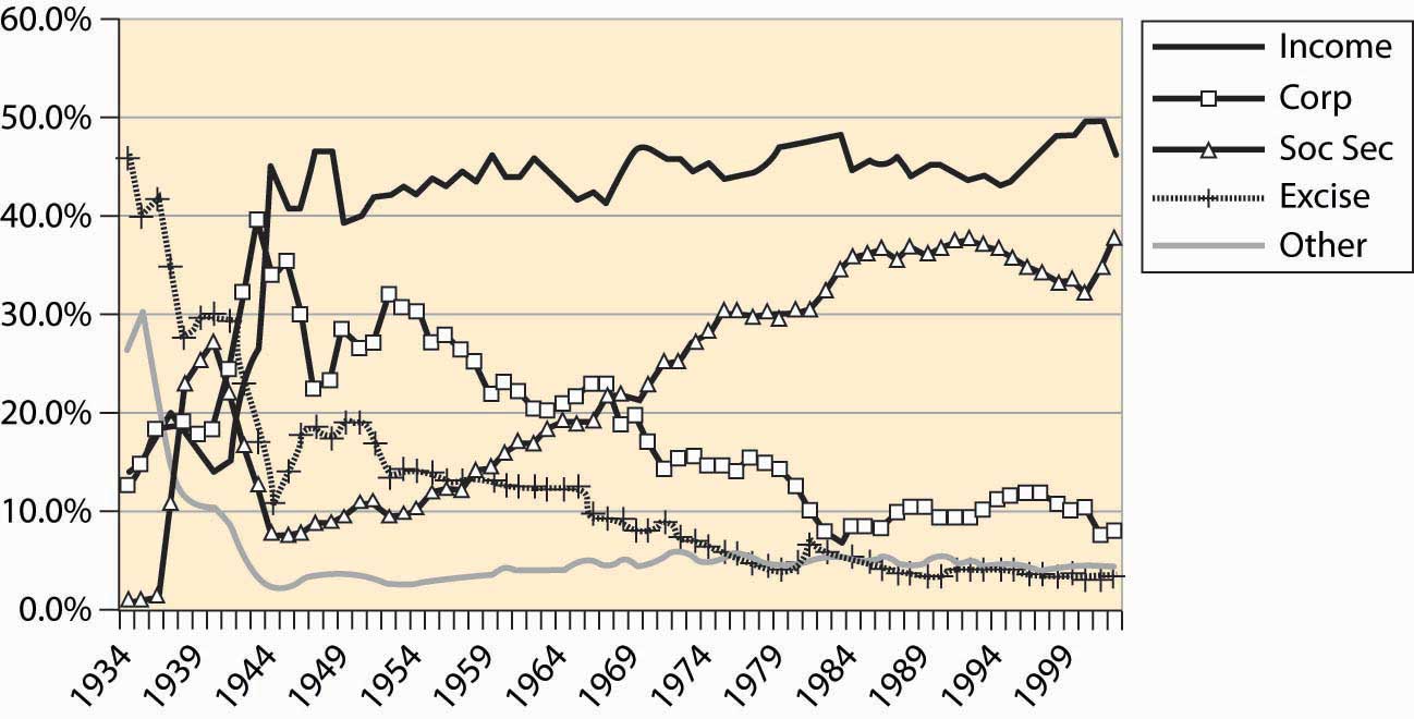
Where does the government get the money to buy all these things? As we see in Figure 4.49 "Sources of federal government revenue", the federal income tax currently produces just under 50% of federal revenue. Social security and Medicare taxes produce the next largest portion, with around 30%–35% of revenue. The rest comes from corporate profits’ taxes (about 10%), excise taxes like those imposed on liquor and cigarettes (under 5%), and other taxes like tariffs, fees, sales of property like radio spectrum and oil leases, and fines. The major change since World War II is the dramatic increase in social security, a consequence of the federal government’s attempt to ensure the future viability of the program, in the face of severely adverse demographics in the form of the retirement of the baby boom generation.
Figure 4.49 Sources of federal government revenue
An important aspect of tax collection is that income taxes, like the federal income tax as well as social security and Medicare taxes, are very inexpensive to collect relative to sales taxes and excise taxes. Income taxes are straightforward to collect even relative to corporate income taxes. Quite reasonably, corporations can deduct expenses and the costs of doing business and are taxed on their profits, not on revenues. What is an allowable deduction, and what is not, makes corporate profits complicated to administer. Moreover, from an economic perspective, corporate taxes are paid by consumers in the form of higher prices for goods, at least when industries are competitive.
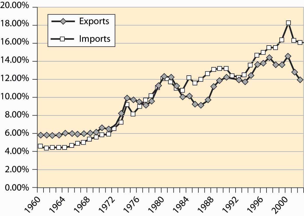
The United States is a major trading nation. Figure 4.50 "Total imports and exports as a proportion of GDP" represents total U.S. imports and exports, including foreign investments and earnings (e.g., earnings from U.S.-owned foreign assets). As is clear from this figure, the net trade surplus ended in the 1970s, and the United States now runs substantial trade deficits, around 4% of the GDP. In addition, trade is increasingly important in the economy.
Figure 4.50 Total imports and exports as a proportion of GDP
As already stated, Figure 4.50 "Total imports and exports as a proportion of GDP" includes investments and earnings. When we think of trade, we tend to think of goods traded—American soybeans, movies and computers sold abroad, as well as automobiles, toys, shoes, and wine purchased from foreign countries. Figure 4.51 "U.S. trade in goods and services" shows the total trade in goods and services, as a percentage of U.S. GDP. These figures are surprisingly similar, which show that investments and earnings from investment are roughly balanced—the United States invests abroad to a similar extent as foreigners invest in the United States.
Figure 4.51 U.S. trade in goods and services
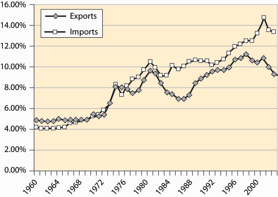
Figure 4.52 "Income and payments (% GDP)" shows the earnings on U.S. assets abroad and the payments from U.S.-based assets owned by foreigners. These forms of exchange are known as capital accountsEarnings on foreign assets, and the payments from U.S.-based assets owned by foreigners.. These accounts are roughly in balance, while the United States used to earn about 1% of GDP from its ownership of foreign assets.
Figure 4.52 Income and payments (% GDP)
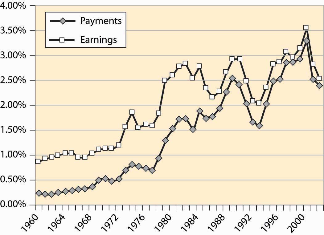
Table 4.2 Top U.S. trading partners and trade volumes ($ billions)
| Rank | Country | Exports Year-to-Date | Imports Year-to-Date | Total | Percent |
|---|---|---|---|---|---|
| All Countries | 533.6 | 946.6 | 1,480.2 | 100.0% | |
| Top 15 Countries | 400.7 | 715.4 | 1,116.2 | 75.4% | |
| 1 | Canada | 123.1 | 167.8 | 290.9 | 19.7% |
| 2 | Mexico | 71.8 | 101.3 | 173.1 | 11.7% |
| 3 | China | 22.7 | 121.5 | 144.2 | 9.7% |
| 4 | Japan | 36.0 | 85.1 | 121.0 | 8.2% |
| 5 | Germany | 20.4 | 50.3 | 70.8 | 4.8% |
| 6 | United Kingdom | 23.9 | 30.3 | 54.2 | 3.7% |
| 7 | Korea, South | 17.5 | 29.6 | 47.1 | 3.2% |
| 8 | Taiwan | 14.0 | 22.6 | 36.5 | 2.5% |
| 9 | France | 13.4 | 20.0 | 33.4 | 2.3% |
| 10 | Italy | 6.9 | 18.6 | 25.5 | 1.7% |
| 11 | Malaysia | 7.2 | 18.0 | 25.2 | 1.7% |
| 12 | Ireland | 5.2 | 19.3 | 24.5 | 1.7% |
| 13 | Singapore | 13.6 | 10.1 | 23.7 | 1.6% |
| 14 | Netherlands | 15.7 | 7.9 | 23.6 | 1.6% |
| 15 | Brazil | 9.3 | 13.2 | 22.5 | 1.5% |
Who does the United States trade with? Table 4.2 "Top U.S. trading partners and trade volumes ($ billions)" details the top 15 trading partners and the share of trade. The United States and Canada remain the top trading countries of all pairs of countries. Trade with Mexico has grown substantially since the enactment of the 1994 North American Free Trade Act (NAFTA), which extended the earlier U.S.–Canada agreement to include Mexico, and Mexico is the second largest trading partner of the United States. Together, the top 15 account for three quarters of U.S. foreign trade.
The U.S. economy has recessionsPeriods marked by a drop in gross domestic output., a term that refers to a period marked by a drop in gross domestic output. Recessions are officially called by the National Bureau of Economic Research, which keeps statistics on the economy and engages in various kinds of economic research. Generally, a recession is called whenever output drops for one-half of a year.
Figure 4.53 Postwar industrial production and recessions
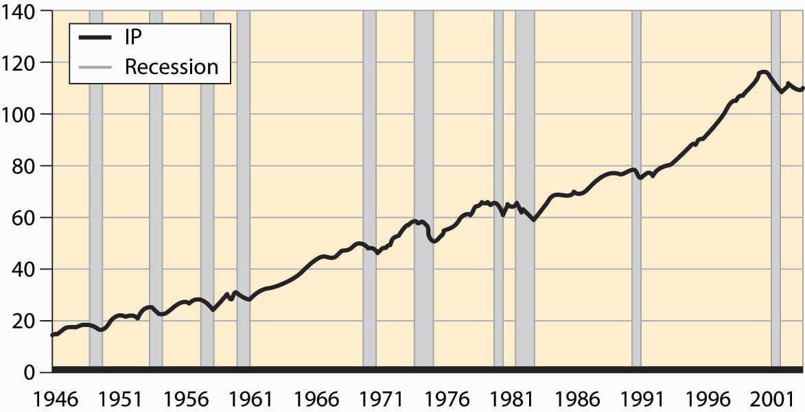
Figure 4.53 "Postwar industrial production and recessions" shows the overall industrial production of the United States since World War II. Drops in output are clearly noticeable. The official recessions are also marked. There are three booms that lasted about a decade; these are the longest booms in U.S. history and much longer than booms ordinarily last. Prior to World War II, a normal boom lasted 2½ years and the longest boom was 4 years. Recessions have historically lasted for 1½ to 2 years, a pattern that continues. Indeed, the average recession since World War II has been shorter than the average recession prior to that time.
These fluctuations in output are known as the business cycleRandom fluctuations in output., which is not an exact periodic cycle but instead a random cycle.
Figure 4.54 Percentage of the population employed
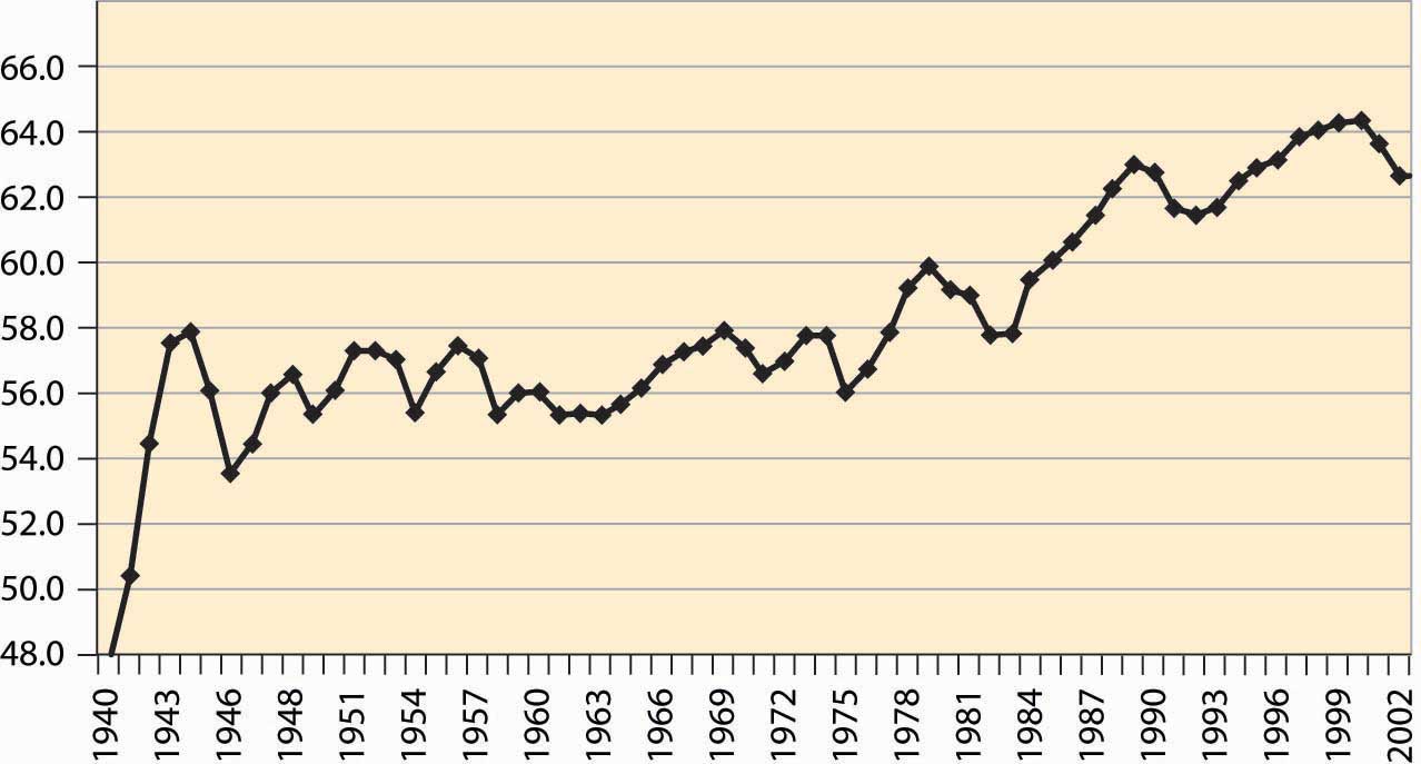
An important aspect of the business cycle is that many economic variables move together, or covaryTo move together.. Some economic variables vary less with the business cycle than others. Investment varies very strongly with the business cycle, while overall employment varies weakly. Interest rates, inflation, stock prices, unemployment, and many other variables also vary systematically over the business cycle. Recessions are clearly visible in the percentage of the population employed, as illustrated in Figure 4.54 "Percentage of the population employed"
Some economic variables are much more variable than others. For example, investment, durable goods purchases, and utilization of production capacity vary more dramatically over the business cycle than consumption and employment. Figure 4.55 "Industrial factory capacity utilization" shows the percentage of industrial capacity utilized to produce manufactured goods. This series is more volatile than production itself and responds more strongly to economic conditions.
Figure 4.55 Industrial factory capacity utilization
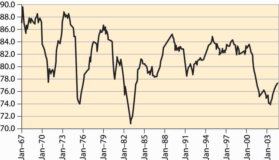
Source: FRED.
Most of the field of macroeconomics is devoted to understanding the determinants of growth and of fluctuations, but further consideration of this important topic is beyond the scope of a microeconomics text.


